Park / Mirage Springs
-
 22-August 23
- Views 1,560
- Downloads 245
- Fans 0
- Comments 9
-
 55.00%(required: 50%)
 Bronze

G Force 65% CoasterCreator9 60% Milo 60% Terry Inferno 60% bigshootergill 55% Liampie 55% pants 55% Xtreme97 55% posix 50% RWE 50% Scoop 50% ottersalad 45% 55.00% -
 Description
Amidst the swelter it appears, existing only within its own boundaries.
Placed 6th out of 13 entries in the OpenRCT2 Title Sequence contest with a score of 7.63. Thanks to Deurklink for hosting and congrats to all who entered! -
 No fans of this park
-
 Full-Size Map
-
 Download Park
245
-
 Objects
160
-
 Tags
Tags
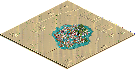
![park_3197 [MM2014 R2] Oasis](https://www.nedesigns.com/uploads/parks/3197/aerialt2799.png)
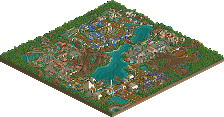
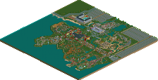
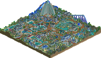
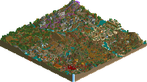
I like it but don't love it. I think that the theming is pretty solid overall. The main RMC was good as was the water coaster. The ferris wheel was good too. It could have used another smaller scale ride though to add to the overall vibe. Good work and a worthy entry it seems to me, even though I haven't seen the others.
Fun park, I love how the RMC swirls through the park and has these interactions with the buildings. Not really a fan of the big green temple. it looks a bit too blocky for me. but again I like that the water coaster has interaction with it. Unfortunatly I think a lot of the buildings in this park suffer from this blockyness.
Some nice ONCSO tricks with the invisble colour option, especially on the buildings. Makes me wonder what kind of crazy tricks we will find with this new feature.
The little flower patches in the water are also a nice touch.
Overall I do like the park and think it has some great ideas, great job!
Interesting park, there's bits that I like (like the temple fountain, which is really nicely done btw) but I'm also left confused on what the general theme is here. Would be interested to see who did what as the park does feel incohesive to me with on one side the pink temples and on the other side the big lush temple with both being connected by a simple boardwalk path.
This shot I thought was pretty neat!
I like the sails of this ship, although I do wonder how it ended up there with no room to sail away lol
Not really a fan of the huge sand expanse with randomly placed cacti. I think if youre going to use sand instead of blacktile, it should either be the way Cocoa did it with Great Mesa Gateway, or how natelox did it with Commandante. Either no detail except to show the vastness, or a lot of detail. Besides that, the architecture is pretty unique. The cinema domes are interesting and bold, but stick out a bit too much. Probably could've been embedded into the pyramid a bit better.
Having the park be a mirage was a cool way around the "No visible void" rule, and the setpieces (Especially the temple) are cool and fun to watch. Also, that water edge effect was nicely done, really helps with the concept.
Like Ge-Ride, I like it but I don't love it.
- Mirage edge
- Ship with MK98 proportions
- Ziggurat has some rough edges... Like the exposed vertical land, the thin archways, and the undetailed bottom layer
- Ferris wheel looks terribly generic and out of place
- RMC layout
- Cacti are not indigenous to the Middle East
+ Colour scheme
+ Ziggurat shape
+ Hanging gardens with colosseum walls, looks dope
+ Water coaster wrapping around colosseums
+ Minigolf fountain
+ Crosses and glass walls are a nice visual motive
Overall there's some nice elements and some elements that need work. Overall it could use some more focus and planning. But it's nice and enjoyable for sure!
Thanks for the feedback all. I wouldn't say my 50% is my best work and there's plenty to be improved both in and out of the game, but it was fun working with Levels on this.
When the ORCT2 title sequence contest was announced, I couldn't turn down the opportunity to potentially show up in one of my childhood-defining games. I wanted to make a park based on a part of the original RCT1 title sequence I loved, and the water coaster from Sunny Swamps came to mind. The rules called for lots of blank space outside of the map as to not show blacktile on larger displays. I was thinking an island at first but felt it would be a little obvious. Why not do the opposite and have a mirage or oasis in the middle of a desert? My original idea was completely hackless as to not cause any glitching that would make it not ideal for the title sequence. At the same time, however, my clinically diagnosed fantasy brainrot kicked in and I started thinking of cool ride hacking to really make it feel like a fantastical city existing only within its own boundaries. My idea was some flying boats made of canoes with multi-dimension trains above. As you can see, this didn't come to pass.
Grand Tour had just been announced over at NE, but I was committed to entering this and entering another GT round later. I mentioned my idea over in RCTClub and Levels quickly reached out. This was very much welcome, as I really wasn't feeling RCT in general and was even contemplating putting this park down. I send Levels the save and he comes back with some crazy hacktacular tile inspector work. What?! His argument is that exorbitant use of the tile inspector shows what ORCT2 is capable of even with no custom scenery. I decide this is also a cool approach and we could make something bonkers out of this. He then turns his hacktacular tile inspector work into the massive temple in the final save. I'm conflicted; I'm not jiving with the idea of this thing overshadowing the rest of the map without having much in the way of peep interaction or rides, but I also kinda don't want to nuke his work. This puts me in a state of limbo for a good few days, but I ultimately think it's cool and we keep it.
Early concept sketch I whipped up for Levels showing the original (mostly) hackless look.
Remember when I said I wasn't going to enter Grand Tour? Long story short, I end up on NOLA Jazz Festival with Jene despite barely having enough energy for Mirage Springs. It's tough for me to even plan out much let alone build, although I did whip up the over-under interaction with the RMC over the temple and the water coaster coming out. Thankfully Levels had a good head of steam and finished both coaster layouts alongside the rest of the temple under the RMC lift. The water coaster is mostly his but I gave the RMC an overhaul later down the road so most of that was mine. I would say the overall aesthetic leaned more Levels by the end, as he covered me while I covered Jene on Grand Tour as his availability dwindled. I wanted a more exotic array of colors than the muted reds but didn't exactly get much of that on the map. I did put a lot of emphasis on having as many gardens hanging off supports as I could for that lavish Babylonian feel. The fading flowers trick I actually learned from Mrs. Walto during H2H Classic, but I recently found out ar2910 did it first.
The process of this one is hazy, especially since it was almost three months ago, but the last day of this park was a nightmare. Long story short, I forgot a piece of invisible path near the entrance and attempted to solve what I thought was a peep trap for at least an hour. I think I went to bed at 2 AM that night having to wake up at 8 for work. I'm just thankful I even caught it at all or else I'd be wishing we got 6th in the contest.
Ultimately we didn't make the title sequence, probably because our liberal use of zero clearancing made things a bit glitchy. I'm not too mad about that though because I still got some great experience with NCSO and collabing with Levels, a new release here, and a fun little build on top of that. I do wish I had planned more in advance; I had a lot of ideas that I didn't communicate well, and even though I do think we had chemistry and we were chill together the build itself feels a bit fragmented as a result. A solid macro sketch before sending the first save could have made a world of difference. Regardless though, it is what it is and I'm happy we placed as well as we did.
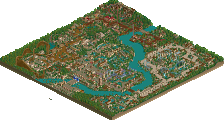
Rough builder map. Purple is me and green is Levels.
An enjoyable little sliver of RCT here that combines the imaginative fun of scenario play with the innovative fun of NCSO. The expanded color palette works very well with the permanently beige walls of Sawyer, and invisible paint is used quite creatively to expand the usage of existing colorable objects. Some of my favorite features are the coliseum/side-friction structures, the SLC sails--who knew it actually stood for "Sails Look Cool"?--and the aptly-named cool temple fountain. Ozy is a solid RMC with great interaction, and Secrets has some key moments which include the curvy coliseum dance and that brilliant use of the 3D theater door as a ride arch. The hanging gardens aesthetic translates very well to NCSO, and the grandiosity of the structures here bring back the distinct nostalgia of the BC era for those of us old enough to remember it.
Just a few things to consider for your next venture into the NCSO realm...
- The black shutters on the Christianity buildings are a nice addition, but they do not need to be on every wall. Some left blank will accentuate this detail and allow us to appreciate it more.
- I'm not big on void-colored Wile E. Coyote tunnels in place of actual visible interior walls, as the depth of the tunnel gets lost in favor of what looks like a painted black wall rather than an actual tunnel.
- The square landscaping around the outside appears very... well, square. Xtreme or Steve could chime in with a gif here (you know the one). I know you both can create beautiful, natural shapes with the land tool, and I imagine you would do so on the outskirts if you had more time, but it's still an odd contrast to the amount of time you put into shaping the oasis itself.
- Ensure that all of your Roman walls line up. It is particularly noticeable during the parts of the pyramid that clip - note how only the ones out of line show more hedge than wall.
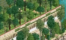
- Not only do cacti not fit in this part of the world, but the ones here were all placed at the exact orientation with just three rotated cacti existing across the entire map.
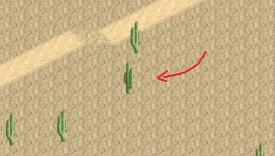
And then there's another one somewhere.
The deadline seemed to have hurt this one a bit, but the creativity is definitely here. Two rising stars coming together to create something fun is always... well, fun... and it certainly shows here that the two of you enjoyed building this. I would have liked to see this in the title sequence with the other parks, particularly a money shot like this:
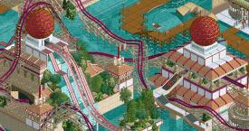
I know both of you have expanded into DKSO and/or limitless CS, but I encourage you both to continue to embrace the NCSOpen aesthetic as well.
"Money shot" is the exact term I used to describe that last screenshot and I was hoping at least that would make it into the title sequence. Also I snorted like five times reading that review 10/10