Park / Laguna Adventura
-
 04-August 23
-
 Laguna Adventura
- Views 5,911
- Downloads 576
- Fans 9
- Comments 25
-
-
 83.50%(required: 80%)
 Spotlight

RWE 90% yes Babar Tapie 85% no CoasterCreator9 85% yes G Force 85% yes In:Cities 85% yes Liampie 85% yes posix 85% yes Terry Inferno 85% yes Faas 80% no Scoop 80% yes Xtreme97 80% yes SSSammy 75% yes 83.50% 83.33% -
 Description
An adventurous trip around the world!
-
9 fans
 Fans of this park
-
 Full-Size Map
-
 Download Park
576
-
 Objects
1
-
 Tags
Tags
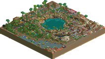
![park_4086 [H2H8 R1] Tahendo Zoo](https://www.nedesigns.com/uploads/parks/4086/aerialt3817.png)
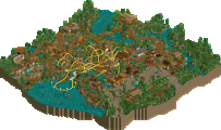
Jappy, first of all congrats. This park and achievement seems like a culmination of nearly a decade of building on the site that has really seen you grow so much as a builder. I remember when you posted your first screen here, it was a pretty good one and sort of had a unique style that made you stand out. Historically, I've always liked how you've approached your projects, your focus on full-scale realistic parkmaking is really a treat for me since that is what I enjoy most. In many ways I think our approach to the game has been pretty similar as a result, and at times we've often drawn similar criticism because of that approach. Easkerton Towers, JWAK, and Everland all remain favorites of mine. And while I we might have diverged a bit in recent years in styles I still really do enjoy your work.
Overall, this park is probably your best technical achievement, which is the biggest reason I was inclined to give a yes vote. The theming and archy generally is your best yet, there are a lot of highlights here. The few indoor rides are all very distinct and grand feeling, which I like a lot. Overall, this is probably your best lineup of coasters too, not only from a purely ride enjoyment level, but also from a technical layout quality perspective. I'm so happy you added the mega coaster in the back last minute. I feel like your last few parks I've always tried to lobby you to add a big sprawling hype coaster in at the end and until now you've always said no. Which I think has hurt you a bit, always sort of makes the parks feel a little incomplete in terms of lineup. Like Walibi Holland before Goliath might have felt, or Walibi Belgium before Kondaa. Those rides just elevated their parks to another level, and at long last you've done that for yourself here and it paid off well. However, that isn't to say the other coasters aren't nice too, I really enjoy the flyer and the spinning coaster, especially the spinning coaster. That might be your best overall coaster yet all things considered. The RMC, while understandably controversial, I appreciate because you stuck to your vision and did what you wanted, I enjoy that. If I were to say anything about it, I kind of wish the supports were a bit more graceful or that the layout utilized some of the new track pieces, I think overall it kind of dates the park a bit but something I can definitely look past.
I'll echo what Liampie has said and hope that in your future work you maybe are a bit more defined on your theming, rather than sort of falling into more generic tropes, that will help you differentiate your work a bit more and elevate things as a whole past this level you've already established. I'd also like to see your develop your flat rides a bit more, I think in this park you are sort of on the edge of outgrowing many of the in-game flats. Not that everything should be a custom built one, but I would like to see more of that going forward. Speaking from my experience, I think that really helped me progress as a builder, when I ventured into the realm of custom rides it unlocked a lot more for me in a realistic sense. No longer was I stuck building in the scale of the in-game rides or limited to the lineups that they would allow for. Plus, as much as I enjoy you sort of doing your own thing as far as parks go, I do wonder how things would look if you tried to replicate a different style of park. Your recent "American Realism" stuff looks promising so I hope you explore more with that, but hey I get it, you build what you like, haha.
So overall, congrats. This was well earned, and I'm happy to see your finally reach Spotlight, hopefully it's not the end of things for you!
Congrats on the spotlight Jappy. Really happy it all came together for you. Most of my thoughts have already been said and I think that G Force's review summed up a lot of my thoughts already! I think in comparison, this is quite a step up from Canary Mines and Everland - almost night and day imo. There is so much more depth to your theming than in prior parks and that is most evident in the Caribbean/Pirate area.
Bold move to stick to your guns with the RMC - I was a bit iffy on it personally because of how much it contrasts with very under-detailed water and sand.
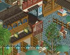
Beyond that, really enjoyed the Asian (sorry I don't know the exact theme) with the Flyer. Really well done. It reminds me a lot of Expedition Everest and also of our unfinished H2H8 cyberpunk park. New Orleans was nice as well - very detailed and immersive.
The flotsam/island area was neat. Quaint and simple, but I could see it being a cool place to sit and eat lunch and view all the park surrounding you.
Lastly, thank you for letting me contribute to the park. It was great to see this all come together. Congrats again!
sorry it took me so long to finally view this---huge congratulations on finally making it over the hump. this park is a perfect blend of classic jappy and modern NE sensibilities. it really feels like you're hitting your stride in terms of overall RCT vision, and I love it. the new orleans area, the orange family coaster in africa, and sherpa were the highlights for me, but really it was all top notch. Very deserved and always exciting
V1 Review #4
V1 Seal of Approval:
+ Very good "outskirts".
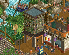
+ Amazing entrance, especially the use of rocks on the arches and the waterfall with the park logo in fron ot it.
+ Great mainstreet.
+ Big fan of the Extreme Spinner layout.
+ Templo Trueno is great, especially the use of the drink stall in the facade and the cut-away portion.
+ "Mexican" area really good in general.
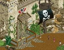
+ The Pirate area is absolutely mind blowing and definitely one of my favourite RCT2 areas ever. Architecture, layout, landscaping all fits perfectly.
+ Rope Course is a very nice little touch.
+ Sherpa looks fantastic, as does the entire Asian area.
+ Good amount of nice looking show stages
+ African area very strong overall, I especially liked Springbok.
+ The Safari Ride deserves an etxra point.
+ New Orleans is again very strong.
+ Overall park layout
+ Overall composition
V1 List of Neutrality:
+/- Waterski show on the lake was good, but the placement was not my favourite (see point 1 of the negatives)
+/- Not the biggest fan of the RMC layout.
+/- Adventure area is decent, but not my favourite. I feel it doesn't come together as well as the other areas.
V1 Scowl of Disapproval:
- Personally not the biggest fan of the long gangways over the lake, would have preferred to leave it blank.
- Swinging ship near the entrance feels really isolated.
- Sherpa is probably too quick towards the end.
- Not the biggest fan of using the twister attraction twice.
- Block brake timing of Voodoo didn't work for me.
V1's Opinion:
This is a fantastic park. Even though you received a spotlight and a high score I still think it's underrated. This park has everything and feels so right, in a way. Everything in this park feels like it belongs in exactly the way you build it. Very high consistency with very good rides and areas. You thought of virtually everything a park might have without losing your style. Absolutely incredible park.
90%
Fantastic work. I can see the inspiration from a lot of parks all blended into one and it works really well.
I love the RMC. Ignore the haters.
This park is huge, and a detailed review of every single area of this map would take about a month, and I'm already five months behind reviewing this one, so I'll keep this one short and begin with a list of some of my favorite small details using the plus sign that has become popular in this comment section...
+ Templo Trueno's deliciously carbonated facade - this is one of my favorite buildings in the park, and using the soda stall to represent a flag with ancient Latin American markings on it is a simple yet brilliant detail.
+ The King Kondaa snake head.
+ Daisy Belle and the boat theater built in a similar style.
+ The big yellow north star.
+ The little playground in Africa with the colorful tiny merry-go-round.
+ Sherpa's nicman supports on the lifthill, and the Riverland-esque back
+ The jolly roger made of rocks above Arrremsea's vertical drop.
+ The way you've made House in the Bayou look so grandiose and yet so rundown at the same time.
+ Springbok's colorful supports.
+ The iconic park sign with the waterfall.
And that's just ten of many fun details that can be found around this
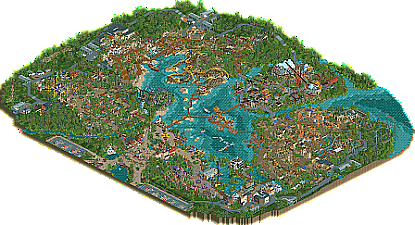
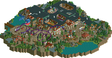
Going across many different continents, you've successfully given each area an identity of its own primarily through distinct architecture, with the foliage and landscaping varying each time along with it to fully create the experience of being in each world. In an era becoming increasingly dominated by curved and half-diagonal architectural and path objects, you've proven that high-quality environments can still exist and look great without any of those, and no area feels as though it is missing them. Some of the backstage roads may have benefited from a curved section every now and then, but for the most part, the roads work perfectly well with just square and diagonal pieces. From a guest's perspective, the part of Africa between the wall and the lake feels a little path-heavy without as much to see, and I think the pathway in the middle of Safari Ride could have been overhauled and replaced with a large attraction instead (a show stage, perhaps involving animals), but that's the only area design change I would make out of every section of this park. Even with what you have there now, you've made it work in a way that looks nice, and Africa, like every other miniature world you've built in this park, belongs on a Spotlight map.
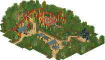
And speaking of belonging on a Spotlight map, every one of these layouts does as well. It is difficult for me to choose just one favorite, as you've designed them all so well - Sherpa is the obvious contender, but then I look at El Nino interacting with that temple in such a graceful knot, and I like it just as much. And then Volare literally swoops in with those curves, and for a family coaster, it does everything it needs to do and looks good doing it. Treasure Mine does this equally well. I can see why Arrremsea (perfect nomenclature here) is a bit more controversial - it's an RMC with a loop built mostly over water using only straight vanilla supports. If a theme park asked RMC to design a coaster with a vertical loop, they would probably do it, just as they'd probably accommodate a water splash, so I have no complains about the loop. I do wonder why you chose only to use the straight vanilla supports and not even the modified versions as well to accentuate them, though really the only place I'm not the biggest fan of them here is in that long straight line over the water... I think you missed an opportunity here to create some sort of bridge over this little inlet, and by keeping the supports bridged over the water, it would have accentuated that exciting underwater drop. King Kondaa has a great layout, but it feels somewhat separate from the action in that corner from the guest's perspective, and from our perspective, it blends in a little too well with the terrain in that shade of green; celadon or seafoam would have accentuated this powerful layout a bit more without sacrificing the idea that this coaster is one giant green snake. But if those are my only complains about anything relating to the coasters, I say you've done a top-notch job at designing every one of the rides in this park.
The landscaping on this map, as I've mentioned in an earlier paragraph, helps set the scene for every area, and using a different combination of foliage, Krypton rocks, and 1k ruins each time is enough for us to know where we are even without looking at the architecture first. This map reminds us that, even as Fisch rocks become the dominant choice for rockwork in this part of the decade, Krypton rocks still have a place in RCT, and when skillfully paired with 1k ruins (and in the case of the rapids ride, Liam), you can work wonders with them in a way that fits into any era of parkmaking. The quiet backstage landscaping serves its purpose well, and with the exception of a few too many right angles in the grass slopes for my liking, it is all very pleasant. Every so often, I come across an unfinished tile, but they generally aren't obvious enough for me to find them if I'm looking for them. Do I wish for grass trim borders and more path and terrain texturing? Sometimes, on a cold winter's night. Is the backstage area still great without it? Every night, regardless of the temperature.
This is one of those marvelous Spotlights that is not a product of its time but rather can exist in any era of RCT and still be great. It is that perfect recipe of realistic parkmaking and pure RCT fun that has come to define the chef's unique style. Everything you build looks as if it was as much fun to build as it is to look at, and this reflects in all of your work but particularly in this one. Laguna Adventura is further proof that, as long as Jappy enjoys RCT, we will enjoy everything Jappy builds.