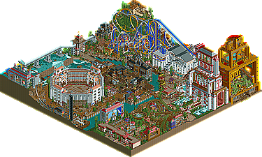
Park / Roman Vice
-
 02-July 09
- Views 41,894
- Downloads 1,430
- Fans 5
- Comments 103
-

-
 79.38%(required: 70%)
 Gold
Gold

Jaguar 90% Liampie 90% G Force 85% Sulakke 85% Cocoa 80% chorkiel 75% inthemanual 75% trav 75% Coasterbill 70% CoasterCreator9 60% 79.38% -
5 fans
 Fans of this park
-
 Full-Size Map
-
 Download Park
1,430
-
 Objects
504
-
 Tags
Tags


Dammit....now I wish I'd waited to vote.
Edited by Wanted, 03 July 2009 - 02:36 PM.
The whole thing is put together very clever, de layout is perfect, de details are insane, there's humour and atmosphere. The fun factor is HUGE!
I have two big complaints:
- There are a lot of historic inaccuracies, although I didn't kill the park which it did in World Showcase.
- The park lags a lot.
That's it. This is the best park of the season, before Testament and Belmont Shores!
Thanks for making such a good park, although this is probably killing us.
It's really hard for me to comment on our park. The atmosphere and layouts are very good, some of the architecture is as well. There are only few flaws, but there is less to look at.
While Southpoint was very well done, it just didnt have anything amazing in it IMO. Alot of really good details and cool rides, but it was too much coaster and small shops for me. it needed something more to make it look more impressive.
Roman Vice, while perhaps not the most amazing execution, had a ton of amazing, clever ideas and rides, HUGE buildings, and impressive coordination. It was bathed in Kumba, in some areas too much, like the whole woodie vine area can be pointed out in another of other Kumba parks, but alot of the other details were so fresh. There was obviously alot of though put into the park, and it really shows.
Great jobs both teams, Hurricanes just got my interest better.
FK
Okay, now onto the parks. I don't know why this matchup has already been declared as a let-down by some. I thought both parks were pretty good, and I had a realy hard time deciding where to put my vote...
Southport:
My opinion on this went back and forth so many times. Seeing it in-game immediately reminded me of an RCPro Summer Showdown park that Dr. Dirt and I built a few years back. We tried to squeeze as many roller coasters in one little map as we possible could, and eventually got criticized for creating a park that was too busy. Well, sometimes I think that the fun of RCT is in the challenge, and I'd say a job well done for fitting 6? coasters on this small map. Big One was pretty good. Glad to see the extra supports on the drop and turnaround, just like Pepsi Max. The layout was also nice too. I especially loved that part where it dove under the rapids ride. Nice touch. The Big Dipper and Roller Coaster were deffinitely outshined by the Cyclone, which in my opinion was one of the best coasters of the competition so far. Great looking, and well-paced. I can't say the same for the other two aforementioned woodies, however. Some of the turns on those would send fragments of broken ribs through your skin lol. The wild mouse and Space Invader admittedly didn't hold my interest; there just wasn't enough going on there. Overall, I still feel like the park looked fairly unfinished for some reason. There were so many places where a few details could have really refined the area. Oh, and the catwalk railing on Big One's hill was floating
Roman Vice:
Well, at first I really enjoyed this...but the more I looked at it the more I realized that it's the same old tricks, over and over. I feel like the best way to describe why I feel this way is to use a checklist of things I was expecting when I opened this...
explosions: check
seldomly used coaster type used in a new(ish) way: check
enormous stations for rides: check
entertainers with weird names or backstories: check
a huge maze: check
lots of trackitechture: check
lots of animated scenery (fire, fog, etc.): check
tall buildings: check
lots of typos (Orgasum?): check
I don't know, it's just the same old same old for me. I don't mean to be a dick about it, because I've usually found this style of stuff to be a blast to look at and explore. Even thinking back to an earlier canes' park this season that I voted for. It's just that, after a while, the same formula kind of starts to lose me. But anyway...the duelers were pretty kickass. Some of the dive machine looked forced...but looking at the layouts separately--they both were pretty good. The rapids ride was cool, albeit way too fast at the bottom of that one drop. I try my best to deal with rapids rides that don't have guide-rails, but when a boat thunders to the bottom of the drop and pulls a hard turn out of nowhere, it's just too much. The atmosphere of the park was really great as well. The elevation differences were really nice, and the whole park generally was pretty interesting. Again, nice park here. Kept me interested for a good deal of time, for sure.
So, when it came to my decision, it could have gone either way, but again, I felt like I was getting sick of the same old formula in the Canes' park. The Germans had a lot of stale elements as well (the beach-side park/all the RRP objects), that have been either consistent throughout their parks or the whole contest, but I just kind of preferred the Germans' park for whatever reason. But really though, great job to both teams. There's been so many great parks this H2H season, its truly incredible.
so yeah...vote: Germans
Good luck to both teams!
However, I'd still vote for RV. It's way more interesting and vibrant imo.
Having been to both Blackpool and Southport numerous times it does reflect the atmosphere to an OK standard but it doesnt quite convince me. That said the execution and architecture was astounding. The theming was really really well done. Well done mate
Roman Vice has far too many good ideas, theres something I like everytime I look at it.
(*cough* Kumbahacks *cough*)
Edited by T.N.T., 03 July 2009 - 05:01 PM.
And who cares about typos hahaha wtf dude?
Are you seriously complaining about MAZES when a 60x60 park has 3, yes thats right THREE wooden roller coasters! ANDDDDDDDDDDDDDDDDDDDDDDDDDDDDDDDDDDDDDDDDDDDDDDDDDDDDDDDDDDD to top it you are saying that it is boring to see a seldom used type of ride in a new way when certain parkmakers on these forums use a ride that is always used IN A NEW WAY.
What the hell man? The Hurricanes park is ANYTHING BUT same old same old. Everything in this park was unique. It didn't resemble anything they have build thusfar.
You know that's not true.
Stop behaving like an idiot, please.
Level we are glad that you like our park, but please have a little more respect for other peoples opinions.
And to be fair, the Germans' park has a similar thing going on. A lot of the elements are things we've seen before, as I said.
And don't take this as a "I don't like this idea because it's not original." That's far from the truth. You could make a million boardwalk parks and I'd still love them. You could make a million world showcase parks and I'd still love them. The Rome idea was very unique/original...but it just used a lot of stylistic elements that I've become really used to seeing, as opposed to the Germans' park which took a heavily-used concept and did it in a new way.
The more I type the more I realize how it probably is coming off that I don't like Roman Vice. Not true. I thought it was great. But I liked Southport better.
I do also disagree with this. The pick pocketer near the collusium in the slum area was different, the coasters were so well done the pacing was extremely hard to get right but nailed completley, the frozen people, never really done untill this h2h but just added so much more depth to the park. When i think of rome I think of maroon and white buildings, this park had one or two to reflect that colourscheme but I've also never seen a custom collusium with a shrine to parkmakers with people walking around with golf clubs symbolising swords. You just can't get any more in depth details like Roman Vice in my opinion.
For me i knew it would come down to aesthetics vs concept and i believe Roman Vice was a far superior concept with just as good execution and aesthetics to boost the park.
Yeah, and I think it was really cool you guys didn't do that. The basis of my opinion is still that I felt like most of the things that were neat about this park, were things that were neat in other parks. Again, either by the same parkmaker(s), same team, or to a lesser extent, other parks in the community. I think that's a pretty fair opinion. I've looked through both parks for a great deal of time, and that's what I've come up with.
My opinion....don't be a hater
In my eyes the Flying Germans park was the same old same old boring boardwalk park. I mean it was nice...like round robin quality but definetly not playoff material. Sure the park was well executed but nothing was unique. So the better park clearly goes to the unique one. I don't want to see repetetive parks.
As JK said the depth was superb.
SO in my opinion Roman Vice is better, but I guess I respect those who decide to go against it......