Park / The Belgian National Historical Society's Annual Reenactment of the Battle of Waterloo
-
 17-July 23
- Views 27,303
- Downloads 302
- Fans 0
- Comments 45
-
 73.00%(required: 70%)
 Gold
Gold

WhosLeon 80% Babar Tapie 75% Camcorder22 75% In:Cities 75% ottersalad 75% RWE 75% Xtreme97 75% chorkiel 70% CoasterCreator9 70% Faas 70% Scoop 70% SSSammy 65% 73.00% -
 Description
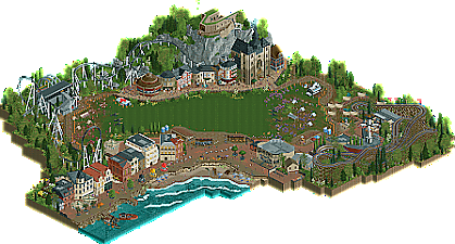
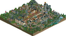
Please enjoy the historical society's annual tradition of reenacting one of Europe's most famous and significant battles. For proper viewing, please utilize SHIFT+BACKSPACE to clear crashed ride messages. Our three sections are the seaside (based on Ostend, and includes the woodie area), the Ardennes/cliff (based on Dinant), and the battle itself. There are three buildings that were attempted to be "ugly", one for each section. In Ostend, the half-diagonal(ish) one. In Dinant, the one on the very right with the steep roof and the Walloon mural. And in the "battle area", the brutalist coaster station for L'Union Fait La Force.
-
 No fans of this park
-
 Full-Size Map
-
 Download Park
302
-
 Objects
1
-
 Tags
Tags

Round 2 - Belgium
For Round 2, we received nine entries. That is almost as much as there are governments in Belgium! Which one will come out on top? To help you vote in this match, here are the objectives for this round again:
1. Your park must be set in or themed to Belgium.
2. Your park must contain at least three distinct areas.
3. Your park must include at least one ugly building.
How to vote
Before you vote, you have to make sure you've viewed all parks with thought and care. Voting happens through the polls above. The submissions will be judged on two criteria. First, you are asked to vote for the parks that you think completed the three objectives for this round the best. Second, you are asked to judge the parks on their overall quality - separate from the round objectives. After 72 hours, the polls will close and we will add up the votes from each poll. The submission with the most votes in total will earn the creator(s) a ticket to the final round!
Cafe Lux
by Splitvision (100%)
Expo 77: Belgium Pavilion — The Three Transport Waffles
by alex (100%)
The Belgian National Historical Society's Annual Reenactment of the Battle of Waterloo
by RobDedede (67%) and Terry Inferno (33%)
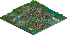
Saint-Branler, Swaffelbeke, and Het Schaambos
by Xeccah (65%) and Ethan (35%)
Enjoy three delectable flavors of Belgium, a rustic, Flemish port city, a once-proud, industrious, Walloon mountainside village, and the dark forests and winding rivers that separate the two.
Omloop Het Koksijde
by ottersalad (70%) and MorganFan (30%)
Parc Naturel aux Ardennes
by RWE (50%) and Faas (50%)
België - Tous Zusammen
by Fred (60%) and Jappy (40%)
Fred & Jappy in The Diamonds of Antwerp
by WhosLeon (50%) and Xtreme97 (50%)
An ode to our beloved little country.
Barrage côtier
by Lurker (100%)
Fred & Jappy in The Diamonds of Antwerp
that blows me away how crazy and well designed is the map and that comic part
Please turn on in-game music while viewing our park, and utilize shift+backspace. Thanks!
It's official, I need to retire, y'all are too good
Couldn't find an ugly building in any of these
Wow, what a round!
Cafe Lux:
+ I liked the way more original take than the rest did, and I like the cute details like the sour mat road
- With more diorama like scenes like this, it's nice to look at for a while, but it doesn't really hold your attention because not a lot of stuff is going on.
Expo 77: Belgium Pavilion — The Three Transport Waffles
+ Lovely miniature railway style ride, very cute to look at it going around. Also cool ugly building!
- Nothing really strikes me as Belgian, and the three square pavillions in the middle being copied and pasted is maybe a bit lazy.
The Belgian National Historical Society's Annual Reenactment of the Battle of Waterloo
+ The battle scene was absolutely great! Not sure about the cannonballs hitting the crowd though!
- The way you tried to make the diagonal sloped turns work, just looked off to me. You could have easily made an effective layout without them. Also I couldn't really distinguish three distinct areas.
Saint-Branler, Swaffelbeke, and Het Schaambos
+ This park had some of the coolest architecture of the entire round. Not only the pretty buildings but also the ugly ones!
- The way you chose to do the park edges is absolutely baffling to me. The same goes for some very unnecessary uses of half diagonals.The map is practically square, so why not just do it the normal way?! Right now it looks absolutely messy and distracting to me. I took some screens of examples, I don't think it's necessary showing them here, but I can send them to you on discord if you want to know what I mean.
Omloop Het Koksijde
+ I liked the very Belgian coastal vibes, with ugly buildings lining the coast. Effective and recognisable. Also cool that you chose a very Belgian sport to showcase. This is the second big event now, wasn't that the assignment of last round?
- Couldn't really distinguish three areas, and I have a hard time making the yellow coaster make sense.
België - Tous Zusammen
+ Very effective way of showcasing the whole of Belgium, and that coaster is awesome! Also good composition with the sightline all the way to the tower, pointed towards by the coaster.
- The architecture in the middle section didn't really strike me as the pretty Bruxelles buildings. I think they were a bit too plump and underdetailed for that. I would have made them skinnier and more ornate.
Fred & Jappy in The Diamonds of Antwerp
+ Wow! I thought this would be a gimmick park only visible from one angle, but I was wrong! Awesome! Good clean architecture all the way through and amazing how some of the elements stick out of their frame, giving an awesome effect!
- Not much to fault on this park, the area around the coaster's queue looked a bit unrefined/unfinished, but that's also because the bar is raised so high in the rest of the park.
Barrage côtier
+ This is just purely fun vibes, love the area around the junior coaster.
- This didn't really strike me as Belgian, and the way the park is layed out, it doesn't offer a lot content-wise.
Great job everybody!
I know what to vote on quality-wise, but I have a hard time voting for the objectives, because I think none of them really nailed both (including ours). Jappy and Fred maybe did the best with the three distinct areas, and maybe Otter/Morganfan of Xeccah/Ethan had the best ugly building(s). I don't know yet...
Barrage côtier by Lurker (100%)
A fun RCT1 entry. I liked the lock/sluice. That felt the most typical Belgium part to me. Also a nice touch to name all the attractions in Belgian. It’s all very flat, which is also typical Belgian.
Cafe Lux by Splitvision (100%)
This is such an amazing creative concept. All the different cakes and pies are really well done. Nice opening in English and Belgian. The ‘Praline Glijbaan’ is so much fun. Nice attention to detail like the choice of floorwork.
Expo 77: Belgium Pavilion — The Three Transport Waffles by alex (100%)
Really like the choice for those Tile Block Deco walls and that waterornament. What a great way to sell this architectural style. The crystals as fries is brilliant. Great beer-sculptures. Those miniatures around the traintrack are so incredibly well done. The café is beautiful in all it’s crudeness.
Parc Naturel aux Ardennes by RWE (50%) and Faas (50%)
That’s a beautiful entrance. Fun details with the trashbins tucked away on one side of the roof. Great work on the foliage and landscaping. Lots of verticality. Brilliant example of an alpinecoaster. The tower is very successful in portraying the typical archy. I do think the upperdeck looks one layer too thin though and the midlevel is difficult too read from one angle. But those are nitpicks. Great ridenames in Walloon.
Omloop Het Koksijde by ottersalad (70%) and MorganFan (30%)
Was waiting till someone would take a swing at the Belgian Coast. Really well done archy. Very recognisable. Fun idea to combine de Cross with fair rides. Also, it’s always nice to see some Dutch representation with the supporters in orange and ‘Walibi Holland’- like theming underneath the yellow coaster.
The Belgian National Historical Society's Annual Reenactment of the Battle of Waterloo by RobDedede (67%) and Terry Inferno (33%)
So that is a very fun opening. Nice hacking. I don’t think everyone in the crowd survived, but oh well. The coasters are really well done and fun. The archy was nice, but didn’t look specifically Belgian to me. I liked the mural of the Vlaamse Strijdvlag.
Saint-Branler, Swaffelbeke, and Het Schaambos by Xeccah (65%) and Ethan (35%)
Very nice opening in Flemmish and Walloon. That boulevard with all the half diagonals is beautifully done. Actually it’s amazing architecture all around. Very recognizable. Loads and loads of content. How did you guys get this done in such a small time-frame? Incredible. I also like the small details; like the coffeeshop that’s named Bakkie pleur or the buttplug at the Duvel-sign. You never know how the night will develop after you drank some craft beer in Belgium.
België - Tous Zusammen by Fred (60%) and Jappy (40%)
A park about Belgium by the two godfathers of Belgian RCT. Great choices in music. The park style is very recognizable as Jappy and Fred. That coaster is just absolutely brilliant. What a beast. Also loads of wonderful details. Like the little waffle logo’s at Gauffre Liegeoises and the Belgium flag on the coaster supports.
Fred & Jappy in The Diamonds of Antwerp by WhosLeon (50%) and Xtreme97 (50%)
Oh good lord! This entry is incredible. What a creative way to show a park and to accentuate the three area's. I’m just completely blown away. The archy is amazing. So recognizable as Antwerp. Loads of details, but still very readable.
Amazing work all around, really impressive stuff here in such a short amount of time.
Massive kudos to Xtreme and Leon for incorporating such a wonderful eyecatching feature (not calling that a gimmick! Seems like an understatement.) while masterfully ensuring that the park is still a cohesive and readable product from the other angles. Really, really well done and a truly wonderful thing to open a park to. Shades of Gangland brilliance but somehow manages to elevate that concept, which is really impressive.
Love seeing some LL here from Lurker yet again - while more abstract and less obvious with respect to the objectives, I can still tell what you're going for. You have such a wonderful style and I really appreciate your drive to keep LL relevant - makes me want to finish up my projects I've got going in that game.
Jappy and Fred, I really appreciate your work here. Packed with detail and does not fail to deliver as one might expect from some native builders! The coaster is really rather impressive. Love the take on three unique areas!
Faas and RWE, I like the naturalistic take on this. Really cool stuff, as I'm a big fan of big landscaping. While perhaps not as packed to the brim as other entries, I enjoyed the way that everything fit into the environment.
Otter and Morgan, super cool theme! I didn't expect a dirt bike race, but it's really cool to see. I love that balloon archway, by the way. Fun set of supporting rides, and beachfront parks are always a joy to see.
Xeccah and Ethan, I would expect nothing less from you two - it's truly packed full of details and almost overwhelming to imagine how this was done in such a short time. It's a shame that the size of the park got away from you both a bit, but your ability to take on themes like this in such a short time is certainly deserving of attention. Love the coaster station among the ruins, and the boats are really well done.
RobDedede and Terry, super fun intro scene - I almost thought it was Splitvision's entry and I mean that with the utmost of praise! I also appreciate the inclusion of some fun layouts and a bit of verticality here, it really adds to this in a way I'd not expected to see this round. This entry has a significant "fun factor" to it that I enjoy.
Alex, really nice clean parkmaking as usual. I'm beginning to sense a bit of a theme with your entries. I don't know if this one is as strong as your R1 entry, but it still has that typical Alex charm and I do love that model railway.
Splitvision, wow - not what I expected at all. Maybe a bit of a miss as far as some of the objectives go, but I may be missing something. That being said, I absolutely adore the creativity with the theme you chose. From the various confectionery to the wafer supports, this is seriously oozing personality and deserving of a ton of praise.
Another great round, classic Grand Tour! Here are some quick thoughts as I wander thru all the lovely parks.
Cafe Lux - Love the concept, the creativity, top marks for thinking outside the box. It was really cool to see all the different ways you repurposed existing pieces to make delicious confections. In places it seems a little spread out, but I get why everything couldn't be overlapped. I feel like some creations are a bit better defined than others, and the 'three distinct areas' objective is lacking, but overall a great entry and another unique creation from SV.
Expo 77: Belgium Pavilion - The idea of having a consistent aesthetic that is then taken and applied to different pavilions is wonderful and very alex. The construction has your trademark high execution thru simplicity, and it was fun to explore the different ways you morphed the aesthetic to meet the requirements of Belgium. I do wonder if this concept overall may have trouble competing with more country-specific entries in each round, but as a progression I'm loving everything so far (and I'm not sure you're all the worried about competition versus building).
Reenactment of Waterloo - The opening scene makes this entry, such a fun idea and so well executed, plus very well framed by the composition of the park. Landscaping is a standout here, particularly the embankment and the beach area. The architecture was a bit spotty in places, the area along the embankment felt the best executed and a really fresh use of different orientations. That being said, even some of the more basic structures had a bounty of smaller details and ideas that were fun to explore. I do wonder if parsing back a few of the larger elements, like dropping one of the coasters, might have given more focus to other ideas, but then again I really enjoyed the balance of skills. Well done overall, a top notch entry!
Parc Naturel aux Ardennes - Perhaps one of the better 'three distinct areas' entries, though overall I just think that objective was ill fitting for this round. I enjoyed the overall aesthetic of this map, a healthy balance between modern and classic rct. I do think the landscaping could have benefited from even a hint of modern rock pieces, as is feels a bit blocky and overly sparse in places. That being said, the rockier area with the climbing walls was top notch, and I love the mix of rides throughout. Weird how the peeps go to the top of the tower and then immediately down. Would have been nice to see them wandering around up there. The entrance building and the bottom of the stream was my favorite, a great mix of ideas and objects. Congrats!
Saint-Branler - I was blown away by the sheer amount of content here, but then I noticed it was over the limit so I guess that explains that. Still impressive to build so much to such a high quality. You both have a style that is very distinct, not just in this round but in general, almost graffiti like and somewhat manic jumping from idea to idea. The result is a very rich product with a ton of depth. Each building and little area feels stuffed with unique ideas in terms of architecture and graphic elements and smaller moments. That in and of itself gives so much to be inspired by, including some incredible architectural moments. I didn't get a great sense for 'distinct areas' but as noted, I didn't care much about that object anyway. The only thing that holds this back for me is the sheer chaos of execution. It isn't as overwhelming here as in some of your other individual projects, but as someone who obsesses over finer polishing details, it sticks out like a sore thumb to see some of the glitches and rough edges that could be smoothed out. It does give your work a unique, almost collage feel to it, but it misses a bit for me as a neat freak. That being said, overall I thought this was amongst the best this round and certainly something I'll look back to in the future. Congrats!
Omloop Het Koksjide - As has become common in GT, a ton of content to explore that brings this map to life. The bike race (supposed to be cycle, no moto I believe?) was a lot of fun, and a great way to add activity that circulates around the map. The finer details of the rides, the food trucks, and the general infrastructure of the race was great. The architecture was good throughout, though I found some of the execution and texture treatments could have used some polish. I also feel like the crunch elements, where used, could have used a bit more blending to feel like dirt and wear on the ground rather than just something laying on top. A really good entry and some solid parkmaking in general, congrats!
Barrage Cotier - I don't have LL configured to open right now, but took a peek in open. Probably one of the best in terms of having distinct areas. Overall, I think the original LL styles make it hard to really capture a Belgium aesthetic, but the classic rct vibes are immaculate. My favorite area was the big of agriculture on the far side of the river and the lock.
Belgie - The coaster really makes this entry and ties everything together. It was fun to watch it circle around the park, storming thru all the different landscapes and then come back and explore those areas individually. You can tell the care that went into selecting and crafting different elements of Belgium from those with intimate knowledge of the country. I really enjoyed the variety of rides and attractions as well as the overall composition of the park. I did think some areas were a little path-heavy and the architecture felt a little lacking in the kinds of details we see with most GT parks. I get that may be an aesthetic choice, but I can see a version of this with more detailed architecture that just wows, and in a few places the execution didn't sell for me. Overall, a great park and definitely one of the best at capturing a true Belgium-vibe. Congrats.
The Diamonds of Antwerp - Scary stuff this. To have a single angle with such impact, a whole different level of storytelling, just so impressive. I can see people already trying to belittle this by calling it a gimmick, but if someone innovates to craft an incredible, engrossing park concept with the quality of execution to back it, call it a gimmick all day. It hits all the objectives in a very unique way, and then it also offers an incredibly crafted park to explore beyond just the narrative. The architecture is impeccable; super detailed but super carefully executed to produce structures that are clean and clearly defined within their space but also so textured and full of depth. Hard to pinpoint any favorites because they're all at such a high level, but I particularly love the castle, the station, and the zoo animal house. Pretty much everything here is so well crafted and carefully placed, and with an incredible eye for where and how to break the grid. Truly well done, this is awe inspiring rct. Congrats!
Well done to everyone one a great round, not a bad park among the bunch. I didn't give a lot of weight to the three distinct sections objective, as I don't think it played well for this round, so I mostly gave my votes based on quality and execution and how well parks succeeded at the other objectives, with a slight edge to those that also had the areas.
Cafe Lux: Love this concept, such a cool take on the rules. Very fun, very charming and some nice CTR use throughout.
Expo 77: Belgium Pavilion: I love all the miniature scenes around the train ride. So much great object use to pull those buildings off in such a small scale like that.
Reenactment of Waterloo: A cool, technically impressive opening and some nice technical stuff around the park too. And I like the way the park is built around the field and the overall layout of the map.
Parc Naturel aux Ardennes: Love seeing a well done alpine coaster, especially with this map's nice use of elevation and terrain. And the tower building is a nice centerpiece that works well with the map.
Saint-Branler: This is such a lively park, from the distinct style of texture work, to the interaction of rides to the pathing, this feels like a bustling city, one I can really explore and just get lost in. And the architecture (And boat building) is fantastic on top of that.
Omloop het Koksjide: Cool having a cycle track and event as the centerpiece, especially with all the varied terrain on the winding track, a nice way of setting up the 3 areas too. Also, really like the mini golf under a coaster, some fun ride design there.
Belgie: Really enjoy the depictions of Belgium's terrain and history (Especially the industrial structures). Main coaster is impressive and has a ton of great interaction with the park.
:
The Diamonds of Antwerp: When I saw the overview I could quite realize what I was seeing, then I loaded it in-game and wow, what a concept and what presentation. And the fact that it's a normal park for the other 3 angles as seriously impressive and adds quite a lot.
Barrage Côtier
Very charming and clean entry. It's hard to specifically theme to asomething in LL but there's definitely Belgian flavour in this. Loved the Wonderland park and the agriculture setting. Done very well. Also really liked that you went with Dutch names for the rides, great touch.
FredD & Jappy in the Diamonds of Antwerp
Fucking hell dudes... when you asked me if I could be a part of your entry I never suspected you would make me a comic character in a rct park! Have to say the jokes are spot on, Jappy really would take photos of trains holding us up and I would definitely nag to ride a coaster The whole comic book feature is amazing and I was even more amazed when I rotated, expecting a Juloow, but seeing a normal and complete park. This is some next level genius here.
And even more amazing is that this park even would go for the win without the comic book feature. The archy is amazing, some of the best facades ever seen imo. It also feels very recognazible and Belgian and I think you managed to include the objectives perfectly with the subtle areas of the city, zoo and port. The ugly houses included were also neatly done and very creative. Also the ship is a beauty. I'm really baffled by this entry... just wow... and I feel honored I got to play a role in it!
Parc Naturel aux Ardennes
Glad somebody else also didn't forgot the Ardennes, the most beautiful region of our country if you ask me. Really lovely and atmospheric little entry. The water stream and the entrance with the big tower are the highlights here for me, the obstacle parcours an alpine coaster were also pretty neat. Also loved you included me crashing my bus (come on, as if I would crash my bus) haha. I admire you guys went without og landscaping, I do think it could have benefited of some fisch rocks though. I also didn't find it to really have 3 distinctive areas.
Omloop het Koksijde
Oh look, it's our Belgian coast which is filled with ugly buildings! Got that objective easily out of the way Have to say, for someone who has been to our coast a lot, you guys nailed it. Feels very much like our real Belgian coast and the atmosphere is spot on here. Kudos for portraying one of our national sports (cyclo cross, I actually hate it because everyone here thinks we are so great at it and dominating a sport while it's almost only us Belgians and a few Dutchies who practice it. Also just an excuse for people to get wasted on beer and act as primates).
I think you executed the cyclo cross event very well. I liked that you guys included some rides with it. The Eurofighter was a bit weird as this would've made more sense as a fairground coaster for the cyclo cross. The minigolf however is spot on and has that typical Belgian coast ugliness. Also here there weren't really 3 distinctive areas imo.
SaintBranler Swaffelbeke Schaambos
Amazing archy here all around, especially love the Duvel building, the ugly brutalist building and the belfry. Have to say the Heineken ad is kinda unrealistic since Belgians mostly hate it and feel very superior about our beers haha. The ugly brutalist building is without a doubt the best executed ugly building of this round. Loved the Manneken Pis ride, that added some great curvature. The industry zone with the Vekoma tilt coaster was also great. Also funny you added me being checked by the cops. I have to agree with Faas that there's too much half diagonalism because of half diagonalism. Never been a fan of half diagonals, it can look good when it's not overused and subtle.
Here it's a bit too much and not really adding to the park. The best example is that bridge above the Friturerende Belg, that would have looked way better and cleaner if it was normal diagonal or just straight. Now it just looks weird and skewed. Please don't this too personally, I found half diagonalism an annoying trend on NE. To end on a positive note: loved the city noises you added as custom music, that really added a lot to the atmosphere and experience.
sorry but I'm not having this - there are three pavilions, it's literally in the title.
Great round! Most of these things were very reminiscent of Belgium and great parks all around. Let's go by all the categories again.
Themed to Belgium:
Parc Naturel really gave that boring Ardennes vibe. Leon and Xtreme greatly captured (and rebuilding) parts of Antwerp. Shoutout to that row of buildings against a cliff in Waterloo, because it reminds of the part where you just enter Belgium from Maastricht which has been my most common way of getting to Belgium.
Three distrinct areas:
Tous Zusammen clearly got the assignment! Great job showing Belgiums versatility. Antwerp was a very clever way of highlighting the three different areas with the panels.
Ugly buildings:
Was really excited for this and not dissapointed. In some parks I had to search more than I wanted but still. Koksijde had several of them which greatly enhanced my enjoyment of the map. Ardennes had the best big ugly building.
Three best parks of the round:
3. Tous Zusammen - you obviously have an advantage being Belgian. What I really liked about this park is that it works as a park (or area) themed to Belgium. Could have worked as an area for JK's Lonely Planet in that sense. Don't think that's been done (often) before.
2. Three villages - Don't need to use a lot of words. This was just really great parkmaking on all fronts.
1. Antwerp - Same thing as the three villages. Obviously what's on the map is outstanding. At first I thought this would have only worked from one side for the cartoon but then I turned the map and it's still gorgeous. That's impressive on so many levels. How those areas mash together while seeming so separate in between the panels. Don't think many people could do that.
alex i really don't understand how you can enchant me with the ugliest thing i have ever seen. truly an inspiration
Saint-Branler, Swaffelbeke, and Het Schaambos
Wow. There is a level of skill and artistry here that I can only appreciate and never replicate. So hats off to the both of you. The sheer scale of some of the architecture is quite stunning. The cathedral De Bossen In goes thru is quite imposing. The train station with the green roof as well. Quite ornate, which is true for most everything here. I can’t really find fault in much here. If anything, a bit cramped? Also, love the hidden Jappy near Duvel. Neat. But I’m sure I could go on about all the lovely buildings, but I’ll let others do that. Amazing stuff all around.
Parc Naturel aux Ardennes
Very fun. Quite a dramatic amount of elevation here. Fun terrain coaster as well. Maybe doesn’t hold my attention as long as some of the other entries, but still very fun to traverse the mountain-side like the peeps did.
Waterloo
Impressive little battle, well done guys. That was quite fun. Big kudos for originality here. Coaster layouts are quite nice. Also I’m guessing it was Terry, the cliffs and fisch rockwork is immaculate. Well done guys.
Expo77 Belgium
Just gonna say it first - that water sculpture is a winner. Hot damn. Great job on that one Rollie Crump. Otherwise, very wonderful architecture that you’ve carried over from round 1. Would love to see all your entries pieced together one day. There is a great amount of fun here, but also precision and detail.
Cafe Lux
You guys just keep coming with amazing content. Wow this is original. Always expecting something new from you, and you never disappoint! A candy counter was a wonderful idea. Love the chocolate coaster as well. And simple things like the ice cream cone are way too detailed and I love it.
Fred and Jappy in the Diamonds of Antwerp
Damn. I honestly struggled to score this. Worried my score is low. Just such amazing creativity with the comic strip. Can’t believe you pulled that off so well. The city behind the panels though is amazing. So much detail you guys packed in, it’s incredible. The readability of each building, scene, area is top notch considering how small the map is and how much you guys added. The train station is immaculate as well. Can’t find much fault at all really in this. I want more!
Barrage Cotier
Small little park. Cute, but hard to stack up against all the RCT2 in this contest. Doesn’t feel very Belgian to me, but I’m from Ohio so what do I know.
Belgie
Quite impressive, large chateau to open on. The main coaster certainly is massive. Interesting idea to split the map like that. Quite fun to watch it traverse everything. Lot of nice areas, architectural moments throughout. Some areas are more detailed than others, but I tend to prefer the more natural side with the flume ride. Very pleasant.
Omloop
First, thanks MorganFan for putting up with my idea. It’s meant to be a cyclocross race course, but I was struggling with the bicycle CTR to work at the speeds I wanted, so I swapped to motorbikes. And, 2 riders makes sense for an amusement attraction/tourist ride.. Right? Always have always been fascinated by cyclocross as a sport. Would love to try it once. Really fun to research races, courses, and Belgian seaside architecture. All the buildings I placed on the map were modeled after real places in Koksijde, so that was a fun town to explore on Google maps.
feel like this might be the highest quality round of any NE contest ever. pretty much every park i opened i thought "ok wow, this one HAS to win, no way there's another park better than this"... and then the next one was better. i'll do a proper review of all of them at some point soon, but damn, guys.
True! The first time I saw one I giggled. Loved it
Round 2 - Belgium
Results
The second round of Grand Tour 2023 has now concluded. From the 9 entries received, WhosLeon and Xtreme97 emerge the winners with 75 points over the two questions for the entry Fred & Jappy in The Diamonds of Antwerp! They join Hydroportal and FK+Coastermind as the second pair to reach the Grand Final.
Find the results table below. The total score for each entry has been calculated from the following formula. The builders of the winning entry are eligible to compete in the Grand Final.
Score = Objectives votes + Quality votes
Fred & Jappy in The Diamonds of Antwerp
by WhosLeon and Xtreme97
37
The Belgian National Historical Society's Annual Reenactment...
by RobDedede and Terry Inferno
19
Saint-Branler, Swaffelbeke, and Het Schaambos
by Xeccah and Ethan
18
39*
22
België - Tous Zusammen
by FredD and Jappy
14
Expo 77: Belgium Pavilion — The Three Transport Waffles
by alex
4
Omloop Het Koksijde
by ottersalad and MorganFan
6
Cafe Lux
by Splitvision
4
Parc Naturel aux Ardennes
by RWE and Faas
6
Barrage côtier
by Lurker
4
* The penalty calculation due to exceeding the tile limit is:
(Total number of unique votes) × (Tile overage ÷ Tile limit)
84 × (1000 ÷ 5000) ? 17
Onward to Ethiopia!