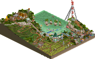
Park / Parc Naturel aux Ardennes
-
 17-July 23
- Views 27,303
- Downloads 300
- Fans 0
- Comments 45
-
 67.50%(required: 60%)
 Silver

G Force 75% Babar Tapie 70% CoasterCreator9 70% In:Cities 70% SSSammy 70% WhosLeon 70% Camcorder22 65% chorkiel 65% ottersalad 65% Terry Inferno 65% Xtreme97 65% Scoop 60% 67.50% -
 Description
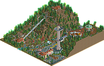
The Ardennes are a region of extensive forests and rough terrain. Let's go for a trip into this very special region in the south of Belgium!
-
 No fans of this park
-
 Full-Size Map
-
 Download Park
300
-
 Objects
1
-
 Tags
Tags

What a provocative batch of parks!
Alex- This is cool! What a great expansion of your last entry, hoping to see them all together at the end! The big brutal expo hall looks sick. Love the brown concrete and harsh angles. love the train with all the mini monuments, they look great and are incredibly detailed. All the awnings around the park are done really well and realistically too. Cool little entry.
Splitvision- This is super cute, fun, and creative. It's such a wacky idea. I like the wafer supports the most, they are really clever. The mayan trim macarons are so sweet. Super well done!
Lurker- Cute and on style. This has 3 pretty clear sections. I love the farm stuff the most honestly. I think its personal but that my fav type of stuff to build.
Fred and Jappy- The large coaster is super impressive, It really makes the three areas really distinct. However i dont think it utilized its length very well, i think axing the hack and making a self deul, even 4 ways at points could have been super cool! The architecture is really gorgeous and absolutely belgian. I really enjoy the logflume! Great moment of interaction.
XTreme and Leon- This is super cool. I really wanted to do something like this for micro madness with the oil rig! Its so cute and pulled off superbly. That coaster is incredible and is my top 2 with Morgan Fans. The train station is the architectural highlight for me. And this ugly building is the most believable.
Ethan and Xeccah - this is incredible! The tilt coaster is incredible! I love how huge it is but how well its built into the structure. The yellow coaster looks great but i dont love the pacing, its too fast at the end launching into that diag air time hill and into station. The archi is always on point, no misses here. I don't think the ugly building is as striking and dramatic as it coudlve been!
RWE and Fass - super cool to see the new alpine stuff! The shoestring rides are going a bit fast but they look great! I LOVE this tower, its so purple and large.
MorganFan and Otter - I love this! I love that dense little yellow coaster a whole lot. The lift structure is super funky, having seen the inspo. I really dig the whole ugly modern shoreline apartments. The park vs the fair vs the race was cool way to make the sections. Really enjoy the atmosphere in this one. Gorge entry !!
Dedede and Terry- This has to be the best hack in a while, congrats on that. The battle is so dynamic. Was great to watch multiple times to follow new parts. Great text and music. The coasters were done well too. The gimmick on each was great, the extra switchback section on the steel coaster was fun and creative and the smooth hills on the woodie are a great touch and flow well. Wasnt entirely sold on the ugly building but alas, Super great !!!!
Barrage Côtier
You managed the seemhow impossible: recreating a slice of Belgium in LL, a very difficult test! The landscape is recognizable the way it has been laid out, and the archy too somehow! Only wish you would’ve tried your hand at the ‘ugly’ part of our coastline: the concrete wall of apartments and restaurants.
FredD & Jappy in the Diamonds of Antwerp
When you asked if I’d mind to appear in your park, this is not what I had in mind! Amazing stuff guys. Highlights are the homage to Belgium’s rich comic history, the archy, the SS Belgenland…. Only minus point is: where’s my office?
Parc Naturel aux Ardennes
Love the little touches in this one: the junk behind the restaurant, the mitrailette stall on top of the mountain. Landscape might feel a little too grand for Belgium, but what the hell. Oh yeah, that tower is awesome.
Omloop het Koksijde
Instantly recognizable as the Belgian coast. The cyclo cross is spot on too. I can hear the voice of Belgium’s most beloved sports presentor Michel Wuyts in the background. You managed to make an entry that truly feels as though it exists, a slice of land that is here. Only question: where’s the famous coastal tramway???
SaintBranler Swaffelbeke Schaambos
Impressive! Love the grittiness of this one. Does not feel really Belgian in some spots, more Dutch sometimes. But the atmosphere is spot on. Love Schaarbeek station, the flags on the walls and the ugly building. You can be proud of this!
The Belgian National Historical Society's Annual Reenactment of the Battle of Waterloo
Hilarious! The battle is fantastic. It’s the humour that really does it for me. The batallions, ‘Dinaunt & Dinuncle’… The archy really was recognizable and suitable for this entry, only the coastline was a little out of place. I’d only wish our coastline looked that nice. Bonus points for the Tintin music btw!
Expo 77 Belgium pavilion
When opening this, it instantly clicked what you are planning during this contest. While I like the little references to Belgium such as Mini Europe, Fred’s buses, the fries and beer and the flag colours in the roofs of the pavilion, I must confess I’m a little disappointed that there wasn’t….more or something.
Cafe Lux
Def the most original! The pastries (or “pateekes”) in the counter are very creative and well done. A cool way to get the three regions represented! Sadly, it did not hold my attention that long as it is very static, even with the chocolate balls.
@Jappy: Good shout on the tramway. Kept seeing it in my research for this entry, but when we decided to have the start/finish line parallel to the coastline, it would've been on the same road as the tramway. It was definitely a missed opportunity to add a lot more detail and realism to the scene. I tried to balance building a realistic city with a cyclocross overlay but had to remove some bits of city sadly.
Thanks for all the kind comments, everyone.
Djeezes, I took that coast tram so many times and now I even work for the company running it... and I even forgot it had to be there in the park. I'm gonna cry in a corner.
Cafe Lux. I like the look, very stylish. The floor pattern is simple but effective. The macarons look good enough to eat. But there's not really any movement which cuts back on my enjoyment a little bit. Maybe it needs a mouse or something.
Belgium Pavillion-- The Three Transport Waffles. I like the running theme. When I first looked at it, it was before the Ethiopia round so I didn't know how much of a running theme this would be. Very elegant. Not as much content as many others but I do really like the water tricycles.
I'll abbreviate it. TBNHSARotBoW. This was a really cool entry. Makes me want to brush up on European military history. Great battle even if the windows did clog up my computer screen. I like the coasters standing for both sides. Lots of cool peep level details. The church was the main piece of architecture that really stood out to me. Did you use a custom wall to get the weathering effects? Nice idea.
Out of all three of those, I only think that Belgium Pavillion had a standout ugly building with the waffle shape.
Saint Branler, Swaffelbeke, and Het Schaambos. This was a very well made, immersive entry with more angles than a disco ball. I liked the rides and the architecture. Very good urban scenery. The factory coaster, Course du Bijou was very well made. Much more to say if I spent more time looking at it. I'm guessing that the brown tower by De Friturende Belg was the ugly one.
Oomlop Het Koksijde. Lots of cool stuff going on. The horse race, the family coaster, and Dive, a Eurofighter? It doesn't have the best architecture of the round, not putting it down because it's fully adequate, but I really love how animated it all is. Is the ugly building the brown house?
Parc Naturel aux Ardennes. I like the tower, the mountain coaster, and the attention to scenic detail but the buildings on the whole were a little too brown for me. I don't know which is the ugly building.
Belgie- Touz Zusammen. The architecture is a bit larger scale-wise. I like it on the whole even if it doesn't have all the angles of Saint Branler. The coolest thing is the double station coaster, Ensemble sind wir een volk. It's like two Cheetah Hunt coasters put together and stuck in an urban setting. The vocal music sounds nice too. Guessing the factory is the ugly building.
Fred and Jappy in the Diamonds of Antwerp. This one stole the show. Brilliant how you synchronized the comic with the actual setting that you can see from the other angles of view. Guessing the building with the Discover Antwerp sign is the ugly one. This entry has scale, grandeur, and good angles all in one. I can see why it won.
Barrage Cotier. I like how rural and flat it is. Very different from the others. From the Belgian theme parks I looked at it seems like you've captured the feel fairly well. I like it for what it is, regardless of the last place finish. Not sure which is the ugly building though.
Expo 77 Belgium Pavilion
What a fun experiment. From the aerial, it comes at you in a strange but endearing way. The rides and your lake centerpiece are quite special. I love your miniature figures, the food icons, and Jappy’s miniature world tour (hope he can really feel the love this round haha). You are brilliant, and even from reaching the top, I love how you continue to develop your style in experimental and unexpected ways. What a success.
Barrage Cotier
This is a really fun interpretation of belgium through LL. I love the glass abstractions, it’s one of my favorite things in LL. The buildings I really liked where the purple and red buildings furthest south of the map. They are really well done and have great shapes, the overall usage of the geometric pieces is dope. I like the architecture and the chess piece monuments next to your maze. I dig the composition of the river and the trainstation, reminds me of the Belgian port cities like antwerp. THe farm area is so sweet as well as your walkways along the water. I also like how you design your dams and gravity wallsa nd what not in LL, it comes out very clean and charming.
Belgie Tous Zusammen
Belgian boys came to represent! Off the bat I really enjoyed the vibe of this park, it’s kind of got a classic H2H vibe that is really well balanced in your themed areas. On the first pass, there looks like a lot of coasters, but it is one mega machine which I just love. We absolutely do not see monstrous coasters like this enough! I really love the little detail you did with the supports painting them like the flag. All the mining motifs are instantly recognizable. I really enjoy the framing and landscaping of the area by the log flume. That s&s scream n Swing is also phenomenal. This park just has a lot of bold choices really well done and in good fun. Like how Ensemble cuts the main mid-way in half, that would be such a cool thing to see in person. It’s in the trenches so it’s not an obstruction of peace in this area. Things like this I really love to see!
Cafe lux
I am always so excited to see new work from you because you are one of the most special builders on this site. This is just phenomenal. The best food I have ever seen in RCT and the overall encasing of the entire piece is incredible. Just so much brilliance as always. I love the wafer supports, and the interpretation of buildings as food pieces. The way you put a couple of glass pieces to show the shininess of the glass but not cover the whole thing is absolutely genius. This is just such a fun outside-the-box creation, easily one of the most fabulous bedroom-style parks I have ever seen!
Fred and Jappy
It goes without saying that this is one of the most overwhelming contest creations of all time. Like, and that’s even aside from the whole comic panel bit. Which is also just ridiculous. It is so compositionally well done. I love the silhouettes you did, they remind me a bit of the one-tab building challenge you two did a couple of years ago when was I just kind of getting my footing in. The two of you just showed how much you can execute with this game and still going. I am obsessed with the ways the buildings sort of pop through the comic panels. It is just so animated and alive. The architecture is to die for. Part of what makes it pop so well is the color usage on this map is just perfect. This is what I love to see with the expanded palette, the full-color spectrum. I also really enjoy how you framed the steamboat that it is very clearly drifting away from the half-diagonal dock. And the more I look at little pieces like the luggage by the dock.
Omloop
I love this unique representation of Belgium. I’ve been liking that so far in GT there is some overlap but the entries all stand out from one another. There is a clear narrative here, I love this kind of park where there is a lot of character in between the lines. Like where all the actual streets are closed off and the bike trail is running through it with these temporary structures for the event. I really love the color and shapes of this modern architecture by the water. It all comes together there really nicely.
Parc Naturel
I like this unique composition with the tall structure and the mountains. I enjoy the shape of it as well as the inclusion of a proper alpine coaster. It is gorgeous. I enjoy these sort of environmental parks a lot especially for the unique ride designs and what not. Little details like the obstacle courses are really nice and add a lot of atmosphere to this.. O0r the raising slides.
Waterloo
This really does the three distinct area prompt justice in that I think the overall composition has a cool effect being like this. The architecture has such nice forms and that park is a really great breath of fresh air. The war re-inactmenty is brilliant and top notch execution. I am sucha huge fan of these grad entrances like this. Watching all these peeps run around was just so funny and amazing to me, so well done. There are lots of amazing details like the painters by the water, the peeing statues which are kind of a “thing” in belgium haha. The rides are also all really good. THe foliage across the whole map is fantastic. IT is subtle but extremely well done. The rock work on the mountain too is alsp amazing, I love that it has the jagged sloped edges but the forms are vertical. Very believable. Excellent entry!
Congrats to Leon and Xtreme for such a monstrous entry and winning the round! And waterloo as well for beating us out too! Was a lot of fun to participate in this round with a collaboration