Park / Blackpool Reimagined
-
 04-August 23
- Views 3,491
- Downloads 345
- Fans 2
- Comments 11
-

-
 67.00%(required: 60%)
 Silver

G Force 75% Terry Inferno 75% CoasterCreator9 70% In:Cities 70% Jaguar 70% ottersalad 70% RWE 70% Scoop 65% Liampie 60% posix 60% Xtreme97 60% chorkiel 55% 67.00% -
 Description
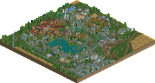
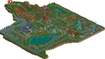
This is a reimagined version of Blackpool Pleasure Beach meant to capture the vibe of the park and not a direct recreation (like a scenario improvement of RCT1's real park scenario than a 1:1 recreation). It uses NCSO objects but with new OpenRCT features, so invisible colors and other features tied to Open are used. This is best viewed with OpenGL which eliminates road line glitching.
-
2 fans
 Fans of this park
-
 Full-Size Map
-
 Download Park
345
-
 Objects
1
-
 Tags
Tags
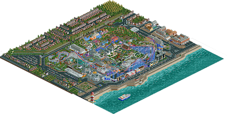

If only the real Blackpool was like this, dang. Super cool map, really enjoyed it.
V1 Review #3
V1 Seal of Approval:
+ The curvy building at the entrance is great.
+ Stalls are good
+ Theming on Valhalla is solid
+ The Blue Miler station and the orange building next to it are very good.
+ Absolutely nailed the Big One
+ Good layout on Icon
+ Icon entrance gate is a cool little detail
+ Avalanche station
+ The spot with Steeplechase, Icon and Big Dipper all interacting is great.
+ Big Dipper strong overall, especially the building for the top of the lift.
V1 List of Neutrality:
+/- Other than the buildings, the outskirts are solid.
+/- Personal preference, but not a fan of RMCed Superb National. I feel the old school woodies are a big part of the charm of old parks like Blackpool. Layouts are solid however.
+/- Avalanche layout is okay
V1 Scowl of Disapproval:
- Not the biggest fan of the buildings in the outskirts. Some of the custom buildings are not very good and I think the contrast from the premade to custom buildings is a bit too strong.
- Not the biggest fan of the actual ride of Valhalla. I think if you wanted a launched log flume it could have been done better. Also not sure why you didn't use the advanced track plugin to have a proper vertical lift.
- Could have used some of the clever multi-layering and placement of the original. Feels like a lot of the rides are very small and super separated from each other.
V1's Opinion:
A good park. Is it gold level? I don't quite think so. NCSO is not my forte, so I might be well off base here, but I do think there is a better park within your skillset, even a better version of this park. I still think it's solid and definitely a strong showing for you.
65%
Bit of a scenario style appeal here. Loved the incorporation of the OG RCT park entrance. The recreations are decent, the inclusion of the new rides makes it a little too coaster-dense IMO. Icon is fantastic. Dismantling the SLC is cute, but the water plot is just kinda chilling there totally inaccessible from anywhere. Maybe it would be filled in or used for something more productive instead of just left as an awkward pool no one can see? I like that the park feels like a real place without being too gritty.
Glad you liked it!
Appreciate the feedback! We had a fun time making this park for the title sequence contest and I think we all learned just how odd of a park BPB is. I think some of our decisions might fall under the contest format, where we were influenced to include some of the new ride types to OpenRCT.
It may not have been conveyed the greatest, but there are pieces of the SLC around the map as it is being torn down. We had previously included it but everything was just a bit too congested in that spot. Appreciate the feedback!
I liked this take on Blackpool, a not quite recreation that shows off the new ride types. Definitely seems in the spirit of the original game, fitting for the title sequence. Also, the support work is great.
really good park
Congrats on the release! Quite a lot to see here - really dense as well. Big One was cool - enjoyed that probably the most. Also appreciate the attention to detail with the surroundings. Adds a lot of context I think. Architecture was a bit plain in places, but there's so much here in terms of rides that are all really well done that it's not an issue.
Look forward to more from all of you.
danwxm88 Offline
When i load this on my machine the people and rides are not moving? what can i do to change this?
Your game is probably paused!
Well I loved this quite a bit. Clear Gold winner in my mind, also interesting to look at this again after reading some discussion about the NE accolade system over on the DKMP discord server haha. Anyway folks be proud, this has so much charm to it. Big One is fantastic. So, so good. Icon and Big Dipper are also great, as well as the steeplechase and Irn Bru.
My only complaint is that the Big Dipper is the only surviving all-wooden coaster. Would've been nice to see maybe one more since the park was known for so many wooden creations over the years. The RMC version of Grand National looked fun, and was a bold move. I enjoyed the nod to Twisted Colossus with the single station and long self-dueling layout.
Another fun feature was the waves in the water, very creative.
Also you included a launched log flume, with a thrill lift! There's a lot of fun little creative ideas like that in here that I really enjoy.
I liked the outskirts, they work for what they're intended to be and set the tone. They also give the viewer something else to see when near the edge of the park besides the black void which is a plus.
Silver feels a little low for this but it's a high silver and still a respectable score. Personally I would've voted this either 70% or 75%. The 55% vote here is kind of baffling to me, but from what I've seen this style is very polarizing so that's just something to keep in mind when submitting I guess. Don't take it personally and keep building cool shit like this please and thank you.
I will never grow tired of full-sized NCSO parks brimming with clever object usage, humble trackitecture tricks, and realistic shapes that break away from the grid when necessary. This is among the first large maps to accurately show how a seemingly minor addition like invisible paint can create such a realm of possibility within a medium largely defined by its limitations. New window options, track wires, and snow-based waves are just some of the creative new features we will be seeing more of within this "NCSOpen" look that has spawned this year.
Some of my favorite architecture here includes the curvy entrance building, Superb National's station, the Big Blue Hotel, and the stretch of buildings opposite the waterfront. There are bold choices here that successfully break from "safe" NCSO, and though not every building is an absolute hit, many of the risks taken do pay off creating lovely forms. I enjoy the level of crazy ride interaction between the coasters, particularly when a larger one like Big One weaves around multiple smaller tracks at once. Very strong layout planning here.
The biggest thing holding this park back was its inconsistency in quality, with architecture being strong in most places but foliage and landscaping appearing to be an afterthought across various areas. For such a thoughtfully designed map where every detail is planned and executed with strong precision, foliage and terrain seems jarringly haphazard in many pockets, causing much of the middle of the map (about half of the "park" part of the park) to appear somewhat amorphous and unfinished. No bush, tree, or garden should ever be placed randomly - deliberate placement creates the most powerful effect. Had the same level of care been given to the natural elements as to the humanmade ones, I believe it would have cleaned up and shaped much of the grassy areas, allowing it greater readability as a whole.
I would have liked to see this crack Gold, but I do see how, while aspects of it are there, the entire park as a whole is not yet there for some viewers. It is very much the style of NCSO I prefer, and for those who have not previously released anything to NE, it is still a very strong debut. I hope to see more from all of you soon, and I hope you continue to push the boundaries of this NCSO branch and keep it alive!