Park / Viridian Island
-
 25-July 23
- Views 1,589
- Downloads 263
- Fans 2
- Comments 8
-
 63.50%(required: 60%)
 Silver

In:Cities 75% Babar Tapie 70% Faas 70% Terry Inferno 70% CoasterCreator9 65% RWE 65% G Force 60% Jaguar 60% Jappy 60% Scoop 60% posix 55% Xtreme97 55% 63.50% -
 Description
My entry for the Title Sequence contest, a scenario inspired NCSOpen park
-
2 fans
 Fans of this park
-
 Full-Size Map
-
 Download Park
263
-
 Objects
1
-
 Tags
Tags
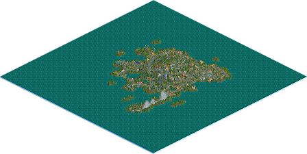
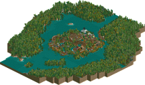
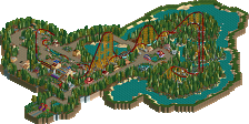

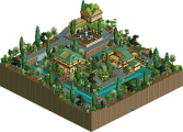
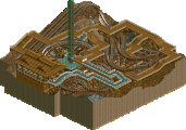
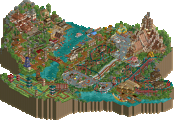
What a beautiful map, amazing work!
Fun island! Very classy made. The single rail coaster must be my favorite. Might be a little overuse of gardens sometimes, but still well done.
there's never an overuse of gardens, don't listen to the train
I have spoken
Interesting choice not having a formal entrance area. Made for a pretty interesting viewing experience. Definitely classy, I think in some ways the landscaping is a far more refined version of what a lot of people did here in the early 2000s, jagged but not overkill. Nice work.
I love this!
To see where you started (in NE terms) and where you have come now without sacrificing any of your authenticity to get there has been a pleasure to witness. Your style has remained uniquely yours, but the refinement of your techniques into something that is so wonderfully readable and approachable is why this work stands out above all of your others.
The buildings in this park are so clean, all the colors and textures fit nicely together, and fence objects are used appropriately as trims without dominating the scene. Despite using exclusively straight walls with right angles in abundance, nothing feels boxy or blocky. Pizza Palace is my favorite with its shape and color scheme, and I love that blue glass seating area. Even the smaller architectural endeavors, such as the bridge over the side friction and that one wooden seating area near Log Jammer, add something special. Also a pleasure to see NCSOpen techniques in action, such as those jellybean shutters and the invisible castle wall trim.
Your coasters have always had a nostalgic charm to them, and here I believe you have achieved a balance of realism and Sawyerism that is perfect for this setting. Emperor obviously stands out since that is what an emperor is meant to do, but all of your layouts here flow harmoniously with their surroundings. I particularly enjoy the placement of Viridian Dips and Hilltopper because they interact so naturally with their respective environments. In some ways, these parts remind me of a more fun and whimsical approach to the SFMM scenario.
I do always have a few things to say about the landscaping of this style in general--larger rock formations with some smooth connected bits, gardens in larger clusters rather than one quarter-square at a time--but I also accept that these are stylistic choices rather than flaws when used well, which you have done here. The landscaping flows so naturally here throughout that these aspects do not detract from the park anyway. Creating large land formations in harmonious shapes with no jarring bits is no easy feat, but you definitely pulled it off here.
Your parks have a unique way of tapping into a universal RCT nostalgia that many of us including myself did not know even existed. It is as if there is something in our collective past as builders that we are witnessing now through your parks that we recognize as familiar even if we ourselves did not ever build in this particular style. Whatever strange force is coming to life here, your work has universal appeal, and we are all grateful for the parks you grace us with.