Park / Mato
-
 25-July 23
- Views 1,807
- Downloads 262
- Fans 1
- Comments 14
-
 76.00%(required: 65%)
 Design

wheres_walto 90% In:Cities 85% Babar Tapie 80% Terry Inferno 80% chorkiel 75% Liampie 75% posix 75% RWE 75% Scoop 75% G Force 70% SSSammy 70% ottersalad 65% 76.00% -
 Description
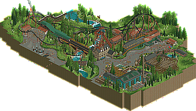
Mato is a Native American word for bear! This ride is a backwards multi launch (why it can only run one train!)
-
1 fan
 Fans of this park
-
 Full-Size Map
-
 Download Park
262
-
 Objects
1
-
 Tags
Tags


Very cool AJ, once again you've shown a lot of improvement here, generally this is your best work yet I think. The coaster was very unique, not entirely sure the hack is flawless. Was the beginning supposed to be self powered? I guess I wasn't really sure how the coaster was supposed to make it through the layout without being self powered, seems odd to combine that with launches personally. But regardless, it was fun to watch and a great little concept. The Virginia Reel was a nice inclusion too and pretty well done, cool contrast in coasters. The archy was maybe a weak point but I totally get the style you were going for.
Overall, another solid release. I think you're really close to having a real breakthrough, this and some of the teaser screens you've shown recently point to that I think.
What an amazing layout!
Yeah the layout was awesome. The map really packs a punch and I felt you showcased each element of the coaster really well. Foliage was also beautiful as we've come to expect from your parks.
Great job AJ!
This is really cool and lovely! First of all, the coaster itself is great. Really love to see such a daring concept where the coaster leaves backwards and during the ride has a forwards part. Mostly it goes the other way round, so I was quite surprised looking at it. The Norwegian loop and tophat are also perfectly placed for the peeps to get all the attention. Great placement.
Also like the modern take on a Virginia Reel coaster, really well done. The star of the show is the foliage, feels pretty unique and those flapping butterflies make it come across so real.
Loved it.
I am happy this was released here! Landscaping and atmosphere continue to be among your best strengths, and I love the coaster layout. Great work!
I like the gritty industrial buildings set in that rugged landscape, it's got good atmosphere (And the music helps with that). Coaster is impressive, really like how it's built into the structures and follows the landscape, also like seeing a Virginia Reel as a supporting ride.
Fun layout - not fully convinced on the first half with the hidden lift pieces to speed up the train. But, the rest of the layout was quite enjoyable. Simple architecture throughout, but the openness of the map was refreshing. I think this would've been a higher score for me if you didn't need hidden booster/lift pieces.
I finally had time to open the park, a lovely release! I really liked the sobriety of the architecture and the theme of the attraction, I mean I know that personally I couldn't have stopped myself from putting bear sculptures everywhere and making caves, and this minimalism works very well here! The landscape is also very well done, I really like this smooth river and the work with the grass. The whole thing is very coherent and pleasing to the eye - a very good job aj!
Super nice. I like he spike and tophat combo a lot.
oof that diag bunny hill was supposed to be the first little pre launch, should've added a fin or catwalk i suppose! i can see how it is missleading
you're consistently one of the best players in the game right now. I love everything you release and this is no exception. Possibly your most refined work. Layout is fun, and overall theme is excellent. Great work as always!
Excellent layout, and inspiring foliage combinations. Feels so natural, and helps the entire atmosphere breathe. Aaron Copland's Hoedown is an amazing touch, and enhances the Western meadow theme. I'll have fun exploring this design more closely, as well as the rest of the park.
Congrats on the design, thought it shoulda scored higher myself but when do I not? Love this string of releases from you this year. Your work is very refreshing, pulling from a wealth of references but very individual in style. You have this vibrant, saturated, almost baroque aesthetic to your work that has huge impact. That combined with your continued improvement in honing your execution makes this a real treat. Really loved the landscaping, the colors, the support coaster, and the little path details like the paw in particular. Congrats again!
This is the type of quality lawncare I appreciate in a Design. The clickable overview does not accurately convey from that angle the full beauty of this landscape. When you rotate the frame 180 degrees, that's when you truly see the immaculate grassscape in its full glory.
Harmonious grass is certainly something I prize in any RCT work, but there is certainly far more to this map's aesthetic cohesion. Everything works well in relation to everything else in a relatable manner, and that heightens the map's realistic draw without relying heavily on crunch. The architecture strikes a lovely balance between realistically functional and thematically pleasing - the entrance building is adorned with all the right objects for a modern industrial look on one end of the scale, while on the other, we have appropriately plain government-style restroom buildings that look exactly like those that would exist in this sort of outdoor setting. Multi-story stuff (as in, where multiple stories are functional) strikes a special chord with me, so if I had to pick a favorite corner of the map, it would be Elon. I particularly like that building because, even if there were no taps on the right side, it still architecturally implies beer.
But even with all of these other strong elements, it is ultimately the coaster that ties everything together here. You've built a layout that is as aesthetically pleasing as it is fun to ride, and that is perhaps the most important component of a high-quality Design. This coaster and all of its surroundings would fit right at home on a larger Spotlight map, and this is the level of quality I am seeing in your work more and more. Everything you create is a work of art and a breath of fresh air.
You'll get your 80 soon. It's hard not to smell the green in the air with all that magnificent grass.