Park / Country Roads
-
 19-June 23
- Views 31,402
- Downloads 234
- Fans 0
- Comments 28
-
 60.00%(required: 60%)
 Silver

Babar Tapie 75% Jappy 75% CoasterCreator9 70% In:Cities 60% ottersalad 55% RWE 55% Scoop 55% Terry Inferno 55% Xtreme97 55% posix 45% 60.00% -
 Description
This park was named after the song, link here, consider it optional for viewing: https://www.youtube....h?v=1vrEljMfXYo
-
 No fans of this park
-
 Full-Size Map
-
 Download Park
234
-
 Tags
Tags
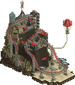

Round 1 - USA
Results
Our first round has now closed, seeing off an eclectic variety of States that spanned a number of landscapes and locations. Out of the 13 entries received, it was Hydroportal and FK+Coastermind who comfortably came out victorious with an impressive 51 points from the two questions with their entry Lady Gaga at Wrigley Field 2023, and become our first pair to make it to the Grand Final! Congratulations! Commiserations also to J K and Terry Inferno who's Floridian entry Gatorland came first place in the Objectives poll, and second overall.
Find the results table below. The total score for each entry has been calculated from the following formula. The builders of the winning entry are eligible to compete in the Grand Final.
Score = Objectives votes + Quality votes
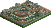
Lady Gaga at Wrigley Field 2023
by hydroportal and FK+Coastermind
18
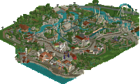
Gatorland
by J K and Terry Inferno
21
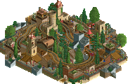
The Holy Texican Empire
by Ethan
8
Louisiana Action park
by Babar Tapie and In:Cities
9
Bussin Bayou
by AJ- and Bubbsy41
13
Balloonfest '86
by Liampie
18
expo77: Worlds Fair Houston — Entertainment Complex
by alex
11
Vermont State Autumn Fest 2023
by RobDedede and Splitvision
13
NOLA Jazz and Heritage Festival
by Jene and Gustav Goblin
13
Roswell UFO Fest
by FredD
9
Waikiki Beach - Aloha Festival 2023
by RWE
8
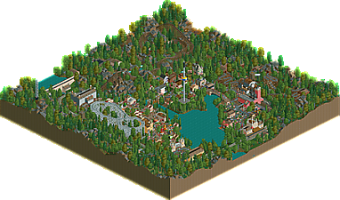
Country Roads
by Lurker
3
Formula 1 Las Vegas Grand Prix
by GammaZero
3
Next stop, Belgium!
Congratulations Hydro and FK!
Josh + Babar: love what a unique and lively atmosphere you created here, probably my favorite of the Louisiana parks. the music and little details made it feel very much like a “josh” park even if the bulk of the building was babar, i think yall were a great pair because it all looks seamless and feels like its in the FAP cinematic universe. the coaster train looks so stupid but i love it so much, and the setting with flying through the bayou with the makeshift boat station is one of the standouts of the round. also props with the music on this. We’re clearly in a golden age of RCT audio advancement which i’m living for and i love seeing yalls creativity in that realm.
Rob: another vermont park at last! Coaster layout looks great, love the integration of the “black diamond” and those new drops look real cool. Stuff like the tiny town and tower all feels very appropriate. If anything wish there was maybe a bit more elevation to give the feel of vermont’s dramatic valleys, and maybe a bit more variation in tree type/foliage in general, since it plays such a prominent role. Right now all the orange trees are the same type with a little bit more nuance with the landscape I think this would’ve done justice to the excellent layout you made.
Terry + JK: another “this makes sense” pairing of builders. Feels like it could’ve been an area of Lonely Planet. Mini golf is a highlight for me, reminds me of the 100’s of mini golds in orlando. Its very technically well done, perhaps something isn’t clicking to make this one of the top parks of the round for me? I think its that it feels like its built on a larger map/spotlight type scale if that makes any sense, especially in the peninsula half of the map. I think that half of the map could’ve felt a bit more intimate and homey.
Gamma: dang this feels really cool and ambitious, shame you were rushed as it really would’ve benefitted from peeps. Feels like a true breakthrough for you, this could’ve been pushing 80% if you’d gotten the last bit of finish. I really have to commend the overall composition here, laying out a map with skyscrapers is hard and you managed to do it without blocking anything too much. The combination of the orange coaster and grand prix running through everything looks awesome and has great interaction. Serious props for this map!
RWE: this was well executed and checks all the meta boxes but I felt like it was a little by the numbers? I know you were rushed and i think some of the micro would’ve felt more unique and lively rather than filler if you had more time, but i think that component is an important part of this competition. Archy is solid and my favorite bit was the church/parking structure/hotel area.
Liampie: well done for the rushed job, one of my favorites of your quicker parks. The mass of balloons creates a unique visual and the portrayal of the fallout from the event + the state shape were very creative. Easy best for completing the objectives.
Gustav + Jene: the archy on this map is seriously great, some of the best of this round. I think what held this back for me was the lack of content on the bottom half of the map, and the fact all the densest content ended up along the map edge. I think a map like this could’ve benefitted from being more park-y too.
Fk + hydro: this is one of those GT parks we’ll come back to for both being boundary/meta pushing and just a masterpiece in general. Easily the best quality of the round, but i think it also displayed the most clear passion for the subject matter. The archy is fuck you levels of good and some of the best urban building i’ve seen i the game, its the perfect level of detail to capture the city without being spammy or glitchy. And is this a real live recording, or did yall process the original song to make it sound like its in a stadium + add crowd noise? Because the audio is spot on and i’m mad i didn’t think to try that out first.
Fredd - its a low key idea but I feel like you did a pretty good job capturing the feel of a smallish american city. Was hoping to see some southwest parks and the architecture and landscape feels like it does a decent job placing it in that legion. I think the crunch felt a bit forced, sometimes it felt more like i was seeing mesh objects on a road than a worn down road/sidewalk, and i dont think that trash object ever looks great when used to that extent (but it would help if you rotated it haha). We’ve seen fairgrounds before but the saucers give it a unique feel and the coaster was pleasing to look at.
Aj + bubbsy - love the scene at the start, love the coaster and its supports, love the landscape and the archy. If anything my criticisms are that it might all be a bit tooooo watery and could’ve benefitted from another ride or something. Also maybe i’m spoiled but i wanted to hear some more cajun music!!
Alex - always love to see another alex park! This is so clean, perhaps to a fault, and it doesn’t feel particularly texas-y. nonetheless its some great realism and a very nice recreation of a classic coaster.
Ethan - another one of my favorites of the round. After the experimenting and density of your MM entries, this reigns things in a tiny bit while still keeping the unique character and liveliness of your style. It feels quite texas-y but also quite a bit more colorful and vivid than i assume this area is in real life (you could maybe stand to use 70% as many shades). I think what pushes this towards the top for this round is the emphasis on theme park content, especially that dang coaster which is easily the best of the round. Layout is so flowy, and you absolutely nailed the framing for that first drop and also the dive loop. Lastly, nice job making those rock cliff objects look better than we did lol.
Lurker (i dont have LL textures tho) - although this looked on the surface like your typical no hack old school LL builds, I very much enjoyed seeing how you incorporated elements of the state into this style, mostly in the mine theme and the mountainous terrain. hope to see your take on some other countries in this style during this competition!
missed voting for some reason but best objective would've been liam's park. the state shape was a mix of maps shaped like states, or states that were too difficult to find, and liam's was a unique take that was easy to see. events this round were a bit of concert overload so it was nice to see an event that was an "incident". Quality vote would've gone to fk/hydro, ethan, LAP, in that order.
Roswell UFO Fest
Great ride design and I love the concept. Big fan of your googie gas station and that bus terminal. Some other details like your trucks and water towers are excellent. I really enjoy this kind of entry, just so many little design features to explore and really taps into a love for the ride design and realism aspects that I share too. The suburban and redneck places are on point. I don’t know why, as simple as it is, but the big red pool and unkept lawn is such a nice touch. The Invasion coaster is fantastic, I really like the station design for it too. Really nice shapes.
Bussin’ Bayou
.What an intro. The roller coaster is awesome. Big fan of the New Orleans style but in the bayou swamp environment. Love marriages like that where you take two completely different parts of the same place in harmony. What I really like about it is this feeling of submerssion. You can see the ground in the water if you look close enough but there is this eerie feeling that comes with swamps that you cant quite make out what really lurks in the murk… And at the same time, the atmosphere is really fun. It’s just so alive! I love some of these little bits like your slushie machines with the colorful water objects, the stalls, these boats with people hanging out on, fantastic seating areas and that queue for the coaster. This just looks like such a fun place to be right now. Also, the architecture is awesome!
Expo77: Worlds Fair Houston
Really great interpretation of the prompt. I wish I had this kind of intuition with the roller coaster. The layout is still fantastic and I didn’t immediately recognize the shape but when I did it is the perfect blend between achieving that shape and being a genuinely fun and flow-y roller coaster. I am always a huge fan of your architecture, just such awesome geometric forms. You also always find a great way to incorporate colors into thee kinds of atmospheres. This park is really full of it and capitalizes on this diverse palette while still maintaining that cold uniformity. Also, that Gemini sign though… fantastic.
Waikiki Beach - Aloha Festival 2023
Really hit the vibe. Really nice, clean resort architecture with those pattern accents. The landscaping is great on the whole, but especially on that beach that gradient is so satisfying. The event atmosphere is so lively I feel like the peep concentration is on point for that. I love the drummer’s trap set haha. This overview and overall color flow is so great. Such a nice and instantly recognizable diorama for me, at least given that this entry takes place in America. There are some really excellent ways you’ve broken the grid too like with that Foster hotel. The horizontal lettering against the diagonal entrance against the half diagonal road works so well. The atmosphere is also greatly enhanced by how lived in these hotel suites are. Infrastructure is also really nice here. Just such a great, well polished map!
Gatorland
I love the colors so much, those pastels! This map comes together so well, the map shape is utilized in a phenomenal way. So many great bits in there like the enclosures and that golf course is so perfect. The vibe is maintained extremely well throughout this park. What a great duo! This landscaping is stunning. The curvature is on point, just such a great organic flow in the paths. The sort of constructiviism in all your materials is on point. Great textures. The mid-way is beautifully composed. The framing of your looping coaster is also fantastic. The park is pristine and very well polished, the atmosphere is really unique and a lot of fun. The event is also stupendously executed.
Louisiana Action Park!
I love this kind of scrappy, junk yard RCT. Phenomenal from both an overview and in the micro, just so much … junk! The vehicle work throughout is stupendous like your trains and boats. That submarine you snuck in though, wow! All the junky scrapyard rides are perfect. Landscaping is also fantastic, and the little touches of Orleans in some of the architecture add a nice variety. What a fun park and a fun, unique take on the New Jersey Action Park legacy. I like the interpretation of the event that this action park is definitely a tentative thing ahahahaha.Also, that Louisiana shape is super sneaky, but phenomenally done! Brilliant object combination for that billboard thing. There is just so much great fun to see. The steam boat is chef’s kiss, and that Bayou Blaster is really nice layout.
NOLA Jazz and Heritage Festival
I love the unique composition with the map shape. There is a really nice flow through the paths between the down town, French colonial style all the way to the swamp where the road cuts off. The stage is really really well done, and the surrounding trucks and stuff too. The city colors and architecture is so lovely, and I love some of the posters and mural work too. Just fantastic usage of colors. The churchand flower plaza has a really magical vibe with the horse drawn carriages out front. Kind of feels like the Disney New Orleans square which checks out and is definitely a good thing. Just lovely atmosphere throughout. I love the riverboat, you know I’m a sucker for these! Just such a classic, America look that completes that dock on its own. Fantastic grid breaking and path flow, the shapes feel very organic. Overall a very fun map to explore.
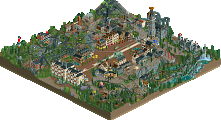
Country Roads
Classic Lurker! Really nice center-lake style map. The landscaping is great, and some really creative ideas like these banners. I love the train station that exits and leads up to the park entrance. The dam is a really nice touch. I love the river rapids secluded between the rocks weaving in and out with the mine train overhead. The wooden wild mouse is so classic, and the coal belt/station design is mint. Lovely lovely Loopy execution, big props by going through with that for GT, I am certain this is the first, and hopefully not the last! I like hwo with the rides are set up you kind of find them the more you look, making it an engaging view. Like the golf course in the trees.
Balloonfest ‘86
I aspire for this level of skill to be able to complete and polish something with all this creative micro and architecture with such a time crunch.This opening frame is epic, love panning up to the top of this incredible tower. Verty strong interpretation of the prompt, this event is given a ot of grandeur with the way the balloons expand into space, with the actual festivities occupying the town square. It’s a really nice composition. There is soem really fun micro like your stamp statue. I love these cultural/monument allusions to real life historical pieces that I notice in your work.
Vermont State Autumn Fest 2023
Wow! That guess the weight challenge is cool, a really really clean way of implementing that. Really nice centerpiece coaster, the flow is so good with the new pieces. I adore the pumpkin flat ride to bits, and also the usage of the NCSO pumpkin scenery pieces throughout is creatively done. The autumn foliage is so pleasant especially with the colors. That grass gives a nice canvas for the colorful foliage.
Lady Gaga at Wrigley Field 2023
What a beast! I am in awe of the attention to detail. This stadium is massive but every infrastructural aspect and construction kept in check. those half diagonal AC units though! Abd those half diagonal stadium lights! The overflow seating on top of the buildings is so cool, looks like such a vibrant urban atmosphere. This feels like such a massive moment really nailing the event prompt. Those half diagonal stadium lights though… Every building the architecture is on point and some interiors to boot. And for this urban city scape there is great color. Everything works really well together. Apartments look lived in. This map just has all the bells and whistles for content and it radiates passion for the source material.
Formula 1 Las Vegas Grand Prix
Wow that’s ambitious, and to me that is always a compliment. But off the jump the architecture is stunning. Really brilliant solutions to the grid breaking action you got going on here. Excellent incorporation of the state shape, I love the little zig zag at the North end, fun little obstacle around the fountain really nice composition. I recognize that it is unfinished but you should absolutely finish this because it is looking really good in my opinion. Peeps, path additions, some other stationary stuff and this is chefs kiss
I owe these entries some reviews. Since there are 13 entries, I'm limiting myself to about 3 sentences for each.
AJ and Bubbsy:
I love the beginning trick with the fog and the state outline, probably one of the most clever ideas for that requirement. The architecture is fabulous, and achieved the New Orleans look quite well. There are many cool rides and details throughout, but I wished you had highlighted the barge parade a little more.
Alex:
I would really like to build with you someday, as I admire your clean style and ability to bring areas to life while maintaining a level of minimalism. You also have excellent ride design here, as shown with Gemini. The architecture on this map has a cool and unique look, though I do wish you had leaned into the Houston/1970s/Space Age stuff even more - why not try the Astrodome or use some Houston Astros baseball team colors!
Lurker:
Never change, Lurker - the lake as the WV outline worked surprisingly well here! Is this entry as detailed as the others, no. But it has heart and continues to maintain a classic LL style that is well worth preserving and that on its own is admirable.
Gamma:
This was seemingly an ambitious entry that was unfortunately rushed for time. So many cool ideas and shapes can be seen throughout this map - I especially liked the Mandalay Bay Hotel. I hope you choose to finish this someday and bring it to its true potential; the map deserves it.
Fred:
Cool state choice and event choice! Some of the highlights for me were the Pinfari coaster, which was really well done, and the strip of low-height American style shop buildings. I appreciate the attempt at making the streets look gritty/cracked, but I think the textures could have been improved a little bit.
JK and Terry:
The Florida state outline felt quite natural here, actually, and made for an interesting park layout. The Hopkins coaster was a highlight for me, as were the Jimmy Buffet concert and the gator head entrance. I think this park struck a really nice balance between crunch and cleanliness, with there being much textural detail while still being easy enough to visually digest.
Gustav and Jene:
I would go so far as to say this map featured some of the best architecture we saw this round, with the New Orleans style coming to life quite nicely. The custom music was also really nice, and helped with the immersion. I also appreciated the inclusion of the streetcars! Oh, and the little patio area with the murals was wonderful! I want to hang out there. Can't forget the food trucks either - so cute.
FK and Hydro:
There's not much I can say that hasn't been said already, to be quite honest. Simply an incredible map. It appealed to me as a baseball fan. At one point I wanted to recreate a baseball stadium, but that's now gone out the window, which isn't a bad thing. And the Wrigley rooftop seats... my goodness. Great work.
Liam:
I respect your commitment to the round objectives, which included a cool (and real!) event and a simple-but-clever way to make the Ohio state outline. The Cleveland Balloonfest was actually an idea I pitched to the Tile Inspectors for a park at one point, but Point Nemo won out instead (also my idea lol). Suffice to say I was happy to see this idea be represented in-game when I saw this map.
Babar and Josh:
Just loads of fun. I think it was a smart choice not to do New Orleans in this Louisiana entry, as it helped it stand out from the other two. This park makes me want to see a continuation of even more action parks in all the (funniest) states. Imagine an Action Park Ohio (dangerous industrial waste area), or Action Park Nebraska (redneck farmers and tornadoes), or Action Park Arizona (aliens, retirees, and conspiracy-theorists). The possibilities are limitless. Everyone should have a take on one.
Ethan:
I think it's a shame you did not win parkmaker off of this, but I won't dwell on that. As you probably know I am a big supporter of scripted sequence openings to parks, and this one had a great one. The other highlights for me were the coaster, which had an awesome layout, its queue, and the landscaping. The landscaping felt really fresh and had a cool, unique look, which I think matched the San Antonio/SFFT look well. Great work, dude. Oh, and the half-diagonal architecture was straight gas.
RWE:
I see you, RWE! Another cool state choice with Hawai'i. You captured the modern look of many of the buildings in Honolulu really well, from what I can tell. I do wish your event were a little more unique, how about a surfing competition?! That feels very Hawaiian. In any case, this was really great work, and you should be proud of it.
Split and I:
Split came on late in the building process and added some really cool hacks (the guess-the-weight and the pumpkin ride), as well as helping me finish some of the other scenery. It was a really fun build and I agree with some of the sentiments that it was a tad unrefined. But you know what, maybe that's just my style. A little rudimentary. I'm okay with that. I had fun making it, anyway. Isn't that what matters?
Here's to more great RCT.
aj and bubbs:
it somewhat works as a lampoon of louisiana. some bits of it are really nicely and cleverly executed but as a whole it doesn't come together for me. i don't feel like this went by the objectives of this round well, either, as this is more of a general event and nothing specific to the locale (for example, if you did a pride parade in the setting of san francisco or new york- incorporating stonewall- it would be different). the foliage is very questionable for the environment and the firs/evergreens really stick out in a place that needs huge oaks and cypresses to feel correct.
the execution of its bits cant make me justify lower than 65, and that feels about right for this.
alex:
for as low-effort this was as you claim, your use of motifs will never not be second to none. this park is insanely good, and every design decision you make you seem to get the maximum amount of effect from it as possible. it's strange to see something that usually by others is done is such a sterile way feel so lively and dripping with atmosphere. as far as the objectives of this contest, this follows them very weakly, as this felt like just an excuse to make a very good area of a theme park. that being said.. while i could never vote this over others in a grand tour setting, just purely for an accolade vote this would be an 85 for me.
Now may be as good a time as any to provide a brief look into the Gatorland building process.
Since our styles are very distinctive, you've probably already figured out who built what, but here is the share map just in case it's still a mystery to you.

J K has a very refined, realistic style of architecture, while I've been coasting off of steel roofs and wood blocks since 2018.
Gatorland was such an enjoyable park to build, and I am grateful that we got to create and finish something so memorable in such a short period of time. When I refer to the time limitations, I refer to the fact that neither of us had the entire month available to build, so everything aligning so that we could both build this to its entirety and each take our 10+ day vacations allowed for dual maximum productivity and relaxation. The only point in which we were both building simultaneously was during the final eight days of the contest.
J K left for Greece first, so I put a rough map together during the first 10 days of the round. First priority was to get the land shape to resemble Florida as closely as possible.
Eventually the map shape began to follow the land in its resemblance, but it is the land itself that is modeled directly after the state in its proportions.
Over the next 10 days, I built at my usual snail's pace (see: Patagon), somehow taking 49 ingame years just to get to this point.
Note the placement of this gator pond in particular, which corresponds to the location of Lake Okeechobee.
The initial plan was to create a park heavily based upon the 'real' Gatorland (quotations used because the evidence that Florida actually exists is marginal at best), so a few of the rides--notably the zipline and the rope bridge--are based on actual Gatorland attractions.
I threw in a few traditional amusement park rides because this is RCT, not just T, and I chose Hopkins for the coaster because it strikes an unmistakable balance between interesting elements and "this park can't afford a real coaster".
Then I went to the beach and did not build anything for the next 10 days, so there was a full week where neither of us were building and the map just looked like it did in that last shot of the map. Note the ugly, cheap-looking buildings that ultimately did not survive - these were leftovers from when the plan was to create a park very similar to the real Gatorland as opposed to a celebration of three different regions of Florida's Alligator Alley. Technically, the way it is now satisfies one of the R2 criteria, and had I left that weird crescent-shaped atrocity on the map, it would have satisfied another.
When I returned from my trip to the beach (roughly 2,500 miles/8 million km from Florida), Key West had appeared!
From the 10th to the day of the deadline, both of us were building every day, and between the two of us, we averaged 10 years/day after J K first entered the playing field.
I had not ever built a vehicle in RCT before, but I believe Jimmy would be proud to tour in this bus and eat from this truck.
Not all vehicles made the final cut, however...
The final area, Islamorada, appeared before my very eyes over the final week. This is it just five days before the deadline - further proof that J K can build at superhuman speeds.
Less than 72 hours to go, and we were still missing one quintessential Everglade component - actual moving airboats. We both knew for a while that it had to be done, but the map was not set up to accommodate an airboat tour - the St. John's river would have scaled awkwardly - so I answered Billy Preston's long-unanswered inquiry and decided that the airboats would indeed go round in circles.
Note how there is still a structure on the map that did not make the final cut. This building was so forgettable, I forgot to get rid of it until the final 48 hours.
Eventually, the location instead became home to a gator wrestling stage at Monsieur K's suggestion, based loosely on a signature attraction at Miccosukee Indian Village. I used steel roofs and wooden walls to keep it within the Everglade style used in the rest of the area and definitely not because they're the only architectural objects I know how to use,
24 hours to go, and the map was essentially indistinguishable from what it looks like today aside from some of the foliage not yet being in place. Since that was predominantly my domain (big surprise), naturally it took literally until the final day to get it all done. I'm not going to take a screenshot of it - just click the aerial and pretend the frozen staff and a few of the grass objects aren't there.
Overall, I am immensely grateful that J K and I got to build this beautiful map together, and it has been wonderful to see it win second place in our Grand Tour debut and first place in the objectives category. Not bad for two guys who don't live within 2,500 miles of Florida.
In order of parks in the batch download file.
Bussin' Bayou. I like the coaster, the atmosphere, and the moving fog. It was very clean and classic architecturally compared to the next one I saw.
Expo 77: World's Fair Houston -- Entertainment Complex. It was very well done in a minimalist sort of way. Modern and minimalist in a way that maybe less aesthetically talented players couldn't get away with. At least in regards to the architecture. It seems like you know where to put the details to make them count.
Louisiana Action Park. I thought that this was brilliant, vibrant, both backwards and forwards thinking. I've never seen a coaster like that where every vehicle is a different type. Also the triple dip log flume was neat. I like the jet skis and the motorbike races. I've never seen anything quite like it, at least in RCT.
The Holy Texican Empire. Outstanding architecture. A great gladiatorial match. A very interesting theme. The RMC Raptor was one of the best I've seen in the game so far.
Roswell UFO Test. The X Files music was great but the content didn't do much to evoke anything with the music. Good work though, just in a competitive round and needed a bit more, maybe ride-wise to stand out.
Formula 1 Grand Prix. It had some very good content, another good Raptor coaster. The architecture is a little minimalist but a good scale and very solid. The Formula Racers were pretty neat. I don't know if you meant to have them as a ride or make them invisible. At least I'm now not the only one to rush out a contest entry with the rides not running. I know that this was a time crunch for you and I'd love to see what it would look like if you had more time.
NOLA Jazz and Heritage Festival. A bit minimalist compared to other entries. However, I think that the architecture and to some degree the foliage, has a nice subtle, inviting quality that makes it stand out. That's something that can't be faked.
Lady Gaga at Wrigley Field 2023. I was stunned when I first saw this. I don't know how you finished it with such a high level of detail in such a short time. It's no wonder it got first place. I have one criticism, that Lady Gaga doesn't seem to move. But the rest of the details including seating on building roofs outside of the stadium more than make up for it. I'm not ordinarily into this sort of theme but it was done incredibly well.
Balloonfest '86. This was surreal. Swimming pools lifted by balloons into the sky? Or is that just something in the distance? The large stamp sculpture reminds me of Seattle. Well done. This is probably the first time I've seen balloons out-vibe the architecture.
Vermont State Autumn Fest 2023. Great foliage and nice work making it the shape of the state. A bit minimal but has an atmosphere that warrants repeat viewings. Reminds me of Beetle Juice.
Waikiki Beach. Nice beachfront atmosphere. The buildings are some of the most evocative of the contest for me. The concert and activity on the beach were neat. It doesn't have the cool coasters or rides of other entries but it's nice for what it is.
Gatorland. Serene. It feels like Florida having been there multiple times. It has a nice enough atmosphere to warrant multiple viewings and the concert stage is a bit atypical, like many of the other parts which makes it fun to look at more than once. If I were afraid of gators, well I'd probably be too scared to walk through the entrance even before I saw the real gators.
Country Roads. It's fun to look at. The foliage is good enough to rival the RCT2 entries. It has many things I'd expect to see from West Virginia like the steel mill. I am not familiar enough with the landscape of West Virginia. Looking at some photos online, it seems like you captured it about as well as you could with LL. Good work, even if I've heard John Denver's song Country Roads too many times as of late.
Congrats to all contestants on doing good work and I hope to get around to reviewing the Belgium round and voting into the Ethiopia round.