Park / Electric Fields
-
 25-July 23
- Views 2,179
- Downloads 325
- Fans 0
- Comments 9
-
 55.50%(required: 50%)
 Bronze

CoasterCreator9 65% G Force 60% Jaguar 60% Terry Inferno 60% Xtreme97 60% In:Cities 55% posix 55% RWE 55% bigshootergill 50% chorkiel 50% ottersalad 50% Scoop 40% 55.50% -
 Description
My version of the Electric Fields scenario.
-
 No fans of this park
-
 Full-Size Map
-
 Download Park
325
-
 Objects
1
-
 Tags
Tags
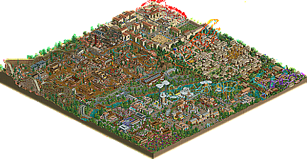

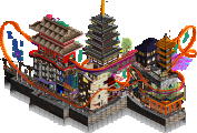
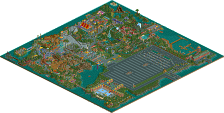
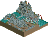
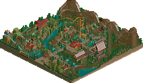
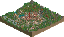
This is some fun classic style NCSO, really enjoyed this. The themed areas are charming and the entrance complex is especially nice, Also see some nice use of RCT1 content and the new colors. Coasters have some odd moments, like the sharps turns and lack of brake runs at the end on a couple as well as some under-supported sections, but they also have a lot of interaction and some nice theme elements (Like Lightning Strike) that makes them a lot of fun to watch.
Some really fresh and nostalgic NCSO. There are some real strokes of genius here like the clouds around Lightning Strike and the buried balloon stalls for Berry Harvest. I also like the themes you don't commonly see in other parks like this, such as the farm, ancient Incan, and Texoco areas. Would love to see you keep honing your style while maintaining this level of charm and originality.
Congrats on your first finished release here! Gotta love some good ole ncso. I dont find this to be particularly recognizable as electric fields but its still enjoyable! I love the whimsy and style of theming in each area!
Starting with my favorite area, the entrance and cloud coaster. The white cloud shapes are really great on Lightning Strike and Sky Shoot! The merry go round looks great there in the front, good building around it! Might be the best in the park!!! I like that you have the virginia reel and spinning wild mouse next to each other!
The western area i think is another standout. The woodie station and logflume station are killer. Also really impressive to get a deuling steeplechase in such a small footprint without it standing out. Hhaha i also like how the spashboats have a huge double down and a turn right at the bottom! Ouch lol.
The Mexican area is also really well done, the pizza roofs get a bit repetitive but i love that motif. Would love to see you do a whole design in this style and more breathing room! Always a fan of mazes and shit, go off!
Sick ncso park dude looks like it was fun to build! Cant wait to see more screens and parks!! There are some great moments here
This is honestly really cool and really fun. It reminds me of a lot of early RCT2 Gold level work - I think the medium has evolved a lot and it's more of a nostalgia factor now, but that doesn't stop me from enjoying this for what it is.
Thanks for the comments guys, this was really fun to make, I plan to make a lot more in the future.
Is this really the Electric Fields map? This is quite an interesting take on the classic scenario!
There is a classic charm to this map that could almost lead one to believe it was much older if not for the modern touches around and about. The way you've put areas together using one very distinct architectural style for each section is strongly reminiscent of old school parkmaking, but you've also included plenty of OpenRCT2 techniques to anchor the park in a more modern era. Pizza stall, t-shirt and monster truck roofs are all very dear to me, so seeing all three in a park again reminds me of how much fun I had finding new roofing techniques in my own works. My favorite architectural forms here are in the western area and around the entrance. The carousel also seems delightfully familiar and I love it.
A few notes to take into consideration for your next work of NCSO goodness...
- You can give the terrain more definition by committing to larger shapes with the paints and textures. This will give it a more refined look and eliminate the "checkerboard" pattern--most notable in the western area--that causes every terrain square to appear square shaped.
- Your buildings will actually appear cleaner with fewer vertical posts and wooden post fences. There is a temptation to create squares with these objects that are about the size of the standard wall object, but that ultimately ends up creating a grid pattern that can become homogeneous if used to the same degree throughout a park. I recommend using these, as well as the steel latticework, as accents but not as main architectural features.
- A good coaster looks even better with some breathing room. Yaotl is a bit squished in the corner and Chupacabra seems a bit isolated from the action. The layouts are perfectly good, but they would have benefited from being somewhat more integrated with their respective environments the way that most of the other rides in the park are. You have a natural eye for ride interaction, so most of the other coasters are well-incorporated as key focal points in their respective zones.
- Larger coasters with multiple trains should use block sections to their advantage, as otherwise the trains can get too close and negatively impact each other if plagued with the wrong breakdown. Lightning Strike is a solid example: run it on turbo or hyper until the end of year 27 - it seems to crash in October each time due to the trains ending up too close together and influencing each other.
Overall, this park looks as if it was an absolute blast to build as well as being skillfully designed--the dream combination for every RCT builder--and I appreciate that classic NCSO is alive and well! This one channels multiple styles of NCSO quite nicely, so it is a pleasure to view this park and see all the different interpretations of the classic Sawyer objects that got all of us hooked on this medium in the first place.
Some negative space and breathing room would've been welcome in some parts, but what the hell; Great park full of fun and creative rides. Classic NCSO showcasing exactly the sort of RCT parks I imagine Chris sawyer had in his mind when designing RCT
Interesting park - quite fun to peruse. I agree with Terry in that this looked really fun to build. I think what holds this back most for me is how crammed it all felt. Also, the coaster layouts felt a bit too spaghetti for me. Having said that, the entrance area was a highlight for me. Felt very much like Lurker's work of late. Look forward to seeing more from you.
Late Review #11: Electric Fields
Woah, what do we have here! A relatively large map, filled to the brim with content, in a style that looks very old school. I like it! I'll say a few words per area:
Entrance area: the most generic, and a bit cramped around the carousel, so I'm not a huge fan. But you made the architecture in the middle feel quite textured, good wall spam here. The stuff in the back feels completely separate stylistically, so that's a bit weird. Lightning Strike looks really cool though, I like what you did with the theme! Good job.
Jungle area: so many weeping skulls! Good idea, but overused. Do it once, and make it count. Are the skulls crying because of the coaster layout? I'd say that your layouts are your main weakness overall, they are consistently lethal. Great colours though, and I appreciate the stylistic consistency in this area (and other areas). Because of that, despite the flaws, the area still works!
Ruin area: this is pretty wild to look at. Not easy to read, but visually striking. Wild mouse is a good choice to complement the look. And look at that, more weeping skulls! Tlatoani has some issues again, but the colours are nice and the interactions at the end are good too!
Mexican area: I get what you're trying to do here, but I found both the landscaping and the architecture to be too bland. The skulls aren't even weeping. There are some object and colour combinations that show potential, though.
Western area: has some great moments, I really like the area around Gunslinger/the hairpin coaster. Grizzly has the best layout in the park, great coaster! Love the steeplechase. Architecture is nicely textured again, and the front half of the park is laid almost like a LL park, like a budget Fatha Tropico brand park. The area around the mine train and splash boats is less strong, looks like you built half the area, then improved, and then finished the rest with a higher skill level?
All in all nice park, I hope you're reading this after two years.