Park / Fringelands
-
 29-May 23
- Views 1,878
- Downloads 251
- Fans 0
- Comments 3
-
 58.00%(required: 50%)
 Bronze

Babar Tapie 70% In:Cities 65% RWE 65% Jaguar 60% Terry Inferno 60% Xtreme97 60% CoasterCreator9 55% G Force 55% ottersalad 55% Scoop 55% Liampie 50% posix 50% 58.00% -
 Description
A park with a loose collection of themed areas, NCSO except for the new ride types, invisible railings and invisible stations. I also decided to keep it somewhat scenario-like, without trackitecture (Other than split off pieces of functioning rides).
-
 No fans of this park
-
 Full-Size Map
-
 Download Park
251
-
 Objects
1
-
 Tags
Tags
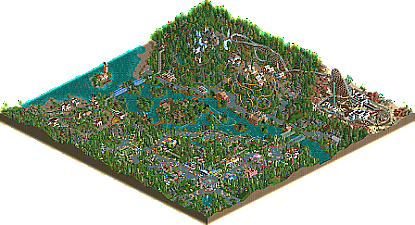
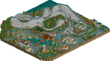
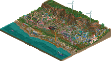
This is really nice, as usual, feels very 2002. I'm glad you've done a bigger map again; ideally you'd make it even bigger, with more distinct areas and more ambitious rides. Not so much that it doesn't feel like Lurker anymore, but I think there's potential there.
While the park feels old school I think this is also a nice subtle showcase of new OpenRCT features. The two largest coasters being custom is an obvious one, but also using the expanded colour palette, and also the 'invisible' colour. The light pink carousel is great, I didn't know I wanted light pink in the game.
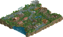
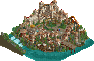
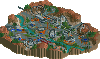
The tropical area is probably the best looking area of the bunch, but I also like the mountain village and the white archy of the desert town. Again, would've been nice of you expanded both of these areas.
And now for the most important question... is it NCSO?
Awesome park! It has a very fun atmosphere everywhere and some really solid coaster layouts. Both RMCs were really well-done and highlights in the coaster department, as well as that little launch coaster that interacted with the guest path. I think my biggest complaints come from the foliage and architecture. The foliage just felt like filler and was, at times, a bit too dense. And the architecture felt like the usual NCSO square buildings. Both could've used some places where you took more risks, like that partly snow-covered mountain (great use of terrain to accentuate the coaster experience. Anyway, nice job, congrats on a great park!
^I would say it counts as ncso. But since it uses some of the newer features, then maybe it's ncsopen. Someone used that term on Discord, and I like it.
Really cool park showcasing a mesh between a more classic RCT2 style and the new features brought with open. But regardless of semantics the vibe feels very ncso and true heartfelt RCT. The pirate area with Palmtree Panic is probably my favorite. I think the architecture is so clean and it really captures the RCT I fell in love with. The shapes feel like Loopy, the ncso wall pieces and accents, and then a nice mix of the new colors, especially those shutter windows! And the layout itself is great, the juxtaposition of that spike is so satisfying. And a mini golf course to vouch, always love those.
The composition of your alpine coaster is really great. I like the concept of traveler and that area it covers as sort of one piece. It's kind of unorthodox for an out and back coaster to actually go out into a completely different landscape and I think it offers a really cool, dynamic ride experience.
Congrats on the full size solo Lurker! I always love seeing your work and the joy it brings.