Park / The Wizarding World of Harry Potter
-
 29-May 23
- Views 4,688
- Downloads 465
- Fans 7
- Comments 20
-
-
 84.50%(required: 70%)
 Gold
Gold

In:Cities 90% yes SSSammy 90% yes bigshootergill 85% no CoasterCreator9 85% no posix 85% no RWE 85% yes Terry Inferno 85% yes wheres_walto 85% no Xtreme97 85% no G Force 80% no ottersalad 80% no Scoop 80% yes 84.50% 41.67% -
 Description
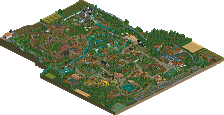
Welcome to The Wizarding World of Harry Potter, a park built and owned by Warner Bros. Built next to a zoo (bought by the WB and completely restored) and a dedicated entertainment area. The park is part of a large investment programme and intends to seriously challenge Disneyland. Like its direct rival, it’s a family park focusing on immersion.
Adult ticket (1 day): 70€.
Children's ticket (1 day) : €50
Adult pass (Zoo and park) : 90€.
Child pass (Zoo and park) : 65€.
Parking (day): 10€.
Where to sleep?
Camping **** des Quatre Maisons
B&B ** "Le Cul-Sourcier"
The park was built on the site of "Cul-Sourcier", a hamlet in the countryside north of Paris. There’s still the Simonnet farm (still in activity) to the south-west of the park, which is holding out against Warner Bros to avoid expropriation of the land.
The park is divided into 3 zones built around the central castle: The Magical London, Hogsmeade and a zone dedicated to the villain. -
7 fans
 Fans of this park
-
 Full-Size Map
-
 Download Park
465
-
 Objects
1
-
 Tags
Tags
![park_2455 [H2H6] SF - Hurricanes - Rowling Versus Tolkien](https://www.nedesigns.com/uploads/parks/2455/aerialt2205.png)
![park_2400 [H2H6] R3 - Flying Germans - The Adventures of Harry Potter](https://www.nedesigns.com/uploads/parks/2400/aerialt2142.png)
This is rather incredible, possibly your best theme park work yet.
Absolutely fantastic, though I'd expect no less given the detail and creativity of your past work. I think my favorite area might be where the pumpkin carousel is, but there's so much to unpack and enjoy here.
Going to repost what I said in the NE Discord:
"i think this park is the one right before he actually hits it big
the level in quality is definitely not consistent throughout and the stuff I'd presume he built was far better
the big issue is of course composition; i think he detail work is basically already there if he cleans it up
my advice to him is that this next time, slow down. he's got the skill now to really put something great together. he should switch his priorities into refining and finishing a consistently-great project to its completion"
"I certainly disagree with the community score; i see this as cusping-parkmaker level and i'd probably go with 80."
I'm a huge fan of this, its a big enough hit for me. I think the rides were super creative, loved the Askaban and Slytherin ones. I would love to visit this park in real life. I would not have been able to tell this was built quickly, so if that is the pace you enjoy building at keep it up. I wish the castle was a bit bigger and more dominating of the skyline, but its still awesome. The detail work is there, or a less cold way to say it might be the details in this park are awesome. So many fun things to find for a harry potter fan. As a member of the community I put the score at 90, I hope you get that shiny gold star. If this isn't it, I dont know what you have to do to break the "cusp" of parkmaker and be legit.
Fantastic and charming stuff, Readability is pretty good to me, with overall planning balanced well with the micro-detailed scenes. I also really like the zoo next to the park, a there a lot of nicely done exhibits there and it adds to the overall map.
Also, I'm impressed with the fact that there's almost no glitching or flickering even in hardware mode, that impressed me especially with how quickly this was built.
Man, this park blew me away. This park is full with details and full of atmosphere. As someone who has read the books and movies, it also felt super recognazible and a little nostalgia throwback to my childhood/young adulthood.
Stuff I really liked:
- Hogwarts epxress train station
- the Pumpking carroussel and the buildings around it, such a great backdrop and so atmospheric
- that ship, crazy!
- The Chamber of secrets, the station and queue
- the outskirts/zoo had some great buildings
If I have to give one point of criticism, it's that the Charles Weasly coaster feels a bit weirdly placed. Bit outside of the park, I missed it on my first round of viewing the park. Other than that, really love the park. The coasters are pretty small but that's a very realistic choice to go for since the HP franchise is more aimed at kids and young adults than thrillseekers. They also allow for more immersive experiences, which is what a HP fan would appreciate more than a big ass beemer.
For me, spotlight quality. Mes félications!
What a fascinating park. It has all identity of a Babar creation: excellent theming, immersive environments, fearless execution of ideas above all else. I do agree with some comments that the composition, ride design, and inconsistent quality in spots, but what comes through most is your sense of fun and endless imagination.
85 was the easy part of the vote for me, I think it's plenty good and has enough scale to be considered a Spotlight contender. Voting no was more difficult, in the end I think to clear that bar it needed some combination of: Hogwarts interiors, at least one large feature coaster, more time/explanation/advertising to process the strangeness of a theme park next to an existing zoo (that decision is endlessly fascinating), and more time devoted to polish and pushing boundaries.
I think your micro work may be playing against you here: the Alchemists Guild showed truly wonderful interior design, Captain and Exodus were conceptually more abstract and imaginative and thus more captivating. By comparison, this feels more conventional both in terms of genre (themed realism) and style (it feels a bit autopilot). I kept coming back to the zoo as the thing that made this park stand out in a meaningful way. Maybe I'm playing too much of a gatekeeper here, but I wanted just a little more to get that Spotlight distinction. That being said, this is pretty clearly your best large scale work and you're beyond deserving of Parkmaker at this point. I'm really happy to see you continue to build
What an absolutly amazing park you made Babar. The fact that you build this in 2-3 months with such level of detail is mind blowing to me. I love all the little scene´s you recreated from the books/movies and you added so much character to these scene's that they really feel like they come alive.
Im also glad that there are no big flashy rides in this park, it would have killed some of the atmospehere in these scene's.
Its clear to see that you created this park out of love for the HP franchise so good for you that you managed to finish this without getting bored or trying to rush things
I hope you get that Spotlight you so desperetly deserve man! congratz on the release.
I think if I had to pick one thing to love about this - the attention to detail and dedication toward the source material is really phenomenal - but I love the little shows dotted around the park. I think that's a great touch of life and atmosphere that elevates this for me. The park as a whole is a bit of a sea of brown, but I think that's just part of your aesthetic - I try not to make too much commentary on color, as it's more subjective than it may seem considering those who are colorblind and just personal color combination preferences - but it's always something I tend to notice.
I think this is a reasonable contender for Spotlight. I could see it go either way; kinda dances the line for me personally! The park is certainly not perfection incarnate, but what's there is great stuff. Certainly Parkmaker level if not Spotlight.
This is an amazing park, that has me really torn honestly. I think it could easily be a spotlight, but there's a couple of little things that just come up a little short.
On the positive side, SO much to see - everything feels new and different from everything else, lots of really recognizable stuff. You've done some really clever things with objects to tell the story of what we're looking at, and it's 99% awesome.
Hogwarts is incredible - my only gripe (this is a preview of pretty much my only gripe with the whole park) is that it's so much of the same brown color on a background of the same brown color. Makes it quite difficult to focus on what's going on.
And honestly, that's pretty much my only overall negative point - from a color perspective, and also from a density perspective, it's the same throughout. That dull brown color is everywhere - buildings, paths, foliage, rooves, coasters... it makes some really cool things just bleed into each other. Not easy on the eyes. And composition-wise, I think the park has the same problem. The foliage is DENSE. It makes the park feel "full up" and packed.
If you can make a park of this quality but with some negative space to let the amazing things breathe, and maybe some splashes of color to make the important bits stand out, then you'll be SMASHING it. So much of this I love, I just wish it was framed a little nicer.
Babar, very impressive, I do enjoy the Harry Potter films so this was really fun to look through. The Zoo was also well very done from construction level, although I do sorta question the combination of the two, no big deal. Generally the archy is a massive highlight, you really have a nack for building in a way that is very interesting but not needing a lot of detail. Atmosphere is top notch, I could really feel like I was there which maybe is the best comment I can give on a park in RCT.
There were a few things from more of a technical level that bothered me, and perhaps it ultimately lowers my score for the park a little, I'll try to summarize them quickly.
1) With a park like this that has lots of stage shows, exhibits, indoor attractions, and themed set pieces, identification is critical for a viewer. Many times I felt myself trying to mouse over things to help me identify specifically what each show/stage/exhibit was for, generally I enjoy when this is fleshed out and clear to the viewer. Really missed your usual map/readme here, I felt it would have elevated this tremendously and probably fixed this problem entirely.
2) Foliage/Object selection; yeah this is probably more of a personal taste thing, but I wasn't into the foliage. It works okay, but a lot of bad objects kind of bring things down, generally I think we have many better options for a lot of this stuff so that's kind of what gets me most, but again, this is a big preference things so don't expect to please everyone here. Ultimately you were consistent which is most important.
3) Tracked rides; yeah I seem to notice a trend here, these aren't your favorite things. Most of these were just good enough to where it didn't come out as a big negative, but amongst everything else, they stood out. The dragon coaster especially felt like a bit of an afterthought to me, not my favorite work of yours there.
So yeah, not sure I'll get a vote in time, or decide on one in general, but a very strong park, your best yet. I love seeing the development of your style, every park thus far has felt quite cohesive yet you're definitely improving. Regardless of the outcome here I hope you'll keep giving us more.
First, congrats on another massive park Babar. Really envious of your output and how much thought and care goes in to your parkmaking. Big Harry Potter fan, so a lot of the little references and moments I loved. As always you have really cool sculptures and moments scattered throughout that are quite fun. For example, the green cauldron food stand, the big ship infront of I'm guessing a stage show, Quidditch pitch to name a few. Diagon Alley was neat. Overall the architecture was splendid.
In terms of the zoo, really appreciate the zoo, but it felt lifeless. The forms, structures, architecture were all very modern and creative. The giraffe signage in a few places was really cute. Just needed music, some invisible rides, or something to add more life. One other thing that held the zoo back was the brown. The entire zoo was brown. Makes every exhibit/building blend together and lose their identity.
I agree with some of the comments by G Force. I too was mousing over a lot of parts of the park to see if I could find out what a static scene was. What are the stage shows? There also doesn't appear to be any actual food stalls in the park? Had a hard time identifying specific things in the park and zoo.
Also, I think the rides in this park hold it back. You have tracked rides, but they don't hold my attention and if anything, they detract. The rapids ride was half wooden coaster track, and the Hagrid's motor bike coaster is IMO a boring out and back. The Charles Weasley coaster was squeezed up against the map edge and sort of off in the corner and hidden from the rest of the park. And then the quidditch simulator was nowhere near the Quidditch pitch. Confused on that design choice.
But anyways, sorry for the negative comments. I think I wanted to share my thought process. You have an incredible skill for creating immersive environments that peeps can walk through and enjoy. We just need to pair you with someone who gives you layouts and you'll be cranking out 95%-100% spotlights.
congratulations you beautiful boy
I think that if you collaborated with other users to raise your coaster-building game, your next park is guaranteed to be a spotlight.
I'm sure there are dozens of talented coaster builders queueing up to help you with coasters (myself included)
Congratulations Babar! Love it all around. My favourite part is the Logan Patronus.
holy cow this is impressive. so much to love here, i was not expecting an entire zoo with the incredibly nostalgic zoo tycoon theme music though hahaha. hogsmeade was by far my favorite area, you really nailed the atmosphere and composure there imo
This was absolutely fantastic. Excellent work!
KingLizard Offline
The park wont open for me, something about RMCT2 cant be found?