Park / Frightmare Hills but beautiful
-
 04-August 23
- Views 1,925
- Downloads 267
- Fans 0
- Comments 10
-
 61.00%(required: 60%)
 Silver

CoasterCreator9 70% G Force 70% bigshootergill 65% Jaguar 65% In:Cities 60% ottersalad 60% posix 60% Terry Inferno 60% Xtreme97 60% chorkiel 55% RWE 55% Scoop 55% 61.00% -
 Description
Hello there, and welcome to Frightmare Hills.
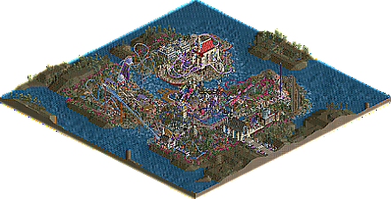
For the second DKMP Scenario Coaster Improvement Contest, we were tasked with taking a pre-built coaster, and improving it, as well as the park. I chose Frightmare Hills, and to improve its large inverted rollercoaster, Frightmare. I gave the ride more of a B&M style layout with large, sweeping drops, and smoother transitions. Of course, I wanted to retain some of the original layout, such as the iconic pair of large loops, the pre-lift section (which always fascinated me as a kid, and still does), and the pass by the waterfront.
There are many rides here, such as a GCI Woodie (Necromancer), a Vekoma Flying Dutchman (Flightmare), and a Vekoma Shockwave Launch coaster (Cathedralmare). Big shoutout to Herbart for his support work from his Timeline Stage 12 entry. I used it for my Mack Rides Hypercoaster, Skymare. And thank you everyone who inspired me from the first scenario coaster improvement contest 2 years ago.
This is a slightly revised version of my entry, which placed 3rd with a score of 8.70. I hope you all enjoy my park!
Ps. Please be sure to take a look inside the two cathedrals, as well as the haunted mansion ride! -
 No fans of this park
-
 Full-Size Map
-
 Download Park
267
-
 Objects
2
-
 Tags
Tags


V1 Review #1
Let me preface this by saying that I'm not that knowledgeable about the DKMP style, so my opinion could come across as weird or unfitting.
V1 Seal of Approval:
+ Very cool entrance building
+ Great Ferris Wheel
+ I like the layout of Necromancer
+ Cool layout on Skymare (although the realist in me says it would be hell to ride standing up)
+ Area around Cathedralmare is great, including the station, the round paths and the coaster.
+ Dr. Nitro Brio's Lab is fantastic
V1 List of Neutrality:
+/- Some of the stations are a bit bland, architecturally
+/- Probably too many coasters?
V1 Scowl of Disapproval:
- Foliage and ground textures outside the park extremely bare and plain.
- Not a big fan of the castle for Necromancer
- Park maybe a bit too dense and messy for my taste
- Not a fan of a motion simulator being out in the open in this kind of park, does not help the horror atmosphere.
- I think using default entrances is okay, but maybe it was done a bit too much in this park.
- Not a fan of Frightmare's layout. The double loops are visually interesting, but I don't think they fit the flow. (Since it's part of the contest, not much to do about it but yeah, it's still part of the park).
V1's Opinion:
All in all, I think this is a really solid submission. There is definitely creativity and skill apparent. I do think, however, that both of those qualities could be put to better use overall. Overall the park is somewhat inconsistent for me but I still think it warrants a silver accolade.
60%
Quite a busy style here, sometimes hard to read but a lot of fun to explore and I like the atmosphere . Cathedralmare is probably my favorite layout, Necromancer is pretty fun too, overall a lot of fun interaction moments and I like the switchback railway.
I think potentially having too many coasters might have hindered this map in the contest, with the main coaster included in the base scenario almost seeming like a footnote. That being said, there were a few really fun coasters in here, especially the scenic railway and the cathedral coaster. You certainly were wearing your influences on your sleeve in this one.
I'm sure you'd probably do some things differently if you were to build it now, but having this one on the resume is certainly nothing to scoff at, and i'm sure you'll look back on this one fondly as time goes by.
Version1, on 05 Aug 2023 - 07:22 AM, said:
Thank you Version1 for the thorough and constructive feedback! I love your review format and agree with your criticisms, especially the vanilla foliage and landscape outside the park boundaries.
Lurker, on 06 Aug 2023 - 03:20 AM, said:
Thank you Lurker! This was certainly a fun project to work on, and I agree, Cathedralmere is my favorite coaster of the lot
94SupremePosse, on 08 Aug 2023 - 3:47 PM, said:
Thank you 94 for your feedback as well! I was thinking the same thing, the approaches I would have done differently. Of all the competitions I've been apart of, this is easily a top contender for the pure fun and nostalgic factors.
This park is full of enthusiasm, and it's infectious. You've written so many encouraging and helpful reviews on my work that I'm going to go deep on this.
Positives
1) Big-time wow factor upon opening the park. The scope is incredible for a one-month build.
2) The station to My Little Demon has an interesting and pleasant shape and lots of nice textures. Great building.
3) The rockwork throughout the map is tremendous. Big fan of the jagged landscape and how you inserted rocks throughout.
4) The fencing is phenomenal and follows the paths nicely.
5) I love the catwalk walls. I am a sucker for a nice canal.
6) The center of the park is rewarding to explore with so many buildings.
7) The Skiffa ferris wheel looks great.
9) I like the layouts for Necromancer and Flightmare a lot. I also love the Flightmare station.
10) Love the scenic railway and the platform alongside it.
Neutral
1) The entry church is an eye catcher but there are some things I would have changed. I would have made the entry way bigger rather than just using the base door pieces, maybe with the arches from the future set. I also wouldn't have used the dark ages corners with this building, as I don't think they match too well with the rest of the textures.
2) The foliage is solid, but I think you could have varied the heights of the trees more. Could have maybe had more dense clumps and more clearings as well.
3) The ferris wheel at the entrance of the park looks fine for that style of custom wheel, but I've never been a big fan of them personally.
4) Agreed with v1 that not hiding the entrances and exits was noticeable. Not sure how I feel about it, I generally like hiding them myself, but it's not necessarily bad not to.
5) Frightmare layout is OK, I like the interactions, but the number of curved drops feels excessive. Spreading it out a little would have been a good idea, I think.
6) Nice layout on My Little Demon, but too many trains on the track at once.
7) Your new-gen Vekoma is well-placed and has neat interactions. It has some tight pullouts though.
Negatives
1) I remember thinking this when I voted, and I still think this, that the Mack hyper layout is the biggest weakness in the park. To me it's just too boxy, sort of almost flag shaped with a long, thin out and back section followed by a square of track.
2) Not a fan of the station of Necromancer. The big castle piece feels out of place, I don't feel like the colors match the rest of the park well, and it feels too boxy to me.
3) The stone arches are interesting but I think the stones would have been better used as an accent for a land bridge. It looks a little gravity defying as is.
4) It would be nice to see you do something more interesting with the port area with the three paths sticking out over the water. It's the only area that feels unfinished to me.
Verdict
A solid park that is more than the sum of its parts. I gave it a 70. Great work!
the_bru, on 09 Aug 2023 - 02:22 AM, said:
Thank you the_bru for your incredible review man! You definitely pointed out a lot of stuff I didn't realize prior (especially the details with the opening cathedral), and it's all gonna help me up my game.
Given that the post body on NE5 is so narrow, maybe we don't always have to quote entire big posts again
As you know I enjoyed this park. I think as others have said it has a quirkiness in its design that I find daring and refreshing. Stylistically and compositionally there is clear improvement potential, but typically the players who do not conform to any perceived community "meta" are those who enjoy playing more, and thus also improve quicker.
I'd love to see it in your case Bluetiful!
Any plans for future projects?
posix, on 11 Aug 2023 - 11:51 AM, said:
Yes, sorry! I just fixed my replies
And I do have future plans. I have some concepts that I was working on for a few of DK's contests, but it would be nice to explore them more in a full-fledged park, or as a design with CSO (it'll be a learning curve). I really appreciate your feedback, thank you!
Only just managed to check this out but I want to say that I'm enjoying the colours here, and the wacky architecture around Frightmare's station is great. Wish we had more of that, and less of the other stuff. It's a bit incohesive. Some of the other stuff is cool too (entrance building, switchback coaster), among some less successful stuff (Killing Moon building). I think in general, less is more. Expand on the good ideas, leave out the rest.
Liampie, on 31 Aug 2023 - 12:15 AM, said:
Thank you Liampie for the feedback, I appreciate you taking a look at things! I'm looking forward to building my strengths as time goes on.