Park / Sensory Overload
-
 07-May 23
- Views 1,157
- Downloads 330
- Fans 0
- Comments 6
-
 Description
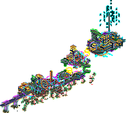
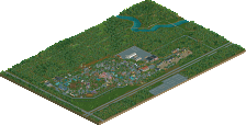
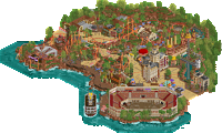
This is an entry I made for DKMP's narrow coaster contest. The coaster could not be more than 8 tiles wide, and the park could not be more than 20 tiles wide.
Due to the restrictions this park has an odd shape and layout, but I had a ton of fun playing around with this theme.
I'm quite happy with the end result, and I plan to re-use this theme for a full scale park without any restrictions.
I hope you enjoy watching this coaster go around as much as I enjoyed building it! -
 No fans of this park
-
 Download Park
330
-
 Objects
1
-
 Tags
Tags
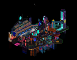
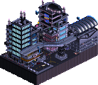
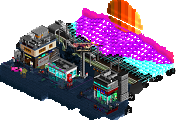
This was so much fun to look through, a great take on the cyberpunk theme and some nice trackitecture throughout, Love the colors too. A full park like this is something I'd love to see.
Considering the width limitations of the contest, this layout is incredibly flow-y and fun to watch. Elegant transitions and mixtures of elements. The vibrant, electric park style seals the deal.
Interesting park, which after MM23 probably feels a little less impressive than it would have otherwise. In places I felt you tried almost too hard to make it funky. I think you could try to relax your style a little, and focus more on refinements. I know you're still very much in an experimentation phase though.
I think if this is a design submission, its definitely 65+. The coaster itself has some really great moments with the jumps and the overall flow. I agree that it is very vibrant. There's some unique objects here that I haven't seen in awhile (wwtt). Not sure the trees/foliage was necessary. I think going full cyberpunk/futuristic would've been neat with hologram trees/scenery or more alien looking trees.
This is unique; I didn't realize there was a single interconnected coaster at first. Despite being a horrendous aerial to create; it's a fun take on the theme and the aesthetic style!
Great aesthetic and the support work here was a revelation, I hope you'll continue to expand into more CSO because I found the contrast between track and boxy construction a bit jarring