Park / La Belle Époque
-
 19-March 23
- Views 3,427
- Downloads 367
- Fans 1
- Comments 17
-

-
 78.00%(required: 70%)
 Gold
Gold

chorkiel 80% CoasterCreator9 80% Jaguar 80% RWE 80% Terry Inferno 80% wheres_walto 80% Xtreme97 80% G Force 75% In:Cities 75% ottersalad 75% WhosLeon 75% Scoop 65% 78.00% -
 Description
For all the romantics of NE.
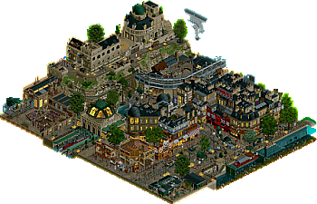
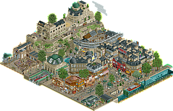
A small park inspired by the Paris of the French Impressionists. Available in two versions: night and day (open the night version first). -
1 fan
 Fans of this park
-
 Full-Size Map 1
-
 Download Park
367
-
 Objects
1
-
 Tags
Tags
![park_3338 [H2H7 R2] World's Fair](https://www.nedesigns.com/uploads/parks/3338/aerialt3037.png)
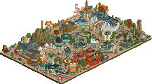
This is wildly atmospheric; the nighttime version with the lighting effects and the "snow" object utilized as rain splashing on the surfaces is a fantastic effect. You're beginning to remind me of a French robbie92, and I mean that with the utmost of respect.
The clouds don't quite do it for me, but the atmosphere, especially in the rainy/night version, just oozes out of the map.
I thought it would be neat if there were more peeps out and about in the daytime version, or just generally more stuff going on. Maybe different music too? Anyway I definitely prefer the nighttime version.
One thing I'll say is the notices about missing entrance and exit do take away from the atmosphere somewhat, easy stuff to fix for an extra bit of polish.
Man, you're quickly becoming one of the best players of this game in my opinion. Seriously impressive work. Seemingly endless creativity, content, and productivity. You're a h2h team all in one.
I usually play with weather effects off, but I had to turn them on just for the rainy version. That's how good of an atmosphere you crafted here.
I opened them in the wrong order at first (whoops!), but I do think I made the right choice in the end, as I feel like the daytime version gives off that calmness perfectly, but ends up being a little underwhelming as a result. In comparison, the nighttime version is just stellar. Like CC9 has mentioned before me, the palette plus the lighting effects make it all feel real, and more than just a diorama (and it's probably the thing most sorely lacking in this park's sister release, but that's neither here nor there).
As for the scene itself, it's just amazing. Nothing feels out of place, and every single object looks like it's there for a reason. The music choice wraps everything up - a classic, although I do think that something slightly more upbeat could have been used for the night map. At the end of the day, that's a stylistic choice and it's entirely up to you, though. As a final thought: I have to disagree with Ling here, I love the clouds!
Anyway, that's it from me. Congrats on a stunning release that I'm pretty sure no one saw coming haha. In any case, I've done my part, you're contractually obligated to review my release now!
This release is, to me, the very definition of picturesque. It's such a tranquil, beautiful scene - I just had to sit there and watch for a while. The architecture is stellar, the detailing is on point, I really can't praise this enough. It's crazy how much you've improved since the first couple parks I've seen from you.
This is so cute, like almost impressionist RCT! I think all the details and shapes work really well. this is my favorite release if yours! glad i turned the music on! I love all the layers in the park, super fun shape. the train parts at the bottom are my favorite. The rock work is nice af! with all the MOSS!! i do wish the dark and rainy one was WAY darker! it was too cute!
love seeing all your content! come to the club!
Such amazing work with micro-detailing to make this map so lively and atmospheric, the amount of content to explore in a smaller map like this is so impressive.
Also, wow your productivity, the idea that you can produce so many maps at this level of quality is astounding.
Another impressive park from you in such a short time-span. It amazes me how you achieve to be so productive on this level. I agree with others that the night/rain version oozes atmosphere. Love the choice of music to complement it. I think the traveling fairrides are the highlight. Extremely tastefully done. You have such a gift for finding these quirky objects and making something great out of them. I agree with Ling on the clouds. They stand out in a bad way. The only other nitpick I have is that I hoped you explored the day/night concept a little more and changed some more of the little scenes between the different versions. Looking forward to see what you're building next.
This was beautiful, but also too micro almost. I know that's your style, but I think you need to change things up a bit sometimes and build something different. But that aside, it was an ever impressive showing of your skill to articulate something with such fervour and dedication. The map for me was a bit too small to unlock a bit more potential, especially when combined with this maximalist kind of approach. As thus I really don't know what to rate this park.
Wow, this is great. Belle Epoque is a genre that I wish was explored more in RCT. Quite lovely what you've done here. I think I share the same sentiment as others as it could've bigger, more life perhaps? I only say that because of giving it a Spotlight score. That's where the struggle comes in. Minor issue though in the grand scheme of things.
Overall this was very cozy and fun to comb through. I think the architecture on display here will be referenced by others for quite some time.
Congrats on the gold Babar! Number 8 in less than three years time. Really impressive.
You've been producing high quality work since your impressive introduction just 18 months ago, and yet you still manage to improve your skills noticeably with each release. 6 solo Gold wins in a year and a half is unheard of, and I believe that, with each of them, you have honed a particular skill within the game that has made this map as smooth and cohesive as it is now. You had architecture and solid composition in previous releases, just as you had micro-detailing in place since the beginning, but I consider this to be your first release where everything on the map comes together perfectly.
It is difficult not to draw comparisons to Le Coeur du Ciel here, the gold standard of Parisian architecture in RCT2. The architecture in particular is in that tier, and the care with which you've constructed it shows the deep understanding and respect you have for the city and its rich history. I also love seeing the big ground clock put to good use!
A couple choices could have taken this slightly further, such as keeping the rocks a different color from the buildings to allow both to pop a bit more or doing the same with the paths, but these sorts of things do not detract from the experience in this case.
I would have given this 80 even with only a single version of the map, preferably the night version since it brings out the atmosphere better between the two... those yellow windows against the darker construction really help set the scene. For a vignette this size of a photorealistic city scene with no roller coasters and only a moderate amount of interactive elements, this map is about as good as it gets.
But yes, we do all want to see something like this on a larger scale. I know roller coasters aren't always your favorite to build, so perhaps an urban setting like this on a larger map (over 100x100) with more immersion, interaction, and moving parts could be the map that finally breaks the big eight-0.
Finally got around to checking this out and I really enjoyed the experience. I use experience as the term here, as it felt like real life vs strolling through a theme park.
Funnily enough daytime was my favourite view but I opened this first. I did love the bright yellow lights and the rain splashing on the floor but maybe this would've been my favourite if I opened this first, as the two versions weren't wildly different from each other.
The architecture was really well done, a lot of beige for me... I'm currently doing a Parisian theme I understand why that is. Some orientations of buildings were quite similar because of the leading colour throughout the map that was even used in the landscaping as well.
With that said, the small touches like the vegetable market, the Parisian show (really well done) and the injection of life in the rides and clouds, led to a really amazing release. I feel this is your best yet, because it was super polished, bursting with atmosphere.
I'd give this an 80% and a No for spotlight just because I feel it's very small for such a prestigious award but things I'd change to create a bigger impact...
+ Stick to one version of the park, the rain version would be the preferred for the vibe you were trying to set.
+ Mix up the colour palettes so the buildings don't blend into the architecture
+ More moving peeps to help the frozen peeps across the map
+ Better execution of the clouds
Like someone mentioned above, you're very rapidly becoming one of the greats of the game, and you really haven't been around that long. I enjoy every release from you and if you keep at this level and pace, you'll be hitting spotlight in no time.
Thanks to all for your feedback that I always read with attention! The positive and negative reviews are very relevant here and I'm surprised by the score, I had applied for a design accolade at the beginning.
As often for my projects, it's the desire to dig a theme or a technique that gives me the inspiration and motivation, here we find my favorite themes which are history and architecture (and details of course). I'm also aware that I've reached the end of a cycle and that it's time to propose something else, especially in terms of attractions or ambition !
It is absolutely terrifying how good you are and how fast you can build this level. Insane. While the map isn't that big, it is full of little details and micro detailed architecture. One thing I didn't really like were the moving clouds, didn't do much to me as they seemed more like massive objects than clouds.
This little map is full of atmosphere. Have to say I prefer the rainy day version, it's almost real life like atmosphere. Makes me want to go to Paris.
Babar, I'm sorry if I missed to let you know that I'd changed the submission category from Design to Spotlight. We all agreed in the admin chat that this was not suitable as a Design submission. If you'd like more details lets chat on discord.
I didn't get around to checking this out before, but I've been missing out. This is so beautiful and moody. The rain splashing on the roofs... It fills me with false nostalgia.