Park / Dinotopia
-
 07-June 09
- Views 48,908
- Downloads 1,083
- Fans 0
- Comments 119
-
 65.50%(required: 60%)
 Silver

Xtreme97 75% chorkiel 70% In:Cities 70% RWE 70% CoasterCreator9 65% posix 65% robbie92 65% saxman1089 65% Scoop 65% Liampie 60% nin 60% geewhzz 50% 65.50% -
 No fans of this park
-
 Full-Size Map
-
 Download Park
1,083
-
 Objects
418
-
 Tags
Tags

![park_3229 [MM2014 Final] Cavumus](https://www.nedesigns.com/uploads/parks/3229/aerialt2949.png)
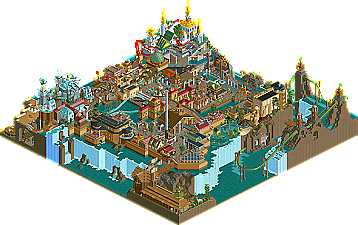
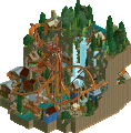
Anyway, I loved that book when I was little. I read it cover to cover and even read some of the other Dinotopia-based story books that came out. To be fair to the Canes, this one was hard to recreate. As somebody who is familliar with all this, I had imagined it all to a level of grandeur that RCT is barely even capable of. I liked the park enough, though. I thought the hatchery was cool, as was the whole town area where the dinosaurs were "walking" around the streets. The Pangea globe was a nice touch, but I seem to remember it being a lot more impressive in the book. I think there was even a whole illustration devoted to the inner-workings of Waterfall City. Whatever...that would have been a pain in the ass I imagine. One thing that would have been really neat is if you guys would have included Treetown. Hell, you could basically make a whole park off that. Either way, it's evident the parkmakers here did know a good deal about what they were doing. Nice park guys.
EDIT:
http://www.dinotopia...ia-history.html
This may be helpful
Edited by zburns999, 08 June 2009 - 10:32 AM.
dinotopia, the archy was great, but the rides were very lacking indeed.
belmont, brilliant everything. jeez. first SWS then this?
agreed the invert in dinotopia is up there with worst coasters of all time
I had the same problem.
Edited by Turbin3, 08 June 2009 - 11:55 AM.
-JDP
Nice park, but nothing stunning. Average...
+ Theme
+ Most architecture
+ Cave
+ Dinosaur objects
- Coasters
- Landscaping (especially the waterfalls, they didn't look good IMO)
- Some architecture
- Detailling. while every building was very detailed, there was nothing special; no signature details.
This sounds more negative than I actually am. I just can't find many good things to highlight...
Rating: 12/20
Whzz Kids
Wow.
+ Pulling off a cliche theme in a new exciting way
+ Screamin' Swing (wow)
+ Shore (both the beach and the rocks, wow)
+ Overall atmosphere (extremely real)
+ Amount of details without making the park look too busy
+ Shops
+ Roads
+ Flow
+ Working hammergamething
- Some objects (trees)
- Go karts
- There's just too little of this stuff!
Just wow, this has to be one of the best realism parks ever made. The whole atmosphere and the music really made it a feelgood-park, which I really like. Wow. You've got my vote. Wow...
Rating: 19/20
BTW, before some Elementalists are starting to complain, in general I appreciate fantasy as much as realism. I didn't prefer a realism park over a fantasy park here, I prefer an extremely good park over an in my opinion average park.
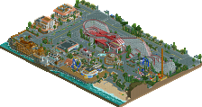
But what sticks out to me from the overview is the great detail!! I love the stores and the restaurant. The woodie looks great and the streets with the cars are amazing too! Rent-a-bike is a stunning idea aswell.
Not to say anything bad though because I like the way the competition is set up but this is definately one of the bad parts about letting vote percentage decide which park is better. Everybody knows who is going to win this matchup but I have to say that our park is really great in my opinion aswell. There are a lot of beautiful details and I love the whole concept. I think if it'd have been up against other parks it would most likely have won since it is something different and in my opinion nicely done.
This is very unfortunate for us because I think if you look at the overall quality of our team's parks we have achieved great things so far and this matchup might throw us back really far.
But as I said before, amazing park by the Whzz Kids and I hope to see more of this stuff from you (but only after the competition is over please ;] ).
By far my favorite park of this season, Whzz Kids.
Dinotopia could have been even more epic if it used a larger map. Its coasters were ass.
Belmont, barring some open spots that could easily have a custom stand or something in them, was perfect. So many original hacks, too.
I found this park great. Not awesome or amazing or out of this world, but it really was a nice park. I don't really see what makes the park so fantastic for other people but i'm happy to accept that some people really do find it that way. To me, it's just another well executed realistic park.
The little touches here and there were really nice, the hammer game, the peeps riding bicycles. It all added up to make the park stand out a little bit more, without these there wouldnt have been a whole lot to look at and ultimately make the park a bit mediocre.
I found that whilst the roads were well done, they were a bit excessive, once you've seen one road done well, you dont need to see a whole bunch of others. I know it adds to the whole point of the park, that it's just a small road-side park with a classic woodie etc, but for me it took more away from the park than what it added.
Coaster design was great, park layout was great, ride selection was great, there just wasnt anything there that leapt out to me to make the park something special.
However clearly my opinion doesnt speak for anyone else as you are winning by quite a margin lol
Highlights:
-Woodie's Layout
-Guests riding Bicycles
-Volleyball Court
Dinotopia
I just felt that this park submerged in the theme better. It had some great architecture, lots more to see and whilst, like Belmont Shores, there was nothing really special, it was still a great park and one that I really enjoyed viewing.
The coasters were lacking and some really were just awful, but the overall theme made up for it and I really liked the custom Top Spin with the facade behind.
The park's concept and overall idea was really good, it's always nice to see a different theme being portrayed although some parts didnt really flow together all that well, like the Asian style area in the top corner but after reading the read-me it makes more sense, so a real good job you put that in there.
The ride interaction was really good too.
Highlights:
-Ride Interaction
-Park Theme/Concept
-The underground cave section with the eggs and nests - really great.
Overall
Overall I felt that both parks were great, solid entries, just for me Dinotopia edged Belmont Shore as it offered more to see and submerged me into the theme better. Vote went to Hurricanes.
Man, there's gotta be somethin'.
Let's see......Beta...no, Nokia...no, Liampie....no, well, he did say "lovely' but.....no, Micool......no, Levis.....ehhh, the "realism vs. fantasy" thing has been done to death already so...no, SF....no (and, there is a 2nd custom wav in the park), Micool again...nah, wasn't talking to me, AHA!!!!!!!!!!!!!!
Cena!!!! It's clearly not the Black Eyed Peas, it's Dick Dale - "Misirlou" which proves that you don't know what the fuck you're talking about!
There, now I feel better.