Park / Dinotopia
-
 07-June 09
- Views 51,609
- Downloads 1,172
- Fans 0
- Comments 119
-
 65.50%(required: 60%)
 Silver

Xtreme97 75% chorkiel 70% In:Cities 70% RWE 70% CoasterCreator9 65% posix 65% robbie92 65% saxman1089 65% Scoop 65% Liampie 60% nin 60% geewhzz 50% 65.50% -
 No fans of this park
-
 Full-Size Map
-
 Download Park
1,172
-
 Objects
418
-
 Tags
Tags
i give up.
ill mess with it later.
vote goes to whzzkids
I'll probably vote for the Whzz Kids, but I can't say that for sure of course.
Lovely match-up.
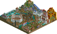
is this supposed to be Belmont Shores in Long Beach or what.
-Rent-a-bike
-Screamin' Swing
-Giant Dipper
-Parkings
-Big-O
While I loved these things I didn't get why there wasn't an entry fee at the Giant Dipper and other rides.. It's not supposed to be a park right, but more like some rides at the beach front? If you're making it uber realistic, those details annoy me.. I liked the custom1.wav, but I didn't get why there was a custom2.wav in the archive if you're not going to use it.. Anyway, great park and got my vote!
Dinotopia was good too, but Belmont just was better.. I liked some of the architecture, although I always hate those cjk roofs.. They just don't fit in rct imo and look ugly.. I hope these parkmakers will never use them again.. Overall it was too cramped; Only a couple of elements from the coasters were visible, and because of all the animated water scenery I experienced a lot of lag which all made the coasters hard to follow unfortunately.. The music file was weird; It didn't contribute to the atmosphere imo, which a music file should do.. Also thought the colors on the dino's was not looking good, what are they smoking?! I think only the original color look good on them.. Kudo's on the readme though, it was a nice read!
In the end though, it was just outmatched by the whzz kids park, but I enjoyed watching it so good job!
SF
no offense as this is the internet...
but I think you're fucking ridiculous.
+ Good Points:
* The Carroussel (A working Carroussel)
* The hack on the station of the woodie.
* The custom ferris wheel cars.
* The Coastline
* The custom music (I espiacially like the Black Eyed Peas music by the woodie).
* The architecture ... Just awesome.
* The Hammer game that is working ...
* The peeps that walk on normal path and on path that is raised 1 clearence ... Awesome ...
* All the details like the surfboards hanging on the outside of the buildings.
* The Realism factor, well, this scores the ultimate for realism, for sure ...
Bad Points:
Well none actually, ah well, okay one to mention, the file size, a fucking 22 MB ?
That is a lot ...
I also checked out Dinotopia, but the theme, well, I never liked Dinos.
So I couldn't get the feeling that the parkmakers of the park have.
Well, I am going to vote for Belmont Shores just because it attracts me more:P
Both parks are great, that for sure, I just don't like Dinos and that stuff.
Red River Delta had roofs that fit in rct2 in my opinion, those cjk roofs don't, as the tiles' lining is too dark which makes it too stand out.. If you want to use these more steep roofs I would use Magnus' steep roofs, they look waaay better.. that was the point I was trying to make.. If you think Red River Delta had worse roof objects than cjk's you have to check your eyes..
SF
Will comment later
Dinotopia also didn't shout out to me, the rides were pretty poor although the arch wasn't bad and had a nice continued theme. overall though it was just ok. Belmont shores just blew me away....
i had these continuous shake-your-head moments in disbelief of how someone can produce SUCH a park. apart from the convincing ultra-realistic style, the peep-functionality and all the things they could do just blew me away. there were people riding their bicycles?!? and the architecture of the "downtown" part was kinda beyond. you're trying to teach cp6 a lesson, and it's not like you didn't succeed ...
wow.
dinotopia, it was also great. i really did like it. it had cool moments, it was built with a lot of care to details and the landscaping and terrain height variations looked complex and very hard to build on. yet, you made it look easy. i believe this park would have won most any other match, judging from the avg park quality we've seen so far, but here, it was actually kinda outmatched. i'm really sorry guys because i would have liked to give you some recognition by voting for you, but it just has to be belmont for me here.
Belmont, This park is not real, it just can;t be. There was so much stuff in there that even CP6 wouldn't think of. The amount of realism in this park was astounding. The architecture at the bottom of the park near the pier, that restaurant's architecture was just phenominal, the out door eatery are with seats sitting over the ocean was an awesome idea. The hamer ride was awesome, i loved that idea too. The architecture on the side of the map selling body boards and surf boards was also incredible, the little details like the boards themselves really brang that area alive! I really really want to know what the hell that big black screamin' swing on the edge of the map underground was for. I know it had something to do with the blue SS but i don't know what. Someone explain please? The actuall SS itlsef was really good too, the themeing like the control booth was a great detail. Onto the woodie. What was the hack that you used to have some sort of an extended station entrace area for, why include that? Also how did you do that? The ride itself was awesome, great pacing, great supports, the station was immense and the whole layout of the ride was absolutly perfect for a park like this. The Big O got me thinking, you could of made it peepable by just having a station at the bottom and then one straight piece of track directly above it, or would that of just stuffed it up bad?. Another thing that i liked was the rocks at the bottom at the pier part, the time it would of taken to make the,m look the way they do, i don't even want to think about it. Also why have all the smoke and effects below water, what was that about? I also really liked the go-karts. But 9 circuits, thats way too long. Good use of the wooden track as track, nicely themed but the circuit number was too long. I also really want to know how n earth did you get the 1 height clearance path to connect up with the normal height clerance path?
Great work builders, i can't guess them nor do i have the slightest idea as to wh they are.
From me you a very rare 10/10, only 2 have been given out by me, Belmont Shores and WWAP.
Again great work to both teams but Belmont just blew Dinotopia out of the water!
Why???
Will post full review soon
'also really want to know how n earth did you get the 1 height clearance path to connect up with the normal height clerance path?'
Object manipulate path that is already joined together i.e place 3+ tiles of path in a line,if you raise the middle one by a quarter tile the peeps will raise up and then lower back down to normal height after.Once the path is raised a quater tile it will automatically build at that height aswell unlike with coasters
I'm astounded at the level of detail in both parks.
btw, where did you get those pictures in the readme? did you make them?
Belmont is a great park, but its not perfect. I'll start with the few negatives I found. The area between the carnival games and beach was just like a 30x25 area of path and trees. The go-karts look to be a little unfinished and I really like all the roads, just its like the whole park and id like to see more rides, we get it your good at making streets! lol, honestly tho this park is pretty kickass. I love the carnival games and ice cream shop in that little area, you should have expanded it imo. The little rides scatter around were nice like the surf boards and jet skies. Giant Dipper was nicely done, but so expected with this theme, no originality points there. 8.8/10 not quite perfect, but if you had more time who knows?
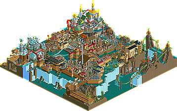
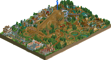
Dinotopia was really fun. Imo it is the best themed park this season trailing only Testament. What I liked best was the shops with all the dinos on the paths around them. The dino fountain was also really nice. I loved the entrance and the neat windmill. The rides were pretty good, tho none really struck me as amazing. The wild mouse and Intamins were the best imo with Chandara and the green one I cant spell not being that far behind. Also I think the styles of our parkmakers here worked really well together, same with Belmout tho. I just wish you guys had more time, the park is finished, just was a little rushed in the end and we nearly used the extension. I don't think it would have helped or matter tho, a realistic park like the Whzz Kids had will normally beat a really good fantasy park like this. 8/10 great work guys, keep your heads up.
Really tho things are not going the way I planned at all. I thought we might lose our first two matches or be in tight battles, yet we handle both without much trouble. Last week and this week I was so sure would be wins from the start of the season and it looks like both parks are going to have lost by way more votes then I think is fair. It all comes down to week 5 for us, we must win or lose by like 1 vote and have everything else pan out exactly how we want. After this round I will post what each team needs to make the playoffs.