Park / Belmont Shores
-
 07-June 09
- Views 51,948
- Downloads 2,148
- Fans 11
- Comments 119
-
 88.75%(required: 70%)
 Gold
Gold

5dave 95% no Maverix 95% no Airtime 90% no inthemanual 90% no Liampie 90% no Pacificoaster 90% no Stoksy 90% no FredD 85% no Coupon 80% no Ling 80% no 88.75% 0.00% -
11 fans
 Fans of this park
-
 Full-Size Map
-
 Download Park
2,148
-
 Objects
432
-
 Tags
Tags
Pros:
EVERYTHING!
Cons:
NOTHING!
K0NG - obvious.
disneyhland - not so obvious. I recognized small bits in his style, but I didn't expect him in a fantasy park. Also, I think he can do better (and more please
Fisch - I didn't suspect him at all.
Mifune - I suspected him, but didn't recognize anything for I'm not too familiar with his style.
I was pretty sure robbie92 was involved...
Robbie is better and has more quality, ... plus he won't build something like that
That's exactly what I think about disneyhland and Fisch, and half of what I think about Mifune.
All three players are people I deeply admire, and I adore their work in this park...
Yes disneylhand has built on a fantasy park but that makes him an even better parkmaker because he's branched out and tried a new style. Not all parks have to be realistic.
Mifune was our number 10 pick yet he upped his game to work with two incredible builders, which in my opinion is a win in itself as mifune was the main driving force for this park. He set the theme that the entire hurricane team wanted to build on it. We then selected the guys that would be an awesome team.
Fisch has produced his second park this season and another very good one. He may have one win and one loss but his work has been consistently good and is definitely a candidate fro MVP.
It seems to me the community is getting very sour about parks that don't meet Belmont's level of realism. Dinotopia and even Milo's and Micools park were fantastic visionary parks yet people bash them? I respect opinions yet when it comes to a general level of negative comments it just seems slightly wrong. What about the aspects that makes the park good? I’m certainly not hearing much of that for some of the losing parks these days. I haven’t seen any H2h parks this season which I couldn't stand well except for one. However the hurricanes have produced another decent park and lost fair and square. We already feel let down as we brought our A-game. Less salt in the wounds guys.
I'm ending my rant now but a year or so back Kayte ridge beat an amazing fantasy park and changed a lot of people’s views on the game. It has made the game stronger and I love realistic parks and everything they have to offer. Yet why do we have to repress the guys that don't want to build that style?
Edit with comments about Belmont.
I myself enjoyed the park. I appreciate the realistic details and such but I wasn't completely wowed by it all. The skill was apparent and you pulled everything off to perfection. I guess the reason I wasn't fully immersed in the park was the soul reason it was a pier park.
I love the pier boardwalk parks, I can relate to them because they are fun and have the quirky atmosphere that you nailed. Good choice on the music as it was so refreshing to hear that music in a park like this. The point I'm trying to make is I'd rather go to a theme park than a pier side park. I know your direction and as I've said the execution was perfect but it’s just my personal taste. I will happily expand on my view if you feel my comment needs some justification, just catch me on aim.
That said. The cycles were a glorious touch, not sure why but it reminded me of a Pokémon game on the DS because there was a city moving around what you created. That detail could have been the best idea this season. It seems so stupid just making a ride invisible so people can ride around a city is the best hack to me but if that’s the case, why hasn’t it been done before? I really appreciate this park for depth and that one single ride proved that all to me.
The coaster had a fantastic layout but that wasn't the main thing that grabbed me. A decent player can produce layouts like that. What makes you stand out from the crowd is you know what to do with every other aspect of the ride to make it pop and seem so memorable.
Let’s compare two of the greatest coasters this season. We have the Flying Germans coaster in Park Asterix which had a fantastic layout a guaranteed memorable layout. What made it stick out from the crowd was the surrounding theme; Quaint forest with energy and life, the supports; realistic and placed to perfection and the clever use of pace that made the ride seem more and more thrilling as it went round.
Your coaster while it wasn't as complex or long as the Germans had the other aspects that made it so memorable. You got the classic layout down, nailed it, what more could you do? Well in your case you built an awesome entrance. It wasn't just thrown together but I can tell you planned each block within that coaster boundary to boost your ride design even more. The pathway (with tunnel) through the ride for the guests to get through, the building near the end of the design added to the thrilling climax of the ride, the scenery around some of the turns just screams a boardwalk woody. Were others would fail to go this deep into ride design you've gone further and created such a memorable coaster. Without meaning to offend you if you can do this with a boardwalk coaster I think you could do this with any ride.
Ranting again, I'm hard to please but like my comment above this I wanted to add everything which is good about the park because it deserves it. While it was not my favourite park of all time it was one of the best h2h parks I have seen.
Congrats whzzkids at getting to the playoffs, you guys certainly deserve it, hope the canes could face you guys because we have some awesome stuff lined up.
I have an idea here Fisch. Why don't you take me more seriously than you already do? Then, my perceived 'arrogance' would really bother you. Although, I'm glad some of what I say actually has an effect on people or my posts would be fruitless. Funny thing is....I initially was on another team, yours. Now wouldn't THAT have been a kick in the ass? You could have had my arrogance thrust upon you on a daily basis. LOL...what if we were PAIRED together......you'd get all of my arrogance in IM's and beyond. I'd have given you....like....three squares to build on because I'm so fucking good that it would ruin the park if you had more. God only knows I gave Gee nightmares along the way. Because he really brought this park down when he started building shit.
And, I've said numerous times that everyone is entitled to their opinion. It's just that if it doesn't coincide with mine.....it's clearly wrong. Ya think people would get that by now.
Also....I did a little bit more than the restaurant. I let Gee place a couple of bushes (where I had dictated them to be) so he wouldn't feel all left out. I'm just pissed that I had to work with such an amateur during a contest like this.
K0NG, you're either my hero or my annoyance most of the time, but that post was fucking hilarious...
It would've been cool to work with you as well... However, since it led to Belmont, I'm okay with it...
Great job though! So much better than expected...
Haha, this post is really cool and I realized it had two good things about it.
1st it's hilarious, 2nd luckily you really weren't in my team.
edit:
Before I say anything else I just wanna finish with that statement(by the way, your post made me laugh haha, so for me it's all fine again). K0ngratulations to advancing to the plaoffs, guys.
Edited by Fisch, 13 June 2009 - 08:59 PM.
Ahhhh...I'm just kidding. I'm sure you have a plethora of women banging on your door.
Asking for the panties you stole from them to be returned.
Those things aint cheap.
And...wtf is a "plaoffs"?
Just asking.
And Robbie....any time.
Edited by K0NG, 13 June 2009 - 09:18 PM.
How I wish to see you losing the next round... and I don't mean your team, gee is a great captain, I presume. I mean you, just you. I really hope that you also see your hard work crushed by something else, but not just because of the sheer quality.. No... because of a fuckin' trend, for heaven's sake!
And cut the crap on Fisch, it's not his native language. As it's not mine, either.
---------------------------------------------------------------------
Thanks to my fellow builders for their lovely work and to everyone who voted for us on this one. The park was something really special for me, as my teammates might know!
Are you running out of jokes or why is everything you say so ridiculous?
Because of people like you there is a minimum age on this website but obviously it doesn't really help or otherwise you wouldn't be posting here. I don't think I should actually respond to this anymore because I feel bad arguing with a kindergarten kid.
edit:
wtf is aint? Might ain't be the word you meant to say? I have no clue.
Edited by Fisch, 14 June 2009 - 07:52 AM.
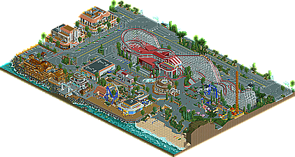
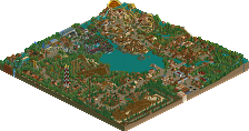
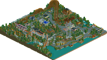
The South Beach architecture really seemed to fit well with the classic rides. This is what made this theme not the cliche that many were calling it. Everything had a very refined look indicative of real life waterfront developments.
Giant Dipper was very true to Church. He and Traver were ahead of their time and this coaster is no exception to that. Obviously many elements were taken from the two remaining Giant Dippers, enough that even if it didn't share their great, distinct color scheme (which in spirit went great with the architecture) would have been instantly recognizable.
The one thing that could have helped this theme would have been an iconic, state of the art new ride. The hubless Ferris wheel was the best candidate for the job but it was too small to be iconic. Making it twice as big really wouldn't have taken up too much extra room. A huge hubless Ferris wheel would have made a great addition to the brand new logo of the revamped area, maybe even serving as the "O" in "Shores" as well as serve to make the park more visible. Not really related but a good number of moving cars would have added to atmosphere, maybe setting up invisible stations at the stop lights or something like that...
Now what confuses me is the name itself, is this park to be located in/be Belmont? If so I would have expected a recreation of the current Giant Dipper with the surrounding area revamped but still alluded to in some form (which this wasn't). If anything the Dipper was much more like the Santa Cruz version...
If there's some way you guys could expand this park to include more shoreline, I would love to see that. A competing park perhaps set 100% out on a pier?
Xcoaster Offline
On the other hand, I found Dinotopia much more interesting to explore, as it was more of a theme park, but it isn't quite the paragon of its semi-realism style that Belmont Shores is with realism. It was a hard decision, and I would've normally left it at a draw.
Belmont Shores:
Wow, I first thought from the overview it'll boring and Dinotopia on the other hand looked so exciting from the overview. First - I really love the theme, although it isn't really new it is now the best themed boardwalk park out there imo. I only wish you could have expanded the map onto the pier a bit, would have made it a lot cooler. The hacks were genious and I always wonder how you do those things. The woody was really great, I loved the layout and the classic feel of it. It looked fabolous from all 4 angles. The poles on the structure added a lot to it. The way you did the station was also nice (peeps entering and stuff). I only think the 6 seater wooden coaster cars would have been a bit more exciting imo. The screaming swing was really awesome too, I never thought I'd see a working one let alone a working ring-the-bell game. With all the working rides (carousel, bike rental, ring-the-bell and screaming swing) I was a bit dissapointed that the ferris wheel wasn't. It looked good, though. I loved the way how the people walked around everywhere, in the park and downtown and how you made the sidewalks higher than the streets itself. I watched quite everything in this park for some pretty long time. And I bet I look back to it very often. Thanks for that!
Dinotopia:
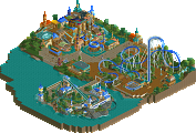
I was new to the theme. I heard the name Dinotopia before and I think it's some kind of TV show. There were parts I liked and some I didn't of course. First off, the readme was really nicely done. The landscape of the park was also really unique with those waterfalls. Great work on that! Velocerapter was really nice, I liked that one. A BBS on that ride would have made it even cooler. Pity the wild mouse ride didn't work, it looked pretty nice. Great setting again. The corkscrew seemed a bit crammed into the corner, but again I liked the archy around that one. As most of the people here I also wasn't a fan of the Invert, it looked totally out of place and didn't really fit at all. Really tough matchup again, thanks!
"MFG"