Park / Ignitemare
-
 19-March 23
- Views 1,982
- Downloads 372
- Fans 0
- Comments 7
-
 60.50%(required: 65%)
 Design Submission

In:Cities 70% CoasterCreator9 65% Jaguar 65% Terry Inferno 65% chorkiel 60% G Force 60% ottersalad 60% RWE 60% Scoop 60% wheres_walto 55% Xtreme97 55% posix 30% 60.50% -
 Description
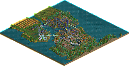
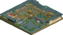
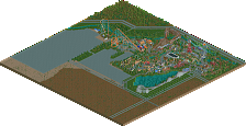
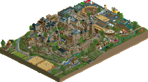
This is our entry for the DKMP ride creation contest 48. We were tasked with remaking a coaster that came with an original RCT/RCT2 scenario.
We chose Frightmare, of Frightmare Hills. It is now “Ignitemare”, a traditional B&M invert that has set the surrounding village ablaze. We kept a few nods to some of the original coaster’s elements (the pre-lift, the vertical loop with something going through it, the twisty ending), while giving the overall layout a big makeover. -
 No fans of this park
-
 Download Park
372
-
 Objects
1
-
 Tags
Tags
I gotta be honest; I didn't read the description before opening this - and I could tell what you based it on. Props for that! I hope other people can appreciate this; I may be an outlier in how much LL scenario play I've done.
I love the coaster and the massive scale of the ride - it really dominates the area and I love it. No complaints at all with the ride itself really, it's great and does a lovely job of improving the original inspiration.
The foliage as a whole is nice! I enjoy the farmland and the way the water features interact with both the ride and the overall landscape. Seems like a really cool spot for such an imposing ride.
I think where this loses some points for me is the architecture. While the massive scale of the ride is great, the buildings themselves fall a little flat. Some of them are a strange mix of objects that comes out as a bit of an abstract confusion, and some of them are just not terribly detailed. I appreciate the pseudo-NCSO look, but unfortunately I just don't think a lot of the architecture works. That being said, the farmhouse scene and greenhouses are lovely.
Also; we need more scenic transport rides! Love the inclusion and interaction of the chairlift.
This coaster is so fun, the big shape is really great and the elements are contoured so well. I think i would pace it differently but oh well, diag breaks and inverts in general are rather hard! The first drop- the first inversion and swoop over the bridge is sick.
The wild mouse is so freakin good! i love these and this is the best one in a while!!! love it. The hack on the ring of fire is done so welL!! The counter concentric merry go round is fun that goes both ways and both ways!
The outside details are fun, the lookout tower with Fid in it is one of my favs. the farm land and divided land works so well. I think the foliage could get denser! i also kinda want some underwater play?
Really like the interpretation of the original scenario layout, some really cool interaction moments and elements. Atmosphere is pretty on point as well, and the concept is pretty cool.
Alright, time for my contractually-obligated review.
First off, things I like:
- The layout is all sorts of awesome. I love how you made a realistic and flowing layout while still keeping the spirit of Frightmare. The interaction with the water and custom supports definitely elevate this a ton.
- The flat rides. Super clean and well-executed.
- The wild mouse. Standard, but well done, and the footers are a nice touch!
- The above is probably the best architecture in the map. Love the farmhouse, greenhouses, bridges and farms.
- I like this little graveyard too!
What I'm a bit unsure about:
- The burned buildings. I understand, they're the focal point of the coaster's theme, and the theme itself is a very strong concept. My uncertainty lies with the buildings themselves. Again, it's probably as good as it gets for NCSO, but for me, this might be a theme that's a hair too hard to pull off without custom objects. I could spot the recolored NCSO garbage and ruins from a mile away, and that kinda took away the suspension of disbelief for me.
- The yellow flames on top of the station. Honestly, the flames themselves are already a bit weird to me even though they fit the theme, but in any case, I'd have preferred if you just kept them with their original colors.
What I don't like:
- The rest of the architecture. I don't want to simply echo CC9's thoughts on it, but I agree with him completely. Maybe it's because I'm more of an old-school player, but I think the attempt to consolidate expansion pieces and regular NCSO feels pretty forced here, and most of the recolored WW/TT objects stick out like a sore thumb. Additionally, the classic "wooden fence + trackitecture" style of the station, that's also replicated in other buildings, just didn't do much for me (maybe because of the colors), but this is more of a neutral point than a negative one.
Overall:
There's definitely more good than bad here, and I'd say you've done more than enough in achieving the contest objective. IMO, this is a Design-worthy submission as it is, but I think it would be stronger if the whole mainstreet(?) portion was removed or reworked. Congrats on the release!
Really nice layout I think, didn't feel way too long at the end which is sometimes a trend with Inverts as tall as this. All the elements were effective and well framed to me. Nice work.
Nice work guys. Coater flowed very well from element to element. I agree with G Force that everything was well framed. Would be a blast to ride irl.
Foliage and theming was great - love the fall colors and how the coaster seemingly ignites/burns stuff it flies over. Cool idea.
Architecture here is pretty lacking in comparison. Very basic/boxy structures. But the greenhouses are cool. Simple, but effective there. The coaster station shape is neat too.
I'd actually never seen this map before, but I'm glad I accidentally opened it. Frightmare is iconic, so it's nice to see an interpretation of that. I can see how it didn't get design - the layout is lacking some flow - though it would be a killer layout if you were to translate it to No Limits or something. The surroundings are a bit hit or miss for me. The architecture is eclectic; Gamma gave a good example of where everything comes together well. I also like the buildings that incorporate timber framed elements, and the burned down stuff as well. I just spotted Hex fishing on the bridge, nice. Not a detail I have seen before! But the bridge also has a random glass floor which I think is just one of those random filler features that you see so often in DKMP. Same with the generic flat rides that look out of place here. To end with a positive: I like the foliage for the most part, despite the wacky colours. Suits the theme.
Nice stuff guys.