Park / Better Left Unseen
-
 26-February 23
- Views 7,555
- Downloads 256
- Fans 0
- Comments 28
-
 No fans of this park
-
 Full-Size Map
-
 Download Park
256
-
 Objects
1
-
 Tags
Tags



This match was incredible, and really hard to decide on.
AVC - This micro is just unbelievably aesthetic AF. The colors, the music, the styling, the gradients, it just comes together to create such a unique and yet distinctly AVC bit of beautiful parkmaking. If i'm being nitpicky, there are a lot of repeated forms - I think they were correct and well structured for the macro, but I think as a result it made this feel more like a solidary moment rather than something that changed or evolved. The track was nice, and with only 100 I think a lot of us struggled to put a coaster in it versus thru it, but without being able to follow the ride it looses some of the dynamic movement I found. Again, I love the macro of it, but it left this feeling like a solidary beautiful moment in a larger story, rather than something the changed. And, the fact that two other parks in this round evolved as if by magic, it was hard to not notice here.
Walto - I think this is probably the top moment of the contest for me. From the music, to the way it constructed itself, the finished project, and just the magic of watching something build itself, it made my heart sing. I always talk about how MM is the place for innovation and bold concepts, This is for me a moment of true innovation that MM is perfectly suited to create. It has so many applications and potentials elsewhere, but if you did this on a full scale format it would start to lose that magic. Here in MM, it is the right size and the right way to create something truly unlike any other thing. Aka, an innovation that only MM can truly birth. I watched it a few times, entranced. Bravo
cocoa - It is SOOO interesting to see this in the same match as walto's magic clock (phrasing?). This felt like walto's but instead of happening of it's own accord, you had to initiate it. I loved the music, the styling, the weirdness, the overall vibe. Where I think walto's wows with the way it does what it does, this wowed me with the narrative, the feeling of exploration, and excitement of getting to replay it, reunderstand it, and rexplore it from a couple different views. I think this would be the moment of the contest if not for walto's. I'm so in love with both from the perspective of bold and innovative ideas that MM can contain and pushes players to make. Bravo.
Jens J - I really hope you don't take my praise for the others as a dismissal of your work. I thought this was excellent and a great demonstration of the skills that got you to the semifinals in the first place. I love the aesthetic, the vibe and colors, and the different scenes you made within the structure. It was a malicious joy to explore and I think would have done well in most rounds of this competition. Unfortunately, I think it came up against 3 of the biggest heavyweight entries we've seen, two of the most unique and innovative, and that contrast was tough. Nitpicking it (because I have to with this match) there were 2 sides of the micro that lacked a bit due to the construction and layout of the building, three if you consider that the front had some great set dressing, but not nearly as much to explore as inside. Like I said, these are minor in most matches but compared with these other entries, it was a brutal round to be in for most parks. Regardless, I'm really excited to see this level of execution with your work and see what you do post MM.
Overall, I was soo stuck between AVC, cocoa, and Walto on who to vote for. Two felt more innovative, one felt more beautiful, I think that anyone who made these should be in the final. Ultimately, I had to go back to what I most enjoy in MM and what I think this contest is the perfect place for; innovation and outside the box thinking. For that reason, I gave walto my #1 and cocoa my #2. I felt the innovation and bold concepts of both these micros slightly outweighed the beauty and aesthetic of AVC's entry. Regardless, I think that whoever doesn't win this match will likely be our wildcard finalists. A major congrats to all on a stellar matchup.
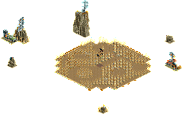
This is Art: Absolutely mind blowing effect, and entire scene building itself like that. So satisfying to watch, and relaxing as well (The music definitely helps). What an impressive display of technical skill.
A Night in Goa: Feels like the colors and themes should clash but they work amazingly well. Fantastic architecture combined with a very lively theme and feel.
Better Left Unseen: First time I opened this I sat for a bit waiting before I realized I needed to rotate. Great use of the one angle trick, and a great creepy and dark atmosphere to it.
Game Over: A lot of great micro-detailed set pieces, great run-down industrial atmosphere around the building and some nice use of the litter editor. Also, the guests being stuck on the ride and wanting to get off fits so well.
No ranking here
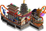
A Night in Goa : Another great park from you ! The theme is so well exploited, it's immersive as possible. I really liked these lasers and lights, it brings a real atmosphere, it's full of details to watch, I love it.
This is Art: I think everything has been said about this park Walto, I'll just say how great and smart it is, a masterclass
Better Left Unseen : I didn't understand everything but I don't care, it's just super intriguing and interesting concept, I enjoyed getting lost and exploring the different sides of this park, it's really good
Game Over : As always, your parks are a breath of fresh air in this contest, I love looking at them, the great strength of this park is its simplicity, this minimalism creates a great atmosphere, all the elements are well brought, I took a lot of pleasure to explore all these mysterious rooms
1) A Night in Goa by AvanineCommuter
-Concept:++
-Content:+++
-Quality:+++
Overall; Very colourful and buzzing atmosphere when you first open the park. Especially the colour scheme and pumping psy-trance music makes this micro pop. The vertical construction is excellent and each level of the construction gives something interesting to see. The different fading effects in the sky and the pink eye sculpture shooting lasers make this an unique art piece. To close it out, the coaster popping through, the Intamin free fall launcher thingy, the twister and the raft-lift gives it some nice movement action. Unreal how you can fit all this on 100 tiles.
2) This is Art by wheres_walto
-Concept:+++
-Content:++
-Quality:+++
Overall; Reminds me of Splitvision's rocket launch micro, but this is done with more refinement and overall aesthetic I feel. Can't imagine how much time it must've cost to get it all synced this way, but the end result is impressive. Very close with AVC's micro, and after a few times going back and forth between the 2 micros I kinda encountered the same issue I had with Split's micro; that the repeatable viewing experience is kinda bad, as after once you've seen the event play out you kinda seen it all and it becomes this static scene (still very nice though, but static). Whereas with AVC's micro I kept seeing new things and the buzzing vibe and movement in his micro kept me more interested long term, so that's why my vote end up with his entry, but very impressive opening event!
3) Better Left Unseen by Cocoa
-Concept:+++

-Content:++
-Quality:++
Overall; Like everyone, I was like "this is it?!" when opening the park, but once I realized the one-view objects in every different view, it was very impressive. A bit chaotic in 3d and especially 4th rotation, and after multiple viewings I'm still not entirely sure what it's about, but I don't really care either. Flying pigs with eyes coming out of their asses always gets me
4) Game Over. by Jens J.
-Concept:++

-Content:++
-Quality:++
Overall; Very cool slaughterhouse/Saw kinda vibe you've created here. Love all the torture/murder scenes inside the building and the overall crunch and decay you've added to the building. Bit light on content though, but 100 tiles isn't much. Would've been cool if you could've fleshed out the whole of the darkride more, with the loading platform (with theming as well), car storage area/maintenance etc. Now when pressing cut-away view there's nothing to explore really, so missed opportunity I think. Nice entry overall though, as a horror fan, this is right up my alley
Now where do I even begin with this matchup...
AVC - Holy freaking rave party... first of all, the colors in this are amazing. The green strobe lights combined with the purple/green gradient in the background and the more natural building colors work so well together! Love the use of Qing toilet peeps as jumping guests haha. Also a big shoutout to the foliage here, maybe a bit less noticeable but you did such a good job at making it look the right amount of overgrown. Lots here to feast on for the eyes. Combine that with a banger track (which the ears can feast on) and you have a fantastic micro as a result. Sidenote: I have no clue how you guys make a 10x10 look so massive lol.
walto - Literally my initial thoughts where:
"Oh, just a clock? That should boost my chances of mov- hold up now wtf is happening"
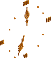
The fact that you managed to sync up more than 150 rides so well is already an achievement, but then also creating a beautiful scene with it is just on another level. Seeing the school of fish cars combined with the hybrid cars turn into a tree was wild. I'm a sucker for genius uses of various ride vehicles and there was plenty of that in here. Definitely one of the most innovative moments this Micro Madness!
cocoa - Again, same thing as with walto. These overviews did fool me haha.
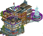
Turning it once: Fabulous mansion.
Turning it twice: Gave me some "Urban Fabric" vibes (probs because of the curved stairs). Definitely got more scary with the dripping blood, eyeballs and those spiral objects.
Turning it thrice: Absolute mayhem. Nightmare fuel. Total chaos and I live for it.
Each rotation gave us something new and more unexpected. We have seen lots of single angle trickery, but to do that from 4 different sides is something I hadn't really thought about before. Great stuff!
What a semi final to end up in! I must say it has been a complete shock I made it this far since I was already preparing myself for a R1 elimination, but I'm very happy to have shown of the three things I like to do the most in RCT:
Round 1: Landscaping / rockwork
Round 2: Sculpturing
Round 3: Perspective tricks
The first two rounds, I very much struggled with time issues which led to some disappointment about hypothetical scenarios of what could've been if I had just a bit more time, but I am glad to have made it through both the group stage and quarterfinals and to now finally finish off on such a high note with probably some of my best CSO work yet. Although I was too scared of watching these gory movies as a kid (and still would probably flinch away at a few scenes haha), doing a horror-esque theme like Saw was something I definitely wanted to give a try, especially with such a small tile limit perfect for doing smaller scenes, and I would say it was a fairly successful attempt.
I have learned a ton throughout this whole experience and want to thank all of you for leaving reviews behind (and of course a big thank you also to the ones voting for me)! I hope to continue this boost in motivation into my current project. Best of luck to walto (and potentially AVC or cocoa) in the finals!
Match
Conclusion
The poll is now closed. The formula to derive the results is:
As replacement, AvanineCommuter is invited to submit a park for the Grandfinal. If there is a drop-out their micro will be chosen at random as replacement. Likewise, he is eligible for the wildcard spot.
In no order reviews below:
Walto - my god what a crazy experience this was, you totally pulled a Dynamite Dunes on us and it was mindblowing! I think this is the only park where I reopened it multiple times in a row just to experience the magic of seeing it come alive again and again. I knew you were going to pull some game breaking shit this round, and you absolutely knocked it out of the park. The music was the cherry on top and perfectly sold the idea and set the mood. I’m hoping you don’t back down for Finals and you bring everything you’ve got, because this was phenomenal.
Jens - hands down your best work yet in terms of detailing… such such clean work, and such creativity in the unique way you use objects. As a horror fan myself, I loved your take on the Saw series and really enjoyed digging into the fine detailing you had in all the interiors. It would have benefitted you to make this larger / taller though, to bring more content and more death traps. I could imagine if this were a cutaway interior of a much taller building, you could have made almost like a TV-stack of individual rooms, each soaked in a different color, each with a similarly deadly trap… that would’ve pushed this to another level! Even so, it was fantastic to see your work this MM. It’s especially great to see how you tried to showcase different sides of your building style each round. Really really cool.
Cocoa - I knew from our chats that you were building something crazy, but I was expecting Dynamite Dunes style WOW factor. Instead, we get the vibiest, creepiest fucking park with a slow dread… and it’s so incredibly effective. Another innovative and crazily creative idea, and so perfectly executed as expected. Each turn had me digging in and held my attention as I tried to flip back and forth between the views to see the structure unfurl itself into a cosmic horror mashpile of pig blood eye moon crow orgy. The music is probably my favorite from you so far, I’m officially a fan of this artist and will be digging in more to her stuff; it perfectly set the mood and elevated the atmosphere in an incredibly effective way. A nitpick, but as I’ve said many times before, a little more movement would’ve really sold this further - imagining especially as the park slowly unfurls and descends into madness, the more CTR or animated objects could have been added to make the house feel like it’s being ripped apart. Killer stuff.
As for my park, thanks for all the folks who left reviews. I’m very happy that people loved the psytrance jungle rave, definitely a super fun build for me and I loved the way it turned out. @Mulder you’re a rockstar for the custom palette and for the best mayan trims this mayan trim lover could wish for.
AVC - One of my fav things you've made tbh, really enjoyed the architecture, ambience and storytelling. I'm a sucker for "moments in time" with environmental storytelling, and this is right up my alley. I feel like you and I went after similar things this round with building a micro around an event, and I was kicking myself when seeing how well you used the little peep objects on the balconies. The lighting, gradient and laser effects were all executed so well too. Combined with the music it all tied so well together.
Walto - As everyone has said, this was a blast to watch. I had an audible reaction when seeing it unfold, and the coaster cresting the lift at the end was the cherry on top. It landed second for me due to the "lack" of content after the fact, and possibly a bit of personal preference based off what I mentioned above. Still, incredible piece and I can appreciate the level of work and timing something like this requires.
Cocoa - Fun micro, like many tohers I sat waiting for the 'moment' to happen before realizing I just needed to rotate haha. At least we've come to expect crazy things from you. This didn't quite hit as much as Urban Fabric (which I loved), but I can appreciate the intricacies put before us and the farmhouse vibe was perfectly off-putting. A great little horror piece.
Jens - This entire contest you've been finding your stride, and it's been great to see you become even more comfortable with CSO. All of the little details, the storytelling of each room.. this being in a larger park with this level of execution would be killer (pun intended?). And the Saw theme is such a bop. Excited to see what's next from you.
its been an honor losing to you all. walto---fuck you for stealing my weird thunder this round. avc---fine, we're even now jens---see you next h2h, i dont think you'll be a tree man anymore
i went into this round assuming it was a wash and i'm glad I did, because it allowed me to focus on something weirder and more personal and less focused on winning---id been sitting on this concept for a while. i think it was murakami (cant remember) who said he would never say what any of his books were about, and I'll think I'll continue that legacy.
i have a lot more rct in me, but it may have to wait a bit while i resume my other hobbies and shit...and get a more ergonomic setup to play. I'm not sure my tendons could have taken 400 more tiles lol. thanks everyone for a ridiculous contest, absolutely pushing boundaries in every direction. MMMM