Park / Iron Tiger
-
 19-March 23
- Views 1,743
- Downloads 271
- Fans 0
- Comments 11

-

-
 64.50%(required: 65%)
 Design Submission

CoasterCreator9 70% Jaguar 70% chorkiel 65% G Force 65% In:Cities 65% posix 65% RWE 65% Scoop 65% Terry Inferno 65% Xtreme97 65% ottersalad 55% wheres_walto 55% 64.50% -
 Description
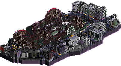
What happens when a corrupt construction firm bulldozes an entire city block in Kowloon "for public entertainment purposes", and when a mediocre parkmaker decides to reboot an old failed design "for the funny"? Well...
Yes, I guess this counts as me being officially "back". Not that anyone really cares though. Either way, I hope you enjoy Iron Tiger! -
 No fans of this park
-
 Download Park
271
-
 Objects
1
-
 Tags
Tags

![park_4134 [H2H8 R5] Romon U Park](https://www.nedesigns.com/uploads/parks/4134/aerialt3926.png)
Nice work; I think this is a pretty substantial step up for you. The coaster itself is well made, and probably one of the better standalone RMC layouts I can recall - pacing is pretty good and the ride itself is generally very imposing and impressive.
The cityscape itself is good - nothing earth-shattering, really, but it's nice. Some more light and life might have added some more depth, but overall - really quite well done - and welcome back!
The city is great. This is quite the coaster to be plopped in the middle of a city park though, with nothing else around it. The station and everything else associated with the park itself also look a little disconnected from the rest of the map. In that sense there is almost an RCT-scenario-esque "take a park and bring it up" element to it, which I do appreciate, but wish the park was maybe a little bigger (or more of it was shown) with some supporting rides, food, the kind of cheaper/higher margin stuff you would obviously do IRL to get cash flowing in. Layout is solid though!
Very cool. Love the music. The drop synced up with the coaster drop for me at one point - whether intentional or not, it was great. Nice work. I really dig how unique the queue is.
Thanks BSG for the logo! And thank you guys for the early comments.
CC9: Thanks for the praise on the layout. It was really fun messing with the RMC track for the first time, so I'm glad that it resulted in a nice coaster. As for the lights - yeah, you're completely right. I guess it's just one of those things that seems very obvious in hindsight, but didn't really cross my mind when building.
Ling: Yeah, this is one of the criticisms I was expecting to receive. My aim was to make it look like the coaster was a standalone attraction in the middle of the city, but I do agree with you that the coaster's surroundings could've been fleshed out more to make the scenario more believable. If there's any excuse that I can give, it's that I wanted to limit the size and scope of this map so that I could actually get it done in a reasonable timeframe without losing interest (something I always struggle with in RCT). At the very least, I'm glad that the city park element is recognizable at a first glance!
I:C: Thank you! To be honest, I think the music choice was a big driving force behind the theme idea in general, so I'm glad that it fits well. Full disclosure, the sync with the coaster was entirely unintentional! When I noticed it, I couldn't believe that I'd done that on accident. I'm glad you like the queue - at first, I was gonna go for a more traditional one, but I couldn't pass up the opportunity to portray the gardens in the Kowloon Walled City Park in some way:
I look forward to hearing more thoughts on Iron Tiger!
This is a nice comeback! I really enjoyed watching the coaster - nice flowing layout and it's so satisfying when it syncs up with the music. The surrounding cityscape seemed a bit simplistic at first glance, but there's some nice details sprinkled throughout. The custom palette and music really help sell the atmosphere, so good job on that. I would've loved to see you incorporate some more of those gardens though, the pictures you showed look beautiful!
I finally managed to update open rct2 to open your park!
Nice use of the diagonals, it's fluid and it really breaks the classic rigidity that can be found in this type of park! Overall, it's a very promising work for the future, it lacks a bit of details, especially for facades but it will come with time ! This is a park with personality which is a great point: an affirmed color palette, diagonals, just a little more detail and life!
This layout is sick! i love all the elements, the barrel roll into the over back on top of the station is my favorite. I love the lift supports a ton, we've seen a lot of these sick RMC lift hills ands this one is super good! I like the nestled queue.
However, these surroundings are really the standout!!! Holycow they're good. I think all the facades are done so well. Its so impressive how consistent they are across the whole map, in level of detail and quality! I wish the coaster's density complimented the buildings in a more meaningful way!
Lastly, im glad i checked this readme, the music adds a lot to the atmosphere, i'm slowly being convinced pallets like this may be 'too dark' but i think its really adds to the park as a total package. and welcome back lol
Solid RMC layout, a lot of well-placed elements and good pacing. Some solid urban architecture surroundings, also like the custom music which goes well with the night palette for atmosphere.
Two thing I'd like to see: Some extra scenes around the city and footers on the coaster, I think those would really add to an already very solid build.
Welcome back to the community. I think you have a pretty neat layout here. I agree with CC9 that the coaster has nice flow and is very imposing with the juxtaposition against the surrounding city.
What I'm hung up on, is the surroundings and the park the coaster is in. It seems underbaked perhaps. The park has sparse and random bush/tree placement. And the cityscape doesn't do much for me. It's very same-y and I think provides a backdrop. I'm sure though the apartments all have nice views of the coaster across the street. The architecture is nice, I'm nitpicking because I want to see more purpose to it since this is a design.
Add sadly, not a fan of the palette, sorry. It looks like a shiny blob of supports to me.
I'll respond to the new comments eventually because they all deserve a response, but safe to say that I'm not in the best headspace for that right now.
Well, I'm still pissed, but I told myself I'd reply to these at some point, so it might as well be now.
Thibo: Thank you! I appreciate that you noticed the little details. The gardens are a bit of a complicated aspect. I thought they were a nice way to fill up some empty space on the coaster's plot, but I didn't wanna overdo them due to the whole gritty urban atmosphere I was going for. I do agree though, the real-life ones look really nice.
Babar: I know you said it with the best of intentions in mind, but it still stings to hear "it will come with time" when I've been trying for almost ten years now, lol. The criticism is noted, though, and thank you for the compliments!
AJ: Thank you very much! Your point about the surroundings might be addressed a bit further below.
Lurker: Thanks! I hear you about the footers - to be honest, I kinda didn't want to add them at first, and, by the time I could've changed my mind, I was so far into the building process that I decided to just stick to my guns and release it footerless.
Otter (and re: surroundings): It's definitely helpful to hear an opinion from someone who thought this was a bit lacking. I'll go ahead and agree with you on the foliage - aside from the "manicured" garden spots, I'm not exactly proud of the foliage either. It's something that I still don't understand how to do well, and, to be frank, it still doesn't click even after looking at numerous guides and examples. The sparseness of it was intentional though, as I wanted it to seem like not much attention was paid to the coaster's immediate surroundings apart from the sightlines that people would have from the streets and queue (in-universe, of course). I understand if it didn't really work out, though.
Now, regarding the cityscape, here's my honest opinion on the discussion. I'm not gonna say I didn't expect people to see the lack of interaction between coaster and architecture as such a negative, but I still stuck with it as a completely intentional creative decision. While I love interaction (and especially designs that have the coaster be intertwined with its surroundings) just as much as the next person, I don't think the lack thereof is inherently a problem, not even for a design submission. For Iron Tiger, I just didn't think it would make much sense to have the layout leave its assigned plot of land, considering the quasi-narrative I built around the coaster. Of course, you (and anyone else) are perfectly entitled to consider interaction and "purposeful" surroundings an integral part of designs (and I assume the majority of people here share that opinion); it's just a bit hard for me to accept that Iron Tiger was effectively a design failure from day one because of an intentional decision that I still stand behind. About the architecture being same-y, I do understand where you're coming from, but once again, I intended for it to be that way, to fit the reference material I drew from (whether or not I achieved it is a different story).
I should stress that my intention here isn't to say "well it was ALL intentional so actually there are no flaws here and you're wrong for thinking there are" at all. I accept the criticism and it is useful to understand what panel members value in submissions. I also want to add that, while I'm definitely frustrated, none of that anger is directed at you (or walto, for that matter). As long as you had your reasons for voting the way you did, I'm fine with it. To end in a less negative note, thank you for taking the time to review!
Okay, that last one was a lot. I still haven't gotten EVERY thought I have about this off my chest, but I don't think any of you deserve to hear me vent my frustrations (I also don't wanna sound more melodramatic than I already do right now). So yeah. Thanks for the comments and votes and stuff.