Park / Assualt on Earth Base Gamma Gamma (2287)
-
 04-June 09
- Views 31,678
- Downloads 1,029
- Fans 1
- Comments 120
-
1 fan
 Fans of this park
-
 Full-Size Map
-
 Download Park
1,029
-
 Tags
Tags
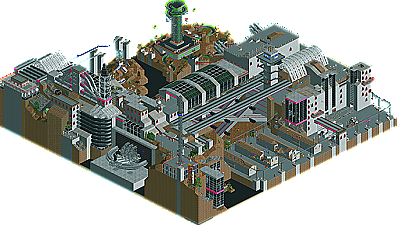
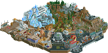
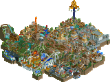
Also thanks to the Elementalists for their park, which was pretty cool too. Micool and Milo being in there didn't surprise me at all, but just because he's a LLer I expected Roomie too.
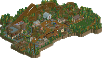
Wooden Layout - Turtle with tweaks by Chapelz
General Landscape Design - Chapelz
Path Layout - Turtle
Foliage - Dimi (came up with the general type that turtle and i followed)
Flyer Side Architecture - Turtle
Village - Chapelz with tweaks by Turtle
Wooden Station - Chapelz with tweaks by Turtle
Fishing Village - Turtle
Rice Patties - Chapelz
Water Ride - Turtle
Unfortunately Dimi had family issues to attend to that limited his time with the park.
I guess I'm still in shock that we lost. I kind of promised my team the victory. I couldn't see how we could lose--especially after seeing Red River Cove. Not to say it isn't good, because it is, but I don't see how it's better than ours. It most certainly is NOT a "static model," and that's all thanks to milo who is a genius at this thing.
I think the main difference between now and the last time I was building parks and showing them off here (two years ago?) is the attitude toward ll parks. I guess times change and people don't easily catch up. I will be exiting stage right again soon; this time not because I am bored with the game, but because I don't believe there is an audience for my work. So why show it off? Maybe I will make something cool and show it to posix, and milo, and levis, and cam and roomie and geewhiz and maybe even turtle, who seemed to like our park more than his own but couldn't say it outright. He knew what he saw. Look, when the codex first came out Gamma Gamma would have absolutely destroyed anything it came up against. But times change, just like in the real world.
So that is the place I will be returning to.
Go Elementalists.
peace
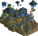
On the screenshot, milo made everything to the right. I did the power source, pilot training, and warrior, and everything to the the monorail station (though not the monorail). I also did the foilage.
milo did everything else. I want you all to know he is one of the greatest craftsmen at loopy landscapes to ever build in it. I hope he isn't done making drool-worthy art with it. look out for his next shit.
Don't be silly, of course there is an audience. RCT2 is way more popular but LL is still alive. The most recent LL spotlight has almost 400 downloads; I consider 400 people as an audience.
Moreover, your park has almost 50% of the votes. That's actually good, half of the community likes your work more than Red River Delta. The other half, where I belong to, probably likes your park but likes RRD more. I think Assault on Earth Base Gamma Gamma was excellent.
Honestly, you're right Micool. I preferred your park to ours. I thought it was more interesting. You were both unlucky not to win this.
That's true man, but it only got twelve.
Edited by Panic, 12 June 2009 - 04:35 PM.
Edited by Panic, 12 June 2009 - 05:56 PM.
that isn't the case... anyone on our team will tell you that we were working up to the last hours of the deadline just to get the map done. The reason the idea isn't executed to its full extent is because we just didn't have the time... not because we just tried to "boost our egos" with small patches of work or however you want to put it.
and I don't think you can make the case that this would have lost against "any average park"... or that rides (or 1 ride) would have helped. It went up against this park and lost... there's no reason to take it any further than that.
Edited by Milo, 12 June 2009 - 06:28 PM.
Edited by Panic, 12 June 2009 - 06:58 PM.
And not doing something you like just becuase you don't think there's a market isn't an effective way to live life.
Red River Delta:
The readme was a bit too long, IMO. If there were some pictures in it, it might have been a bit better, but I wasn't really arsed to read through all the stuff... But kudos for making a readme! The park itself seemed very nice, I especially loved the atmosphere and the landscape. The rice terraces were beautiful, great work on that! The river looked also very nice with those little isles and the waterfalls with the bridge. The rides were also really good, I especially liked the flying coaster. I only thought it missed some custom supports, those would have added a lot to the ride! And I didn't like the catwalk by the woody. I will never understand why people keep doing those, as the RCT woodies have a catwalk already? The layout of the woody itself was really nice, though. I didn't like the archy that much. It had no flow and it was mostly too cluttered and unorganzied for me. Maybe it's because of the roofing, I don't really know. The floating pier was a nice idea too. All in all an enjoyable park, great work guys!
Assault on Earth Base Gamma Gamma (2287):
As I saw the overview, I instantly knew who did that, or at least who did most of this
"MFG"
red river delta is basically what Long Hegu should have tried to be.
A minimalistic, deliberate, atmospheric masterpiece. Nothing felt weak. Foliage and landscaping was on point and the lack of clutter really ended up making that an important feature in the park. Ride design was incredible and their uniqueness as well as their execution contributed very well to the whole picture. All of the layouts were masterfully integrated in such a way that doesn't take too much effort to do, but had a level of elegance lost when people try to do too much or force things in. All of the architecture has the touch that shows that less is very often times more. But at the same time it doesn't skimp on the little things. The intentional imperfections in the buildings? The pontoon-floating huts? The bushes that are growing through the cracks of the stairs? I love this park and back in h2h5 was probably the best park since Kukuana, besides of course for anything geewhzz touched.