Park / Aquatica
-
 29-May 09
- Views 24,960
- Downloads 1,057
- Fans 1
- Comments 72
-
 Description
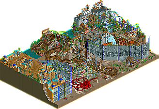
I love my the top half of the pirate area, which is some of my best work yet even as of 2011. Louis' lower Atlantis looks pretty good too. Everything else is not worth downloading.
-
1 fan
 Fans of this park
-
 Full-Size Map
-
 Download Park
1,057
-
 Objects
355
-
 Tags
Tags


i'll post more later.
Pity about the Germans park being unfinished how it looks, but good job getting something in I guess.. I like the bits done in the upper right corner, props to whoever did it!
I really like what our team did for this week, can't stop looking at it, lol
SF
The Germans park, while having a few highlights here in there, didn't quite excite me as much. I didn't quite know what to think of it as I couldn't understand it very well.
The good points however were the Port Royal section. While not breaking any rules for innovative work it did its job and the archy was beautiful. I liked the underwater fish but it just seemed an after thought to me to ask people to visualise them swimming through the blank space. You did well to fill it up but I just couldnt get into the park.
Atlantis had some beautiful structures and it had a nice atmosphere (of the architecture on the cliff face) The section in the middle really didnt do anything for me.
Good job on trackitecture however. Someones pretty skilled in the ammount of shapes and variation of track you put on this map.
I'm sorry to seem so harsh but I think this park could of been a lot better or even a winner with either Atlantis or Port Royal expanded.
Edited with double review:
Xlapak:
Pros
Great idea for a theme. We've all heard the conspiracy nuts.
A well shoestringed mine train
A great multilooper that's kinda like Viper, Anaconda, and Dragon Mountain combined... but with far more epicsauce.
Well themed
Quite a few nice touches. Love the parrots, I found them all without cheating.
Cons
From all the similarly themed parks out there, the egypt theme tab has been burned into my brain.
Meh pacing on the suspended
I'm not feeling the invert for some reason
An aztec park that somewhat breaks the Aztec mold but doesn't break the "4 Coasters, 1 Water-ride, Generic Flats" pattern I've seen too often.
TLDR: Nemica: Forgotten Land with an aztec theme.
The one water-related name:
Pros:
Good theme idea
Port Royal is somewhat vibrant
All the little fishies in the sea!
No Quarter is a good medium size invert
Nice quarter tiling
Cons:
Atlantis area is dead, no atmosphere, done to death, and has no big ticket rides.
Center is unfinished
No water! Seriously, did all the fish in the world sprout wings?
No reefs or anything for the fishies to swim around
TBH the octopus is meh and Indigo Hills did it better
Odd supports
Atlantis, aside from Port Royal, is a waste of time and I only spent more than 4 minutes on it because I was eating ramen.
TLDR: When finished, it'd make tough competition. Until then, it's veering towards shit.
Edited by 6000000flags, 29 May 2009 - 08:31 PM.
I voted for Xlapak...whatever that means.
Nothing overly special. The green coaster and the water ride were highlights.
The layout and red coaster were low points. But a solid entry nonetheless.
Aquatica was a mess. 3 distinctly different styles and qualities exhibited. And it was unfinished.
The light brown side was decent though really repetitive and bland especially for such a small area.
The middle was atrocious. The coster was terrible, all of the ride entry and exits everywhere were eyesores, the coster things buzzing around were annoying and not that effective really, and the octopus could have been better. I think it could have looked nicer if it had been all under water, though those ugly diagonal window fence things would have made that difficult. The Port Royal area was really nice. Pretty much everything in this area was well done and effective. The only downside there was the giant fence in front of it blocking the view.
My vote went to the ALs, really good park. btw whats the thing to watch at the end of Snake in the grass? I did not see anything... 8.1/10
FGs your park was nice, but really seemed like it was trying to be generic. I liked some things, but overall it was just not as good as Xingawhatever. Oh and Port Royal? Atlantis? and to top it off the park is named Aquatica, Ed already made an H2H park with the same name! 6.4/10
I can't open Aquatica but from the screenshot, what's there looks pretty cool. That underground creature there is wiiiiiild... Wish it was finished but it does give me a laugh to see that the exact same thing happened that happened to Ed's Aquati- IS THAT FUCKING ED WHAT THE FUCK IS UP DUDE?!
The idea was great but the execution wasnt, Port Royale was the best area with Atlantis coming up second. Seperately each area worked but together they seemed to distant and didnt carry much flow between the areas.
It's a shame that the idea didnt work as well as it should have.
parrots?
made from bikes?
PARROTS YAAY
sadly it also had its flaws, mainly with the rides.
the invert was , kinda boring...
the suspended was also kinda boring...
the corky was better though
overall, a pretty good park AL
im slightly dissapointed our park didnt get finished.
the areas stood well alone, but they lacked continuity.
i hope we can get a decent percentage and maybe win
Aquatica - why the name that indicates there would be water when there is not water...don't get it. As others have said, the park was obviously created in three sections by three people who had three different styles that did not work well together. Really did not get what all was going on, no flow, no cohesiveness, too many ideas and not enough execution
Sorry, if this question was already asked...
SF