Park / Greed
-
 06-February 23
- Views 9,610
- Downloads 240
- Fans 1
- Comments 30
-
1 fan
 Fans of this park
-
 Full-Size Map
-
 Download Park
240
-
 Objects
1
-
 Tags
Tags


1st vote; Last Hurrah: It's insolent how much above anyone else you are performing here. Good general shapes, archy, details, layout, ideas. Everything executed perfectly, there is nothing messy even if some of the stuff thematically is going over the top. Love the octopus. I think we all know by now who is no. 1 for this contest's championship. Also shoutout to my man Mulder for the band peeps.
2nd vote; The 5th Dimension: Tower of Terror: Even after reading the readme (which is pretty confusing) I didn't manage to understand the POV thingy. Even after installing the plugin the ride crashed after some time. But overlooking these two things (which for me don't take much away from the viewing experience) this entry is pretty much excellence albeit maybe a bit too much ambitious. Knowing of your object haul in H2HC I'm glad to see some obscure objects from the past coming back to life. And it pays off, everything is coming to life. Granted it's a bit messy here and there, but to me honestly this felt very much like an actual theme park attraction. The front facade is also great, maybe next time tone down a bit the detail.
No particular further order:
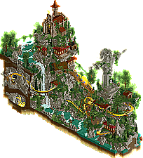
Greed: Great sculpture, the head is hilarious and impressive at the same time. Overall I like the composition of the map, rockwork is nice, although I can suggest playing around a bit more with the shading and maybe adding some non angular pieces of the fulltile and 2x2 boulder rock. Wasn't the biggest fan of the coaster, however I know myself, how hard it is to come up with something nice, especially in such a limited amount of space. The underground parts felt a bit undercooked. My biggest immersion break were the random animators running around.
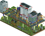
Murakami Highball: Front look feels a bit like deliberate understatement although on further inspection some of the street details are A+ like the little shop next to the launch and the corner cafe. Saturated palette doesn't play into your cards imo here either. I do like the foreshadowing that there is something more to discover. The back side is very impressive. You achieved a genuine rendition of the artist's work (after seeing it on discord, didn't know him). Especially love the flower faces. However, sadly I must admit, I guess this 'art for the viewer' type of RCT is not doing much for me. It's impressive yes, but I'd rather have something immersive for the peeps.
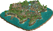
Tsuki: Probably not the most original theme. The same thing as for Raunchy: I'd recommend playing around with shading on the rocks more to give them a bit more of a natural look. The pink foliage works surprisingly well. The gift from Gladsheim is a funny idea and the 'theft' is immediately forgiven haha. All in all solid showing, it must suck to be put in such a killer group.
Greed - The coaster feels a little forced. Love the architecture and foliage.
Last Hurrah - When the design quality is this high it feels ridiculous to complain that you get more of it, but it is kinda similar to your round 1 submission in a way.
Murakami Highball - I LOVE the happy flowers.
Tsuki - Flamboyant but at the same time somewhat more austere than some of the other submissions. Noice.
The 5th Dimension: Tower of Terror - Simply figuring out how to correctly view this park was a challenge which is an achievement in itself.
The 5th Dimension: Tower of Terror: Despite never quite figuring out the POV thing, the stone and glass work on the building and the way to turns into that shattered reality look when you rotate amazed me. Great creepy atmosphere, and the scenes themselves were impressive.
Last Hurrah: A fantastic tribute park, a lot of great setpieces and references. Love the coaster, the layouts wraps around the setpieces in a great way.
Murakami Highball: Cool how this starts out with a fairly normal city, you get a hint of something more on the first turn and then it really goes into the art style on the third rotation. The art looks spot-on to the artist's style, especially those flowers.
Greed: Really like the landscaping and foliage, rockwork is solid and the statue is done very well. Like the ruined and overgrown look, think it adds to the atmosphere.
Tsuki: Really peaceful and relaxing, and the color combo works better than I'd think it would. Also like the map edges and overall shape, it's pretty well presented.
1) Last Hurrah by WhosLeon
-Concept:+++
-Content:+++
-Quality:+++
Overall; I thought you couldn't top your previous micro, but you did it man. Meticulous architecture, a vibrant colour scheme, awesome deco work and great signage make a memorable piece of art. How you integrate this well paced coaster into and through it all is a mystery to me. It looks like it costs you no effort to create all this quality work, which makes viewing it a true pleasure. The whole concept of the Beatles rooftop concert, all the Beatles references and great new discoveries on all 4 views (love the Helter Skelter hopping around in the coaster station/record store for example) make this a gem of a micro once again. Great job man!
2) The 5th Dimension: Tower of Terror by Ethan
-Concept:++
-Content:++
-Quality:+++
Overall; Such a cool concept, such a pity the 1st person view didn't quite work out. When I rotated the view and pressed 1, I see what you were going for with those synced rides, but I think it's very hard to get that to work out well (especially in the limited construction time you guys have). Setting that aside, what is there is just very high quality work. Great front facade of the big ToT building and a nice aesthetic of all the inside scenes with a clever use of the single view spray to create a kind border between the different rooms. Love the creepy/eerie atmosphere with that looming music and gloomy colour scheme.
3) Murakami Highball by FK+Coastermind
-Concept:++
-Content:++
-Quality:++
Overall; I'm unfamiliar with Murakami, but after some Googling, found those peculiar flower's with faces and other weird anime art which defines his style. Was a nice surprise that when I turned views those art images were so well recreated among the back of the buildings. It's like 2 different micro's for the price of 1. While the backside is so nicely flowing and fluent, I felt the front was a bit crooked at spots. The longer I look at it, the more I like it tho, as there's so much to explore. After I found out there was a link with music in the file, the park became soooo much better. What music can do for a park is incredible and especially for this park it added so much extra atmosphere.
4) Greed by RaunchyRussell
-Concept:++
 )
)
-Content:++
-Quality:++
Overall; Very vibrant and adventurous piece of work here. Every rotation of the view gives some nice new scenes and panoramas. Great landscaping with all the different height variations, and the foliage and water features work well to create this multi-layered world. We badly need some good mist objects though, as I think the 1J mist/water surface objects hurt the aesthetic more than that they do it justice. The little bits of architecture are great and the Fisch rock work is well done. The concept is a bit unclear, but the gold in the caves, 'The problem' and 'status was more important' point towards the problem of gold luring people away from what should be more important; religion (well, at least in the eyes of religious people
5) Tsuki by Mulpje
-Concept:+
-Content:+
-Quality:+
Overall; I put on 'Summer style' music and that alone makes this micro 10x better imo. I don't get why people entering this contest don't take that 1 second of time to put on some music to give it tons more atmosphere. Anyway, what was there was quite nice, although as with Gustav's micro previous round, I feel we've seen this Asian/Chinese pagoda style a bit too much already and feels copy-paste too fast. Some daring colours used, such as the bright pink, which was bordering on 'too much'. Lovely little mouse ride which gives it some nice movement. Overall well done, was just missing some originality.
Was incredibly difficult to judge this - all 5 entries were excellent quality and it really just came down to what emotions they provoked for me. Well done to everyone - I'm definitely fearing semis now lol
1. Leon: You're on another level dude, this is so good. Feels like a spiritual sequel to your first round micro - urban theme with a compact coaster and a cool fantasy concept. Here it works just as well, perhaps better. Reminded me of the old Beatles micro but amped up to today's meta. So many great details but it's very well balanced too.
2. FK: You're a true artist in this game. First impression was of the aesthetic - bright neon colours elevating the mundanity of the street level which I loved. And then turning it revealed another world - superb work with the sculptures and wild artistic effects. The flower faces are so well constructed.
Raunchy: Sweet piece of work! Love the landscaping and the way you sunk the coaster into it, giving the map a good sense of height. Jesus sculpture is very cool, and loving some of the archi buried into the rockwork as well as the story - does a lot with the small footprint.
Mulpje: Very glad you got to use this in Round 2! Really love the vibe here - the three buildings each acting as a focal point and wrapped in the beautiful pink trees. The coaster is very cute as well in the way it traverses the map.
Ethan: You've definitely shown yourself to be one of the most ambitious players this contest with the scale of your ideas. I think here you perhaps overexerted yourself with trying to get too much into this and the result comes across as a bit messy in places - the main spectacle of the hidden rooms is superb however. The archi of the hotel itself is also excellent. Great work on some of the scenes for the ride - the ghost mirror effect is done very well.
Let me preface with this was the hardest group of MM yet by far for me.
1.) whosleon - this became instantly more difficult the moment I heard "I am the Walrus" coming out of my speakers. The Beatles are my favorite band of all-time (never heard that before from anyone, I bet), and I think this really successfully captures that cartoon/drug-infused vibe of Yellow Submarine. I love the Octupus's Garden statue and the interaction with the coaster. Architecture is gorgeous and makes a smooth transition to the trippy clouds in the sky. Interaction everywhere is flawless. Overall, just amazing and maybe one of my favorites of all time (bias aside).
2.) ethan - wow, just wow. From the outside, it's a beautifully complex piece of architecture. It's amazing something like this can even be represented in the game. Then inside and I see that its even more impressive. From a technical perspective, it's another masterpiece from you. I really liked the POV idea, which I think speaks to why I have this above the others: there's a ton of heart and thoughtful planning that went into this. It's messy, trippy, and crazy, bit a lot of it seems either intentional or thematic. It works for this, and just makes me want to see more of you in the next round. have this veryyyyy narrowly ahead, but again this was a really tough choice.
3.) raunchyrussell - now this is what I'm talking about! There's story behind the design choices, like that amazing rope bridge and the mission at the top of a mountain. The coaster is excellent, but the real star of the show are the surroundings that it twists inside and outside of. The bits of architecture popping out of the grey mountainside and lush jungle perfectly accentuate the yellow coaster track. My only complaint is that diagonal rope bridge at the bottom: it looks great, but is functionally ruined by the grid guest paths. It can't be fixed in game obviously, but maybe it could've been framed better or just not used by guests.
4.) FK - so cool. The alternate angle is amazingly well executed. The fact that those flower/duck things were all made manually instead of with a new object is incredibly impressive. I love the color choices, just not some of the textures (looking at you, roof and street pieces). This isn't normally my cup of tea, but it's really good and commands a ton of respect. I can't offer any real criticism, I just like the others slightly better. And I mean really slightly, I feel as though 2-4 are almost interchangeable here depending on my mood.
5.) mulpje - architecturally, it's stunning. The colors really pop off the screen (especially that pink) and give so much life to the scene. The coaster is good, but not a show-stopper in my opinion. Overall, very solid, but not the best one in an absolutely stacked group.
Yeah, it's the #7MEGA not loading for whatever reason. This train seems to be a bit uncooperative for whatever reason -- I've had the issue with other parks outside of MM. Appreciate the offer for the PARKOBJ, but I'm not sure it would help, heh.
This was imo so far the toughest group to vote on this Micro Madness, all players showed such high-quality parks. Anyways, here's some comments for every one of them:
The remaining three in random order:
Mulpje - This was one of my initial ideas for round 1 and I'm happy I didn't decide on doing it because you definitely did it more justice than I would've done haha. The pink foliage works *so* well here. The architecture is also super nicely executed. We don't really see a lot of the coaster besides the sharp turns sections and some other curves which is a shame. I also wish the rocks had some differentiation between wet rock (from all the splashing of the water) and dry rock. I do really like the water fading into the void though!
RaunchyRussell - Let me start of by saying that this sculpture is amazing: the hands do it for me. And luck for us this entry has even more awesome stuff to offer. The rockwork is great, the whole map has some great height differentiation and you somehow managed to fit in a great extreme spinner layout in such a small rectangular plot. The mist objects are a bit hit-or-miss for me but I do think they work well in this park.
WhosLeon - That octopus though, wow. You could stick together this one and your last Micro Madness entry and it would probably be a great scoring park haha. Super clean, nice architecture, good coaster layouts. Not really sure what to feel about the hanging icicles or the pink clouds here, but those might just be some references I might be missing. Once again another strong showing from you!
Match
Conclusion
The poll is now closed. The formula to derive the results is:
As replacement, FK+Coastermind is invited to submit a park for Round 3 (Semi-Finals). If there is a drop-out their micro will be chosen at random as replacement.
i will say, i KEEP coming back to Murakami Highball (also just a great name). very unlucky not to have gone through
le - Absolute stunner boy. You are so established and comfortable but you continue to push yourself in brilliant ways that seem to never fall flat. All of the motifs, references and color usage continue to impress. It’s an entry based around music psychedelic imagery but it also has excellent, grounded urban architecture and areally lovey ride design. Definitely a complete package.
mul - Your composition, colors and macro scale continues to remain super impressive. Again, I am absolurely in love with your color choice. Architecture and atmosphere are sublime. That dragon sculpture is an excellent piece, and the coaster is quite nice and well suited for your map.
raunch - Love the front facing statue. Kind of a nice jump scare when opening the map, feels very accusatory. I am a sucker for grimy themes like this. The rock forms and architecture hanging of the edge is just so swag.