Park / Xlapak
-
 29-May 09
- Views 26,704
- Downloads 1,101
- Fans 2
- Comments 72
-
 84.38%(required: 70%)
 Gold
Gold

chorkiel 90% no CoasterCreator9 90% yes Cocoa 90% no RWE 90% no Liampie 85% no Xtreme97 85% no G Force 80% no Scoop 80% no geewhzz 75% no posix 70% no 84.38% 10.00% -
2 fans
 Fans of this park
-
 Full-Size Map
-
 Download Park
1,101
-
 Tags
Tags
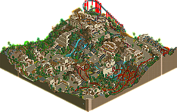
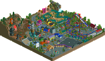
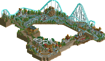
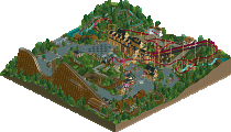
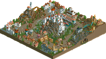
I guess I'm the only one that wasn't overly impressed by the LL park? Given the competition, I would have still given them my vote, but that was only because I didn't get the other park. There were a lot of plot holes, I guess you could say. But for the LL park, beyond the use of some seemingly new textures, there was absolutely nothing new. It was still the same old boxy 2x2 or 2x__ shit that's been going around for years, with a few variations. The foliage was not on par with today's work... I liked the coasters, yeah, but it really was a lot of the same, with some logical steps up with time factored in.
Edited by Midnight Aurora, 02 June 2009 - 10:32 AM.
You build a park, you send it in, you hope it wins, you describe the process as fun. That's it, nothing more!
Edited by K0NG, 02 June 2009 - 01:23 PM.
Xlapak:
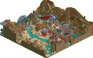
Another awesome LL park. You guys still keep pushing the limits of this game. Really nice. The theme isn't something new, but I like the whole 2012 idea behind it. The readme really helped a lot, good work on that! The park really oozes atmosphere and has some really nice LL architecture in it. The landscape was also VERY nice and everything was embedded and interacted with something. All the coaster were really good and pretty unique. The supsended coaster was solid, I liked how it was going in and out of the structure on top of the mountain. The astronomer was also really cool, I noticed it after I've read the readme file. Snake in the grass was the best embedded coaster of the park. It interacted really nicely with the surroundings and the architecture. Demon of the fall (cool name
Aquatica:
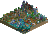
I wasn't sure about the themes here. You had Atlantis, Port royal, and some sort of sunken lost continent. I don't think this themes fit together at all. A readme was missing. I had no idea what was going on in the park. You had those two barriers (against water I suppose) and it was splitted into those 3 incoherent areas which aren't even connected to each other. And if the middle area was a water tank, why is a coaster in it that goes through holes in the tank? Sorry, I just don't understand it at all. I thought the pirate area was nice. I liked the coaster, it flowed pretty well and was nicely embedded! The cliff looked pretty cool with those buildings nestled to it. The atlantean area looked similar from the layout, but the buildings weren't that nice IMO. The archy was good, but there were some colors missing (maybe white and yellow). And the middle section was a bit confusing. It was aztec to some extent, but the other buildings looked rustic... I hope this park is unfinished and there will be some sort of explanation for it.
"MFG"
I mean, 2 votes in the last 2 days, they both went to the Germans and their voting average got up with almost 15%..
I hope some more people will vote in the last few hours, or maybe there can be some sort of look into the votes by the management to see what happened here..
It has been said already, but round 2-match 1 got 28 votes, so where are the other votes?
SF
ps; I don't think that was meant by it, turtle
I voted for Xlapak. A really nicely landscaped map, it flowed really well. Every little area was good to see, small touches to add to the park, parrot on a fence is bloody lovely. And so is that large wooden door. Really well done.
will write what I think about the parks later. but both where pretty good.
altough it was kinda dissapointing to see an unfinnished park again.
Does this really surprise you? It's way too common for this contest... has happened numerous times in each and every contest of this type in the past, so you knew it'd be happening again.
when is the next match gonna be posted?
Edited by Panic, 03 June 2009 - 05:10 PM.
"Ohhh. Awww shit."
I hate our park. There's is some good stuff, but as a whole it's a huge mess.
Port Royal, I think, is probably one of the best areas I've ever done. It's a shame it is located in this park. If I ever do another pirate-themed park I'll copy this area into the new park. The lower pirate area was done by Luigi, but we all agreed that there were a few annoying flaws so I modified it a bit. The lowest row of buildings however, is pure Luigi. I feel sorry for him that his upper part got modified by me, and the lower part is covered by a glass wall...
Supports are done by Louis, the small unfinished coral reef by me.
The middle section is done mostly by Luigi, except for the path layout, the temple and the weird coaster.
Upper Atlantis section is done by me, and it sucks. I somewhat like the entrance, but everything else just totally sucks. I believe I had a good idea, and Louis probably had one too, but there wasn't enough time left to do that. What's there now is extremely rushed... Lower Atlantis section is done by Louis, obviously.
The screen gives the impression that Louis did the least of all of us, but that's not true. I believe he spent a lot of hours on hacking all the fish and the coaster supports.