Park / Qhyre Rock
-
 06-February 23
- Views 7,511
- Downloads 237
- Fans 2
- Comments 25
-
 Description
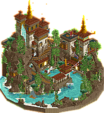
At the heart of the South Sea sits the peculiar spiral outcropping - Qhyre Rock. Settled long ago by an unknown tribe, it is now home to master silk-weavers who trade tapestries and carpets far abroad.
-
2 fans
 Fans of this park
-
 Full-Size Map
-
 Download Park
237
-
 Objects
1
-
 Tags
Tags


Qhyre Rock: Beautifully done with great presentation, rockwork and landscaping are great and I like all the little touches like the fish and insects to give it just the right amount of motion. Also liked the water sounds.
Climber's World Moab: A cool theme, and one where rockwork is very important, which is great here. Love the way the different rock types and textures are used and work together for just the right effect.
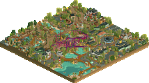
60 Seconds at Monkey Falls: I like how it's so tall while being one giant pillar instead of floating islands or something similar. MAin coaster was fun to watch and had some really cool moments on the way down.
The Old City: Wish this had a readme, from what I can see the concept is pretty good, with the imposing ancient ruin under a layer of ice.
Respite Island: By the time I got to this I was pretty much totally out of ideas or inspiration, so I ended up just doing this somewhat post-apocalyptic Island with hastily built wooden built around and old ruin. I did this in LL because I figured I could at least finish it that way, but kept putting off working on it for lack of ideas and never did as much as I wanted to.
looks like this is closed so i have narrowly avoided having to face Leon again!
Xtreme - so thoughtfully composed and layed out and a well deserved win. Getting such a distinctive shape on a small map can't be an easy task and you pulled it off so well.
BSG - would've gave me a run for my money with a couple more hours of finish towards the bottom of the map. As it is, I like seeing quirky, extensive, and highly vertical coasters like this.
Lurker - This was honestly a breath of fresh air in such a hyper detailed, hyper conceptual competition. Lovely entry and a cute coaster.
MorganFan - If you'd cut the top level you'd honestly have been fairly close to a finished entry, as it is I liked the layout and the ice bridge a lot. Knew you had a lot of potential from H2HC and hope to keep seeing you build in CSO.
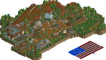
me - this is probably my personal favorite as far as my micros go, once I did the macro and layout everything else came out pretty naturally. I visited Canyonlands, Arches, Bryce, and Zion in 2017 and have wanted to build a park based on the area ever since. Since I barely have time to build at all a micro had to do. I also have picked up on Bouldering in the last year and although rock walls aren't a novel feature in parks, I wanted to take it to the next level. All of the routes on the Bouldering (the colorful artificial walls) were made to be climbable in theory, and I wanted to put a variety of difficulties in there. Shoutout to eyedropper and scenery manager for making it slightly less of a pain, though it still took like 5 hours of the build.
As a progress pic: my rock farm
The remaining three in random order:
MorganFan - Again another park with solid rockwork! The glass bridge is lovely and I like the simple architecture, just wish there was a bit more crunch/detail/anything else to make it not look super monotone in both color and texture. Interesting coaster layout for sure, took me a while to realize the B&M track actually doesn't have the large zero G rolls since you covered that up so well with the LIM and single rail coaster layering.
Lurker - Such a calm atmosphere here. I dig the subtle color differentiations in the track. Wish there was something more to boost this entry for me since it feels a bit flat.
Bigshootergill - This one definitely isn't flat though haha. The start of the coaster gives me Temple Run vibes. The combination of the Fisch rocks and the in-game vertical surfaces isn't really my fav, but I have to say the Fisch rock formations that are there are really well-made. Temple looks great too!
Match
Conclusion
The poll is now closed. The formula to derive the results is:
As replacement, bigshootergill is invited to submit a park for Round 3 (Semi-Finals). If there is a drop-out their micro will be chosen at random as replacement.
xtreme: incredibly beautiful and chill, it almost feels like a live wallpaper or a snowglobe scene in a way. everything is so clean and expertly crafted. both the rockwork and the architecture are top notch. a nice amount of nooks and crannies to dive into which sort of makes up for the lack of life, although slightly more movement would've helped to make it even more engaging i think
cam: i dig this theme and you really managed to create a very convincing environment that looks so much fun to be in. i love how the coaster interacts so nicely with all the rockwork, just great compositional skill. so much going on but still very readable.
[no particular order]
bsg: i feel like this could have been super epic, but just slightly misses the mark because of unfinishedness. the coaster is awesome and so much fun to follow. sadly the rest of the map lacks a bit of life and polish (that im sure you were planning to add). i'd love to see you revisit this concept in some type of way in the future. if finished this would have been a real challenge for xtreme and cam.
morgan: im pretty sure this is very unfinished, but theres still some cool stuff to take away from; i dig the glass bridge and the overall composition of the map (except for the big block in the sky, not sure what you were trying to do there)
lurker: can only view in ORCT, but these days i think its quite close. i like how you just made a cool island without any bombastic "in your face" stuff. its a nice breath of fresh air and super enjoyable to look at. i think you have one of the most distinct building styles on NE at the moment, and i hope that you will stick to it in the future because its very welcome to add some variation and rest among all the super-detailed rct that we get nowadays
Xtreme97 - The crunch you’ve done here is quite superb. Something you have always been good at perfecting. The colors are classic and the object usage is infredibally sharp. Those spires are absolutely stunning. I love the small bits of dye stains and the integration ofnsuch vibrant colors through the rugs.
Camcorder22 - This entry was a lot of fun to look at as I was just sort of imagining what this could be like in real life and how cool the design would be. I like the infamous RMC from h2h8 for the same reason. The the rock climbing theme is a really nice touch. The infeastructure and vibe is unique and very well executdd. One of my favorite layouts this contest.
Big Shootee Gill. -I like the two different rock materials here. It offers some nice intrigue to your world building and how the environment naturally occurs in your world. The coaster and verticality is pretty impressive, and the overall moodiness carries a lot of atmosphere
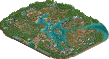
Lurker - A really nice LL submission. The wood structures are well executed and the side friction coaster makes the map have such a nice form like a topographic map. I love the snug fit and the liveliness of everything.