Park / Terra Magica
-
 18-February 23
- Views 1,202
- Downloads 287
- Fans 1
- Comments 4
-
 59.50%(required: 65%)
 Design Submission

chorkiel 70% CoasterCreator9 70% In:Cities 65% Jaguar 65% posix 60% Terry Inferno 60% Xtreme97 60% ottersalad 55% RWE 55% wheres_walto 55% Liampie 50% Scoop 50% 59.50% -
 Description
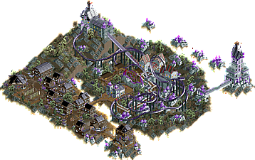
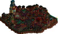
In a land ruled by a mad sorcerer, the very ground is consumed by the same crystals that give the sorcerer his power.
Threatened by total destruction the inhabitants of the village nearby rebelled and ousted the powerful sorcerer. With him gone, the crystals stopped growing and peace returned.
Besides the occasional lynching, the villagers are a happy and fun loving people, and a large rollercoaster was build through the old sorcerer's mansion to remember his banishment. And for good old family fun. -
1 fan
 Fans of this park
-
 Download Park
287
-
 Objects
1
-
 Tags
Tags

Some clever use of DKSO for the crystals and land edges, and the station fly-through/loop is pretty cool.
Lovely aesthetic you've created here with the termite mounds and Mayan temple pieces as crystals. They pop quite well in this palette, and the bold choice to keep the other colors to a minimum works well with the environment you've created. We don't end up missing orange and blue since they aren't necessary here, and the pale greens complement the bright purples surprisingly nicely. The contrast between the wooden village on one side of the bridge and the ornate castle on the other is one of the strongest features of this map.
I'm on the fence about the coaster, mainly because it doesn't end as strongly as it starts. Threading the loop seems a bit forced here, and though I appreciate the queue interaction it creates, it also seems like the coaster just didn't know how to end while simultaneously being constrained by the void cliff edges (which are wonderful, by the way). The track colors--particularly the dark gray--do allow it to get a bit lost in the landscape, but I also have not found a combination that allows it to pop here without being too different from the color scheme you already have. Red or pink would have allowed that balance, but it would have potentially detracted from the idea that the coaster is crystal-powered, so I believe you did as well as you could have there considering the limitations.
I would love to see your imaginative ideas and creative approaches to architecture and landscaping come together in a large park setting. High concept, full-size fantasy parks are all too rare these days, and I believe you could help fill that void with something truly magical.
Cool coaster here. The first drop is well framed - great moment there. The station fly-bys are cool and a nice interaction for the guests in line. The creative land edges are cool and provide some nice beginnings of world-building, but in the end I think the theme here is "crystals".
Which brings me to my next point: it feels like I've seen all of this before. The DKMP same-y architecture. WWTT rocks. 2x2 buildings. But, going back to the world you created, it does remind me a bit of games like AoE, Banished, and other city building games. So I greatly appreciate that.
You've got the tools I think. The portal idea on the edge of the map is cool. Run with that.
My favorite entry of your's from the DKMP contests. Amazing use of the goth palette. The church with the floating bridge is my favorite standout of the park. Great sign for the coaster. Wonderful, flow-y layout. Makes great use of the terrain.