Park / Whzzfest!
-
 22-May 09
- Views 33,396
- Downloads 1,229
- Fans 2
- Comments 118
-
 57.50%(required: 50%)
 Bronze

Cocoa 70% Jappy 65% CoasterCreator9 60% RWE 60% Xtreme97 60% bigshootergill 55% chorkiel 55% geewhzz 55% In:Cities 55% inthemanual 55% Liampie 55% Scoop 50% 57.50% -
2 fans
 Fans of this park
-
 Full-Size Map
-
 Download Park
1,229
-
 Objects
324
-
 Tags
Tags


Just to get people back on topic:
But, I do not think it's right to blame the Whzz Kids as the bad guys. I feel bad that it looks as though us admins gave the "dirty work" of making a decision over the Minutemen park into their hands and they are now held responsible for no match happening and kicking the poor team out of the contest due to the -3 record. That is just wrong. Like K0NG said, posting the poll basically means to bend the rules about deadlines over completely. geewhzz and I discussed whether we should keep the poll posting or just get rid of it completely from now on. In the end we found if this should happen again and the team isn't offered a poll they will again blame us for treating them unfairly as other teams have got one before. But maybe it's worth it, I dunno. I'd kinda prefer to get rid of the polls completely myself to save us some pain next time.
To cut a long story short, my sole intention was to somehow get a match to happen and keep both sides happy and motivated. Didn't exactly work out. But lessons have been learnt.
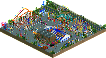
I like this park, but I feel it could've been much more realistic.
I think it's weird to have footers on a fairground.
The bumpercars were too bare, but I'm sure this was rushed. This could've been very cool if finished.
What's this?
This doesn't look finished. I didn't like the coaster too. Not just the coaster itself, but the location also.
Too rushed to look good.
This little area looked really great, but it didn't look like it should look like. The setting of the fairground was 'wrong', I would've picked one huge meadow or some urban streets. Now it looks like the landscaping was made for precisely this fairground. Especially the foliage, folded around the rides.
Also, I didn't like the freefall.
That's all I've got to say. Everything else was lovely. The tent, the Olympia Looping, the custom flatrides. Good job on that!
Minutemen
This park isn't quite my style. The three parkmakers involved are actually my least favourite parkmakers from the Minutemen...
I'll give some examples:
The landscaping didn't flow at all. The high grass grows in squares, the big tree looks forced and the whole image looks very random. Also I suspect the landscaping is used here to fill the blank spots. That's ok usually, but this blank spot is huge. You could've done more with that. The prison being located in the middle of the map would've been awesome.
Is this supposed to be a city? It doesn't look like one. It's repetitive, boring and random.
Why is there a restaurant in the prison? Why is the helipad shaped like a rectangle, while begin small and next to a wall? You should have used the roof next to this building. It's higher and much bigger. It looks like you made a helipad just to have something there.
Another thing shown in this screen is the wall. The grey stones don't look good. I made them tan, and it was way better. Now they scream "Look here! Here's detail!". Not very discreet. Also, I didn't like the towers. Why is the top made of wood? Even more forced detail?
This area wasn't too bad, but improving it wouldn't be very hard. It's incomprehensible why the land under the path is white. It serves no purpose. The fountain looks, again, forced. Just to have something there. It doesn't look good and I don't see why there has to be a fountain here. Why?
Something I couldn't highlight on the screens was the fact that it's a themepark. A concept like this is awesome, but why make it a themepark with an entrance, shops et cetera? Better focus on the theme itself than creating some useless restrictions.
Main problem in this park is sense: There is too little. For example, rides like "Launced!" (without an H), "Horsepower!" or "Hideout!". They didn't contribute to the theme and the exclamations were annoying.
I really liked the ferris wheel btw. Maybe it was a bit too fast, but it's still very cool. Good job on that.
It's hard to decide which one is the better park. Whzzfest was executed much better, but 7 Days in Prison had more things to see. I think I like Whzzfest more, but I'm not sure yet. As my decision has no influence on the further contest the pressure to decide is gone.
Thanks both teams for the parks! It's a shame the Minutemen got disqualified for round three. It may be fair, but their chances of getting into the playoffs shrunk a lot. Please Minutemen, don't give up yet.
By seeing that the park is name "7 Days in Prison" I believe that that was not a city, but a ... prison.
And while prison's may not have a real "restaurant", they sure do not have roller coasters and other rides. Taking a leap of faith here and saying that it's a theme park based on a prison escape..
I don't care about what you think, but this sounds more like insulting than being honest. Maybe I picked the wrong words. I didn't mean the parkmakers in person, I mean their parks.
Unbelievable. I tried to make a normal post instead of fighting like some other people in this thread...
anyway, i'm still glad to see the whzz kids, my favorite team, win another, and I think that they might have won this match up anyway, but it would have been close.
These are another interesting couple of parks. I liked the Whzz Kids' park; I've always wanted to see a 'fairground' style park pulled off in RCT. The problem with this for me was that it didn't QUITE execute that concept fully. As someone's pointed out, there are footers for some of the rides... others are almost well-landscaped... basically, it felt more like a PERMANENT fairground, rather than a travelling one, such as Oktoberfest which you said you modelled the park on? There were some real good things; I did like the custom flats, particularly Chaos. The Wild Mice are good; Olympia Looping pretty good, although a little too slow in places - but appreciate that it's hard to pull this ride off and I think having block brakes on it (as you did) was a good trade-off.
Didn't get the little red coaster in the corner at all. Not too sure about the themed one either, although liked the train of spinning cars. The tent was a cool idea, but I dunno, it kinda looked a bit ugly and too big to me. All the side-stands/games were cool. But it was all just... 'nice'. There wasn't anything exceptional. There needed to be more. As I said, it feels like a permanent fairground rather than a travelling one, and lacks the atmosphere I imagine something like Oktoberfest would have.
7 Days In Prison! is by no means perfect, but I think it offered a little more than Whzzfest. I read the read-me; that did help explain the idea behind the park, thanks. But I think you could have also included a bit about how the actual rides tie in with that storyline. You could have said 'on the John Miller coaster, you live out the escape of John Miller via.... etc etc'. But yeh, obviously you ran outta time!! I thought a bit too much space was spent on the front of the park, and the prison was kinda too crammed and you couldn't really see what was going on.
I absolutely LOVED the custom ferris wheel - but not only that - I loved how the coaster went through it. Wow, that was visually awesome. Almost equally good was the Premier Ferris Wheel Lift. Never seen that done before - great creativity there. Despite that, I didn't really dig the red or orange coasters. The black one was fun, but nothing that special. I liked the little cave with its couple of rides. I liked how there was a lot to get your teeth into in this park - there was quite a lot of little hidden things which took me a while to pick up on. Basically, I just thought that this park was a little more ambitious and slightly better executed than the Whzz Kids' park.
The Gweezh park was ok. The style of the park is never been my favorite style but i enjoyed some parts. The feeling of the park was great and I really felt this would be a map for Oktoberfest (although i have to say i have never been there yet). I have to say i expected something better from these guys. It was a good park but i think you three could have made a better park.
The park of the minutmen was really nice. The thing i liked the most was the bib ferris weel. It looked so nice although (mentioned before) went a little to fast. I can't agree that the landscape looked to forced. I thinki it had no controbution to the theme but it didn't got the park down imo. In overall i liked this park more.
Edited by ivo, 23 May 2009 - 07:39 PM.
never steal my hacks again before I released them .... I like you so I try to help you. but I don't like it when I help people and then see my help used agains me. I would say I will get you back this season. but now my laptop died I'm not sure I can.
still two nice parks
I wrote down a lot of stuff about 7 Days in Prison, and actually forgot to highlight the farmarea, which I really liked (except for the "Horsepower!"-ride). Comet is responsible for this I guess? Well done!