Park / Adriatic Adventures
-
 29-January 23
-
 Otter's LL Park
- Views 2,705
- Downloads 368
- Fans 0
- Comments 11
-

-
 71.88%(required: 70%)
 Gold
Gold

CoasterCreator9 80% RWE 75% Terry Inferno 75% Xtreme97 75% chorkiel 70% Cocoa 70% G Force 70% Milo 70% posix 70% Scoop 70% 71.88% -
 Description
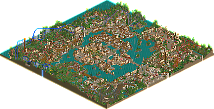
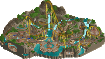
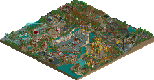
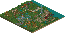
Started in the summer of 2018, Adriatic Adventures is finally here! Explore various lands and themes as you circle around the Venetian lagoon.
Make a big splash in the Davinci Cove. Race around the narrow streets and alleys of Venice. Soar over the ruins of an ancient civilization. And plenty more!
Thank you to those who took a look at the park before submitting it. H2HC really encouraged me to complete this park. Probably easy to see big influences like Cocoa, Natelox, Fatha' among others.
Enjoy! -
 No fans of this park
-
 Full-Size Map
-
 Download Park
368
-
 Tags
Tags
![park_4114 [H2H8 R3] Forum Caeleste](https://www.nedesigns.com/uploads/parks/4114/aerialt3853.png)
Wow. I don't have proper LL anymore so it's a little buggy, but this is just classic as hell. This early pseudorealistic style is just so charming.
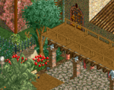
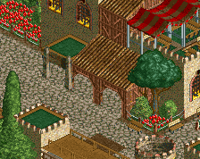
No boat rides in the Venetian area? I think the DaVinci Cove section is my favorite. Really excellent macro with a distinct style from the other lands and unique foliage combinations.
All four of your primary coasters have the same issue where they are in a corner on the outside of the path, with little/no interaction with anything else. On this front I think Aquilifer may actually be my favorite coaster in the park.
My only other complaints really are that the areas are pretty sparse on rides, and the themes are not super clear, and feel pretty generic to me (especially the "ancient" area). But on the other hand both of those things are relatively emblematic of this era of parkmakers. It doesn't sour it too much for me, but I think those aspects might hold it back for people who won't automatically look at it in that context.
This is a fabulous and charming park! I'm honestly surprised at how nice it looks considering it's LL, but I do think all the details are working here despite the limitations. The archy and path details are all clean, and the foliage is pretty nice, too, considering that all the 'modern' CSO is missing. I also LOVE your layouts -- the invert in particular is a treat.
It feels a bit same-y in regards to aesthetics throughout the entire park, but it's small enough to forgive, especially given the LL context of the build. Honestly, my biggest complaint was that the park was empty! I spawned in an entrance and spammed a bunch of trams in; the park feels much livelier and full with guests walking around.
Overall, though, I very much enjoyed this! The simplicity feels elegant and deliberate, rather than lacking.
Nice park Otter. Some areas had some clear inspirations that you put your own spin on which I appreciated, unique ones too.
Some of the coasters felt a bit meandering perhaps but I liked almost all of them, each had a clear identify and feel which is always important.
The Davinci and Byzantine areas definitely were my favorite, not sure if you did those sections last but they felt the most developed and clearly inspired. Hope to see more stuff like that from you.
@Ling: thanks for the comments. Definitely see your points about ride interaction. I think some of it is a casualty of starting this in 2018 and not planning a park layout until 2 years in to the process!
@bmschulz: appreciate ya. Simplicity is my MO lol
@G Force: thank you! You're spot on, those were the last two areas I started. Definitely 2022 me as opposed to the entrance/medieval/Venice stuff that was 2018 me.
We're in a weird place with LL where nearly all LL produced is nostalgic and derivative. Is innovation really desired? I like LL for the throwback vibes, and this park does that well! I don't care that it is derivative in places. It's familiar, it's large, and it's also unmistakably an ottersalad park! And it's not entirely derivative, there are some really nice touches and unique choices: the brightly coloured awnings in the carnival area, the aqueduct, and the general more crunchy aesthetic in the Ottoman area. I think Invader is stunning, by the way. You did a great job giving that one a pleasant environment.
I mean to write a proper review later!
I've given you relatively complete feedback on this before, but I'll just reiterate how good da vinci cove is. overall, fun atmosphere and very cozy work. awesome to see LL in any form these days!
(honored to be a 'big LL influence' like nate and fatha too haha)
This is such a clean, classic throwback park. I really like the blend of textures and the subtle hacks all through it, and the coaster layouts are pretty smooth and have some nice terrain interaction.
Glad you approve Lurker! My RCT style has been to be very subtle or laid back with hacks - at least don't do anything crazy!
@cocoa: thanks again for previous feedback.
Classic LL with a modern take on landscaping and ride design that could fit either in the past or the present. Your influences would be proud of this release!
Subtlety is definitely the word to describe where this park shines. Each choice you've made--color, architectural, object--further highlights your strength in macro area design and composition.
This area is an example of one where everything comes together perfectly. Nothing forced or grandiose... just understated beauty all around.
Entire palettes have been created that consistently omit that lovely shade of RCT blue, so you are showing us once again that this is a color to be embraced, not feared.
One of the most impressive qualities of this park is that it predominantly uses the same three beige wall textures throughout every area, and yet no two areas look alike. Since this park is themed around a specific geographic region where each subsection does not require drastically different architectural design, this choice makes sense, and you've successfully allowed each corner of this park (including the middle corner) to develop its own identity without In that sense, this park is a masterclass in how to design themed areas that are similar but distinctly different.
A few pieces of areas could have been taken further if you had wanted to play with path shape even more.
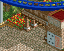
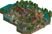
This half of Rome, for example, might have benefited from a rework of that big 90-degree angle (first screen) and a bit more internal detailing/path variation (second screen).
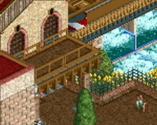
This section could have also tightened up the path around the grass and used a bit less linearity overall.
But these are, of course, extremely minor nitpicks that do not detract from the viewing experience.
You already know what my favorite quality of this park is, however, which is why I've saved it for last. You've done something here that many of the old LL builders neglected to do even at the Spotlight level--you've given the landscaping shape and breathing room with open grass. Not too much--just the right amount--and you've in turn shaped it with foliage and rocks. Sure, many builders can create rides and structures that I could look at all day (which you've done in multiple areas here), but if I'm doing the same thing with clear, open grass, that's the mark of a truly great park (and builder) in my eyes.
Nice layout for the wooden rollercoaster! Kind of reminds me of the now defunct Raging Wolf Bobs
Lovely nostalgic park. Almost felt like a PPASTF task when scoring. I really enjoyed Invader and the surrounding area, as well as the DaVinci Cove. Both i see as 80%+ work, both are very well executed and carefully designed areas. One can really see your strong composition shine here.
I also do enjoy the landscaping and foliage work youve done in this. Every area of the park has its own foliage code, but the styles still dont feel disconnected. Not every park builder can achieve that! I also think you built a very good entrance area. Its nothing spectacular, but feels like exactly the kind of entrance this park needs.
I think the main negative thing i see viewing this park is the macro composition. The park feels like an island of paths and architecture - cool paths and architecture i must say tho - with the coasters surrounding it. I think Angry Otter Bobs shows that issue quite well. It looks like a nice and well crafted wooden coaster, but it seems like from a peep perspective i could get the best view when standing in the blacktiles.
Congrats on finishing such a well done and large park! Definitely had a nice voyage when viewing this and enjoyed most of it. Well deserved gold!