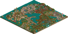
1. Splitvision: This is just too cool. Extremely impressive. I don't really know what else to say. Even though there isn't much content other than the main gimmick, the main gimmick is probably the most interesting thing I've seen in MM so far.
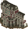
2. Ulvenwood: Such a cool entry. Its almost feels cartoony in a really good way. The architecture feels a bit blocky but honestly I think the blocky feel works really well with the organics and the landscaping features. The dark ride itself was also great. Overall, a very fun entry.
Hoobaroo: Really sweet entry! It was really hard to not vote for this one as I probably would if it was in a different group. The concept seems very fleshed out which is cool and I like all the details you included in here. The architecture is also very solid. I really enjoyed this one.
AmusmentParker: Really cool entry with a really nice atmosphere. The architecture is quite solid as well. Very strong showing!
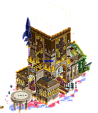
Hoobaroo: A very evocative scene. Weirdly enough, I think my favorite part was A Note. It's such a lovely, simple detail that does so much to enhance the atmosphere of the build itself. There's a nice contrast between how somber the note and little astronaut are, versus how vibrant and lively and colorful parts of the build are. And, of course, the archy is great. This feels like a little slice of some fantasy world -- it's really wonderful.
Splitvision: I was genuinely not expecting this to take off from the screenshot alone -- wow!! What a great technical achievement. I've no idea how you did this. The countdown, the smoke (!!!), the actual liftoff, this was really, really cool. Great storytelling with the little intro popup too. This felt like an experience!
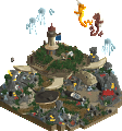
Ulvenwood: I've only seen Coco once several years ago, so it's not super fresh in my mind, but you definitely capture the vibrancy I remember. The archy is really nice, and the little colorful creatures are really well done, too. The build definitely feels like a festive island amidst the black void of the RCT2 background.
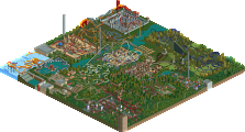
AmusementParker: What an astounding level of detail in this build! The amount you've crammed in here is really astounding; the scene feels absolutely huge without feeling unrealistic or packed. The rides themselves are really well done, especially the twist platform; I just wish guests could ride them. Situating the street to create cutaways into the buildings was absolutely genius to create space for the internal details, which are great. This feels like genuine slice of real life somewhere; you nailed the lively street atmosphere perfectly!
1.) The Stranger (hoobaroo) - Loved it. The mysterious story and setting feels like a novel waiting to unfold. Architecture is gorgeous and, despite there not being a ton of movement from a primary ride, it still keeps my interest for a while. Excellent job.
2.) Sagan 4 (Splitvision) - Wow, I can't believe this is even possible in this game now. The countdown, the smoke, and (best of all) the actual rocket moving. Just amazing. I think I'd give this the top spot in this group if there was more scenery around or a narrative, but hoobaroo's was just slightly better and theming/narrative cannot really be done much more once you go with the authentic space pad vibe (which I love, still, just not as much). That's a long way of saying that this was phenomenal.
3.) Fiesta de los Muertos (Ulvenwood) - This felt a lot like The Stranger, but Mexican themed and slightly less immersive. It's fantastic, it just came up against tough competition. I really like the pop of color from the alebrije, but they seem like early 2000s sculptures (maybe more trackitecture would've impressed more). Love the bridge, music, and little touches from one of the most underrated Pixar movies. And that skeleton in the hammock is really really cool. Super well done.
4.) Southlake Street Fair (Amusementparker) - wow, I really like this and would love to see a full park done like this! It reminds me a lot of G's or Coupon's work but denser. It also screams fun. This is a standout micro and I hope we see more from you. Form the colors to the architecture to the little details, everything is excellent. Please don't take last as an insult here, because ordinarily this has the right stuff to move on.
I give first place to Sagan 4 Launch. Just a great custom ride trick and the countdown numbers were well done. It's just so unusual a sight for RCT that it was really fun to watch.
Second place I give to Fiesta de los Muertos for the fun details and the music. The ride was well integrated into the architecture and I liked the details of the skeletons.
Third place is really tough. I was leaning one way but I changed my mind. I give it to The Stranger for having a sense of mystery that rewards repeat viewings. I could say more about it but it's better to experience it for yourself.
Southlake Street Fair was nearly as good as any of these others but just comes up a millimeter short. The decider for me was the lack of music to go along with it. It might have made my third or second place choice with that. This wouldn't factor in much but this was an especially tough group.
Well, congrats to all on such good micros and I hope to see more work from outside the contest by those unlucky enough to not advance.
1. hoobs---nobody else is as daring with experimental and 'literary' rct, and I'm here for it so much. there's still a touch of trope-iness but I love the warmth and activity and the detailed structures. just so interesting, i cant get enough of it
2. split---i mean, rocket go up
ulvenwood---so close to 2. I love the dark ride and all the tiny details throughout. its an awesome little ride. I didn't quite get the architectural style, which didn't really feel very 'coco' or even mexican.
amusementparker---fucked up good from a newb. this would have won other rounds...really high quality building. just build in the middle of the bench next time!
Sagan 4 Launch is the kinda creativity that sweeps a contest. Would probably have taken the round for me even if it was just the launch, let alone the re-entry and swirling smoke after landing.
I see more I recognize in Fiesta de los Muertos, but I think The Stranger captured my imagination more. Loved how the buildings just fade out of existence, makes me wish I could see just a little further. The details on all the buildings are quirky and interesting but not nonsensical. My one complaint is maybe Anachronism I think is a coaster, but why does it load 5ft over the train tracks and only have one car? Fiesta is a safer concept but I think the originality of the other two edged it out slightly in this tough group.
Southlake is technically extremely good, but I think it's just the wrong format for a map like this. Building interiors only goes so far when you're competing against blowing up sand monsters, dreamscapes, and evil villain hideouts.
Wow what a tough vote this is.. wish all 4 of you could move on to the next round.
AmusementParker: Welcome! This really caught me by surprise. Really nice bit of realism and grittyness. Would love to see this skill expanded into a larger park.
Hoob: Impressive, shiny, colorful are the first things that come to mind. Would love to know who The Stranger is. There's always so much intrigue and mystery to your work and it's captivating.\
Splitvision: Showstopper right there. Holy cow.
Ulvenwood: Music was a great addition here. I think this further cements you as a top tier dark ride maker. You did a great job of incorporating show scenes into the architecture and making it all extremely cohesive.
As voting begins to wind down for this match, and it's clear I won't be moving on (what I was anticipating really), I just wanted to say a few things real quick! First, I want to congratulate my competitors! You all created some amazing projects. The amount of technical building you 3 put out is amazing! Congratulations and good luck in the coming rounds. Second, I want to thank everyone for the extremely kind comments on my submission. I think it's clear that the MM format isn't my niche, and thats ok! My brain just can't create an awesome fantasy driven product. My lane is realism, and hopefully I can expand on my skills and release a full scale park some day (or maybe a design first, ha!). I have a lot to learn but it is nice hearing that I am on the right track.
Splitvision: As soon as I realized the numbers were actually counting down, I knew something awesome was about to happen, but that? Then the second part of it as if the first wasn't amazing enough. Wow, what a display of technical skill.
AmusementParker: Having been to a few small town fairs, this absolutely nails the atmosphere of them. Everything right where it'd be, down to every little detail. Then there's the building interiors on top of it, love this.
Ulvenwood: Charming, colorful and fun. Great sculpture work all around and nice presentation.
Hoobaroo: Great atmosphere, beautiful colors and a great combination of architecture and otherworldly abstract effects.
As voting begins to wind down for this match, and it's clear I won't be moving on (what I was anticipating really), I just wanted to say a few things real quick! First, I want to congratulate my competitors! You all created some amazing projects. The amount of technical building you 3 put out is amazing! Congratulations and good luck in the coming rounds. Second, I want to thank everyone for the extremely kind comments on my submission. I think it's clear that the MM format isn't my niche, and thats ok! My brain just can't create an awesome fantasy driven product. My lane is realism, and hopefully I can expand on my skills and release a full scale park some day (or maybe a design first, ha!). I have a lot to learn but it is nice hearing that I am on the right track.
I'm gonna be that guy and said you don't deserve to be eliminated. Hell, no one in this round does. What you've shown is an emphatic introduction to your style, and if you can get a full scale release of this quality out you just might end up with a green name. Excited to see what you've got!
One of the better matches! I was too late too vote but wasn't sure who to vote for anyway, other than Hoobaroo.
Hoobaroo: what is this? Some kind of a backpackers hostel/convention center outside space and time, for time travelers and stuff? I’m not sure, but I dig it. Stylistically there’s some good stuff, as usual: the station morphing into natural elements, the grandfather clock as a station clock on the platform, the clock docking platform, and the lighting effect especially around the lower level columns.
Splitvision: Yup, classic Splitvision! Not as mind boggling as Gangland or Efundja (for example), but yet another great implementation of clever track syncing and custom trains. The countdown trick is probably the highlight here, but I also liked how the rocket returned without the capsule.
Ulvenwood: reminds me of a park we already got in H2H8. This one is not as good in some ways, but at the same time, it does some other things really well - and of course the micro is a different genre altogether. I like micros that are not overwhelmingly ambitious, and just great micros - this is an example of those. Just a great little scene. I love the musical skeletons, so cute!
AmusementParker: you’re already one of the biggest surprises of the contest for me, whatever happens in this match. This is excellent work and shows attention to detail and ambition, with the interiors and stuff. The golf putter in the coffee place… Is that an employee sweeping up some litter?
Thank you to everyone for your constructive thoughts and kind words. It really does encourage me to continue creating.
Splitvision: Yeah. I mean, this is crazy. No idea how you did this, but it's awesome. The smoke, the sounds, the countdown, this was the perfect execution of this idea. I'd like to see this level of craziness taken to something a bit more visually stylish as well, but for this concept specifically, it was flawless.
Ulvenwood: This was super charming. I love the statues, like the hammock man, the smoking guy on the roof, the guy hanging onto the dragon, the band players around the map, there's so much life in this entry. The music too makes it so alive and I love the atmosphere that you created here. I love the small ride with the reflections in the mirrors, the candlelit dinner... the more I look around the map, I really am just so charmed by it. A little more variance in the building's colors could've added a bit more visual flavor to break up the brown. But this was really great.
AmusementParker: Also dude, what? This is crazy, especially for a newcomer. Super lively, but the amount of attention to detail is what really shocks me here. The bathrooms, the stage, the interiors, facades, the games.... there's so much to see here. genuinely wild. Keep going.
This was a crazy group looking back on it. So good from everyone.
The inspiration for The Stranger came from returning to RCT, and in a way, a part of myself, after a long period of time. Feeling faced with something mysterious yet familiar, intimidating outside yet warm inside. A lot of the building process was completely stream of consciousness and intuitive, as I found myself beginning to find the joy of creating again, I felt as if I was again rekindling that connection with "The stranger", or myself. And the joy of finding that although time passes and I may travel around, there is something within me that remains the same, curious and mystical.
There is definitely a strong spiritual connection to House by the Sea in this entry, that almost manifested itself unconsciously. I left the "story" vague as to aid in sparking everyone's own creative interpretation of the work, and I also really like reading people's own ideas of what it could be. Six Frags' idea of a man and his missing wife, or Liampie's interdimensional traveller's hostel, these new ideas make me smile and in a way add something unfamiliar to something of my own, which I really enjoy. I don't ever want to feel too accustomed to myself or anything I create. That lingering sense of exploration/mystery is what keeps me inspired.
34 Comments
barnNID Offline
1. Splitvision: This is just too cool. Extremely impressive. I don't really know what else to say. Even though there isn't much content other than the main gimmick, the main gimmick is probably the most interesting thing I've seen in MM so far.
2. Ulvenwood: Such a cool entry. Its almost feels cartoony in a really good way. The architecture feels a bit blocky but honestly I think the blocky feel works really well with the organics and the landscaping features. The dark ride itself was also great. Overall, a very fun entry.
Hoobaroo: Really sweet entry! It was really hard to not vote for this one as I probably would if it was in a different group. The concept seems very fleshed out which is cool and I like all the details you included in here. The architecture is also very solid. I really enjoyed this one.
AmusmentParker: Really cool entry with a really nice atmosphere. The architecture is quite solid as well. Very strong showing!
bmschulz Offline
RCT2day Offline
1.) The Stranger (hoobaroo) - Loved it. The mysterious story and setting feels like a novel waiting to unfold. Architecture is gorgeous and, despite there not being a ton of movement from a primary ride, it still keeps my interest for a while. Excellent job.
2.) Sagan 4 (Splitvision) - Wow, I can't believe this is even possible in this game now. The countdown, the smoke, and (best of all) the actual rocket moving. Just amazing. I think I'd give this the top spot in this group if there was more scenery around or a narrative, but hoobaroo's was just slightly better and theming/narrative cannot really be done much more once you go with the authentic space pad vibe (which I love, still, just not as much). That's a long way of saying that this was phenomenal.
3.) Fiesta de los Muertos (Ulvenwood) - This felt a lot like The Stranger, but Mexican themed and slightly less immersive. It's fantastic, it just came up against tough competition. I really like the pop of color from the alebrije, but they seem like early 2000s sculptures (maybe more trackitecture would've impressed more). Love the bridge, music, and little touches from one of the most underrated Pixar movies. And that skeleton in the hammock is really really cool. Super well done.
4.) Southlake Street Fair (Amusementparker) - wow, I really like this and would love to see a full park done like this! It reminds me a lot of G's or Coupon's work but denser. It also screams fun. This is a standout micro and I hope we see more from you. Form the colors to the architecture to the little details, everything is excellent. Please don't take last as an insult here, because ordinarily this has the right stuff to move on.
Ge-Ride Offline
I give first place to Sagan 4 Launch. Just a great custom ride trick and the countdown numbers were well done. It's just so unusual a sight for RCT that it was really fun to watch.
Second place I give to Fiesta de los Muertos for the fun details and the music. The ride was well integrated into the architecture and I liked the details of the skeletons.
Third place is really tough. I was leaning one way but I changed my mind. I give it to The Stranger for having a sense of mystery that rewards repeat viewings. I could say more about it but it's better to experience it for yourself.
Southlake Street Fair was nearly as good as any of these others but just comes up a millimeter short. The decider for me was the lack of music to go along with it. It might have made my third or second place choice with that. This wouldn't factor in much but this was an especially tough group.
Well, congrats to all on such good micros and I hope to see more work from outside the contest by those unlucky enough to not advance.
Cocoa Offline
wow, what a killer round. very close between all
1. hoobs---nobody else is as daring with experimental and 'literary' rct, and I'm here for it so much. there's still a touch of trope-iness but I love the warmth and activity and the detailed structures. just so interesting, i cant get enough of it
2. split---i mean, rocket go up
ulvenwood---so close to 2. I love the dark ride and all the tiny details throughout. its an awesome little ride. I didn't quite get the architectural style, which didn't really feel very 'coco' or even mexican.
amusementparker---fucked up good from a newb. this would have won other rounds...really high quality building. just build in the middle of the bench next time!
Ling Offline
Sagan 4 Launch is the kinda creativity that sweeps a contest. Would probably have taken the round for me even if it was just the launch, let alone the re-entry and swirling smoke after landing.
I see more I recognize in Fiesta de los Muertos, but I think The Stranger captured my imagination more. Loved how the buildings just fade out of existence, makes me wish I could see just a little further. The details on all the buildings are quirky and interesting but not nonsensical. My one complaint is maybe Anachronism I think is a coaster, but why does it load 5ft over the train tracks and only have one car? Fiesta is a safer concept but I think the originality of the other two edged it out slightly in this tough group.
Southlake is technically extremely good, but I think it's just the wrong format for a map like this. Building interiors only goes so far when you're competing against blowing up sand monsters, dreamscapes, and evil villain hideouts.
ottersalad Offline
Wow what a tough vote this is.. wish all 4 of you could move on to the next round.
AmusementParker: Welcome! This really caught me by surprise. Really nice bit of realism and grittyness. Would love to see this skill expanded into a larger park.
Hoob: Impressive, shiny, colorful are the first things that come to mind. Would love to know who The Stranger is. There's always so much intrigue and mystery to your work and it's captivating.\
Splitvision: Showstopper right there. Holy cow.
Ulvenwood: Music was a great addition here. I think this further cements you as a top tier dark ride maker. You did a great job of incorporating show scenes into the architecture and making it all extremely cohesive.
AmusementParker Offline
As voting begins to wind down for this match, and it's clear I won't be moving on (what I was anticipating really), I just wanted to say a few things real quick! First, I want to congratulate my competitors! You all created some amazing projects. The amount of technical building you 3 put out is amazing! Congratulations and good luck in the coming rounds. Second, I want to thank everyone for the extremely kind comments on my submission. I think it's clear that the MM format isn't my niche, and thats ok! My brain just can't create an awesome fantasy driven product. My lane is realism, and hopefully I can expand on my skills and release a full scale park some day (or maybe a design first, ha!). I have a lot to learn but it is nice hearing that I am on the right track.
Lurker Offline
Splitvision: As soon as I realized the numbers were actually counting down, I knew something awesome was about to happen, but that? Then the second part of it as if the first wasn't amazing enough. Wow, what a display of technical skill.
AmusementParker: Having been to a few small town fairs, this absolutely nails the atmosphere of them. Everything right where it'd be, down to every little detail. Then there's the building interiors on top of it, love this.
Ulvenwood: Charming, colorful and fun. Great sculpture work all around and nice presentation.
Hoobaroo: Great atmosphere, beautiful colors and a great combination of architecture and otherworldly abstract effects.
Gustav Goblin Offline
I'm gonna be that guy and said you don't deserve to be eliminated. Hell, no one in this round does. What you've shown is an emphatic introduction to your style, and if you can get a full scale release of this quality out you just might end up with a green name. Excited to see what you've got!
Xtreme97 Offline
Match
Conclusion
The poll is now closed. The formula to derive the results is:
As replacement, Ulvenwood is invited to submit a park for Round 2 (QF). If there is a drop-out their micro will be chosen at random as replacement.
Liampie Offline
One of the better matches! I was too late too vote but wasn't sure who to vote for anyway, other than Hoobaroo.
Hoobaroo: what is this? Some kind of a backpackers hostel/convention center outside space and time, for time travelers and stuff? I’m not sure, but I dig it. Stylistically there’s some good stuff, as usual: the station morphing into natural elements, the grandfather clock as a station clock on the platform, the clock docking platform, and the lighting effect especially around the lower level columns.
Splitvision: Yup, classic Splitvision! Not as mind boggling as Gangland or Efundja (for example), but yet another great implementation of clever track syncing and custom trains. The countdown trick is probably the highlight here, but I also liked how the rocket returned without the capsule.
Ulvenwood: reminds me of a park we already got in H2H8. This one is not as good in some ways, but at the same time, it does some other things really well - and of course the micro is a different genre altogether. I like micros that are not overwhelmingly ambitious, and just great micros - this is an example of those. Just a great little scene. I love the musical skeletons, so cute!
AmusementParker: you’re already one of the biggest surprises of the contest for me, whatever happens in this match. This is excellent work and shows attention to detail and ambition, with the interiors and stuff. The golf putter in the coffee place… Is that an employee sweeping up some litter?
AmusementParker Offline
Hahaha, yep, that was the idea behind that!
hoobaroo Offline
Thank you to everyone for your constructive thoughts and kind words. It really does encourage me to continue creating.
Splitvision: Yeah. I mean, this is crazy. No idea how you did this, but it's awesome. The smoke, the sounds, the countdown, this was the perfect execution of this idea. I'd like to see this level of craziness taken to something a bit more visually stylish as well, but for this concept specifically, it was flawless.
Ulvenwood: This was super charming. I love the statues, like the hammock man, the smoking guy on the roof, the guy hanging onto the dragon, the band players around the map, there's so much life in this entry. The music too makes it so alive and I love the atmosphere that you created here. I love the small ride with the reflections in the mirrors, the candlelit dinner... the more I look around the map, I really am just so charmed by it. A little more variance in the building's colors could've added a bit more visual flavor to break up the brown. But this was really great.
AmusementParker: Also dude, what? This is crazy, especially for a newcomer. Super lively, but the amount of attention to detail is what really shocks me here. The bathrooms, the stage, the interiors, facades, the games.... there's so much to see here. genuinely wild. Keep going.
This was a crazy group looking back on it. So good from everyone.
The inspiration for The Stranger came from returning to RCT, and in a way, a part of myself, after a long period of time. Feeling faced with something mysterious yet familiar, intimidating outside yet warm inside. A lot of the building process was completely stream of consciousness and intuitive, as I found myself beginning to find the joy of creating again, I felt as if I was again rekindling that connection with "The stranger", or myself. And the joy of finding that although time passes and I may travel around, there is something within me that remains the same, curious and mystical.
There is definitely a strong spiritual connection to House by the Sea in this entry, that almost manifested itself unconsciously. I left the "story" vague as to aid in sparking everyone's own creative interpretation of the work, and I also really like reading people's own ideas of what it could be. Six Frags' idea of a man and his missing wife, or Liampie's interdimensional traveller's hostel, these new ideas make me smile and in a way add something unfamiliar to something of my own, which I really enjoy. I don't ever want to feel too accustomed to myself or anything I create. That lingering sense of exploration/mystery is what keeps me inspired.
In:Cities Offline
wow hoobaroo you're so artsy