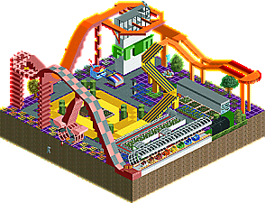
WhosLeon: This is absolutely firing on all cylinders. It feels like you've managed to cram every little bit of an urban cornerstore (subterranean detail included) into a little slice of RCT2. Add in a wonderful spinning coaster and this is a winner! There's so much content to unpack that it's almost difficult to begin, but the fountain and hanging ice cream cones are amongst my favorite details, aside from the archy in general. This feels huge, and, despite being packed, still has room to breathe. Wonderfully done!
Camcorder22: As an avid bass players with a love for Muse and Bootsy Collins, I have spent a good deal of time stealing my bandmates' guitar pedals to see how weird I could get my bass to sound. Suffice it to say, I'm quite familiar with pedals, andy you have recreated them PERFECTLY here. It's honestly ridiculous. The knobs, the lights, the 1/8" jacks, every detail is perfect -- and they comprise only a few of the details here! The whole scene is fantastic and thematically linked very well. I love the color palette, too; it fits the whimsy of the supersized musical devices well. A great shuttle RMC Raptor ties it all together perfectly!
wheres_walto: This is hauntingly beautiful. The scene feels expansive and dreamy thanks to the huge planetary backdrop, and the geometric artforms floating about space enhance the sci-fi atmosphere. Similar to Sepulchre by the Sea we saw in another group this round, your scene here feels like it could be a location in some sort of sci-fi fantasy epic. It's both imaginative and imagination-provoking.
Ge-Ride: This really reminds me of that old board game, Mouse Trap, I think? From the screen, I thought it was intended to be composed of toys, actually -- seems like the concept was a bit more abstract than that, though. Seems like you had a bit of RCT-writer's block, but it's a quirky scene even if it didn't wind up how you originally intended.
Leon, I voted for you as my favourite because the skill is undeniable, but if I see one more Parisian café facade from you I'm defriending you on Hyves.
WhosLeon: I think it’s important to respect your opponent. This is unnecessarily good. You brought a nuke to a knife fight. The coaster is a bit fast, but it looks great and is quite unique. Interiors are amazing and largely hold up even when using cut away view. The atrium with the ice cream balloon is my favourite spot, and I like how the balloon is referenced in the exterior latticework. The fountain is spectacular. One of the first things I noticed was the pee leaking away into the void, but finding orange and purple fluids elsewhere, I question whether it was actually pee. What are the fluids??
Wheres_walto: Can’t lie, I’m a bit over the Stardust aesthetic. That said, this is a pretty awesome non-park. It seemed a bit random at first, but I’m finding puzzle pieces that I can try and fit together. What does it mean? I’ve never seen these windmill blades before… They’re pretty cool. They look like falling flower petals. Nice that you found another use for the planet objects, by the way. Still a pretty cool backdrop.
Camcorder22: Another Stardust looking map, but I’ve already made my point. Looks like you ran out of time, because the blue section is quite underdeveloped and isolated from the rest of the map, and not all rides are named. But it looks like this map is themed to the electronic systems used in music, with all the different amps, and the pretty brilliant drum track ride. I love how that bundle of rings looks. The logos on the amps as well. I also appreciate that you didn’t go with something super tall to live up to your micro reputation. Cool concept, cool execution.
Ge-Ride: first of all, hilarious title. This match is a blood bath and I think it’s pretty clear you’re not going to cut it… But I really like the playfulness here, not concerned with what the 2023 meta is. You had an idea to build a weird coaster using scenery for track, and you used whichever scenery you could get your hands on. It reminds me of outsider and naïve art. It was fun to watch the coaster go a few times, and I was pleasantly surprised to find the blue track section underground, when I tried to figure out why the car that went in didn’t come out on the other side as expected.
Tichy: Did you win MM in round 1? Damn dude. Love it. The music choice here was great too. I agree that this should somehow be a design accolade or something. Just super impressive all around.
Signal Flow: Dang, this was fun to view. Creative, lots of interaction. Some fun hacks. Very busy, but much like comment on BSG's park, the energy and movement here I liked a lot.
Walto: I do like this, but I agree with FK that if this is to be viewed from one angle, it needed a bit more for me to say it was #1 or #2 in this round. Colors/aesthetic were great. Super mysterious vibe as well.
Ge-Ride: Great idea and good execution. Just tough to go up against three great micros.
I've got a lot of criticisms to address and I'll get to them eventually but first I'll say this: I feel like a store's in house brand of cola. Some people like it, some people don't, but everybody agrees it's not as good as Coke or Pepsi.
Okay. Thanks for all the feedback, even if a lot of it is pretty negative.
I'm glad to see the comparisons to video games, toys and board games. Trackmania and Mouse Trap look like fun. It seems that often when I show a song I get comparisons to other music, and now with RCT I get comparisons to other visual and kinetic things. I wasn't thinking on the thematic level as much as I probably should have been. I was figuring that I could do better than the first MM by focusing on a coaster instead of a roto drop. But clearly my thinking was a couple contests behind. Nowadays you need a lot of movement and more than one ride to impress people.
I chose the wild mouse because it has some good elements for micros, level to steep drops and rises and hairpin turns.
Now to address the most negative criticisms. Too blocky. Fair enough. I'd say that much of that is directed at my choice of a coaster that's extremely lateral, some of it at the primitive architecture(I was sorting through over 900 objects which I later cleaned out for the final version), and the rest of it at the fact that I made everything out of blocks so it's literally 'blocky'.
The cynicism. I was originally going for a Rodney Dangerfield sort of name, but I really botched it with the frustrated readme and it ended up backfiring to a great extent. Since the novelty's wore off, I'll find something else to call my future releases.
The lack of movement. I was considering using some more fisherman neon light pieces but I didn't want to make people's eyes bleed. After seeing Camcorder's entry though, I would do it differently and light that sucker up like a Christmas tree.
Then there's the criticism from Six Frags that criticizes everything but the coaster track. I can see how you wouldn't like the colors. I was going for a sort of fauvist color on the ride and the buildings were supposed to contrast with more of a black and white feel. I'll admit that I would have done something else with the surroundings if I'd had more time. I screwed up one thing badly by not having the invisible path which would have helped it all gel together if I'd used some ground tiles on it instead of the typical gray path.
And of course, FK and other's similarly worded but less explicit comments about "The Meta". FK, you had a better coaster gimmick than I did, so I guess you've got room to criticize. I had a lot of ideas from the past but many had been done before and others weren't suited to micros. The build nature out of mechanical parts like gears thing has been done. The upside down stuff and screwy roads thing has been done. The pleasant garden with good landscaping and a minimalist approach to rides has been done by Alex. Then my idea of a more nature oriented park with naturalistic rides and all, I think that's been done too. I came into the contest knowing that my architectural style was quite frankly obsolete, so I focused a bit more on the coaster with obviously mixed results. I'm in the process of updating my architectural style to create new RCT 'me'.
My building process might have doomed me from the start. I didn't know what scenery I'd end up using and I didn't want to go through the endless amount of scenery on the site. I'd gotten too lazy in the past, relying on other people's benches but this time that wouldn't cut it. So I just started selecting scenery pieces that might help me get something made and I didn't know how to put them into different tabs so I had a few more normal sized tabs and one colossal tab of over 900 small scenery objects.
As Liampie already figured out, the coaster colors were for the different coaster sections and there's a little trick included to see who's paying attention. I was aiming for daring colors and a coaster with a gimmick but also a good layout.
Outsider art, postmodernism, naive art, all I can really say is that I have a terrible quality where I only like building something if it feels like my idea. That's why I don't usually mimic photographs, or say other artwork like FK has done with his Picasso Sour. With an exception for the minimal landscaping for Skygarden which I blatantly stole from somebody's screen. I don't know what made me this way but I seem to be stuck in that kind of groove, at least for RCT.
Well, I hope I've responded to your comments in a complete enough way. Congrats to the other three who've either made it to the next round or have a shot at getting in. I hope my idea inspires somebody else to do something interesting in the future.
leon - The balance if verticality in your interior cutouts and the readability is fantastic. The atmosphere is so rich, like that same kind of feeling a h2h gives a little when the concept clicks. Sculpture work is really good and I was weirdly drawn to the paths and restaurant infrastructure. And how you fit that hell of a coaster too! What’s cool is I could kind of see this micro layout in an ife cream shop like thisz Liek a real lightning in a bottle location in Austria. As always, whos leon but hitting all the marks.
camcorder - how u did the pedals is simple bot perfect. I lobe how instead of recreating known pedals you made your own boutique designs based off tbe motifs. So much energy and creativity. So cool seeing you and Ge still around making crazier stuff as ever. The colors are full of life and your micro/decal detailing is such a treat.
walto - super cool. I really idig the semi transparent vjbe of a lot of the set pieces The poetry is also sweet, I appreciate this kind of self expression in RCT. I like the very extreme and kind of light-defying Stardust aesthetic done like this where the iridescence is in everything. Has so much life and vibrancy but doesn’t tamper with your readability when you are sacrificing shading to achieve it. Just the overall luminosity is so nice.
Ge-ride
I’ve wanted to explore the scenery for track pieces idea more andI like how you did it here. It makes raelgood use of all th different marble slope angles available. It reminds me of that game mouse trap which makes me nostalgic as I was also drawn to that game as a kid likewise due to the building aspect.
Leon – Salon Tichy: This is right up my street. Crunch, clean ideas and pure innovation throughout. This entry proves you don't need a huge vertical beast to get across a class idea and execute it with so much integrity. The most important thing for me was how each and every angle was crafted completely different to one another. So much talent, great release mate, I hope to see you in the final.
Walt – My R2 and for very good reason... it was awesome. Super expressive, interesting and the execution we've come to expect from you. I think you're the best player when it comes to switching between realism and fantasy, I never know what you're going to be building next! Great job Walt.
---
Cam – A hard choice for me because your entry was stacked with great content. I loved it all to be honest and wish I could've voted you as well. Looking forward to seeing you in the next round.
Ge-ride – This was the colourful style I've come to expect from you and I spent a lot of time viewing the entire layout again and again at different angles. I think you're onto something with the complete custom track built of blocks. Without seeing the track ahead it always kept a sense of mystery. I really enjoyed this. Thanks Ge!!!
29 Comments
bmschulz Offline
Faas Offline
Leon, I voted for you as my favourite because the skill is undeniable, but if I see one more Parisian café facade from you I'm defriending you on Hyves.
Liampie Offline
WhosLeon: I think it’s important to respect your opponent. This is unnecessarily good. You brought a nuke to a knife fight. The coaster is a bit fast, but it looks great and is quite unique. Interiors are amazing and largely hold up even when using cut away view. The atrium with the ice cream balloon is my favourite spot, and I like how the balloon is referenced in the exterior latticework. The fountain is spectacular. One of the first things I noticed was the pee leaking away into the void, but finding orange and purple fluids elsewhere, I question whether it was actually pee. What are the fluids??
Wheres_walto: Can’t lie, I’m a bit over the Stardust aesthetic. That said, this is a pretty awesome non-park. It seemed a bit random at first, but I’m finding puzzle pieces that I can try and fit together. What does it mean? I’ve never seen these windmill blades before… They’re pretty cool. They look like falling flower petals. Nice that you found another use for the planet objects, by the way. Still a pretty cool backdrop.
Camcorder22: Another Stardust looking map, but I’ve already made my point. Looks like you ran out of time, because the blue section is quite underdeveloped and isolated from the rest of the map, and not all rides are named. But it looks like this map is themed to the electronic systems used in music, with all the different amps, and the pretty brilliant drum track ride. I love how that bundle of rings looks. The logos on the amps as well. I also appreciate that you didn’t go with something super tall to live up to your micro reputation. Cool concept, cool execution.
Ge-Ride: first of all, hilarious title. This match is a blood bath and I think it’s pretty clear you’re not going to cut it… But I really like the playfulness here, not concerned with what the 2023 meta is. You had an idea to build a weird coaster using scenery for track, and you used whichever scenery you could get your hands on. It reminds me of outsider and naïve art. It was fun to watch the coaster go a few times, and I was pleasantly surprised to find the blue track section underground, when I tried to figure out why the car that went in didn’t come out on the other side as expected.
wheres_walto Offline
Did people not open the web page shortcut included in the download? That's where the music is
Liampie Offline
Match
Conclusion
The poll is now closed. The formula to derive the results is:
As replacement, wheres_walto is invited to submit a park for Round 2 (QF). If there is a drop-out their micro will be chosen at random as replacement.
ottersalad Offline
Tichy: Did you win MM in round 1? Damn dude. Love it. The music choice here was great too. I agree that this should somehow be a design accolade or something. Just super impressive all around.
Signal Flow: Dang, this was fun to view. Creative, lots of interaction. Some fun hacks. Very busy, but much like comment on BSG's park, the energy and movement here I liked a lot.
Walto: I do like this, but I agree with FK that if this is to be viewed from one angle, it needed a bit more for me to say it was #1 or #2 in this round. Colors/aesthetic were great. Super mysterious vibe as well.
Ge-Ride: Great idea and good execution. Just tough to go up against three great micros.
Ge-Ride Offline
I've got a lot of criticisms to address and I'll get to them eventually but first I'll say this: I feel like a store's in house brand of cola. Some people like it, some people don't, but everybody agrees it's not as good as Coke or Pepsi.
Ge-Ride Offline
Okay. Thanks for all the feedback, even if a lot of it is pretty negative.
I'm glad to see the comparisons to video games, toys and board games. Trackmania and Mouse Trap look like fun. It seems that often when I show a song I get comparisons to other music, and now with RCT I get comparisons to other visual and kinetic things. I wasn't thinking on the thematic level as much as I probably should have been. I was figuring that I could do better than the first MM by focusing on a coaster instead of a roto drop. But clearly my thinking was a couple contests behind. Nowadays you need a lot of movement and more than one ride to impress people.
I chose the wild mouse because it has some good elements for micros, level to steep drops and rises and hairpin turns.
Now to address the most negative criticisms. Too blocky. Fair enough. I'd say that much of that is directed at my choice of a coaster that's extremely lateral, some of it at the primitive architecture(I was sorting through over 900 objects which I later cleaned out for the final version), and the rest of it at the fact that I made everything out of blocks so it's literally 'blocky'.
The cynicism. I was originally going for a Rodney Dangerfield sort of name, but I really botched it with the frustrated readme and it ended up backfiring to a great extent. Since the novelty's wore off, I'll find something else to call my future releases.
The lack of movement. I was considering using some more fisherman neon light pieces but I didn't want to make people's eyes bleed. After seeing Camcorder's entry though, I would do it differently and light that sucker up like a Christmas tree.
Then there's the criticism from Six Frags that criticizes everything but the coaster track. I can see how you wouldn't like the colors. I was going for a sort of fauvist color on the ride and the buildings were supposed to contrast with more of a black and white feel. I'll admit that I would have done something else with the surroundings if I'd had more time. I screwed up one thing badly by not having the invisible path which would have helped it all gel together if I'd used some ground tiles on it instead of the typical gray path.
And of course, FK and other's similarly worded but less explicit comments about "The Meta". FK, you had a better coaster gimmick than I did, so I guess you've got room to criticize. I had a lot of ideas from the past but many had been done before and others weren't suited to micros. The build nature out of mechanical parts like gears thing has been done. The upside down stuff and screwy roads thing has been done. The pleasant garden with good landscaping and a minimalist approach to rides has been done by Alex. Then my idea of a more nature oriented park with naturalistic rides and all, I think that's been done too. I came into the contest knowing that my architectural style was quite frankly obsolete, so I focused a bit more on the coaster with obviously mixed results. I'm in the process of updating my architectural style to create new RCT 'me'.
My building process might have doomed me from the start. I didn't know what scenery I'd end up using and I didn't want to go through the endless amount of scenery on the site. I'd gotten too lazy in the past, relying on other people's benches but this time that wouldn't cut it. So I just started selecting scenery pieces that might help me get something made and I didn't know how to put them into different tabs so I had a few more normal sized tabs and one colossal tab of over 900 small scenery objects.
As Liampie already figured out, the coaster colors were for the different coaster sections and there's a little trick included to see who's paying attention. I was aiming for daring colors and a coaster with a gimmick but also a good layout.
Outsider art, postmodernism, naive art, all I can really say is that I have a terrible quality where I only like building something if it feels like my idea. That's why I don't usually mimic photographs, or say other artwork like FK has done with his Picasso Sour. With an exception for the minimal landscaping for Skygarden which I blatantly stole from somebody's screen. I don't know what made me this way but I seem to be stuck in that kind of groove, at least for RCT.
Well, I hope I've responded to your comments in a complete enough way. Congrats to the other three who've either made it to the next round or have a shot at getting in. I hope my idea inspires somebody else to do something interesting in the future.
Ethan Offline
leon - The balance if verticality in your interior cutouts and the readability is fantastic. The atmosphere is so rich, like that same kind of feeling a h2h gives a little when the concept clicks. Sculpture work is really good and I was weirdly drawn to the paths and restaurant infrastructure. And how you fit that hell of a coaster too! What’s cool is I could kind of see this micro layout in an ife cream shop like thisz Liek a real lightning in a bottle location in Austria. As always, whos leon but hitting all the marks.
camcorder - how u did the pedals is simple bot perfect. I lobe how instead of recreating known pedals you made your own boutique designs based off tbe motifs. So much energy and creativity. So cool seeing you and Ge still around making crazier stuff as ever. The colors are full of life and your micro/decal detailing is such a treat.
walto - super cool. I really idig the semi transparent vjbe of a lot of the set pieces The poetry is also sweet, I appreciate this kind of self expression in RCT. I like the very extreme and kind of light-defying Stardust aesthetic done like this where the iridescence is in everything. Has so much life and vibrancy but doesn’t tamper with your readability when you are sacrificing shading to achieve it. Just the overall luminosity is so nice.
Ge-ride
I’ve wanted to explore the scenery for track pieces idea more andI like how you did it here. It makes raelgood use of all th different marble slope angles available. It reminds me of that game mouse trap which makes me nostalgic as I was also drawn to that game as a kid likewise due to the building aspect.
J K Fan Offline
Finally got round to finishing R1 comments.
Leon – Salon Tichy: This is right up my street. Crunch, clean ideas and pure innovation throughout. This entry proves you don't need a huge vertical beast to get across a class idea and execute it with so much integrity. The most important thing for me was how each and every angle was crafted completely different to one another. So much talent, great release mate, I hope to see you in the final.
Walt – My R2 and for very good reason... it was awesome. Super expressive, interesting and the execution we've come to expect from you. I think you're the best player when it comes to switching between realism and fantasy, I never know what you're going to be building next! Great job Walt.
---
Cam – A hard choice for me because your entry was stacked with great content. I loved it all to be honest and wish I could've voted you as well. Looking forward to seeing you in the next round.
Ge-ride – This was the colourful style I've come to expect from you and I spent a lot of time viewing the entire layout again and again at different angles. I think you're onto something with the complete custom track built of blocks. Without seeing the track ahead it always kept a sense of mystery. I really enjoyed this. Thanks Ge!!!