Park / The Amazing Adventures of Spiderman
-
 14-May 09
- Views 34,072
- Downloads 1,290
- Fans 1
- Comments 54
-
 67.00%(required: 60%)
 Silver

Xtreme97 80% Camcorder22 75% chorkiel 75% RWE 75% CoasterCreator9 65% Cocoa 65% Liampie 65% posix 65% saxman1089 65% geewhzz 60% Scoop 60% In:Cities 50% 67.00% -
1 fan
 Fans of this park
-
 Full-Size Map
-
 Download Park
1,290
-
 Objects
392
-
 Tags
Tags
![park_2403 [H2H6] R3 - RevoLLutionists - Concrete Jungle](https://www.nedesigns.com/uploads/parks/2403/aerialt2138.png)
![park_3143 [MM2014 R1] Parkouroaster](https://www.nedesigns.com/uploads/parks/3143/aerialt2757.png)
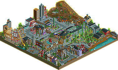
I feel very sorry for the Germans, but I went with the Hurricanes in the end. I thought Park Asterix had more heart and soul, but I liked the execution of rides and architecture much better in the Spiderman park. In Park Asterix, I had a huge problem with the path layout. I thought it was very confusing and drowning in endless amounts of foliage and trees. But I loved all the ideas put into the park and the strong references to the Asterix story. It really was hard to decide.
> What I love the most about The Amazing Adventures of Spiderman is the bank. I don't know if anyone has even talked about that yet but you should look through the park and search for hidden things because you'll find so many. The bank is the greatest for me and in my opinion one of the funniest ideas of H2H5 so far and it was executed wonderfully. Really search for it, you'll like it. But the rest of the park is beautiful as well of course. As I said above I'm gonna check everything out again later.
on a side note, can you please put the poll order in the order the downloads are in the post? I almost put the codes in for the wrong one.
Edited by Cocoa, 15 May 2009 - 03:03 PM.
(I am not gonna vote on this one, can't decide)
This park is nearly perfect. Awesome coasters, awesome flatrides, awesome theming and really nice atmosphere.
Parc Asterix is great too, but the path layout is a little bit too confusing.
It was a really hard decision, great match-up!
I didn't like either one of these. I'll tell ya why when I have more time.
I really really wanted to love the Spider-Man park. (Incidentally, it's Spider-Man, NOT Spiderman - pedantic point, but still crucial to a Spidey geek like me.) I kind of feel bad not voting for it, as I've waited for one of these parks for a long time... and I'm kind of judging it on what's not there rather than what is there. Basically, I've toyed with making a Spidey park for a LONG time, and have all these concepts for it - some the same as you - such as the Venom ride themed around the Bell-Tower and even Doc Ock's ride to some extent. And the fact that I'm judging your park against all my ideas is perhaps kinda unfair, but meh, it's my vote.
I do love some of the things in the park. The Venom interactive shooting ride is great. You've also managed to miniaturise New York very nicely. The Mysterio theatre was cool. The traffic is cool. That bank heist thing is great. But most of the rides did very little for me. Electro... good concept, and credit for uniqueness, but I didn't think the pacing was too good. Sandman - likewise, minus the uniqueness. But yeh, on the rides front... I just couldn't get into it. Nothing really stood out. There were semi-pointless, 'dead' areas, like the waterfront area. And - I get that this is a park which is more focussed on the Spidey villains (I read the read-me) - but I just felt it really REALLY needed an actual Spider-Man ride. It was a Spider-Man park, but there was no actual Spider-Man coaster, ride or attraction. So yeh... I liked it for the most part, but because I wanted to love it, I was kind of left feeling disappointed... if you get my drift?
Park Asterix. Wow. There was a LOAD of great stuff in there. The woodie is hands-down fantastic. Not sure I've seen a better ride than that in a loooooooooong time. I was blown away watching it, and I love how it seems to keep gathering pace as the ride goes on. The number of crossovers is phenomenal... it's just a superbly, superbly designed ride. Absolutely incredible, and definitely the stand-out attraction thusfar. Archy wise, it was all quaint and nice; and having been to Parc Asterix myself, I think you actually pulled off the feel of that park quite well. The little Asterix models were really cool. Loved the underground Wine-Tasting ride. And the small rooftops coaster.
Basically, I think this park had great, interesting rides - all integrated together in a convincing, cohesive theme. Very well executed. The Spidey park has the theme and the general execution, but bar one or two, fell flat for me on the ride-front. So I voted for Park Asterix. But as I said, I think part of the reason for voting Park Asterix was because I viewed that one with no context, whereas I viewed the Spidey one with a clear background of how I myself would pull off this kind of park - and so I judged it against how I think it should have been done. As opposed to Park Asterix which had a clean slate. Hope I'm making sense. Incidently, once I get my exams outta the way and I start playing RCT again, hopefully I'll be able to present you with my own take on the Spider-Man theme...
But seriously, this was a VERY close call, and these are two of the strongest parks thusfar.
Xcoaster Offline
Anyways, both parks are great. This is definitely the best matchup thus far, as both parks are in the same game, same sort of style, and finished. I haven't decided on which one I'll vote for yet. I'm leaning towards Park Asterix, as I prefer its atmosphere, but Spider-Man was also very nicely done and in the sort of style I usually prefer.
-JDP
The Premier & Intamin were real nice, but the woodie and what looked like it was a meant to be a Gerstlauer were just way to short. Expecially the Gerstlauer, it was like, Lift, drop, helix, turn oh and i'll finish it there.
The flat rides, whilst built really nicely, I just cant help but think they are too big, and in a way pointless.
The architecture didnt really flow. I don't really like this style anyway, it's almost to 'clean'. I cant really describe that, lol, it's just something in that style I don't like, I think it's that the buildings are big, a lot are built with the smooth texture and that they are facades, I dont know, I just dont like the style of it.
There were parts in there that were brilliant, for example the mural over the entrance, but then there were parts that were just not as good, for example the plain back of the mural with just 'Drive Safely' written on it.
In my eyes there were more cons than pros.
It's a difficult match up, both parks are great, we shall see which comes out on top.
Park Asterix: This was a very nice park, the parks layout was hard to follow a bit because the path blended in with the surroundings but from a peeps standpoint that's not a bad thing. And the woody was just god damn amazing. It had an amazing pace, especially with how long it is. It had great interactions with the land, surroundings, and itself. I also really liked the rapid's ride. The atmosphere around the ride was great. Everything else was above par as well. Though the woodies station was dissapointing, other then that I really loved the park.
With that said, the Flying Germans got my vote.
Pointless? No way. I can understand they don't work and Dock Ock was set to moving to show some movement. This was to help that out. I'd rather see two custom themed rides with different ideas then a standard swinging ship or twister in its place.
I somehow think this comment is also strange. Somehow I think the city yet admittedly not flowing does its job by showing a busy city area, a residential neighbourhood and a warehouse/dock section. A city theme shouldn’t and wouldn’t benefit from "a flow" as then it would appear too structured when the makers need to produce a busy atmosphere. Look at Dark Janus's pro tour park and the current Bioshock. Both have a busy variation of architecture to get across the purpose of the busy (or dead in case of bioshock) atmosphere. In my opinion, flow doesn’t come into them and their still amazing.
My main problem with it was the color choices. More color would have helped a lot. And more risks with the landscaping and foliage would have been a nice touch.
Spiderman was an overall average park. The architecture was verging on terrible in most places though there were a couple of nice spots. Landscaping was non-existent...and color was rarely effective. The two custom flat rides were high points of the park and the various custom signs around were done well. Besides those couple of nice parts, the rest just left me disappointed.
FK
mmm...critical match here. Germans with a win will tie Hurricanes in overall record, although not surpass them with vote percentage, which is second in rank.
It was pretty obvious the Germans wanted to crush the Hurricanes as their park was totally decked out, maximum size in tiles and very very detailed.
Hurricanes
---------------
The park was nice on the surface, but after further examination it just didn't work. I just had a hard time getting into it. I'm not really a Spider-Man fan but I know enough about it from seeing the movies to have a grasp on the park. I assume what you were going for was a realistic park, in essence, the visitor is Spider-Man going around the city battling the villains in the park. I understand that, it just felt wrong to not have a major coaster themed after Spider-Man. It's like going to Six Flags and the park has a ride named "Mr. Freeze" but there is no Batman ride. This would probably never happen in a Six Flags park, but I can understand why you chose not to do it, but to me, it just didn't work here.
Everything really didn't come together for me. The rides in general were lacking. The Intamin (Electro), while a nice idea, and refreshing to see this type of coaster done, just didn't work layout wise. The first half of it, while good in layout, didn't have good pacing. I didn't like the transition into the dive loop and the twist going the wrong way didn't help. That cobra roll...OUCH. Much too fast right there. I mean, the airtime hill is 70ft in height, and the top of the cobra roll is 50 ft. It's obvious it just doesn't work, so why keep it? Spend some more time on the coasters, they are what really make a great park, great, because after all, who would want to visit a park with bad rides? The ending of the ride just felt like an afterthought to what could have been a great signature ride. After the final wing-over, well, what should we do? Just make it go straight back to the station. You went to the trouble of using tri-rail giga track, so why not go to the trouble of using bi-rail mini rollercoaster track, or even adding some transfer tracks? However, the station and detail was out of this world. Amazing atmosphere there. I assume it was supposed to have a roof but left off to show the details, even if not, it was still perfect on the inside. The custom music also did wonders for the park overall.
I'm pretty sure someone said it already but the builders of this park sorta clashed badly. The architecture, which was mentioned before, and I have to agree with Louis! worked in some places and in others it didn't. There were some great minor details like the fire hydrants, fire escapes (with no windows on the sides...weird?), water tower on one of the buildings, although I think most buildings in NYC have them so more would have been better, sewers on the sidewalks, hot-dog stand, dumpsters, queue-times at the entrance.
The bank was awesome, as well as the ride inside where the bank is robbed. The facade is absolutely perfect here, especially with the revolving glass doors. I really liked the subway station, too. Good job on the Spider-Man statue and mural at the entrance.
The woody was just not good. It doesn't look like an engaging, fun ride. No real thought to layout, just some helices and no thoughts to negative g-forces or other interesting elements. Sandstorm, which was cool in theming, liked the crane and the sandstorm statue, the ride however, while not bad, wasn't thought out either. Maybe I'm wrong but I'm pretty sure Premier LIM coasters need LIMs placed gradually along straight track to get speed, not just able to be blasted out of the station.
The church was cool, but seemed sorta short. I remember in the movie the bell was very high in the air, but maybe the comic books tell a different story. Also...Venom...what? I see an entrance to the ride, but no exit...really? There's no EXIT to the ride? I just...wow..*speechless* How can people think they can get away with some of this crap. Think through your building process and what real rides actually need if you'll be pulling off realism. Way too lackadaisical for my tastes.
Err..wait...what? After further inspection, it seems the great station I thought Electro had doesn't seem so great..
Yeah, that's what I like to see, kickass detail. Got some nice pipe detailing on the roof, nice color variation for the individual car queues, some badass smoke going on, nice glassed area with staged theming. Reminds me of something like Riddler's Revenge's station, or say Mr. Freeze. Got the spidey web all in the corner, looks like some guest pretending to be Spider-Man shot his souvenir up there. Nice ops booth if you delete some roofs. Some sweet looking fencing that offsets the return of the train to the riders queuing...yeah that's the shit I like to see.
What...the exit, sort of just, runs into a wall? Really? How do they get out? Use their spidey senses?
I switched around to see if I saw any signs of an exit around the midway. Woah, what do we have here?
Some awesome theming around the queue house, got the +/-. Nice fencing between the cobra roll and the midway..
Decent queue house....but seriously, you just forget the exit, but can't fake an actual ride exit on the midway? Well, that's alright, got it right on Kraven.
Yeah, there it is...nice entrance and small showing of the queue line.....and the exit! I found it! Thought for a second the exit led into the TV Store as a gift shop...but, well, uh, huh? How do people actually get to the ride? There aren't any stairs. People can't get to the ride or exit off of it..
Beautiful on the surface....cool entrance, got the arrows, very unique. But seriously...no exit? Do people just exit the way they came? Maybe if the ride breaks down, but no park I've ever been to do this... I guess I can give you the benefit of the doubt and say the path that goes off the map is the actual ride exit. Is there supposed to be more to this park?
Peeps would have added a lot to this park. Maybe if you had to think of them you'd actually make exits to your rides...I don't know...
Overall, the park just didn't work for me, and wasn't at the detail level and thought that I generally like to see in parks. The cars...I know WHY you did them, yeah, cool, okay, it adds some movement and adds some atmosphere, but if this is a theme park, they wouldn't have something like this. I felt like you did it as just a cheap ploy into adding atmosphere that should have came across through the other things you were building. Also, the entrance was confusing, ticket booths and no actual park gates? I guess they take your ticket when they sell it to you? Entrance to New York City Trams outside of the park that I assume takes you inside the park, why was this like this? The overall thought process that went into this was just very lackadaisical. They bounce off the map, but is there more to the park...?
I know this sounds really harsh, but I'm a bit sick of the community slipping by and getting recognized for making 'great parks'. Maybe I'm just way too knit picky, that could be, but I really think these builders have it in them to do something much better than this.
This park...beautiful on the surface, but could have been so much more.....
Flying Germans
---------------
Now, I have no clue what the comics were for this park, but I didn't need to. You ran the risk of using a park based on a concept most people probably don't know. But everything just worked well. Now that I examine this park further, I can see why chapelz said it was a bit 'unfinished'. The station for example, looks to be missing some detail work, especially railings on the entrance side of the load platform to the GCI. I gotta be equal here, as I ripped into the Cane's park for the same crap.
Well, we can just hope the peeps are overly careful while queuing...they could just fall off the side. Also, the missing planks above the entrance..seems to be built for use with modified, or just never got around to getting rid of the huts. The woody just was a great ride overall. Good pacing, good flow. The triple diagonal airtime hills...WOW how fun would those be?
The park was just very beautiful overall. I've wanted to see someone do forest-esque theme for quite some time and ya'll nailed the foliage.
The rapids ride was cool, even if the boats just floated on the lift hill. Some more time probably should have been spent on it to make it flush so the boat is actually deep in the track. Also hiding the rapids complete circuit hack could have been done better. build it all the way underground and raise the land back up so it doesn't look so ugly.
I loved the underground wine tasting place/ride, very cool there. The broken up paths to the left of the entrance were also unique and gave the area a great feel. I liked how you gave the vibe of the new area coming soon. Good placement and very believable location, like they knocked out some of the parking lot to add it.
The wild mouse felt like an afterthought, but it wasn't terrible. I liked the mack, it was nice to see some unconventional coaster types. Asterix the Gaul was also cool, I loved how it curved around the architecture. Also loved the supports for it. all the statues around the park were also cool and the peeps really made the park feel vibrant.
---------------
Vote = Germans
Nice job here, on what I'm assuming will be a win. Ya'll deserved it here.
I will comment next week, as I do not have much time this weekend.