Park / Home Away From Home
-
 16-January 23
- Views 14,046
- Downloads 394
- Fans 1
- Comments 45
-
1 fan
 Fans of this park
-
 Full-Size Map
-
 Download Park
394
-
 Objects
1
-
 Tags
Tags

![park_2401 [H2H6] R3 - Hurricanes - Avatar](https://www.nedesigns.com/uploads/parks/2401/aerialt2145.png)
Otsdarva Offline
I believe there's a miscount on the votes. The poll shows nin receiving 23 second-favorite votes as opposed to 22 as reported in the conclusion post. Also, Ziscor got 27 first-pick votes instead of 26.
I guess it doesn't really matter since it won't affect the result rankings.
Nin: Duelers, yes.
Barn: the gritty textures on the rocks distracted me from what was otherwise a gorgeous micro. If you're going tall though, try to provide some additional interest all the way up.
Gustav: Clear narrative, fun ideas. Execution could have been a little cleaner, but a strong entry in a tough round!
Ziscor: Love the vibe, love the energy, just in a stacked bracket so it didn't take my vote. Don't really have anything bad to say about it.
We forgot to close the poll, the 81th vote was cast after we officially concluded the match. Like you said, fortunately this doesn't affect anything.
1) barNID: absolutely love this concept. I love how you managed to make your entry interesting despite it not having a ride or attraction. The statue of the archer was amazing, at first I didn't even notice it and then when I saw it my jaw dropped and I knew this was my number 1. Deserved to go through imo.
2) nin: nin has a tendency to always end up in extremely tough match ups in whatever contest he joins and this was no exception. Loved your entry. The rides were integrated so well into everything and overall the execution of everything was just very on point. The horse sculpture was cool. Only minus point is that the coasters clash near the end, but overall great entry and deserving of going through.
3) Ziscor: I loved this entry, I think purely looking at the content that was present this was my favourite, the problem was that I thought there wasn't enough content overall to compete with my nr 1 and 2 spots. I think a ride or something else to hold the attention for longer would have made this the number 1 for me as the archy and detailing that was there was the best of this round for me.
4) Gustav: Cool entry and nice job. Little bit rough in some places: I thought the archy was a bit inconsistent in quality and the rockwork & coaster layout could have been better, but other than that it was still a really good entry and a cool concept. That one little house on the side of the cliff reminded me of Endswell which I also thought was cool. Little bit unlucky with the match up as this would have done better in any other group I think.
Simulataneously honored and disappointed to be part of the craziest round of the tournament so far.
1. barnNID: Before submissions dropped, my win condition was you submitting something technically excellent but not very conceptual. Imagine how I felt when I opened this round and saw you submitted what may be one of the coolest things I've ever seen in this game. There is just something about this that tickles me like almost no other micro in all of round 1. It's surrealism rooted in realism, with the huge mish-mash of different of eras of architecture towering upward signifying the progression of time. World's biggest archi flex. Is that blood stained on the walls? The enormous and detailed grandfather clock buried in the tower of towers really drives up the surrealism factor. I cannot leave without talking about the archer sculpture. Might be the coolest sculpture in the entire contest counting Mamarillas' gigantic Evangelion mech. I'd say the one minor flaw is the lack of motion outside of the arrow, but jeeeeez. Was not expecting something this high-concept out of you at all. Definitely one of my new favorite builders now. The fact that this lost is an actual war crime.
2. nin: You were feeling it a little too much in the VC sessions leading up to the deadline and it was scaring the hell out of me. I can see why now. A well-executed dueler with good length and little differences in 225 tiles or less? Madman. That moment when they helix through the colosseum is just genius. Genuinely an unbelievable layout; probably the best I've seen in a Micro Madness. There's a lot more surroundings than you'd expect, and of course the man who patented the term crunch would find plenty of opportunity to utilize it. That trackitecture Trojan horse is the cherry on top; it is so recognizable and reminds me of the way Leon utilizes vehicles. (Is that why you kept saying you felt like Leon in VC?) While a slow burn for me, this is one hell of a micro and absolutely deserving of a win. Considering how much I threatened to kick your ass, I humbly accept defeat.
3. Ziscor: Someone's been looking at Stardust Circuit. By far the best attempt at synthwave/cyberpunk/whatever in RCT2 so far, and that is a high honor. You did something daring by focusing less on making the absolute most out of the space given to you and instead zeroing in on the micro in Micro Madness. I will never not go googoo gaga peepee poopoo for ambient lighting effects and they are here in spades. The reflections look seamless, especially the Lambo headlights reflecting in the puddle. The synthwave mountain sunset backdrop is absolutely spot on, and it was smart of you to use the railway as a divider between the gritty street scene and the more abstract section. I put it below the other two just because there's really not as much going on, but my god this is a hard 3rd place.
Legitimately three of the best micros in the entire contest. Wonder which poor unfortunate sap had to go up against them.
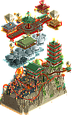
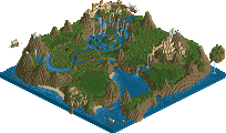
?. Gustav Goblin: The idea for Home Away From Home came to me when I was walking my dogs a few months ago and noticed a huge fire breaking out in the mountains. What the hell?! It's cold out and there's no wind! Why the hell does Mother Nature keep wiping out entire towns and then snowing all over their smoldering remains a day later? I wish I could live in a little flying house and never have to worry about fires again. That's when I immediately realized it would be a really fun idea for a micro, and by the time MM4 rolled around it was fleshed out enough to make a solid round 1.
My original plan was to do this in more of a generic fantasy style a la Heaven's End, but I already played Endswell painfully straight with the generic fantasy flying ships and floating islands theme and wanted to try some new things. My mind quickly jumped to Asian theming, which funnily enough is just as cliche, and it stuck when I realized ancient China had some of the world's oldest flying technology. Coming up with ways to supersize sky lanterns and bamboo helicopters and put them to use was a boatload of fun. It was originally a lot more low-key as well, with just a mostly charred landscape and a few flying houses just barely escaping the flames. Stakes are high in Micro Madness though so the idea naturally evolved into what it became by the end. There was also this effect I wanted to do where I gave it an inverse sepiatone palette, put a bunch of two-angle walls behind it to make it look like a calligraphy painting, and have it look like it was burnt away at the top. That died out quickly.
Having to keep this thing confidential meant learning a ton on the fly. I broke in Fisch rocks and B&M supports for the very first time on this map! I originally wanted the supports to look like huge bamboo stalks, but doing so made them look like Really Bad B&M Supports so I just went for the more straightforward approach. Fisch rocks are stupid fun to use, but my god that landscaping got annoying. No idea how the Tile Inspectors didn't go insane using them all over. I also tried to flex my hacking muscles on this one with the sky lantern ride and Qi. How many of you noticed the propeller on top of Qi which is part of the same train as the swinging chairs? I got the idea from the Adventurers Club swing ride and a DKMP shoestringing contest. Funny enough, the Sky Lantern's shwoopy shoestring track was out of necessity; I realized I accidentally put the pagoda and top level queue line a tile away from each other and had to improvise.
I wish I could say the building process was smooth. In reality it was; there were only a few genuine hurdles I had to re-evaluate and either redo or scrap entirely. There was a point where I realized my map layout wasn't doing it for me almost completely remade everything. Thankfully, I planned a way to stick to my vision on the original map and managed to finish. While my pace was abysmally slow as always, I learned from Micro Madness 3 and stayed focused and committed instead of getting distracted for a solid week. Unfortunately, the pressure of wanting to outperform my awful MM3 and live up to the community's astronomical expectations of what I could provide really got to me. I also wondered time and time again if what I had was genuinely a good micro or if the concept just wouldn't compete. (Spoilers: it didn't.) So yeah, I kinda had at least three genuine anxiety attacks making this, which is really really bad. I have a bad habit of working myself to death under high pressure situations, and even today I'm trying to learn to take things a little easier. Thankfully about halfway through, I hit anxiety integer overflow and the rest of the build was surprisingly serene even right near the deadline.
I really appreciate the feedback all of you provided, and it's incredibly reassuring knowing I'm leveling up with every build. I'm kinda surprised you guys liked the archi; I thought it was really crusty and underdetailed. My layouts need serious work though. I really wanted to capture the progression of going up the mountain, up to the sky village in the sky lantern ride, and back through the sky village, so I'm glad some of you got that. I am a little mad at myself for going for a cliche theme again, especially since I'm a very loud anti-cliche advocate always telling everyone around me to layer or twist familiar ideas to make something a lot more unique. I'm also kicking myself for not having the coaster station be completely scorched as well. Outside of putting more emphasis on the pagoda, I had zero confidence in the station and having it be a charred mess would also give it a diegetic reason for being open instead of just a big ol' coaster station in the middle of a Chinese mountain village.
Obviously I'm pretty crushed by the result, far more than I have any logical reason to be. When I submitted, I told myself that no matter what happens, I made my best work yet, learned a ton, and had one hell of a glowup from the last Micro Madness. This, along with finally having a slightly-above-decent solo work to my name, is something that will outlive any contest result. Getting absolutely destroyed and performing below my seed for the second Micro Madness in a row somehow isn't the most painful part though; it's knowing that had I been placed as a Pot 9 player in any other group, I'm confident I would have easily made it out. I'd be grinding out my R2 like crazy instead of plodding along getting it ready for the bonus round. Admittedly I was a little burnt out by the end of R1, but it's not often I get to put on a show for communities who genuinely support me and want me to succeed. Pretty much everything genuinely impressive I've done for NE was mostly someone else's work, and I was really hoping that I could make a big MM run and finally show you all what I'm capable of at my fullest. And I mean who doesn't want to be That Bitch? With that said, this already feels like it's behind me and all I can do now is to keep building. The only way is up.
With all that behind me, I'd hate to kill the mood any more as we celebrate one of the most insane rounds of any NE contest. Nin and Ziscor, congrats on advancing with some genuinely amazing works. You two made it out of a tight-ass vote; take this golden opportunity and run with it. barnNID, the fact you had to lose was criminal; really none of us did. That's just the nature of the contest. And speaking of the contest, huge props to the admins for continuing what I consider the best one we have. It's been beyond awesome seeing what all of us could could pour into 225 land tiles so far. Excited to see what round 2 brings!
EDIT- One review I particularly want to address.
Honestly I feel like a lot of this comes from me still trying to figure out exactly who I am as a builder. J K asked me what my USP is and I still have no idea. Obviously I'm trying to do well in a contest as an underdog, but this is also me going ham on an idea that I came up with out of nowhere. Throughout the process I wasn't thinking "Well NE likes clouds so I should put some here" or "Le Coeur did really well in H2H so lemme steal those propellers"; I implemented these ideas because I felt they would contribute to my micro's narrative. Honestly I just feel like at the end of the day I don't surround myself with enough reference, inspiration, or art. I feel like I know what I like but have no idea how to put it all together. This lends to what I feel is a very artificial approach, and now I know it's not just me doubting myself but what could be a genuine flaw. Of course flaws exist to be fixed so that's a good path to start on. All love pants.
Times Arrow - barnNID
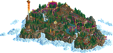
I've seen this so many times, if only to gauge the competition in the round and man, I love it so bad. The sculpture blows my mind, I don't know how you had the patience to make it. The landscaping in general is top tier for me. The foliaging around the sculpture feels so natural and perfect too. It takes me into Halo CE's second level/all of Halo Infinite with the types of trees, the colors used, the rockwork, everything.
Overall, this has so many different themes in it. What's truly so impressive to me is that the execution doesn't miss on any of them. The Greco/Roman/Egyptian bit, the whole medieval castle section with huts jutting out from the edge and the wooden crane, and then especially the brick colonial mansion-type architecture.
The little red bits flying around were great too, and definitely help the map feel alive in a way, since it's tough to keep things animated when you're working with so much plain architecture.
Taking all of it in is a lovely experience as you go from bottom to top. I only wish it were taller so I could admire more of your archy work. What a micro.
Home Away From Home - Gustav Goblin
After reading your building process and the ideas that drove you to make this, it only adds to my appreciation of this. The burning village is done so well with all the basic frames and trees left behind burning all blackened. I reckon all these fire objects are tough to use well to convey a single large fire due to their self-containedness, but it's all real believable here for me.
I think the landscape on which this lower section lays isn't visually that interesting, though. It's almost a 3D trapezium with no significant changes to its shape. Perhaps some sections of the cliff face could have been made so that there's flat sections before descending into a cliff face again.
The upper section is really what I fell in love with super quick. Oh man. Firstly, the clouds were a very useful addition, as it definitely helped me visualize the difference in height between the two sections, isometrically speaking. Then the actual second level of the micro, where the floating houses are made was quite beautiful too. The central 'hub' area almost feels like a fighting game level. I wish there were more details along that platform, perhaps in the form of patterns on the wood, or something else. The Qi building and the queue for Sky Lantern were both lovely to look at too!
I think the rest of the buildings felt a little safe. Some creative shapes would have been great to see, especially with the flying mechanism bits used on the roofs here and here. Right now they don't shine as much as they perhaps could, because they feel slapped onto standard square/rectangle Asian buildings. That's not to say the buildings themselves aren't good, because they definitely are. Simplistic in their make, and very effective. But I just wish the theme for the floating city went even deeper into fantasy architecture, you know?
War & Courage - nin
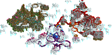
I kind of have a hard time keeping up with this, I'll be honest haha. The duelling coasters are awesome to follow around, and the trojan horse is absolutely crazy. The composition is top notch too at its fundamentals, but it takes me significant effort to scan this map in general.
The Tolsimir rocks add so much to the vibe here too. I find myself at a loss of words with this. I'd love to revisit this with time and grow to appreciate it a lot more than I do now.
---
Feels strange to have been in what is called the 'Death Round'. I'd like to thank everyone who voted somewhere for my entry. I can't imagine having to have made the decision of picking top 2 out of the 4.

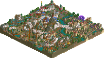
While building 80s Anemoia, I had a lot of doubts if I could get it done (which people in the Discord might be able to attest to), or if it would have any chance at all to win people over. There's at least 3-4 buildings I ended up building completely and then scrapping because they weren't good - or because I kept changing the concept of the micro
Experimenting with reflections came first to me, and then I settled on an Asian cyberpunk aesthetic, driven by the pixel artwork of Waneella... that didn't quite pan out, but the blue supermarket building in the center that resulted from it just moved me so much that I rebuilt everything around it to represent the specific things I love that revolve around the 80s: rainy neon city imagery from anime such as City Hunter, old sports cars and bikes, Japanese arcades as seen in Yakuza 0, the 2010s vaporwave aesthetic (especially the entire album I linked in the download), and synthwave. Truth be told, it was in the very final few hours of building time where I ended up making the synthwave sunset background to fill space - because I had only filled half of the micro till then (scrapped work notwithstanding).
If I had more time from the get-go, I would have perhaps not included the background and instead tried to build more of the detailed city with more experiments with reflections. Whether that would have been received more favorably, I have no idea.