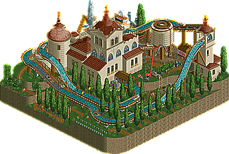
Park / Lombardy Poplar Tree Nursery
-
 16-January 23
- Views 7,530
- Downloads 249
- Fans 2
- Comments 40
-
2 fans
 Fans of this park
-
 Full-Size Map
-
 Download Park
249
-
 Objects
1
-
 Tags
Tags
![park_4380 [MM3 R1] A Petty Squabble](https://www.nedesigns.com/uploads/parks/4380/aerialt4172.png)
![park_3359 [H2H7 R4] #diamondheights](https://www.nedesigns.com/uploads/parks/3359/aerialt2984.png)



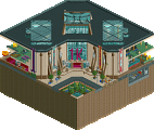
Lombardy Poplar Tree Nursery - Tolsimir

Found out through this that you can apparently change the color of the text used for ride labels?!
This was rather simple in its composition, but that added to its charm. Until I hadn't opened it in game, that full size aerial left me quite confused about what it was about, but it all makes sense now. The cheeky jokes got me good and kept me hunting for more and more in the brief time it took to explore this. I love the windows used in this too. Some great additions to complete this theme!
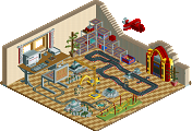
Almost Alone - Milo
A micro that acts as a scene. Loved it! And as mentioned elsewhere, great use of the rules to establish it in a sea of water. Not much else to see other than what's there, which I was hoping wouldn't be the case. What if there were an entire map beneath this water and you'd cut-away view to see it? Still a tight space, but just letting imagination run wild
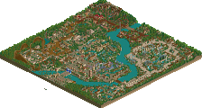
Pinewood Forest - Recurious
Beautifully executed. While the theme has been done like this way too many times by now, I think it wouldn't be fair to judge it based on how visually similar it is to other approaches to this theme in the past. The layered composition lends itself to at least 3 stunning angles. Watching the coaster run along the track doesn't ever get old for me.
Foliage-wise, it felt a bit too much for my own taste, with all the lighter and darker shades of green, mixed with the light browns not meshing all that well for me. Perhaps that's faithful to the theme in a way. In particular, the 1K Half Bush usage felt like it was taking away from the landscaping rather than enhancing it. The way such maps are cut also feels like it leaves a lot of bland brown edges: so seeing some map edge detailing would have been sweet too!
Overall definitely among the stronger maps in this round for sure.
Tin Train - Lurker
Aww man, this is so incredibly cozy. Every part where the train is visible is so nice to look at, namely the waterfall + bridge section, the part where it meets the road, and the section where it goes under the town through the tunnel. Also, I think this is among the better type of application for Fisch rocks I've seen. They work so well because the scene is very toy-like, and they're only used in small sections at a time.
With miniature-style houses in this game, it's always tough to do them well due to how little our CSO objects lend themselves to 'tiny' architecture, but this is very nice to look at.
I like the factory building, and I think if more of these buildings were made to look like they have a specific purpose, this would be even more pretty to look at. For starters, I imagine the white building with the flower boxes could surely be a church building with a cross on its taller side. Then a police building somewhere, a post office, etc.
In a way, it reminds me of Thomas the Tank Engine with how cozy it is. Some toy train music would have been neat too, while we're at it!