Park / The Sand-Powered Sand Carts of Sand Ksar
-
 15-January 23
- Views 8,226
- Downloads 271
- Fans 2
- Comments 47
-
2 fans
 Fans of this park
-
 Full-Size Map
-
 Download Park
271
-
 Objects
1
-
 Tags
Tags

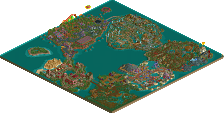
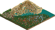
Before anything, I want to commend the admins for the presentation of this contest with the clickable rounds. Above and beyond.
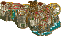
1. Cocoa: Not surprised to see an entry like this out of you. The core theme of sand power is super unique, and the layered rides forming the sand wheels give off the effect really well. I also love how they're incorporated into the layout and how they tie the whole vision together. The coaster itself is super eccentric and unique, with the sand brake after the vertical drop, the parallel lifts, and the immelmann (on a wooden wild mine ride!) being highlights. The archi fits the desert vibe really well; it definitely has the classic Arabic notes with the blues, golds, and domed rooves, but it also establishes its own unique identity with the clay red buildings and deep green Spanish rooves. The warm greens of the foliage throughout really bring it together and drive home that arid atmosphere. My one nitpick is that maybe you could have used a fade object on top of those sand falls to blend them into the background a bit more. The champ rightfully reclaims his throne for this round.
And can we talk about that music? Banger alert!
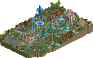
2. Jens J: Absolutely beautiful little piece of atmospheric storytelling. Right off the bat, you may have my favorite use of Fisch rocks of any player not named Fisch. I always wanted to see exactly how you used them in Pirates! 2.0, and now that this is out I can dissect them! The way you incorporate the Esoterra layered rocks makes them feel really natural. Fisch rocks aside, the landscaping and foliage are just stellar. I would bemoan the lack of motion, but you've made up for it in interactivity. You've utilized that Peep Editor plugin to its fullest. It really encouraged me to do a slow cutaway up just to make sure I didn't miss anything. As I did, your intuitive object usage shined through. I wouldn't have thought to have used safety nets as subtle underwater detailing.
It was a tough call between you and Sulakke for 2nd place, but the story aspect and refinement of your entry gave you the edge. Some adventurous custom music would have been the cherry on top, but this is a real gem and a testament to your unbridled potential. Beautiful work!
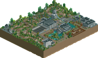
3. Sulakke: Very nice entry with a cool theme! A Weinerlooping is a great idea for the centerpiece of a micro, with a stark color palette that helps it stick out from the swamp. I'm just as impressed at how you managed to work a log flume into the mix as well and still leave plenty of breathing room for paths and scenery. The landscaping and palette really give off a swampy vibe, and while it's a bit hard to see the ground-level detail really brings things together. Great entry, but I think Jens edged you out just a teeny little bit.
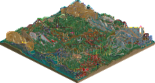
4. mitchellpaul: Oh hey, it's me! It's not just the name either; this entry reminds me of the 10x10 micro coasters I used to post to the RCT subreddit back in the day just like you do now. There's not a whole lot outside of the layout, but I think it's a nice one nonetheless. I appreciate the little authentic touches like the simulated LIM boosters on the hill and the LIM pieces as brakes. Keep building; you've got potential!
1 - Jens - Beautiful little map. Perfectly executed, tons of storytelling detail. This held my attention the most. Great work.
2 - Cocoa - Alright I really dig the music you chose haha. Great first impression. This coaster is absolutely nuts. How on earth did you fit so much in without it looking like garbage haha. The verticality with the sand just works, and the colors you've chosen throughout the map are perfect. Just pure creativity throughout and I'm here for it. Great round 1 entry!
3 - Sukakke - You've managed to pack so much content into this map. Atmosphere is excellent. I love the green water and bones. I've been playing Hunt Showdown lately and this gives off that same vibe. Great work.
4 - Paul Mitchell - I really enjoyed this! Solid layout and surroundings. I like the station quite a bit. Looking forward to seeing more from you!
1. Cocoa - Classic Cocoa style, classic Cocoa colour palette, classic Cocoa verticality and denseness. Definitely feels like you were building within your comfort zone but you build at such an insanely high skill level that it doesn't really matter. So fun, such a delight.
2. Jens J. - You've perfected that style of landscaping. I love love love the vines connecting the little islands. It's built at a modest scale but the details are so thoughtful and the atmosphere is palpable. Great job, Jens!
3. Sulakke - Also oozing with atmosphere. I like how the foliage and buildings almost blend into one. The log flume felt a bit messily done, that's the only thing holding it back for me.
4. mitchellpaul - Fun coaster, but the concept is a bit half baked and I don't love the supports for the tophat. I'm excited to see what else you can do.
Cocoa - Really followed through. Like your previous run the coaster is really sick for a micro. Colors and textures are well executed and very you. Love the way the foliage serves as bedding for the architecture and falling sand.
Jens - The attention to detail in your execution is really strong, everything feels very polished in the sense that a very organic and seamless look is achieved with your landscaping. It's innovative and it really defines your style here. The temple is really nice and your motifs tie the map around so well. The little scenes you created too really makes it something that developes as you look at it.
Sulakke - Grea theme, I really like the way you did the colors here with the extra swamp colors and the pop of the coaster. The swamp is very atmospheric and dense and your overall ride execution is also really strong. I love all the shades of greenery and the dark gritty theme elements of the scene.
Mitchellpaul - Coaster and realism aspects are nice. I would dewfinitely work on overall park composition adding in path interaction and flow between architecture, paths, rides, landscaping.
Cocoa - My first impression was that this had a very shogo-like quality to it, with a lot of big, macro structures that vary from ultra-detailed to more plain. The coaster is a joy of complex interaction, the aesthetic and color choices (plus splashes of foliage and sand) were great. I feel like the execution is missing in a few places (maybe time crunch) but the overall drama and concept are great and an easy example of why you are here to defend your title. Plus, something about weaving peeps and rides thru structures just always slaps, and this was basically that.
Jens - The narrative of this was fun, a little bit of something for us to explore and some of the object use you did to convey the heist was really special. That being said, it's the picturesque scene executed to a T that has me coming back for more. Incredibly well executed, it has the crunch and depth of texture that I adore and the way you're using and repurposing objects is really excited. This could use a bit more drama for Micro Madness, but honestly the beauty of the landscaping, archy, and crunch will get you pretty far in my eyes.
Sulakke - In places, this felt really exciting. Like, the log floating in the swampy water below the flume is so atmospheric and beautiful. I love the use of the hanging moss in the trees. The smaller moments you were able to create throughout, really at the ground level, gave this life. That being said, the amount of tall trees and difficult angles often made it hard to see everything clearly. That feels like a double-edged sword, those are part of what contributes to this atmosphere but they also made it feel like a tangle of trees from some views versus a others that showed the level that you're capable of. I think if you make it forward, finding ways to use verticality to separate and better showcase some of your ideas could greatly improve on the ideas you have.
mitchellpaul - As a lower seed, I'm less familiar with your work/background. Really enjoyed the coaster and the use of new ride pieces to make a full layout in a small space. That being said, the coaster dominates this entry in a way that the landscape (which feels a bit sporadic) and station feel buried beneath the weight of it. Finding a way to add more layers and a more complex concept beyond just the coaster I think would have helped push you to expand on this in a great way.
This was closer than anticipated, but I ended up going with Jens for #1 and Cocoa for #2. While Cocoa had more of what I expect in H2H, I just think the execution and crunch of Jens was brilliant and I want to see more of that (hopefully on an even grander scale). Cocoa's concept slaps, but the few rough edges just nudged it under.
The Sand-Powered Sand Carts of Sand Ksar (1): Incredible building! Visually stunning and the way the sand interacts with the map is really creative and fun to discover throughout the map. I like the constant movement of the sand and all of the rides & wheels. Very cohesive, none of the individual pieces felt disjointed. The height & cut-off of the tops of the sand falling felt a little awkward for me but nowhere near enough to deduct any major points. Beautiful park!
Voodoo Bayou (2): What stood out to me immediately was how much I loved the purple/red coaster contrasted with the bayou-swamp coloring. For me, this was a perfect balance between ride & scenery. Every angle was really interesting and there were new things to find in the narrative. A bunch of really cool details and overall an amazing park.
The Heist of Shri Jagath (3): So so so so so so so close to voting this for second. Closest decision out of all the parks today for me was between these two. The narrative in this park was really cool, made it fun to not only view the park but to experience the park. I really like the visual of the two islands, particularly the landscaping and shaping I was really impressed by. And even the water had interesting features. A playful but VERY impressive park. Great work!!
Goblin (4): I really like how coaster-focused this park is. The coaster is the highlight for me and I think that the unique shaping of it really helps considering the box-shaped park. Some cool landscape elements that I think fit the theming of the coaster and enhance it. It would be cool to have some peeps on the ride, but overall a really cool entry!
Such a shame for Voodoo Bayou and The Heist of Shri Jagath to be in the same group considering they both would've been top contenders in other groups, in my opinion. Toughest decision of the batch. A really great group!!
I'm never sure what to say for park reviews, so this will be quick and concise.
-Cocoa (1) : Winner of this round, a dense and rich park with many details.
-Jens J (2) : Simple but with a great atmosphere and scenery everything I love, I was very hesitant with Cocoa for the first place
-Sulakke : A very good park, nice atmosphere, maybe a bit too dense for me especially with the trees
-mitchellpaul : I like the rocks but overall it's too empty, a few more elements and it would be a very good park!
1 Cocoa - Very cool theming and I love how the coaster swoops around the buildings. I mean you know your stuff is good no need for me to tell you
2 Jens - We got a perfect example of you dont need a coaster to get a excellent map here. Excellent work Jens I love it.
3 Sulakke - What a great and dense jungle brimming with amazing small details. Very cool how the coaster's station goes through the loop in between the 2 buildings!
4 mitchellpaul - very cool layout for the coaster, im impressed how you got so much layout in such a small map. Scenery looks like there could be some impovements but there are some cool ideas.
1) The Sand-Powered Sand Carts of Sand Ksar by Cocoa
-Concept:++
-Content:+++
-Quality:+++
Overall; This is what MM is about; Great amount of content combined with top-notch quality packaged in an unique concept! Love the custom music as well.
2) Voodoo Bayou by Sulakke
-Concept:+
-Content:++
-Quality:+
Overall; Bit messy, but nice foliage, rides and atmosphere.
3) The Heist of Shri Jagath by Jens J.
-Concept:+
-Content:+/-
-Quality:++
Overall; Very nice almost painting like micro, misses a ride of some sort though.
4) Goblin by mitchellpaul
-Concept:+/-
-Content:-
-Quality:+/-
Overall; Felt a bit bare. Nice layout though.
2. Sulakke, great micro combo of coaster and atmosphere. Would have liked more details, but great work with the bone objects.
3. Jens, awesome concept, just not too much going on beyond that and the landscaping, which was great. Very close for me between you and Sulakke imo.
4. MP, very nice layout, supports and use the new track pieces.
The Sand-Powered Sand Carts of Sand Ksar by Cocoa
Beautiful entry with so much going on. The kinetics from the mine-carts, the wheels, the falling sand. All combined with the busy music and premium architecture. My favourite kind of sensory overload.
The Heist of Shri Jagath by Jens J.
The Fisch-rock formations look beautiful and the architecture is great. The opening message got me hyped up and expecting stuff to happen, but then . . . nothing happened. After that I did have fun exploring all the little scenes.
Voodoo Bayou by Sulakke
Big Bad Voodoo is a really nice iteration of this classic layout. Really loving the colours. The purple and red really stand out in the middle of all those murky greens. Great foliage work too.
Goblin by mitchellpaul
That’s a nice layout, especially given the small footprint. It does appear to be very fast in some places. Great park for a first. Take your time to develop skills in archy, terrain and foliage.
sand carts - very pretty architecture and nice shapes on the map edges. the falling sand powering everything is a cool idea
heist - maybe my favorite map of the division, the landscape is just executed so beautifully
bayou - love how dense the swamp life is packed in and how nicely the coaster is tucked into all of it. i really like the bones hanging from the coaster too
goblin - always nice to see new faces! the coaster flows nicely and the hellish landscape, though a little rough gets the point across well. hope to see more from you
Cocoa: impressive amount of content and i always appreciate a coaster that is tightly woven into the environment, aside from that a fun, simple theme executed very well! obvious winner for me
Sulakke: previously pointed out as a downside, i actually really appreciated the obstructive nature of the foilage, because it made me want to explore the map and look around, which i think connects very well to the bajou theme. the striking colors of the coaster also work beautifully against the green backdrop.
Jens: such a beautiful map, i think you're one of the best at organic landscaping right now, and this is a great portrayal of your skill. the vines connecting the little islands and the gradient in the rocks are awesome. the storytelling was also well executed! great job overall.
mitchellpaul: cool coaster with quite a nice layout given the size constraints of the contest. apart from that, not a lot to see but definitely a respectable effort!
deciding on second place was very hard, as i like Jens and Sulakke's entries about equally. In the end, I let the amount of time the map entertained and engaged me be the decided factor, which made my vote sway to Sulakke. sucks because I would love to see more Jens... but also more Sulakke
Had to go back to this match three times to make my final cast on spot nr 2.
1. Cocoa. So much to look at! This map is the winner for me. Cool coaster, I really like that fast lifthill. I had to watch it a couple of times to really be able to follow it all the way from beginning to end, but that didnt bother me. So much content on this map, it's incredible. Some bits and pieces on the edges feel a bit rushed, but dont take away much from the enjoyment.
2. Jens. This was hard. In the end Jens's park won me over because of its atmosphere. Perhaps a bit lacking in Wow factor or movement, what is on the map looks just perfect in terms of landscaping and storytelling. Wish the map edge had some of that rockwork too. As someone else said, I hope you will go a bit ballsier in the next round, if you make it.
3. Sulakke. Another great map. What Jens's map was missing in terms of movement or rides, yours definitely delivered there. I love how you managed to cram in two substantial rides without making it feel too overwhelming or busy. Foliage is done really well too, and I love the bayou houses on poles. The little voodoo ceremonies around the park really added to the storytelling. Not too sure about the half diagonal house with the covers underneath.
4. Cool showcase of all the new elements available in the game. Colour scheme is fitting for a spooky setting like this. Not a big fan of the rockwork.
Goblin - mitchellpaul
The roller coaster here is pretty nice, but I wish I had more to describe about this micro! Would love to see more of your work on this site in the future.
Voodoo Bayou - Sulakke
Honestly, on first impression it didn't instantly appeal to me visually. The structures are obscured by trees in a way that makes it hard to find photogenic angles.
That impression stuck, but it made sense for the kind of theme this shows. With how dense it looks, this almost feels bigger than 225 tiles. The tiny details here and there like the weird ritual going on, the kooky doctor concocting something in that suspicious cauldron, etc. also made it so rewarding to explore! The bones hanging from supports and trees is also such a cool detail too. I can't knock it for not including this just because I like to see it, but I think selling a greater narrative would have made it even more memorable. Lovely archy, and the foliage is for sure really well executed too!
The Sand-Powered Sand Carts of Sand Ksar - cocoa
This is pure insanity man, exactly the brand of parkmaking I expect and love from you. The rides integrate so beautifully with the archy, that I think it's the best example of that aspect of all your work. If this is the standard with how you'll make every entry, how is anyone supposed to ever compete? Instant classic in my book, can't wait to open it repeatedly in the coming months and years to admire it.
There's a lot of distinct variety in the archy, and it still looks visually clean. It's all so effective at looking pretty without sacrificing overall readability of the micro in any way at all.
Also, jam alert on the music, it slapped so hard. Fit sooo perfectly to the theme!
The Heist of Shri Jagath - Jens J.
First off, the concept of park notifications being used back-to-back like a narrative is so neat! Might have been seen in parks before it, but this is is the first time I saw that being used at least. It set a lighthearted tone with which I then explored the map.
I adored the storytelling, and it's definitely where this map shined so bright. The hilarious staff usage ("This isn't a nude beach", says the salmon pink/nude peep as they stare off into the distance near a temple-like structure lmao)
Might be connecting dots where they don't exist, but conceptually this feels like a mix between the Mekong temple stuff (including the concept of some surprise mystery underneath it), and the awesome environment work done on 'Pirates!'. And it's all top tier execution throughout.
I do wish the temple was a little bigger/executed with addition of finer details however, because it looks a tad too simple. Pushing the impact just a little more would have gone far. Perhaps the roof structure was a little small/simple. But frankly, you're so good at landscaping and foliaging that it didn't matter too much.
Overall, super fun and exactly among the kind of works I specifically enjoy MM parks for! <3
---
This group was quite fun to explore. When it came down to it, #1 was certainly Cocoa's micro for me.
#2 was between Jens J. and Sulakke for sure, but in the end, I enjoyed Jens J's just a little bit more, because I was able to enter the map and admire it for more things. I'm sure there is a case worth making for why Voodoo Bayou's could also be admired for more things than Shri Jagath, but this is how my personal taste aligned at least.
I have learned to keep my reviews short from previous MM contest lol, viewer burnout is real.
1. Tomb Raider - Beautiful, great rockwork, temple is detailed but not overdone, cave is a great touch. Love the effect of the land blocks on the bottom fading to black. this is my favorite one
2. Voodoo- Great atmosphere, love green flume, Great framing of lift hill.
Sand Karts - The triple lift is perfectly framed, love the sand falling. I think the archy is kinda hard to read just a personal preference thing from me, very busy.
Goblin - Great layout, love the supports and station. Rocks are kinda boring
Cocoa / The Sand-Powered Sand Carts of Sand Ksar – Great fun to watch the carts whizzing around, and I liked the interaction between the sand scenery and the wheels. Was a bit noisy upon opening, but I guess machines are. Architecture felt a bit too chaotic, even for me (perhaps because it was glitching quite a lot), but the more prominent pieces looked well decorated and interesting.
Jens The Heist of Shri Jagath – Nicely composed temple, and I really enjoyed the little vignettes visible through the walls. Cool idea having the guest play an active part in the story, despite their otherwise ambling nature. Excellent landscaping, rock formations, and natural winding pathways, all making a very believable action-adventure style location.
mitchellpaul / Goblin – Neat coater layout that interacted well with itself and got straight to the chase… just a shame there were no guests riding it. The station is understated but well done, nestled snugly between the rocks, and the other elements of detailing like the tester seat and animatronic-esque fires added a nice touch of theme-park realism.
Sulakke / Voodoo Bayou – Loved the atmosphere on this one, and particularly the foliage mix. Little bits of movement in the scenery kept it feeling like a natural, living marsh, and even the logs on the flume added to this. Good use of the bones motif, without going too heavy. The only thing that looked jarring to me was the diagonal house, not because of the angle, but because I felt the textures weren’t quite right. Other than that though, a really enjoyable submission.
I voted: 1st Voodoo, 2nd Sand-Powered, 3rd Heist, 4th Goblin (was a close call for second and third)
1) Sulakke - Very atmospheric, colors are on point, maybe not the most original theme/concept but delivered to a decent quality. Only the one log flume drop right into a curve was strange.
2) Cocoa - Classic Cocoa, original theme. Not the biggest fan of the coaster, it felt like the final touch was missing (e.g. too many trains). The music took away from me voting this 1st place.
3) Jens - _great_ landscaping! Really mastered the Fisch rocks. But imo felt flat pretty quick. The 'story' had not too much to it. I liked the little roping scene though.
4) mitchellpaul - Cool coaster, good support work. The rocks are pretty spammy, I think some more thought into the composition would have elevated this entry quickly.