Park / Calypso Quay
-
 11-May 09
-
 Calypso Quay
- Views 37,470
- Downloads 1,218
- Fans 3
- Comments 60
-
 Description
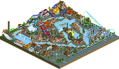
Liampie: "My first park in H2H5. I was the one to first build on the map, but I didn't know much about RRP's current style so I was very unsure about virtually everything... When he first built though, I started to make some progress. Sadly not enough progress, because we didn't finish before the deadline due to hacks not working and me struggling with the chaotic park layout and style. The last night I built until 5 AM, when suddenly a land tower appeared. When I couldn't fix it, I just stopped and submitted it. It wasn't going to be finished anyway... Eventually the park was 80% finished, and it won over the Minutemen's park which was pretty good too.
It was an honour to build with RRP, just a shame that I didn't really know what to do. Nowadays I would've done this totally different. I'm still proud of this though. The atmosphere is great." -
3 fans
 Fans of this park
-
 Full-Size Map
-
 Download Park
1,218
-
 Objects
363
-
 Tags
Tags
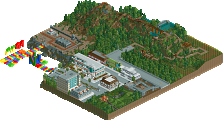
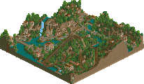
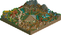
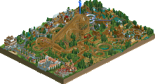
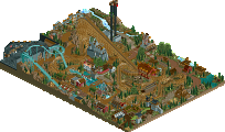
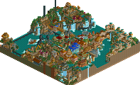
Well, I feel awful really for the Bioshock builders because its obvious they knew what they were doing and they put some work into the park, but I just don't get it because as others have said, I don't know what it all means and thus the park loses its atmosphere pull with me. Sorry.
On the other hand, what fun is that waterpark? It's not like Vampyre where it most assuredly had an unfinished look...this one is virtually complete and nice concept done well. I absolutely love that peeps were in this park too.
Vote went to Calypso
Edited by Buckeye Becky, 11 May 2009 - 06:39 PM.
ahh,having now seen what you were talking about id say that we executed it better
http://www.aqua-leis...er/default.aspx
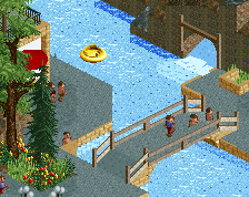
Annoying? It is creative use of objects like that which make the park vibrant and lifelike. It makes the park actually feel like a waterpark instead of the ugly 'sea' like water of the game. Good job on that.
I loved the peepablity and it's beyond me how some of the body slides were operational. The slides, coaster, architecture and foliage were all individually great and well thought out and executed. This is definitely one of the most memorable parks of the season for me, along with World Showcase.
A few things bugged me though, other then the unfinishdness, which was really only bad in the middle. I didn't like how there wasn't complete consistancy, in my opinion if one slide works they really all should, just makes some of them seem less significant. Then you guys didn't even name the slides, makes it seem that much more unfinished. Finally, although it was also a highlight there was some strange course changes on the lazy river that bothered me. for example the part where the rafts went uphill, I think there should have been a conveyor belt or something there to make it at least sort of beleivable.
It really was a fantastic park overall.
I leave opinion of my teams park out because it's really been bothering me what some people are saying about their own team's park, I know the builders know what I think anyway. All I have to say about it is if it's not holding your interest for long enough then pick it apart and look through the buildings, there's good details in there.
edit:
got it to work.
Calypso Quay was absolutely amazing! I can't say how much I loved it when I was looking at it...it's impossible to describe and it has such an incredible atmosphere. That's why it got my vote.
But now while many people (atleast in their comments) are praising Calypso Quay I think we should not forget about Bioshock which was very nice, too! I looked some stuff up about it and I noticed the plane crash that you had there at the top which was one of many nice details!
Edited by Fisch, 11 May 2009 - 08:09 PM.
Look at stuff from rrp/slob and you will realize the importance of spacing
Edit: It even says it in the readme, and this has already been mentioned at least twice in this topic.
Edited by Comet, 11 May 2009 - 08:42 PM.
i really liked the waterpark, but something about our park i just loved.
From the overviews I thought that this might be another close one but, apparently
that's not gonna be the case.
I thought the read-me for "Bioshock-Welcome To Rapture" was great because I was
only vaguely familiar with the concept and that truly helped lead me into the
viewing of Minutemen's park. So, I loaded up the custom 'music' and opened it up.
And was completely lost......(sorry, don't speak Chipmunk here). While the 'intoduction'
here was a great idea, the fact that it featured Alvin, Simon or Theodore as narrator
certainly wasn't. Maybe it's just me but, if you're going to use custom WAV files in a
park, you should probably have them properly recorded or just not use them at all.
Then, the fact that the entire concept is based on an underwater civilization and there
was no water to be found (save for on the log flume...which made even less sense, an
underwater water ride?) really kind of threw me. Although I did go through the entire
park (3 times actually) to try to appreciate everything for what it was.....having coasters
going in and out of structures "underwater" while maintaining the path structure inside
of "airtight" tunnels amidst an "underwater" concept just didn't make sense to me. I
thought that the plane crash debris and the tower leading to the Rapture were very well
done. But, the fact that almost everything was hidden inside those giant structures was
just.....well, kind of frustrating to try to view.
Then...."Calypso Quay". With the read me stating that it too was unfinished and that
without RCTM, I'd be seeing a lot of plain, unadorned entrance/exit stalls....I wasn't
honestly looking forward much to even opening this up.
But, I'm damn glad that I did.
While the unfinished things (and the giant land spike) were distracting, after just a couple
minutes of checking this baby out and I knew where my vote was going. Initially, the 'water'
parts done with blocks and ice colored land seemed like it wouldn't work, but after seeing
how well it was actually used, I certainly bought it as being 'water'. The entrance and
traffic flowing in and out of the area was nice, even if I think it could have been executed
better. The waterfalls and the lazy river were very well done, even if the river itself did
seem to meander just a tad much. "Surfing USA" was excellent as well. After a bit, I didn't
even seem to notice the plain, unadorned entrance/exit stalls at all. All of the
slides were done almost to perfection. All in all, probably my favorite "water park' so far
in RCT. Very well planned out and very believable.
Well done guys.
Edited by K0NG, 11 May 2009 - 11:02 PM.
Calypso Quay, I could both understand and find pretty, though
My favourite part was the entrance, even if it had the huts everywhere, reminding me of my RCTM dislike. The effect though of having people queue at the ticket booths was just very awesome. I also liked the flyer very much. It had such a peaceful, well ordered and just beautiful atmosphere to it. Same for the "Guest Relations" building. I almost went "Awww, that's so pretty" when I first saw it. I must admit I didn't care too much for the waterpark itself. I thought it wasn't spacious enough and I didn't find the way it was layed out believable. No matter what, the park was rather good and I can definitely see why you are winning this round.
The builders of our park know what I think of it so I wont say much apart from well done on creating such a great piece of RCT.
I'll comment on Rapture soon.
Wait, Bioshock is only 50% finished?
I really want our team to win this, as I know what we've got coming, but whatever happens we'll get on with it.
I thought the unfinishedness of Calypso Quay was far more apparant in game than in the overview, which was a disappointment. However, that was the only disappointment. It's just so damn beautiful. No one plays the game like this guy, and i'm a sucker for it. Every time I view a park by this person, the glitchyness grates on me, but do I care? Not a bit. It's playing the game for ideas on a new level, and to hell with aesthetics. Ironically, this almost makes the aesthetics even better, as everything looks so planned, so precise, so "meant to be there". It boggles the mind that you started with a blank map and an image in your head, to be honest. Pretty speechless, and annoying that we came up against it.
Our park was amazing. I almost wish that everyone could see other team's forums, so people know the problems and tribulations that occur, and how hard some people work to get over them. I know for a fact that our team bust a gut trying to get out a completed park, one guy in particular, after pretty much being effed in the a. The mere fact that this is completed is a testament to the drive exhibited. And quite apart from that, it's wonderful! There's so much to look at, things happening all over the place, ideas pulled off really well. I have never played the game, but have taken the time to look at screenshots and videos, and the fact that I can actually recognise the different areas and pieces of architecture, that's quite something. With the time you had to finish this, I would have been pretty relieved to see the architecture just placed to cover up any unfinishedness. But NO! There's stuff inside! And not just stuff, some really nice ride experiences... I urge people to take the time to look at this properly.
A water covered version would have been great, just to see what it looked like, but as stated in the readme, the game just couldn't handle it, crashing whenever a water tile was placed above. That too shows just how much content you've managed to get into this map.
Bloody well done to both teams.
The water park on the other hand - despite being unfinished in some places - is just superb. The water park concept has been done in RCT on many occasions, but this was the first one where it actually carried a proper atmosphere of an actual operational water park. The operating rides and the peeps really bring it to life - there's movement everywhere - and the fact that it has proper archy and an entrance plaza really make it. Also nice to see some good attempts at hard-to-build water slides - the Boomerang was insanely good, and definitely the best recreation of one of these I've ever seen. Also liked the Bubba-Tub (from Wet'n'Wild) style ride.
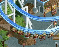
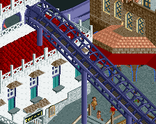
There were a couple of things I didn't like. The MasterBlaster was amazing to watch, but its layout was sort of unrealistic - should have started off higher, so that the ride could begin with a proper drop. The bowl slides... pulled off fairly well, but I've seen better (whilst most other slides in the park were the best recreations I've seen, the quality slipped a bit here). And then, the B&M Flyer. I know everyone's praising this, but for me, it didn't work at all. Everything else on the map belongs in a water park... but a random B&M Flyer?! I'd understand if it was a water-ride, a water-coaster or one of those RollerSoaker rides... but a B&M Flyer really really didn't fit in for me, and I just thought like you'd shoved it in there to fill some space. Yeh, it's a really nice ride and really well-presented, but it's not fitting for this water park - it doesn't belong.
Final comment is: when H2H is all done, please do finish the map. The building housing the red/yellow slides' queue-lines... the random big tank of water (didn't get what that was at this stage)... please do finish the park, just so that we can officially call it the best RCT2 water park out there! So yeh, other than one or two minor complaints, this was a great job - and certainly the easy winner of this match-up. Still waiting for someone to be make a good ProSlide Tornado water slide though...
WAS...(it was 4 years ago....live in the "now" bro)...and, I'd say that whether or
not it was themed better depends on one's perspective and is entirely up for
debate. Albeit in a 'then vs.now' thread...not this one.
brown isnt a theme