Park / DTLA
-
 01-January 23
- Views 1,493
- Downloads 310
- Fans 4
- Comments 10
-
 Description
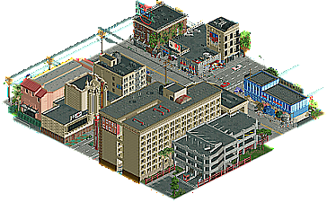
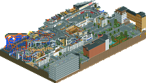
Consider this my Micro Madness entry
Inspired by two years spent living skid-row adjacent in downtown Los Angeles -
4 fans
 Fans of this park
-
 Download Park
310
-
 Objects
1
-
 Tags
Tags
![park_4102 [H2H8 R3] Castles-n-Coasters](https://www.nedesigns.com/uploads/parks/4102/aerialt3848.png)

Nice little scene, great showing of your skills in architecture and world building. Looks like we can all be happy you havent signed up for Micro Madness (yet), because that would have been some really strong competition for us.
Aaaaaaaaaaand you jinxed it.
This is a true gem of a release despite its size. Never been anywhere near LA but I definitely get the skid row vibe.
- You may have the most inventive object usage out of anyone on NE. It's crazy how you managed to blend detailed CSO, NCSO, and even recolorable DKSO together. The custom signs with the invisible Tolsimir signs and letter lines are fantastic. Beach towels and T-shirts as crunch? Did you look at your laundry one day and have an epiphany?
- It's honestly a little weird seeing you release something this still. Not that it's a genuine detriment, but you've defined your style with tons of movement and liveliness in the past. This feels like a Walto Mannequin Challenge.
- With that said, the atmosphere is still there in spades in the form of human influence. The graffiti, trash, and peep scenes really tell a story.
Little hard to rate a release of this size, but I'm gonna go with 75%. A little small and brief to give someone parkmaker over but as close as you can get. Unbelievable quality all around and another big ol' feather in your parkmaker cap. #H05SWEEP
Fantastic work Walto, what a great little treat. Your eye for urban details and crunch is unmatched.
where's the girl in the water tank
I was hesitant seeing that there was an rct version of skid row, but upon opening it up I admired you even more. It's political, textured and honest. The stillness feels intentional, like an ode to design and community and a condemnation of inaction.
In a game with such a cartoonish look, your object selection is so clever for this. It's gritty but beautiful, never making a joke of the unhoused population.
Cheers, Walt.
dropping the best micro before the contest even starts
Pretty neat. I agree with really everything Pants said. Gritty, dirty, intense scene. I want to say I want movement, commotion, vibrancy, but I'm okay without it. I just imagine this area is super loud IRL.
haha, yes, this feels correct. awesome early-midcentury architecture crumbling surrounded by parking lots and homeless encampments. excellent shit here, very detailed. nailed it
i'm going to bump this and second this. this screen was both a breakout for you and a great case for doing more serious, politically charged work. i will also say that pants' comment is one of the best succinct takes i have seen made about another's work.