Park / Patagon
-
 01-January 23
- Views 3,787
- Downloads 507
- Fans 7
- Comments 11
-
 79.00%(required: 65%)
 Design

wheres_walto 90% bigshootergill 85% In:Cities 85% Faas 80% G Force 80% Jappy 80% WhosLeon 80% chorkiel 75% posix 75% RWE 75% Scoop 75% Magnus 70% 79.00% -
 Description
Deep in the Chilean wilderness, a hidden giant awakens
(but not in time for the 2020 Grand Tour) -
7 fans
 Fans of this park
-
 Full-Size Map
-
 Download Park
507
-
 Objects
1
-
 Tags
Tags


![park_3340 [H2H7 R2] Indiana Jones and the Temple of the Damned](https://www.nedesigns.com/uploads/parks/3340/aerialt2942.png)


So excited to finally see this out! Being two years late to the Grand Tour was absolutely worth it, as you've really taken your time to perfect this massive design.
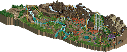
- Patagon may be the most insane coaster layout we've had in a while. Haven't seen a design with a 300 foot drop and nearly hitting 100 mph in a good long while, and especially not in a big serious release such as this. It's really bold and daring and I'm here for it. Even with the outrageous first drop, you manage to keep the pacing fluid and it never seems to take any elements too fast or too slow. That can be tough to control and this layout really is a feat.
- The bike ride and railway are great supporting rides that really indulge you in the rest of the map. The curved train station came out really well; I remember you first posting the screens of it and catching me off guard because I was so used to your NCSO work. On that note, it's nice to see the rock climbing wall make another appearance after Raspberry Acres.
- Landscaping is absolutely stellar all around the map. The mountains are the obvious highlight; I haven't seen anyone use castle blocks for landscaping the way you do. The meadows around the bike trail are gorgeous too, and it's nice seeing you embracing crunch with the safety nets and grass trims.
- The underground section is what takes this one over the top for me. It's such a fun, lively, and unexpected inclusion and a great way to add some more flat rides (of which Rueda de Cagilones is my favorite) without taking away from Patagonia's natural beauty.
- Archi is great. Simple, clean, and understated yet very effective. It's giving ski resort vibes. Lovely interiors too!
- Always a sucker for frozen staff scenes and this one is nearing Kumba levels. Speaking of frozen staff and Kumba, it's a real joy to see all of Hawaii 0-Five showing up throughout this park. It's really awesome that we're all still bouncing our projects off each other even after H2H Classic ended. Fun fact: I'm smoking the same stuff Walto hit when he did The Child's Dream and that's how I did that carousel speedbuild screen.
- Special mention to the original music. It's something I noticed you did for the Scream Queens during H2H9 and as another composer I'm a huge fan. Almost sounds like something out of the Donkey Kong Country series and that is a big compliment coming from me.
80% from me, seriously amazing stuff. This is gonna be what gets you parkmaker. Hell, if you get elite off this I won't be mad. #H05SWEEP
What an exciting release, terry! The rockwork is beautiful and the coaster is enormous. When ive opened this at first i was a little underwhelmed, rotating the view and finding all that indoor stuff was a really great experience. The freefall tower felt a bit random, but i guess it worked. I really enjoyed the ferris wheel and all the mining equipment tho. You managed very well to put in a lot of cool small details in here. Im also a huge fan of the conveyor belt, works really well here.
I think that the architecture throughout this whole park is really well made. The modern buildings with the glass windows are giving me some late fluxtrance vibes. Nothing really great to criticize here, potentially only that its a bit repetitive, but thats also kind of just the style you went for i guess.
All in all an amazing release, going to need a bit more time to think about my vote. Definitely a clear design for me tho.
The patience you must've had sculpting those rocks must've been amazing. I wouldn't be able to do it!
Fantastic release Terry. I said it before and I'll say it again: how are you not a parkmaker yet.
Instead of writing a coherent review, I'll just sum up the things I noticed:
-Coaster: HUUUUUUUGE. Layout seems nice, I dunno, I'm not an expert on those things.
- Foliage: looks great! I like how the waterfall comes from a logical place of the snow, and is that a rock climbing wall? Makes sense here.
- Ping Pong King Kong
- Archy uses not much textures, but manages to look interesting and is very nicely done!
- Kudos for using that giant wheel object in an interesting way!
- I only noticed the inside of the mountain later, I'm an idiot.
Other things:
- Cutaway view. While it does have some fun moments, I'm pretty strict with my opinion on it. Use it, or don't. This is sort of in between for the buildings and the mountain breaks immersion for me sadly. Although I also understand you were just trying to fill in the buildings with large glass walls, so I digress.
- There seems little transition between the foliage and the bare mountainside. This may be very well my complete lack of geographical knowledge, but it seemed abrupt.
- I miss one more extra supporting ride in the outdoor part. Something like a rapids or larger tracked ride.The mountain bike is good, but seems a little too far between bikes for me.
All things concluded, this is a release to be proud of. Give this man his title now, for crying out loud!
Absolutely love this release from you. Awesome landscaping, a pretty damn exciting coaster against that awesome landscaping, just a really classy showing. Clicking into the rides and attractions you really give a sense about what Chilean Patagonia is about, with the food eaten and some great cultural references. A really immersive experience.
What a good year you've had Terry, not just H2HC MVP, but hopefully Park maker status as well with this release.
I don't think you could've done anymore to bag PM.
Ah yes, I meant to post a disclaimer about this earlier...
This map is not optimized for cutaway view. Everything that is meant to be seen can be seen (and should only be viewed) from the default viewpoint. Hotel interiors only go as far as what is visible through the glass, and the mine is built only for a fixed perspective.
This is a .sv6 map, built to older building codes, so opening cutaway view runs the risk of exposure to asbestos.
Such a great map, Terry. The coaster looks almost respectfully integrated into the landscape, not a metal monstrosity but an intentional installation.
You've done so many ballsy things and I think they've all paid off: the object usage in your landscaping, the airtime hills with two flat pieces at the top of the camelbacks, the subterranean section, the "submitting a Grand Tour park years after the deadline"!
If I were to critique one thing, I'd say the hotel could have used a bit more detailing. But at the same time it lets the landscaping be the real star so it doesn't detract from the overall experience.
Big big fan. Your perseverance on this is inspiring.
A great map again from you, Terry. I like the landscaping a lot. It has its own distinct style despite using some of the Fisch Rock pieces (unless they are castle pieces and I am mistaken). Either way, the actual lack of a ton of crunch in a way works to make the mountains look even taller than they would otherwise. The coaster is great as well. Its large, sweeping elements seem to fit the landscape, and not the other way around, which is great to see. I think the chunky supports on the lift work great. I think the thinness of the supports on Lightning Whale in Tokyo Dome City was largely avoided here. And the buildings. I like them. They remind me of the ones you made in Oregon's Palisade, and that's a good thing. Congratulations on this release, even if it is not the 80% many were hoping for.
Impressive size and scale, and some creative object use to do the landscaping, and I like how the coaster fits into thing. Also, I love how the cave cut-away sections are done, flipping the map around and seeing the clean and well cropped map edge cut-outs really adds to the map.
Terry, welcome to the 79% Club!
Sorry, I think you got robbed, because this is utterly fantastic. I'm blown away by the atmosphere. I think the best word for this Design is "character," because it has it everywhere, from the subterranean rides and interaction, to the architecture of the hotel. The whole world really sucks you completely, and it felt like I was truly lost in these mountains. Foliage and rockwork is amazing. I was skeptical of the coaster after seeing the overview and your screens, but you pulled it off marvelously. I also really enjoyed the use of the river and waterfall to break up and otherwise brown and green map. Overall, this is such a unique Design that I anticipate many coming back to for inspiration and ideas.
holy cow, this thing is massive. wasn't expecting an entire underground area! I actually love the layout, even if it seems like it would be a bit sprawling at first. the landscaping is... good. I think you did a good job with this kind of style, although it always just ends up too smooth maybe. but very good attempt here, one of the best. i love the overall atmosphere though, it just feels cold and crisp and fresh. well done