Park / Mahoning Gardens
-
 25-December 22
-
 Mahoning Gardens
- Views 6,941
- Downloads 541
- Fans 16
- Comments 28
-

-
 88.50%(required: 80%)
 Spotlight

Liampie 95% yes bigshootergill 90% yes CedarPoint6 90% yes CoasterCreator9 90% yes In:Cities 90% yes RWE 90% yes saxman1089 90% yes Xtreme97 90% yes chorkiel 85% yes Cocoa 85% no Scoop 85% yes posix 80% no 88.50% 83.33% -
 Description
America's favorite family owned amusement park for 99 seasons!
-
16 fans
 Fans of this park
-
 Full-Size Map
-
 Download Park
541
-
 Objects
1
-
 Tags
Tags
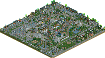
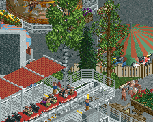
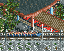
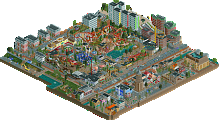
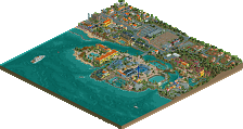
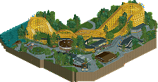
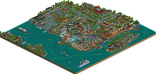
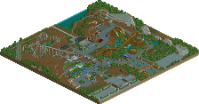

One of my favorite parks of recent memory. Love the incorporation of the history from Elitch and how well some things have been represented. Mr. Twister is absolutely a candidate for wooden coaster of the year. Exceptional layout. Here's my video review:
https://youtu.be/kOfCHUN-PJo
The park started about a year and a half ago during the end of H2H9. I really got back into the game because of the contest and just needed something else to keep myself going. I’d been sitting on the Wildcat layout for a while and was intrigued by some of the vintage photos of the old Elitch Gardens showing some of the sound proofing they added to their coasters to shield the neighborhoods across the street. So the park grew out from there.
Focus of the project was really in recreating that older family run park feel and creating something different from anything seen on NE recently. Much of the map is a love letter of sorts to the older parks that are becoming increasingly rare by the year. Thankfully I was lucky enough to visit the former location of Elitch Gardens in Denver last fall and briefly felt transported back to an era where parks like this were common in many of the cities in America. Interestingly enough another small family run park is only a few blocks from the old Elitch spot, Lakeside park still operates but certainly has seen better days. The former Idora Park in Youngstown was another strong source of inspiration here; it closed in the mid 80s after its main attraction burned down. So setting the park in the semi-recent past was another component that became important, not only because it was a time where places like this were more common but sort of as a challenge to subtly show the park in a different era.
Obviously the park started using the old save format which partially influenced the size of the map but really creating a more intimate setting and focusing on the details was part of it too. Probably wouldn’t have been nearly as enjoyable of a project had it not been for the NSF, which opened up object selection completely and really let me bring in a ton of new objects to get all the details in which made the park what it is. Not to mention getting rid of the object limit which would have totally handicapped the park too. Big thanks to the OpenRCT devs for creating an incredible version of the game that has brought back much more joy to building.
Again, thanks everyone for the very kind reception! We shall see what the future brings.
You've made such a beautiful park, G. Seeing what the other boys did, and how perfectly integrated they are, is a testament to how clear your vision is.
Your commitment to this type of American realism deserve so much praise. As an admirer, this really feels like the culmination of everything you've done before. It's rough and charming; there are stories in the asphalt. Other observant suburban kids could only dream of creating something like this.
I'm sure we'll all be referencing this for years to come. Congrats on the release!
(P.S. Still pissed you had to upstage DisneyEarth and release this in 2022)
I feel like I could look at this all day and never even finish finding all the details in the outskirts, let alone in the actual park. I love that you can see when each section was built (or renovated) by looking at the architecture. This makes me nostalgic for a park I've never been to, which I think is perhaps the highest praise I can offer a Dirty American Realism^TM park.
yall remember when everyone kept picking g force in like round 8 for mock draft
First of all. Congrats on the Spotlight. Well deserved!
I have to admit, at first glance and seeing 3 wooden coasters gave a feel of mehh... what is this. But when i started exploring this changed rather quickly. It is so incredibly well executed. So perfectly clean. No glitchfest. That is something i really admire. I like the traffic and the surroundings. Even the peep smoking a fag behind a building. The green wooden and Liam brick house is really cute. Or the garden find. Maybe something for Gas Monkey. The looping at the parking lot is a nice touch. Also liked the really small rides at the kiddy area. Not peepable unfortunately, but it suits really well. Some of your flat rides also looked so clean. Very well done. like the flyer ride in this picture. I hate it when i can't see the chain tbh, but keeping the distance between the seat and the roof of the ride rather small, made a huge difference for me. Still no chain, wich isn't possible, i know. But this is a good trick imo. Same for some other flat rides with static parts. Hate me for hating them, but it is what it is.No reason to vote low or anything, just personal preference.
If i have to choose for best flat ride, then this would be it. Super Himalaya
It's just so lovely.
And ofcourse not forgetting that incredibly cute golf course.
Also so lovely.
Twister is the best coaster imo. All in all, very nice piece of work. Should make you proud. Well done parkmaker.
I don't know where to begin, but I do know that I'm keeping this in my saved parks folder for inspiration. It absolutely oozes the atmosphere of a classic American trolley park (Waldemeer, Lake Compounce) in a eerily realistic yet tasteful way. Everything from a technical perspective is very clean (hacks for road traffic, no glitching). Even though some are "wonky" or "boring" by today's standards, the layouts are amazing (especially Mr. Twister) and authentic to the source material. The flat ride collection was phenomenal, perhaps one of the best all-around lineups in terms of cohesion with the surrounding area. I'm a sucker for a good skyride as well.
I especially love this area, near the Ghost Ship façade. It screams that there's a story behind all of this, like real people worked and played here for generations, each with their own story. (Obviously not. This is a game still. But geez.)
Congratulations, G, you deserve it.
I really want to give this a review before it's much too late!
Firstly, congratulations on your 3rd solo Spotlight. This is an incredible feat, and one I think really only one other player can boast for RCT2. For me this is a paragon of a classic American amusement park. The establishment of story, world building, explicit context and infrastructural details is the complete package. Whereas a more "typical" American realism park draws your focus to ride/park layout design and infrastructure this really grabs you at everything. I wouldn't necessarily site outskirts as a concept to be what's taking something to the next level but just the sheer passion and attention that draws active viewership. You are given so much visual information that you can sort of feel out what it might smell, or sound like to be there.
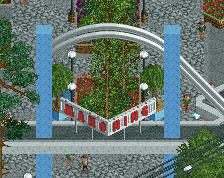
One highlight for me is just the overall design of everything. The arrow shuttle over the park entrance is classy, with the clock centerpiece as a branching point from guests that also serves to inform them of the time (obviously) to plan out their day. There is a waterfall by the entrance to the sky ride near the big wheel which is both a visual and auditory director for guests towards the transportation. Stuff like wheelchair/stroller accessibility. I know not is particularly attentive to this kind of thing, but it's something I deeply respect here as a part of your ingenuity.
Branching off from overall design, your ride design is, of course, as good as ever. The vintage rides like your Rocketships are such a treat to see resurrected like this since they are so few and far between in the real world. Under a similar umbrella, your mid-way games and stalls are all stellar in amplifying the livliness at every corner.
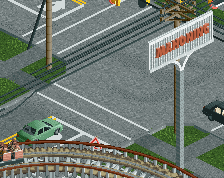
The period architecture is one of my favorite aspects of this park. That and your foliage really shines through like a rose-tinted view. It is similar the same strip malls and infrastructure we are so familiar with now but yet it is given this air to it, like a second-hand nostalgia. The cinema, capri lanes, and chase bank in that southern corner are stellar. Shoutout to Steve for the Dunkin Donuts, I think. The houses do what houses do best and really look like they are a place to live and with people living with them. Not houses but homes. I just love that vibe!
I could continue to comb through every excellent detail, but I think it all speaks for itself. I think I will continue to find new things around this park as time goes on and that's a hallmark of a monumental release. Excellent job G!
yo, I was certain I left a review of this park when it came out...damn. maybe i said something in discord?
anyway, I can't believe you've racked up 3 spots now. just amazing work. you have an incredible nack for american theme park history, and it all shows here. just a joy to see this kind of ... reverence? maybe? for theme parks. gritty, glamorous, whatever. this is the kind of niche shit that makes getting deep into niche hobbies like these all worth it. respect the fuck outta it