Park / Mahoning Gardens
-
 25-December 22
-
 Mahoning Gardens
- Views 8,171
- Downloads 706
- Fans 14
- Comments 28
-
-
 88.50%(required: 80%)
 Spotlight

Liampie 95% yes bigshootergill 90% yes CedarPoint6 90% yes CoasterCreator9 90% yes In:Cities 90% yes RWE 90% yes saxman1089 90% yes Xtreme97 90% yes chorkiel 85% yes Cocoa 85% no Scoop 85% yes posix 80% no 88.50% 83.33% -
 Description
America's favorite family owned amusement park for 99 seasons!
-
14 fans
 Fans of this park
-
 Full-Size Map
-
 Download Park
706
-
 Objects
1
-
 Tags
Tags
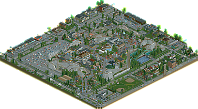
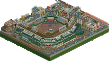
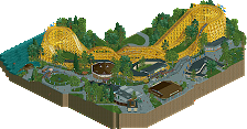
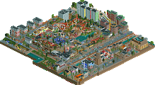

What a nice present to recieve these holidays, another G Force solo park! The master of dirty American realism returns, doing what he does best: bringing the average American theme park alive in rct2.
The park feels so real and believable, as if it was copied from a real park. I really like how you managed to put the history of the park in the game, it really feels like a regional park that still upholds his golden oldies to this day.
Things I really liked:
- the facade of Ghost Ship
- the classic rocket ships (they are such a fun ride irl btw)
- the grand carroussel
- the kiddie corner with the carroussel and other kiddie rides
- the outskirts, who feel so damn American.
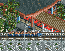
The coasters are all great too, going for all (but one) wooden coaster is bold but very fitting for a park like this. Mr Twister is the star of the show imo, with that great helix as the show element. For the riders and the viewers. That helix kinda reminds me of Kennywoods Thunderbolt.
There's 2 things that I wasn't really a fan of. I do think it's a shame that the log flume is so hidden away from the visitors. A peep could easily spend a day at the park without ever realising the park had a flume. Other thing I didn't really like was the grey path in the park. Must be very tiring to hear but I think the Kong brick path or brown crazy path would've fit better since there's already a lot of grey in the buildings and outskirts.
Really liked this park, while it is dirty American realism it was totally something else and new we've seen from you. Really enjoyed it.
Yes a new G Force park! A Merry Christmas it is. I love how realistic Mahoning Gardens feels. The park, as well as the outskirts. It feels like my laptopscreen was colored by pure Marlboro smoke. A true gritty, mediocre park that has it´s own history and character. The attractions, buildings in the park, but especially the buildings outside of the park are spot-on. The woodies are all destinct and well thought-out in the timeline. I think this park achieves to strike exactly the snare it was intended to strike.
Great park G Force, and it might be the one that pushes me back into playing again.
Having just visited Kennywood for the first time this summer, I was stuck immediately by the similarity. Although Kennywood is no longer family owned, it still has that family-owned vibe in most parts of the park. This creation feels the same way to me. You nailed the family-owned midwest vibe perfectly. The coaster layouts are phenomenal, and the ride placement perfectly lands the balance between planned and unplanned like you'd see in a real park of this type.
Thanks for the great Christmas gift!
This park feels so lively and real it's amazing, from the selection of rides, the layout of things and all of these small details that a lot people probably only notice if they've been to a park like this. Coaster layouts are well done, with a nice and fitting variety of classic rides from different eras, the build facades for fantastic, and I love the thorough and consistent use of texture effects, it adds a layer of grit while being clean and readable at the same time.
And the backstory for this is spot on, very believable for a park like this and explains the ride choices so well.
I love old historic parks, so this is something I love to see in RCT and a fantastic Christmas present to open.
I mentioned this to G Force already: I honestly believe this hits the rare tier of parks like Washuzan. It so effectively captures the essence of what it intends to be in terms of park design, ride selection, backstory, and surrounding area that it pushes realism into reality. To achieve that from imagination and not recreation is astounding. I can't say enough good things about it
Even if American realism isn't your cup of tea, the execution and portrayal of Cleveland's inner ring suburbs are flawless here and should be celebrated
Amazing, amazing, amazing job, now go try something exotic as a palate cleanser!!
You really brought your style to the next level, russ. Lovely outskirts, amazing ride design and backstories, some crunchy realism here and there... so much youve done perfectly here. When looking at this, i was sure this must be a recreation. Finding out that this is actually not blew my mind.
Although the coasters have definitely been great too, the flat rides are the true heros of this park. Loving the scene with the super himalaya, carousel and swinging ship. the mini golf might be one of the best weve ever seen. Added to all the stalls spreaded across the park are perfectly crafted and they do add so much atmosphere and immersion to this.
All in all i think this is your best work yet. Thank you for this great christmas present. What an awesome way to close the year.
This park is so exciting! Thank you very much
Over the years with all the crunch debates popping up I have often been reminded of a topic you started years ago about achieving a gritty style. Euclid Beach was a solid attempt at this, and over the years I've seen the intent pop up in much of your work. But I think with this park you really did it. It's so immersive due to how recognizable everything is. The park really feels like it's been up and running for over a century and the town also really feels very lived in.This map is gorgeous and ugly at the same time. Bravo!
Oh shit it's here!
I'm probably not too qualified to give detailed criticism, but I was wanted to stop in and say that I absolutely love this park.
It feels so real and authentic... like Chorkiel said it really feels like it's been running for 100 years. The backstory definitely added to this. As a viewer I can see how the park grew organically over the years, resulting in the clunky and unusual layout that's so common to real-life vintage parks. I'm sure this must have taken quite a bit of thought and planning on your part.
So many awesome details in here, so I'll just highlight a few of my favorites:
-The Ghost Ship entrance is amazing and super creative.
-The mini golf course is so restrained and perfect. It has that small, low-budget feel that's so common in real life.
-Entrance clock is very creative.
-The tucked away greenhouse is such a realistic touch for a place with a history as a botanical garden.
-Your use of blending textures to make those crappy dirt baseball fields looks perfect... immediately gave me flashbacks to playing on so many similar fields from my childhood.
-The houses on the corner next to the baseball field, particularly the brown brick house with steep roof and the red/teal house with the wrap around patio, actually made me say "Oh wow" out loud when I first scrolled by them... some of the best building realism I've seen in RCT.
-The arrow launched loop for the entrance perfectly sets the atmosphere for a vintage park.
Thanks for this park. I enjoyed it a ton!
Great job on this
The outskirts I really couldnt find a fault, its a 100% area for me. Getting like NE Ohio flashbacks like im in Warren or Youngstown (i know this is more Cleveland based despite the Mahoning name) or like Shaker Heights or something. The building types and store narratives were all cool. (maybe have like a old city hall building?) Its crazy how much you can do without obj limits.
The park itself is well done, like 85-95. Good Narratives. This feels like a retrofied southwinds in some ways? Like a smushed version? Its very your style. Landscaping, detailing, arch, rides, flats all good. I think some Queues were weak? Could use some curvature throughout the park.
Its easily 90-95+. Its creative with your classic frame of reference with great narrative.
This has to be my favorite G Force park yet, and I think what you did so successfully is adapt your style to todays "Action Park" meta without making it look any less like you. What else I'm impressed by is that not only did you successfully place this in a very specific georgraphic setting, but a very specific time period too. We've seen a lot of less subtle time period parks, ie Roaring 20's, ancient Rome, etc, but a time period that is only slightly less than modern is much more difficult to pull off. I kept looking for idiosynchrasies and couldnt find any, every facade has that drab & vaguely brutalist style of an American franchise that hasn't been remodeled in 30 years, which fits the time period perfectly.
Another praise I have is that not only is it distinctly "American", but distinctly midwest. The Xtreme brick objects you use everywhere was a very good choice, as it feels like this object separates the architecture from say, the Northeast/New England style of bricks.
Not usually one for lengthy screen reviews but here was a couple I enjoyed especially:
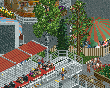
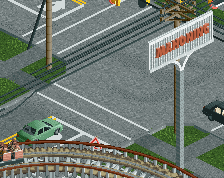
This building especially did everything I said above to capture the time & place of this park perfectly
This has to be one of my favorite mini golfs I've seen in game, the little mill with the water wheel especially. You've done a good job adding splashes of color when you can while still keeping the "concrete jungle" feel, which I think is appropriate for this type of park.
Just imagining how stoked I'd be if it was 1989 and my local amusement park got a janky looping coaster that went right over the park entrance. Perfect lol.
Will have to think more about the rating but its probably an 85-90 to me.
Amazing showcase of RCT skills.
Great to see a full scale release and congratulations on finishing this.
The rating of this park is truly difficult for me:
I am neither familar too well with 1989 parks, old-school coasters, flat rides nor the late 80s in the US. The park greatly captures the late 80s feel for me based on what I learned about this time period.
Personally I wouldn't want to visit the park. The brutalism architecture and tarmac style is something I probably would not enjoy when visting this park in real life - which is completeley independent from the amzing level of RCT you are bringing us with this.
I will think a little more about this before voting and will review old-school wooden coasters on rcdb. Great job on making me review coasters of the 20s/30s. Something only a handful of parks achieved.
As an American, this park is sublime. I also grew up in and reside in the American Midwest (though a bit more west and north), which makes this park feel like it could be right here at home. Another plus is that the larger metropolitan centers around here grew substantially post WWII, with a little slump in the late 80's (recession), so there's still a lot of the kinds of planning and architecture you see here in G Force's creation around in real life as you drive from neighborhood to neighborhood.
And yeah it's gray, it's really gray. But to G Force's credit, it's true to life. People that grew up in and live in the areas that inspired this park can easily relate to the look and reminisce about familiar sights and styles.
Coasters are all just fantastic, of course. I think Southwinds was a clear example of your skill in that department and I love it just as much here.
Lots of little details that make this distinctly middle of the USA, and give it lots of charm. Might be harder for people that live in other regions to get into, but that's ok, variety is the spice of life. Curious to see the score....
Congrats on spot G! I've loved your work ever since I discovered WoF like six years ago but this is just something completely new and fresh. Tackling a smaller family-owned park would naturally come with a lot of soul and personality and you doubled down on it. The history document really gives it a new layer of immersiveness which I will never not appreciate. Will give this a more in-depth review when I get a breather from MM. Rock that red name!
I was looking at the park and obviously I loved it. Easy to just hit 90% and click enter. But when would I ever go above 90? Every inch of the map is nearly perfect. It's not the most mind bending park, but for what it is, it's so good. So what the hell, let's go with 95%.
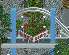
Mahoning Gardens to me is another example of the evolved hyper realism genre. We moved on from parks like SFC, SFSF and Starpointe, for which I thought the 'no atmosphere/endless concrete/generic' argument was always valid to a degree. Modern hyper realism parks are not generic. Unthemed, yes, but there's an emphasis on the park belonging somewhere in time and space. A location and a period. Lagom may have kickstarted it, because afterwards we got Riverland, Seaquarium , LunaPark Adelaide, and arguable Coors East. Washuzan is an obvious example of this trend moving on to more distinct environments. In this it's the familiarity of the American suburbs, but the 1980s setting makes it more exotic than that. And this identity seeps into everything on the map, which is why I rate it so highly. The clock in the entrance area to me is one of the ultimate 1980s details on this map. I don't know why. Kind of ironic, but the clock almost functions as a time machine to me.
Well done G.
Sorry to be the low vote on this. I'm afraid my criticism will come off as totally ignorant to the intention and source material of this park. But as we've often had with realism, is the question whether having to understand or know the real park legitimate or not?
Either way, I just have to say what is probably an unpopular opinion, but the park was too small for me. I know the outskirts are meant to play an important part, but although technically high developed, like most any technical aspect of this park, they somehow didn't do too much for me. In fact, if I can say this, they almost looked the same to me in all of the corners of the park. So I tried to focus on the actual park at hand a bit more. It was at Gold size for me, and again the technicalities are pretty great to see. I loved the flat rides of which some were a real highlight. They looked exceptionally clean and like they're very easy for you to do. The coasters also seemed great and smelled of how knowledgeable you are with this kind of stuff. They were almost like you wanted to make a statement of what a good layout should be. It worked, and I liked them. But they were also the same coaster to me, just thrice in the park. This isn't meant to be harsh, but it's honestly difficult for me to appreciate them because to me they're just so similar, and I'm not a coaster enthusiast by any means. Aside of that, the face of the park itself was good, sometimes very good. It was downtoned and didn't try too much to look pretty. It was just kind of there, but the focus seemed to be the accuracy of translating something from real life to RCT. Without knowing the real park, I'm super sure you managed to achieve that. But it just doesn't mean that for someone like me there's really much to get excited about. I'm looking for aesthetic achievement, strong colours, innovative landscaping, a variety of rides and how they articulate in the language you've found in and throughout the project. I didn't find that too much here.
How about that Dunkin' Donuts, though?
Realism is baseball, and this park deserves its own room in Cooperstown.
The great thing about this map is that very little on it is meant to be a representation of something that would be aesthetically pleasing in the real world, yet it is the authenticity of the depictions that allows this map to be the most beautiful of its kind. The best gritty parks are the ones with the strongest appreciation for the mundane, and it would be difficult to find any map that truly embraces the most ordinary elements of everyday life with such skill and precision more than this one does.
You've nailed the architecture everywhere, but especially in the surroundings. Regular American houses have never looked so real in RCT, and the businesses are dead on depictions of what small commercial buildings looked like at the time. My favorite corner is the one with the Regal cinema, the bowling alley and the Chase bank, but even the purely functional buildings (such as the 7-Eleven or the Blockbuster) are truly authentic. Parking lots, when done right, can be gems, and this map is a diamond mine in that regard. You've gone the extra mile by texturing the top of buildings to show water damage, and that might be the signature detail that highlights your pure commitment to recreationalism.
As for the park itself, you have moved gracefully out of the general Cedar Fair realm and into something that allows for more storytelling, which seems to be the right direction for you since you're the type of builder who will do all the necessary research and more to ensure accuracy and consistency--an important quality when creating something set in a particular place and time. Rather than just building a high quality park that could potentially be anywhere in America in the present moment, adding a specific setting gives the map more opportunities for depth, and this map goes noticeably deeper than any map ending in "-winds" as a result. And yet, it still retains the charm of the others that comes from a lifelong appreciation of theme parks of all sizes.
I've already stated my whole "needs more contrast" spiel that I bring up every time someone builds a large map with an English Palette variant, but since your goal was to create something hyperrealistic and gritty, your color choices make perfect sense. Changing the palette to black-and-white also helps certain details pop at the macro level. Ultimately, the only change I would have made to the color scheme would be giving the park path a different color from the streets and parking lots so that it doesn't all blend together, and that's a personal preference. The buildings are as grey, brown and beige as they need to be, and the homogeneity of the coaster colors doesn't hurt this park as much as it would most.
I missed the vote since I took too long to deliberate, but 90/yes would have been the most likely choice, and that was the final vote anyway, so the rating wouldn't be any different. With your masterfully photo-realistic detailing, it would be difficult for me to rate this below 90, and while I was on the fence about the Spot vote for the same reasons I stated for DisneyEarth, the sheer level of care put into every square inch of this map would have likely influenced me to round up instead of down on that one. Color and macro nitpicks aside, this is a clear step up from your previous Spotlights, so it wouldn't seem right to say they were more deserving of the accolade than this one is. The attention to detail is indisputably in the highest tier, so it is no surprise that this park only missed 90 by a hair (a unit of measurement that neither of us would use anyway). Intention is crucial as a builder, and it is clear by this map that you have fulfilled all of yours during this process.
Someone make this man a sloped mowed grass object. He's earned it.
First, because I forgot to vote on this, god damn I wish I was a guest spot on this! I would've nailed a recreation of a house in this neighborhood! This park is such my jam. You've always been one of, if not my favorite builder in RCT, and this park cements you in my Mount Rushmore of RCT players.
The park itself has so much history, backstory, and character that makes something worth indulging. Other video games have lore, but in RCT you've created great piece of history all your own in each of your releases. Having a park set in this time period was definitely unique and this fact alone is deserving of a spotlight. I hope this encourages future parkmakers to make parks set in time. Pick a date, and make a park set on that date. So cool.
Part of me is glad I didn't vote, because of weird little stuff that probably I, you, and maybe Walto get? Like come on, you recreated the Checks to Cash place and drive thru liquor store on Trisket?? Come on lol
Ride design is top notch. Storytelling unparalleled. And that holds true regardless of "dirty american realism" or whatever. This was such a passion project and it shows.
Some spots I enjoyed:
The car wash was neat.. pretty original with the rotating bits. Colorful too.
This building reminds a lot of the Westinghouse building along the shoreway. I assume that was inspiration, along with some of the buildings along Berea / Madison?
So badly wished I contributed one house. These houses are so West Park it hurts. Love it.
Great framing. Really colorful too. Screw all the grey haters. They grey if anything is great negative space that allows areas like this to shine.
Wooden coaster of the year. Wow.
So after all that, again, loved the park. Love your work. Please let me guest spot on a future park.. sorry I didn't vote.
100% yes.