Park / Steel Buru
-
 27-November 22
- Views 2,968
- Downloads 293
- Fans 0
- Comments 10
-
 76.00%(required: 65%)
 Design

In:Cities 85% Scoop 85% G Force 80% Liampie 80% Terry Inferno 80% wheres_walto 80% chorkiel 75% saxman1089 75% Xtreme97 75% Magnus 65% RWE 65% SSSammy 65% 76.00% -
 Description
A park build by Swagtitties and Mulpje for the 2nd RMC DKMP contest.
Also thanks to CP6 for helping with the layout for the RMC -
 No fans of this park
-
 Full-Size Map
-
 Download Park
293
-
 Objects
1
-
 Tags
Tags
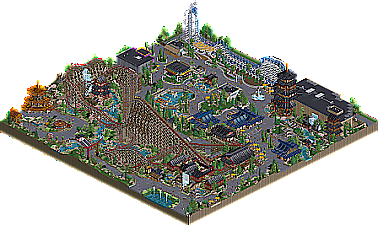
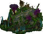
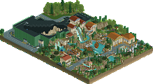
I really enjoyed this, what a great mash-up of styles from two of my favorite players. Both of your styles come through: Mulpje's control of color and epic sense of scale with Swag's absurdly clean trackitecture.
I'm stunned by both the level of commitment to NCSO methods and the effectiveness with which you're able to achieve the same effects as CSO players. Maybe it's my own lack of familiarity, but I was particularly surprised by the use of flat rides to get mulch texture. Highlights for me were the pagodas (truly spectacular work), torii gate, and bumper car building detail. The support work and station for Ultra-twister are phenomenal as well. This is impressive work, great job guys
This is some really very nice NCSO Japanese architecture. It's a lot cleaner than a lot of attempts I've seen, and manages to capture the character of the style very well. A few of the pagodas are a bit on the blocky side or squished in places they don't fit super well (the larger golden one) - but in general really well done.
Coaster layout is nice; definitely has that RMC conversion feel to it.
Great work.
A great collab from two players with very different styles, fitting things together so well. The paths are especially good, love how well they break the grid with NCSO-style building methods.
This had some really stellar moments. Looks like a DKMP style transitioning to NE, and it's interesting to see. So many good realistic touches, a lot of cleanliness in the design. If anything to criticise then maybe the map shape seemed to dictate some compositional decisions that weren't always fortunate. You can take the freedom to design a map shape that suits your park vision better (DKMP may not allow this perhaps, but NE eyes won't care of course).
The main problem for me was the palette though, which I think does nothing but hurt the aesthetic.
Even though this is not technically NCSO, it is a shining example of how to bring an area to life with the NCSO mindset. The map is alive from every zoom point, yet it is not overly detailed in a way that is messy or difficult to read. Building placement is excellent, and the buildings themselves are exactly as detailed as they need to be--no more so, no less. It is also impressive that you were able to work in some of the colorable WW objects--which are better than the original WWs because A) we can all see them, and B) they aren't attached to whatever jarring color they were originally given. This trend of breaking the paths away from the grid is one I hope continues indefinitely, though it does seem to come at the cost of having to hide stray path edges with shrubs and ruins. Still, I prefer it this way over seeing a bunch of blocky right angles.
Both coasters are beautiful; Steel Buru is a lovely, straightforward RMC--you'll have to teach me that chain braking trick--but Ultra Twister deserves credit for being so cleanly executed within the limitations of the object selection. There are easy but less aesthetically pleasing ways that the supports could have been done, so I applaud you for doing it all manually; the effort here definitely paid off.
There are still some clunky choices that kept this from being something even stronger. The foliage work is lovely in some places and a bit on the patchy side in others, and the tree placement didn't always flow as naturally as it could have.
As popular as they may be in DKMP works, these temple walls do not look like rocks, and there is no way to blend them naturally with standard land tiles.
But for every minor dissonant note, there are about ten beautiful moments where everything flows harmoniously, such as that wonderful torii gate, or this absolute work of art:
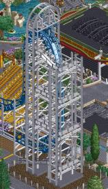
Also a huge fan of lining up those supports with the fence post on the bumper car building (but not New York Roof pieces as I've professed in the past).
You two are some of the strongest DKSO builders, and this work is just one of the many examples we've seen of your immense creativity and resourcefulness. We are all looking forward to what you build next. A large map release from either of you would be especially powerful.
This really has much to offer and some nice moments in it. The architecture is done quite well and you managed to create some nice curves and diagonals. Also i do think the main coaster is quite great. There also really is much to see for a smaller map. There are a lot of creative small things that i really enjoyed when viewing this. I agree with walto that especially the way you did the flat rides is impressive.
To point out room of improvement i would say that im not a huge fan of the overall composition. I agree with posix here, would really love to see you experiment on a more organic map with more freedom. Also some of the foliage and rock object choices were a bit too bold for my taste, same goes for the colors. I think a color scheme that is a bit clearer would have done wonders here.
To conclude in my opinion this still is a really great release tho, probably one of the best DKMP releases weve seen here so far. Keep it up!
ah, the masters of modern ncso. another clean, curvy, realistic ncso design, wrapped up in a nice asian theme. perhaps a bit...been there done that. but still, very lovable. i wish you'd wrap all these babies up into one full scale park!
Damn that looks rad
In retrospect, one of the strongest NCSO-esque designs. Possibly the strongest in recent memory. Two fantastic builders of wildly different styles, coming together to create a unified park without any sign of artistic clash. Path network is top-tier, and while the main RMC is the obvious star of the show, the heartline twister is extremely well-decorated and supported. The Japanese inspired architecture really helps give the park personality.