Park / ImaginIt
-
 09-May 09
- Views 54,806
- Downloads 1,046
- Fans 2
- Comments 78
-
 68.50%(required: 60%)
 Silver

Xtreme97 80% Cocoa 75% Camcorder22 70% CoasterCreator9 70% posix 70% robbie92 70% saxman1089 70% Scoop 70% Jappy 65% Liampie 65% geewhzz 60% nin 55% 68.50% -
2 fans
 Fans of this park
-
 Full-Size Map
-
 Download Park
1,046
-
 Objects
439
-
 Tags
Tags

I don't even get this point. I don't really have any idea what you are talking about.
Well, it's definately a themepark it seems. What are themeparks usually about? It hat tons of rides and was very good for the peeps. It's just a real park.
It might for example mean: Imagine being in it. I'm sure that I'd love to be in this park.
Your park was finished in my eyes, too, but I think it's a bad point if people think it's unfinished even though it is. I really enjoyed your park and I'm gonna be honest about it because I love being fair and just posting my true opinion but I dislike if other people try to make people think the other park was bad because I'm 100% sure it wasn't. Your park had a clear theme...it was a park next to a dry river bed, a broken dam, and a canyon. I truly loved the concept. But while your park showed creativity by having that the Hurricanes' park had 4 completely different themed areas with in my eyes very well done architecture and rides. So how could there be more clear themes than those 4. Your park just had a generic theme. I agree, your park was well executed, but if you want to say that the Hurricanes' park wasn't, then I can only laugh.
But it's alright, everybody is entitled to his own opinion and this is just my opinion about your opinion: it's bullcrap!
By the way, I'm not mad because I could just start laughing about this but I hope that this little conflict will be the start for a lot more comments in this thread.
Edited by Fisch, 09 May 2009 - 07:06 PM.
I have to mention, that I'm just coming out of the pub
SF
ImaginIt was the same old boring amusement park, and the Canyon Boardwalk was one of those parks that only looked good from 2 different views and didn't really hold my attention very long.
In the end, I went with ImaginIt
It's certainly going to be close dude. Best of luck to your team.
However I think your argument is pretty weak. Sharp roof corners are a common characteristic in Japanese architecture, it would feel wrong not to include them in an Asian theme, unless you were going for the contemporary city architecture.
I can't judge about the entrance area as I'm not too sure, from my point of view however it does its job.
Lastly, I loved all the details in the canyon, expecially the washed up riverboat.
As for the Hurricanes, meh. There was a lot of skill involved but I don't think the park worked too well as a whole. It's beyond obvious who was involved, but not only that, it's obivous who placed every coaster, building, and even flower. I don't think the styles mixed too well together at all with some places being really detailed and others underdetailed.
I still enjoyed it, but not as good as Pueblo.
Now I have to try and figure out this voting code so I can vote.
Originality is what H2H is all about, in the end
SF
How it is in the park, that's just exactly how Japanese architecture is.
Look at this picture:
Edited by Fisch, 09 May 2009 - 07:21 PM.
The spiral coaster in AL's park was the best supported coaster of its type ive seen in a long time.
Good work to both teams, but im curious as to how many game years it took to bild PCB?
As I already said...it's not like Louis'.
Besides the fact that the structures are definately different and don't look similar what is not original about the Japanese area? Have you ever seen something like that before? What about the top hat coming out of the tunnel and going over the cliff and the heavy theming of the whole park? If you compare (no offense) how much work was put into both parks and which park has more detail and which park has a bigger variety than I'd definately say ImaginIt should be the winner. And in my opinion ImaginIt is the winner here. There is no reason for you to say it was unoriginal because it's not! I'm not trying to defend the park's quality from your opinion which you are entitled to but I'm trying to defend it from you giving people in my opinion wrong ideas about the two parks which could make them vote differently.
On the other hand:
How often has generic theme been done before? It's generic, what's original about that? The architecture looks exactly like it does in a bunch of other generic themed areas so I want to know what original about that!
Edited by Fisch, 09 May 2009 - 09:00 PM.
Imagin it was pretty cool, I loved the tropical area and Japan was also good. Maybe Pueblo had the better coaster, but id say the two here equal it. Another nice thing was all the shop details and peep friendly atmosphere tho I get highly distracted trying to pop the escaped balloons
I hope we win, but it looks like this will be pretty close...
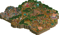
ImaginIt:
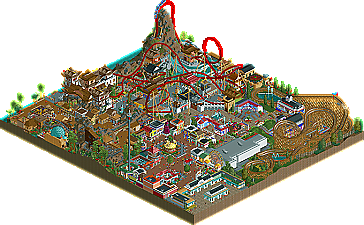
First of all, I don't really know what I'm imagining. Japan? America? A generic mainstreet? I don't need to imagine those. I can look them up on wikipedia. I just felt like the name didn't fit the park at all. Also, this is the second Canes park in a row to utilize generally similar concepts. But whatever, not a big deal. I thought Shogun was a pretty weak coaster minus the launch, top-hat, and first two inversions. The rest was pretty all over the place--something non-characteristic of an Intamin Accelerator. Also, why the switch to mini-coaster track before the brake run? I may be wrong, but I don't know any accelerators that do that. The Japan area, in essence, was incredible. I haven't felt atmosphere like that in a while. You might as well have themed the whole park that way. It was obviously the overbearing theme. I'm not even sure what the area next to it with the mine ride was supposed to be. It looked cool, but that was about it. The American area was pretty good. I'm almost positive I know who did this, as well as the GCI woody. Patriot was actually pretty great. It was so subtle compared to Shogun, but in my opinion, it blew it out of the water. The pacing was perfect, and the layout was perfect GCI, right down to the transfer building. Great job with that. The main-street, as someone else said, is old by now. I feel like I've seen the exact same thing in the dump place or in the ad district like ten times. It looks nice, but it just doesn't add much to the park. Overall, not a bad park at all. It's hard to describe my feelings towards it because I really just couldn't get into it much. I even feel like the parkmakers didn't have any real plan. It was like..."I'll make Japan. You can make America. You can make some random country. And we'll put a mainstreet area there too and come up with a generic name that attempts to encompass all these themes which do not fit together at all." Again. This wasn't bad. It just wasn't great either, in my opinion.
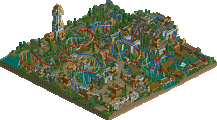
Pueblo Canyon Boardwalk:
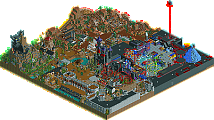
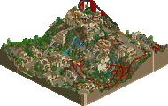
Woah. Just from the overview I knew this was gonna be cool. I was slightly let down, but it was still pretty damn fun to look at. As I said above, it takes balls to do something like this. I've seen so many people try the concept and fail miserably far too many times (myself included). You guys got it right though. From the landscape, to the foliage, to the ruins, to the broken dam, the environment was just so captivating. I really loved how there were debris all over the river bed, and how all the major rides on the boardwalk were supported by those big metal supports. It just looked really cool to me. The architecture was simple for the most part, but it got the job done. The portable coaster in the middle was supported perfectly, and looked great with the little games stalls underneath the transfer area. The water ride was well-incorporated into the cliff-side and interacted well with the surroundings. The best part of the park, though, was undoubtedly the woody. Talisman was just relentless. 180 foot drop? How often do you see that anymore. As someone above said, I love how the layout kept revisiting itself, wrapping around the same areas over and over, but during different parts of the ride. That drop off the midcourse looked insane, as well. Seriously--coaster of the competition so far I think. Best design I've seen in quite some time. Would have been nice to see a longer brake run and transfer track, though. The biggest let down for me was the canyon explorer ride. How fucking hard is it to make some tunnels haha. I'd imagine it would hurt to be continuously plowed into solid rock. It was a good concept for a ride; the execution was pretty awful though, to be honest. Very nice park though guys.
Anyway, glad to see this is a close matchup. That's more or less what I would have predicted. Good luck to both teams.
I really liked it and I enjoyed looking at it. A lot of credit to whoever had the idea for this. The concept is great but like many said before some things could have turned out better. The missing tunnels on the adventure ride definately were a let down. I liked the idea of the pueblos, too. Going through old ruins would definately be cool. The woodie was superb. Congrats for such a great layout and the interaction with the surroundings was great!! I didn't really like the water ride though...actually just like on the Hurricanes' park I thought it was too much squeezed into a small area. The landscaping was good from far away but from closer I disliked parts of it. It did give the whole park a feeling of a rocky terrain which is what you were obviously going for though. The bridge was nice as many others said but I didn't like that construction under the one mountain with the wooden coaster track for the adventure ride too much. What I also loved was the spiral coaster. The supports were very nice and all in all that just looked really cool. Another letdown for me was the architecture though. It just looked too plain in my eyes and a lot of it seemed to lack ideas for better structures. I didn't really notice a lot about the foliage. And yeah...that's all I can think of right now.
What I like about the Hurricanes' park is as other people said before the Japanese area and I also love the tropical area. I actually probably like that one better than Japan. I guess I said the rest in the team forums already and my vote would obviously after my posts from before have went to the Hurricanes.
Imaginit was generic, yes, but it had some nice touches. I liked the water ride with the white brick and I loved the history ride. Just neat ideas and pulled off well. Didn't care for either coaster that much, but I did like the Japanese architecture whether its been done before or not, its still nice.
Pros:
+Talisman - Easily the best wooden coaster of the competition so far, and possibly since Merlin came along signaling the rebirth of RRP. I believe the RCCA1995/GCI2005 label means that the ride was originally constructed by RCCA in 1995 but was re-profiled and fitted with new GCI trains in 2005... Not that the ride is a GCI creation.
+Shooting Star - The best attempt at transportable Schwarzy support work yet released, with a layout that's believable yet original.
+Landmarks - This park is absolutely full of them, and while a few will go in the "cons" category many stand as pros: Cactus rock, the crying face, the bridge, the dam, even the boardwalk itself; all visual markers that help to create a world rather than merely a park... Even smaller ones like the wrecked paddlewheeler would've seemed far more significant had they not been overshadowed (both literally and figuratively) by the others surrounding them.
Cons:
-Adventure ride - Pueblo Canyon Explorer had a couple major issues unto itself and even worse, highlighted many of the parks other weaknesses.
-Weak Landmakes- The once-submerged Pueblos are still rather bare, small and uninteresting. The ICBM, while a good idea, almost seemed like a space hog rather than a real placemarker, particurly in light of the others on the map.
---------------------------------------------------------
Imaginit:
Pros:
+Without a doubt the best Japanese architecture I've ever seen. It not only captures the atmosphere and essence of the style: it actually gets the forms right. The colors are a bit more over-the-top than the real thing: but fuck it, this is an amusement park!
+Fully Peepable - Always great to have the peeps around, yeah?
Cons:
-Coasters - Normally Shogun, Patriot and Genesis would've made a strong line up, but in light of Talisman there's really no comparison. Shooting Star is, while less conventional, a more interesting supporting ride that Patriot any day.
-Generic - Not really much to say here other than everything in the park has been done somewhere else before, and with the exception of the Japanese architecture, I would argue that it's been done far better before. While that argument could be run again Pueblo Canyon Boardwalk the thought process was clearly different. The majority of the architecture and even rides here seemed like pretty ways of filling space rather than creating a park or world. Again, this wouldn't appear to be a weakness had it not been placed again a park that at least aspires to be so much more; even if stumbling along the way.
----------------------------------
Pueblo gets my vote for being an enveloping, if very flawed world... Talisman really pushes past any "amusement park" competition as well.
It's a question of sparkle VS. content... Which should make for a close and interesting match.
Ride6
From the looks of the overviews it's going to be a close call. I'll post my decision later.
The idea of Pueblo Canyon Boardwalk was cool, but it could have been better executed. For example the ruins in the dry bed of the lake. Could have a lot more detailed.
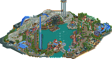
Hurricane´s park was a lot better I think. It had more atmosphere and one of the best coasterstations I ever saw. The theming around Shogun was awesome! The layouts were good, not the best but good.
All in all Hurricane´s park is the better one in my opinion.
Sorry for the short feedback, I don´t have time right now to write more! ^^
Imaginit has the best oriental I have ever seen by miles, though that's one of only a few merits imo. The landscaping was good, and the woodie gets the gci compact down pat. the intamin accelerator isn't that great, it's just not their style. tbh the second half is more like something premier would do if they made a non compact launch. Also, the diamond mine section is not very good at all and its space could be used to expand the meh american section.
If I could vote it would definitely be for pueblo.