Park / Glitter
-
 27-November 22
- Views 8,386
- Downloads 297
- Fans 1
- Comments 12
-

-
 66.88%(required: 65%)
 Design

RWE 75% Magnus 70% Milo 70% Scoop 70% CoasterCreator9 65% G Force 65% ottersalad 65% SSSammy 65% Terry Inferno 65% Xtreme97 65% 66.88% -
1 fan
 Fans of this park
-
 Full-Size Map
-
 Download Park
297
-
 Tags
Tags
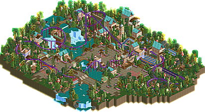
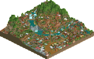
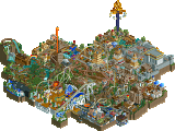
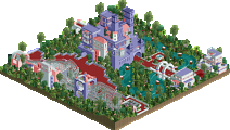
Great atmosphere here, the colors work well and make the park look like it's at sunset, and of course the roofs. Coaster layout has great interaction and fun things with the inversions, flying/lay-down was a great coaster choice with this theme.
This was really nice, the splash boat rooves work surprisingly well as a unique effect, very clever!
Really enjoyed the overall aesthetic. Pacing was a tad slow at times on the layout imo. Probably one of those quirks where peeps would've made the train faster? Enjoyed all the points of interaction with the path, waterfall, buildings, etc. Great as always from you sir.
Is it just me? It seems one of the mushrooms is missing. This probably is what it took to come up with the glitter rooves idea.
Great and dense atmosphere, especially for LL. As others mentioned, the rooves work surprisingly well. A lot of small details which I enjoyed a lot. The coaster felt a little slow in places.
Hope to see more fantasy LL from you.
This is quite charming. Your commitment to creating a stereotypical child's fairy tale world shines through to the point where it sparkles. The points about the layout are valid, though the only section where it truly feels too slow is the high curve between the waterfalls. A few choices seem a bit odd, such as the two roman walls in the ride entrance courtyard (sticking with banner signs would have been cleaner and more consistent) and the paths that taper off abruptly without going anywhere, but for the most part, it all comes together very nicely. Would it have still been Design-worthy with standard track roofs? Almost definitely, but the eponymous roofs create a memorable effect that successfully becomes the defining feature of the map.
I will say that this is the exact theme cheshire cats and swan boats were made for, so I hope you explore and expand this aesthetic on a larger scale one day--perhaps as an area of a full park--and include a variety of rides for our hypothetical whimsical nieces. A child's fantasy world with no rides for children is a bit of a (bald) head scratcher.
Thanks for the comments everyone! I agree with about everything that has been said, the good and the bad. This just got scored and I think it's a fitting score.
@Terry
I started with this corner with the intention of making it a park, but it was not picking up enough momentum. My plans were too ambitious, anyway. Some of the ideas might see the light of day in RCT2. Some of it is suitable for H2H!
I agree swans would've been a good addition. When this thing was still an area, I tried to add a dueling steeplechase ride with unicorn theme, but that's where it all grinded to a halt... I disagree that the map needs rides for children or that it's lacking in that department, though. It's a children's theme in an adult's theme park (in semi-realistic context). I like the juxtaposition. I could also do a cool B&M stand-up with a barbie theme.
Another design to add to the growing list! Good job as always Liam.
Mariah Carey is so happy right now. I love this submission, great job.
A very enjoyable exploration of the wonderland theme. Imagining new building styles and developing them into whole areas seems to be your strong suit. It's impressive that you're still squeezing innovation out of LL.
Lovely coaster. Lovely atmosphere. Lovely atmosphere. This release is not one of your biggest or best ever, but its still done quite well. It shows a lot of attention on small details and nice moments to view, especially really enjoyed how you used the river across the map. Would have been curious to see how a park with this as a corner would have looked. But i can see why it hasnt really worked.
All in all nice little submission. Good work!
Really enjoyed this, the layout was better than I expected upon first opening, and has multiple moments of great framing with its surroundings while still maintaining a lot of flow. This would be a ball to ride in real life, with the movement over the waterfall taking the cake. Which, I might add, is really creative, I've never seen someone put flyer track pieces together like that (curve into half cork). Sure we've seen the combo on B&M interlocking corks but I really appreciated that the intent is crystal clear (or glitter clear?) and just... works. Then the massive twisting fall off the hill/cliff back over the bottom of the waterfall area wraps the entire maneuver up nicely and even puts a bow on top.
I also really liked the whimsical feel happening throughout. It felt like a fantasy land, speaking in very broad generic terms, but I liked that about it. Feels somewhat other-worldly while still working as a themed area or something I could picture being real somewhere.
The bridges having consistent substructure with the wood coaster track works well too, I like when people use consistent building techniques like that in a park or area, small details that help tie it all together. Sure default path supports could've worked, but this is a simple but effective enhancement that just feels very natural.
+1 for open-air station, love those and this one is great.
Also +1 for all the major elements really "having a home," as opposed to just being in random foliage. What I mean is first curves over the elevated pathway, then next few elements over the waterfalls, curves through a tower and around some buildings and a little trench, heartline roll over the rainbow, on and on. The last helix around the little house is cute lol, I love it. Has a little enchanted forest feel.
The only thing I'm not sure about is the glitter roofs, which this is named after... Sorry I just see splashboat track, but that's a personal nitpick.
Anyway I loved it, and am kind of surprised the score isn't higher. 70%-75% to me, maybe even a little more.
again, dont have LL installed at the moment, but this is still a fun little design. I can tell you had the idea for the rooves and then were like fuck it, i'll just build a whole park based on that. its a little bit soft in the theme/direction department but good enough to be likeable anyway