Park / Parc Astérix Armorique
-
 14-October 22
- Views 5,589
- Downloads 504
- Fans 3
- Comments 13
-
-
 78.50%(required: 70%)
 Gold
Gold

chorkiel 85% In:Cities 85% posix 85% RWE 85% CoasterCreator9 80% wheres_walto 80% Camcorder22 75% G Force 75% Magnus 75% Scoop 75% CedarPoint6 70% ottersalad 70% 78.50% -
 Description
You have a phobia of mice? You like ducks, but only in magret? The only Minnie you know is Minnie Riperton?
If so, join the resistance and visit the Parc Astérix Armorique !
I took a big break this summer with rct2, i’m feel sorry for my H2H team but I felt really bored with the game. My summer job was a good opportunity to take a step back. I admit I don't go on the discord anymore and NE.
I came back home at the beginning of September with some ideas and an old desire that I’d never completed: to build an Asterix park. It was a project I wanted to do since a very long time.
I copied the originals for many rides and buildings, which finally resulted in a quick park to build. It was a very pleasant park to build, without pressure, with a theme that I love and know well.
This is also my last park for the year 2022, I have the feeling that I've done what I wanted to do on this game.
https://www.youtube.com/watch?v=-vgg8ReU8gA -
3 fans
 Fans of this park
-
 Full-Size Map
-
 Download Park
504
-
 Objects
1
-
 Tags
Tags
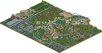
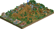
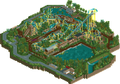
Parc Asterix is one of my favorite parks in real life, so this was pretty enjoyable to scroll through. There's some really nice elements that remind of the real park and ideas that I can definitely see were taken from the real thing. Sometimes these kind of projects are best done as 'inspirations' rather than 'recreations' and I think that was right here.
As always, the sculptures and facades are the real winners here. Just so much life on the pathway and detailed buildings to enjoy. Lots of fun details that I'm still discovering.
Unfortunately the coasters let this one down. There's some really simple thing that could elevate them with realistic parks like this.. stuff like proper brake runs, transfer tracks, and a focus on the flow of the ride layouts. Always happy to offer suggestions in the design process if you'd like!
Fix the coasters and this is another super high quality release with a seemingly unstoppable build speed. Keep it up!
Having visited Parc Asterix for the first time this summer, this release is wonderful to me. A lot of elements I recognize, and a lot of things where I can see you took creative liberties that are in line with fits the park. This is quite credible as a parallel dimension PA, or a second PA elsewhere in France. I spotted some Breton flags!
I want to review this park more thoroughly soon, but for now I want you to know I'm enjoying this a lot! And it's inspiring. I want to build as quickly and seemingly carelessly as you do. I enjoy the game, but I want to have fun like this.
This park is pretty cool. I really liked all the little sculptures and details you put in. However, I did think that the quality was a bit too inconsistent over the entire park. Some bits of it look like spotlight quality while other bits look like silver level quality to me. I really wish you could have carried the spotlight quality level throughout the whole park.
I think the strongest areas were the streets near the entrance area. The architecture was strong here and there were some great details here. All the sculptures also look great. The only downside was that in some places everything was packed together a bit too much which made it difficult to see some of the street level stuff from all angles. This is a problem which I felt persists a bit throughout the park. There are many areas that feel a bit cramped to me.
Another problem is that some of the areas feel a bit dead/lifeless to me. For example the olympic arena, while it looks cool it has basically no movement. This makes it look very static and a bit boring imo. Another example is the area near Par Odin, the ride buildings have such cool little details like the boat above the entrance of Par Odin or the Obelix statue but the path and area around it is just a lot of gray without much colour and details. You did add some of the obelix stones which are pretty cool, but those are also gray. Then you have the walls next to the water which are also gray and the little gray rocks next to the log flume etc. This makes the whole area look very gray.
The last thing that could have been better imo is the coaster layouts like CP6 already pointed out.
This review may sound a bit negative, but I do actually think this is a pretty good park. It certainly has a lot of potential, but there are just a couple of those tiny things that hold it back from really being something top tier. If you manage to fix those things I think you will really be able to elevate your game.
Absolutely beautiful park. I love to see an evolution in your style towards more macro, balancing out the already high-level micro. The themes were adorable and felt very sincere to the source material (which is irresistible). The overall atmosphere was warm and inviting, and meant a pleasure to view this park. Also your subtle but intense landscaping is quite special. You created some really good moments artistically too, especially with path colourisation.
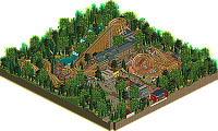
My only point of criticism may be that some of the coasters felt a bit under-engaged. For example the bobsled. I loved seeing it as a ride choice, and I'm not even sure if I've ever seen a custom supported bobsled like this before, but it would've been great to see it receive a bit more theming beyond the station building.
Lovely work. I really enjoyed this! It felt like a nice combination of ideas from the real park and a wonderful collection of novel ideas as well. Wonderful and recognizable sculptures and architecture.
I enjoyed exploring the cityscape outside the park as well! It's not overdone and doesn't overshadow the park which is always a plus, but it's there and it's good!
All in all, a wonderful park with great detail but also very well planned.
Your write-up reads like this is your last park, but I sincerely hope not, you really are a special player. I thought this had flashes of 95+ work but overall felt a little quiet and unpolished, which makes sense knowing how bored you felt during the process. I've been feeling similarly the past few months, but I'll be back and I hope to see you there
Like your previous parks, I love the micro-details and the great sculptures through, and the lively atmosphere through the park. And I like the macro planning, a nice balance of park, backstage areas and surroundings.
Babar I love you and this park.
Gorgeous map with super impressive set pieces. I can't comment on the coaster layouts, but they weren't really a detractor for me personally. I loved the thoughtful little details and storytelling moments throughout the map.
Great work friend
Wow Babar, your buildingspeed is insane man. I really enjoyed this park. The sculptures were amazing as always and I like the cozy seating areas you created throughout the park. I also like that you´re experimenting with bringing more surroundings into your park. Only nitpick I have is that the amfitheatre seems a little underdetailed on the outside. Keep up the good work.
I just want to drop in and say I really loved the release here, more-so than any other release this year from you.
It feels with every park you've created, you're honing your style to something very special. This is the most spread out park in terms of your ideas. It still has the greatness of Tropicool and Geekfest but you've given everything room to breathe.
Great score and a very memorable park you have here. Great work!
Babar, i feel sorry i havent reviewed yet. This definitely is my favorite project of yours yet and i personally would have went that far to maybe call it spotlight-worthy.
Seeing your fun and playful sculptures combined with semi-recreational parkmaking is an amazing twist that really works with the themes of parc asterix. The iconic village in the center definitely is my favorite part of the park. I also always have been a fan of oziris in reallife, some people might know i tried to recreate it for quite some time. I think you really nailed it here!
Architectually your entrance area really is top level stuff. Even now, weeks after this has been released, i keep coming back here to look for inspiration and ideas. I hope you wont mind seeing me steal some of your window techniques
I also really love the work you put into the surroundings. Im always loving stadiums in rct, so great to see 3/4 of one in here! Also your parking lots are really interesting, never thought i would ever say something like that in a review...
To conclude i guess polish your work a tad more and you will be in rct heaven. Your unique style is a gift for this site and your potential is endless. Keep it up!
It's quite an undertaking to recreate an existing park. Where I think you succeeding is showing the theming and atmosphere of the real thing. The architecture in the Lutece and Gaul areas is fantastic and fun to explore.
Where the park is a bit lacking is in the coaster re-creations. Some extra iteration may have resulted in layouts that both match the originals closer and look good scaled in RCT - a difficult balance. That said, I think Tonnerre 2 Zeus turned out pretty good.
It was a great choice to take on this park as it fits your style really well. Great work.
yo, this is excellent, i cant believe i hadn't seen this yet.
i grew up absolutely devouring asterix comics, and i even tried a parc asterix myself as a young rapipo around here in like...2008 maybe. yours is way better! there are tons of details to get stuck into, especially all the characters throughout. great references to the books and also the park IRL, although i have to say your layouts stink lol. the village may be my favorite part here, but that entrance building and courtyard is just phenomenal.