Park / Endswell
-
 24-September 22
- Views 8,731
- Downloads 465
- Fans 0
- Comments 20
-
 73.50%(required: 70%)
 Gold
Gold

RWE 85% saxman1089 80% chorkiel 75% In:Cities 75% ottersalad 75% Scoop 75% Terry Inferno 75% bigshootergill 70% Faas 70% posix 70% Xtreme97 70% G Force 65% 73.50% -
 Description
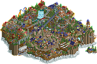
Where land and sky embrace, caressed by the breath of the southern winds. All's well.
-
 No fans of this park
-
 Full-Size Map
-
 Download Park
465
-
 Objects
1
-
 Tags
Tags
- You should only vote if you have viewed both parks in game.
- Take your time to reflect on each park. The poll stays open for three days, not three minutes.
- Everyone but players belonging to either team in the match may vote.
Protip for anyone viewing Endswell; OpenRCT2 will tell you there is a LL texture in the park. This is a land wall we used for macro planning and is not visible in the park. This will not affect the viewing experience whatsoever.
SB, your park is absolutely insane. This is gonna be a finale for the ages!
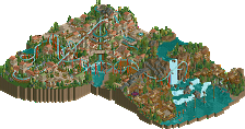
Vermintide - Always appreciate a map-dominating mega-woodie. Selectively replacing the track with hybrid track is a great little visual trick, making the track look like it's kinda been melted. The dwarf statue, the huge structures with some unconventional texture combos and not sweating the hyper-detailing too much is perfect PT2 era. Love to see a fantasy park leaning heavily on the fantasy element. I'm aware that Vermintide is a (series of?) game(s) but not too familiar with the particulars beyond that. I do like that it is a grungier contrast to Endswell's clean medieval fantasy atmosphere.
My one complaint is that the pacing of the coaster is a little strange - some early hills are brutally slow, and the final hills leading to the second chain lift are definitely too fast (and then it very nearly doesn't clear the final hill before the 2nd lift). It would have been nice to not need the second lift - I don't know if it is integral to the representation of the story, but the ride doesn't look like it's structured to tell a story in that way so the lift looks mostly just like a big setpiece. It is very cool though, no doubt about that.
I know this era is waaaay pre-cut-away, but having some glimpse in to the station interior would have been cool. Candle chandeliers, pack of rats, anything. Cogwheels on the main castle are dope. Rotted/infested area of the water is dope, was exactly the kind of thing I was picturing when drawing up concept sketches for Rot.
Endswell - This is so delightfully charming. The combo of fairy tale fantasy and clockwork aesthetic reminds of how J K did his fantasy areas around that time. There is maybe an over-reliance on detail objects from the perspective of being true to 2005, but it definitely wasn't unheard of. So while it does look like the more modern of the two parks, I think both are squarely in the spirit of the contest. Auster definitely looks under-supported.
It's so hard to choose between these parks, because I adore them both but for very different reasons. Endswell's atmosphere is so inviting, but Vermintide's is more unique and interesting. I think Auster is paced better. I'll need to think on it some more. Hell of a round.
Endswell feels like a happy place, and is a worthy opponent in this final matchup. Great work from the builders involved! Also, big shoutout to Mulpje for pulling through on Vermintide after some setbacks. Had a lot of fun building on this park and in this H2HC in general, thank you NE and admins for making this happen!
Thanks a bunch. As I said in the Discord, one of my first thoughts for Endswell was making it feel like a place you could call home so it really means a lot for you to say that.
Having J K on this park would have been incredible, and there was a point during some restructuring where Walto wanted him to jump in. He ultimately didn't because he wanted to focus on his solo, but there was a day where he tinkered with the park and showed us some fantastic ideas for detailing. The balloon docks on the roofs of the buildings near the cliff were his idea, as were the moving clouds which really reminded me of Mythos and Xcoaster's DisneyAir.
It woulda been a pleasure to jump on this park, Walt and myself thought it would be an easy transition, which it woulda been for sure. For me, Rec and Gus were going hard on this, they didn't need another body to complicate things and what they've produced was such a memorable, whimsical take on this theme.
There were a few times in the process, a few objects were suggested and both builders were dead-set on sticking to the 2005 aesthetic and wouldn't entertain anything that steered away from that vision. That was really commendable to me, and the results are obvious for everyone to see.
Just want to shout out to both builders for a really great partnership here. It was a pleasure to see them pushing this concept forward with drive, enthusiasm and overall good quality building. Another special shoutout to Gus, building twice in R6 and pulling weight on both parks, he was in the zone the last 3-4 weeks of the competition, quite amazing really.
More critical feedback coming on this matchup very soon. I don't want to create any bias, but you can expect some points from me, and who I think shoulda won, after the match is over.
Endswell:
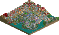
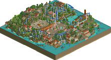
This is so peaceful, love the atmosphere. Love the ride choices too, dueling water slides and a chance toboggan are not what I'd immediately think of in a park like this and they work great. Architecture is great too, I like how even with all the 1/4 tile stuff and trims it sticks to objects from the era.
Vermintide:
This does a great job of making 60x60 look way bigger, with the huge elevation and the massive imposing sculpture, bridge and castle. The gem track pieces were a bold choice, overall I like the gemstone mining theme through the valley.
Overall, a great couple of parks to end the contest with.
This is a fantastic matchup to end with. Congrats to both teams on your parks! This was very close and a tough decision to make.
Endswell is indeed very comforting and feels nice to look at. The atmosphere is definitely there in spades. Very nice use of repeating textures and colors, lending a great deal of cohesion. I loved the dueling slides and overall cliff/mountain area. Using the 4D cars as kites is very cute and a nice idea too. I think my favorite part is the invert station and train turntable. The music is also a very nice touch and makes the scene feel much more serene. The main square is incredibly charming and vibrant, with lots of activity, and I'm always happy to see boats done in RCT2. The clouds are well done and I love the use of the balloon object. However, some parts felt a bit claustrophobic, namely the area behind/under the coaster; it felt like a few too many things were snuck in to fill it out. Also, the red and green architectural area under the 2nd half of the coaster seemed a bit forced and shoved in. While it did look nice, it doesn't really fit with the rest of the park in my opinion. Overall though, I really enjoyed looking through the park, and it's a fitting one for the last match of the contest. Kudos to Hawaii 0-5 for finishing strong.
Vermintide is somehow both a blast from the past and a glimpse into newer styles. You took a lot of risks with this park, but for me, all of them paid off. The enormity of the scale pays great homage to the classic style, but takes it to new heights (no pun intended). While there is clear influence from DKMP style, it doesn't feel overwhelmingly like that. Everything that could have possibly been blown up, was. The massive coaster is a huge highlight for me, as is the huge architecture and sculpture (seriously well done!). Even though some angles are obscured due to the height difference, it never feels overly cluttered or claustrophobic, as if the layout and sightlines were very carefully considered and planned out. The concept and theme are also a knockout for me, and executed very strongly. It felt deep and thorough, if that makes sense - almost as if it had been storyboarded. Using the hybrid coaster rails for crystallization on the coaster was genius, and the splashes of green throughout the map give it a much needed pop of color which I love. Also, Restroom 1 made me audibly laugh. I tried to come up with more drawbacks, but the only one I can think of is that the landscape goes so high, that I can't zoom in on the top of it. I can't knock that too much though since nothing is up there. Overall, very impressive, visually stunning, and thematically brilliant. It looks like this was a blast to build. Amazing work on this, Sundae's Best!
Sorry for not viewing the parks sooner and getting a vote in.
Endswell feels like a BSG / Recurious park. And I mean that in a nice way! Archy feels familiar, I'm guessing you also looked at Isole Calabria a lot for inspiration? lol
But super calm atmosphere with a lot of tropes we've seen over the years with NE. Blimp thingy's, grey castle mixed with brown buildings ala Gotheburg. Elevation changes were big, but well hidden by all the archy you have throughout. Lot of cool structures and things to see.
Vermintide feels like an old version of Gauntlegrym. Like, in an uncanny sort of way. I don't think it's worth causing a fuss over, because you've elevated a lot of what ITM and I did. The smelting area was pretty neat and I think conceptually a bit better. The gem/crystals here were built into the coaster track/supports, as opposed to objects. Massive underground arches and structures with a grand scale. I could continue with the comparisons. Thus, I would've voted for Endswell. Still a good park, but I find it weird to see a park that has a lot of similar things to something I built a year ago.
Appreciate the love. I almost exclusively used Isole and IoE for inspiration like a total basic bitch, but I also wanted it to feel like one of Turtle's later parks atmosphere-wise. There was a lot more I wanted to do with the flying stuff but I think what we have worked well enough. It is a bit bittersweet because on one hand I think Rec and I took a pretty tried-and-true idea and executed it super well, but I really did want Endswell to feel a lot more unique than that and I don't think I did as much as I could have to make that happen. Still super proud of what Rec, AJ, and I were able to do though!
Lovely matchup. Vermintide feels like a DKMP version of that grindlesomething park we faced in H2H. Nice structures and bold scaling as pointed out by others. I agree with Ling that the pacing of the coaster is a bit off. I also think some areas felt a bit rough and unpolished. But all in all a good park and a great ending of the contest for your team.
Endswell might be one of my favorite parks of the contest. So glad to see something from you guys, especially seeing Rec finishing something always makes me excited! Architecture is great and you nailed the whole overall atmosphere. My negative point on this are the clouds. I think they felt a bit weird to me and in some places werent really up to the quality of the rest of the park.I also think some areas felt a bit rushed. All in all good job everyone!
Aaayyyyyyyyyyyyyyyyyyyy





Vermintide: The moment I saw this map I already accepted defeat. Just absolute insanity through and through. I'm not super familiar with the Warhammer universe so a lot of the references are lost on me, but even then the attention to detail and worldbuilding throughout really shines through. The macro is imposing, albeit fairly typical for a Mulpje park. I was surprised to hear Nin had the original macro concept and it would've been cool to see him build on this as well. The main elements like the castle and the dwarf statue are very impressive, albeit they lean more DKMP than PT2-era. The use of vertical drop cars alongside the ferris wheels for the cogwheels is super impressive; I can imagine that was inspired by the wheel and chain in Gauntlegrym. Hell, all the working mechanisms in this park just blow me away. I wanted a lot of stuff like that for Endswell but it didn't come to pass for the most part. I'm also a big fan of the village; it feels so open and atmospheric, albeit a tad bit monotone. The coaster is a crazy centerpiece and actually justifies the use of newer track pieces by having them be made out of gems. So clever. That second lift hill is just insane with all the mechanisms; really reminds me of Gladsheim. The pacing could be improved though; it slows to a crawl over some hills. There's so many more details I can talk about but I'd end up growing a beard as long as that dwarf statue's!
The big con for me is when you rotate the map and come to face to face with a huge, blank land wall. It would have been cool to see some cutaways throughout, especially considering so much of the landscaping is done with land blocks already. Considering this park is based on a video game, some music from the game really would have taken this over the top. Even then, though, that's minor nitpicks for what I legitimately think is one of the best parks of the contest. Like this is seriously incredible and I'm shocked it lost. Speaking of which...
Endswell: Thanks for the Endswell love everyone, I'm beyond happy to see this one win. This was what I brought to Hawaii 0-Five day 1 of the contest and started a week before. My first vision for Endswell was a lot more quaint and less over the top; just a little village at the edge of a cliff. I wanted it to feel like something out of an old SNES RPG at first. However, as I started building and looking at reference imagery, my vision grew into a bustling port city with flying contraptions everywhere. I knew Endswell had to feel like a place you could be at home in with an absolutely untouchable atmosphere. In a sense, I wanted it to be the ultimate Turtle tribute, borrowing both the architectural style of Isole Calabria and the immersive atmospheres of Le Reve Parapluie and Corsair Veredian. I also noticed my idea was starting to look scarily similar to The Apprenticeship.
So yeah, ending up on the same team as Recurious was too crazy. By the first day of the contest, I had defined the shape of the cliff and laid down some crude buildings along with a shot at the invert that would eventually become Auster. At this point its name was Serp and it was a lot more integrated into the town than the final product.
This was my initial sketch for the park. While the individual ideas were cool, in hindsight it looks more like a collection of scattered ideas with not much linking them together. I really should have put more focus into trying to define a macro/path layout and and getting those coaster layouts down first thing. It almost seriously cost us.
I ended up taking a two-round break from Endswell on the second day of the contest to try and get a LL park out. Faas and Terry had started Culinarium and Undertaker respectively, and with a third on the table we could get more than four RCT2 parks out since we were a mostly RCT2-focused team. However, mine didn't exactly go smoothly, and once we confirmed we had Culinarium ready for round 2 I decided to shelve it and focus on Endswell once again.
The longer I was away from Endswell, the bigger my vision grew. I was contemplating architecture I had seen at resorts in the Rocky Mountains and really wanted to nail down the concept of a port of entry between land and sky. I pretty much stripped the entire plaza and coaster and started anew with bigger plans in mind. Starting on the floating island and the ships got me pumped up to plow through this sucker.
In the meantime, I had tipped Recurious off to Endswell since he was looking to chill and collaborate on a park, and sure enough he was down. He quickly came up with some macro ideas I was excited to pursue. The one that really stuck with me was having the landscaping follow a radial pattern with a combination train station and airship dock at the highest point. This also set up for some cool train bridges coming out the back of the map, and I added some big connecting towers to form a grand port of entry. The towers came from an idea Zarathustra had for the invert's zero-G roll which I absolutely loved. From there, I wanted the back of the map to open up with some windmills, the first vestige of Endswell's eventual wind motif.
Endswell eventually got its third builder when AJ reached out to me saying he was interested in collaborating. AJ ended up being pivotal to Endswell's macro, pitching several ideas on how to shape the map. The one that stuck for a good while featured the turntable that made it into the final release.
From then on, AJ and I went crazy on the map. I started focusing on architecture, which back then had nearly no color motif and just used whatever I felt looked good. AJ meanwhile plopped down a first draft for a dueling waterslide. I studied more and more reference imagery and my desire to make this map outrageously epic grew and grew.
Then Recurious hopped on the map and boom, I had a new precedent to follow.
Our new plan was smaller, more detailed architecture with a more unified color scheme of indigo with green and salmon accents. Viori Cove was hugely influential on finding a "palette" to follow. Almost immediately I started leveling up my archi, finding success in complex shapes made out of several rectangles instead of big blocky buildings. While much of my archi was redone, this survived and was moved to the back of the map.
Unfortunately with three builders involved and the least experienced one leading, things got rough. I couldn't figure out how to finish the invert, with AJ and Recurious trying like five million different layouts from launched inverts to B&M flyers. It got to the point where we tried doing the invert on an entirely new map because it was completely blocking our flow. I also became far too married to ideas I was initially tentative on and was resistant to making much change in the park's layout. I was trying my damndest to communicate what I wanted out of Endswell to AJ and Rec, but I was just spewing the same thing over and over again. It was getting to the point where I was pretty much freezing up whenever someone suggested an idea. I just had no idea what to do and wasn't even sure if we could finish in time.
Needless to say, change had to follow if we were going to get this thing done. Rec pretty much redid the entire part of the map which we hadn't built on, adding the huge cliff for the castle and waterfall and completely redoing the invert into the Auster we know and love today. Walto also suggested we change things up so Recurious lead, AJ be second in command, and I focus on micro. While I accepted this was the best course of action to finish on time, I really did want to be more involved in my own idea and kinda felt like I lost custody of Endswell just by being the worst possible leader.
Regardless, the torch was passed and Rec did a bang-up job getting the macro laid out. AJ hopped off Endswell for the rest of the contest to work on Thunder Rock with Zarathustra, only pitching in to redo his slides when we redid the landscaping. I hopped in AJ's shoes and started filling in the gaps, albeit trying to play a more secondary role to Recurious. I started building larger structures like the lighthouse and buildings in the castle, replaced those godawful entry towers with an open plaza, and started plopping windmills on roofs and near the back of the park. I also wanted a wooden coaster themed to a strandbeest in the back section, but it didn't work out so I reverted to my Chance Toboggan backup plan. It was originally away from the turntable but Recurious suggested to have it represent a drive belt and I eventually made it work.
As the map started to develop, I scouted out a key opportunity to divide Endswell into four color-themed areas; indigo for the main town, salmon for the castle, green for the shanty town, and red for the rural section. I felt this would really hammer in the 2005 style, as spotlights back then would have differently themed areas with a narrow color palette for each. While this could be said of many different parks, it's a lot more subtle nowadays.
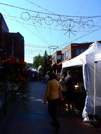
There was a weekend where I did most of the clouds and the Challenger in a hotel room! I was on vacation for a long weekend and had OpenRCT2 ready on my travel laptop during downtime. Coincidentally, Recurious was also away during that same weekend so I had to pick up the slack. I kid you not, on the drive up I saw mountains poking up from the clouds and then stopped in a town where there was an art fair and market stalls lined the street. It couldn't have been anything other than divine fate.
It's not an exaggeration to say the R6 deadline saved Endswell. While it was in an acceptable state by the old R5 deadline, it was definitely incomplete. With a week on the table though, finishing Endswell was doable!
However, the home stretch wasn't without its bumps. Some long-standing parts of the map just weren't coming easy. There were concerns about both the name and colors of the invert, and even today I'm still not confident in either. Worst of all, however, was the train station. I must have revised it half a million times in that hotel room and it only came together when Recurious took a whack at the overall shape and roof. Thankfully, when I picked it up from there the rest came easy, with some ideas like the elevator tower coming naturally.
Endswell truly was a Hawaii 0-Five park by the end, with everyone pitching ideas even if they weren't building. Walto suggested using balloons for the clouds and gave me invaluable advice on the train station (as well as telling me to shut up and build half the time), Faas tipped me off to his kites in A Year In Winkelheim and helped push the overall aesthetic (sorry about those flowers), and J K might as well have been the fourth builder with all the ideas and reference images he contributed.
Honestly, the rest of the process was kind of a blur. Kumba was hell bent on a festival theme we really wanted to push, but it ended up just looking like an ordinary day in Endswell. Regardless, we thought it looked awesome and then the rest just kinda came together. Rec pulled an absolutely bonkers grind the Saturday before the deadline, working up until about 2 or 3 AM his time while I made some last touches to Prism City. The Sunday after, I added some final touches like the hang glider in the rural section and sent Endswell off to the admins. Massive, massive load off my back, and I think the same can go for H05 as a whole.
It's weird looking back and I'm not exactly sure how to feel. I think Endswell turned out very similar to what I wanted, but it took so many bumps to get there and I don't think I did a good job as a leader. I'm proud of what I placed on the map, but considering I worked from a week before the contest to the final deadline with a more open schedule than the rest of H05, I really wish I got more on the map and took some of the weight off Rec's back. A lot of great ideas made the cut, but some which I feel could have made Endswell far more unique slipped through the cracks. Regardless, what matters is three things; we made an incredible park, I learned a ton along the way, and we got the win against another incredible park. With that in mind, I don't think I could have asked for anything more.
One more enormous shoutout to Recurious for being as incredible of a partner as my sick delusions led me to believe and pulling far more weight than I could imagine. Super super stoked we could get our first H2H wins together, even if it's the casual H2H. Big props to AJ for his amazing ideas as well. I'm sorry things didn't go as smoothly as they could've between us, but I'd still absolutely love to collab with you again. Let's do something reeeal wacky. And of course, props to Hawaii 0-Five for statistically being the sickest team ever. It was an honor for me to help secure that 11th hour victory for y'all, and even if we looked like the underdog team we had the story to match it. Last but not least, I want to thank the admins for hosting this contest. The simplified 2005 style is super fun to build in and some incredible parks came out of it.
I'll cap off this mountain of text with some bonus stuff.
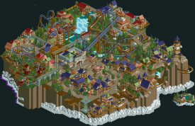
First attempt at clouds. There was going to be a big empty space filled with these things! Glad I cut it as soon as I did.
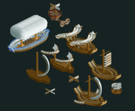
The fleet that didn't make it into the park. Some early attempts at boats made of base blocks, a recreation of the building challenge boat with the wings, an early attempt at the Challenger, my take on a Da Vinci sky screw (I'm still so mad I forgot to put this in), and a wacky flying contraption AJ made which I put a windmill helicopter blade on. It really do wish some of the more experimental wind-powered contraptions made the cut; I think it really would have made Endswell stand out from your average sky-high fantasy park.
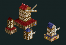
Some early attempts at windmills. We experimented with walls, 1/4 fences, and wild mouse track before Recurious struck gold with looping coaster track.
My first whack at the train station with airship docks on each side. Oh god, get it away!
Concept render for roof detailing J K did while looking at the park. He absolutely nailed the atmosphere!
And a few scattered ideas because why not.
- When AJ had the idea for all the factories, one though I had and wished I got away with was a big industrial building with windmills on top instead of smokestacks.
- I really wanted a mine train out the back of the train station before it was reworked into the invert station.
- My original idea for the Chance Toboggan would have been the most accurate in RCT2. I was going to use a retro-style monorail car edited with the Edit Ride Vehicles plugin to have very little acceleration.
Wrapping up with a dot map Recurious whipped up on his spare time.
Yes, the parks have a similar theme. Both grey. Both dwarf. So what? We based this purely on the Warhammer game and honestly didn't even open Gauntlegrym once while building this.
Accusations like this, in a contest like this, I think it is out of this world.
You are one of my favourite builders but this is quite a shock to read.
Gustav, thanks for taking the time to write all of that up, it's really interesting to get a glimpse behind the curtain of anyone's building process, and always really interesting in H2H as it's normally pretty tense.
This definitely felt like one of mine or artist's old parks, so if that was what you were going for, you guys nailed it I think. I would probably have made the invert a different color to the rooves (think you're right on this one) - maybe a bright yellow to stand out? Great coaster though. Overall, a really great park - interesting to look at, great atmosphere, serene, nice color palette and lots of movement to bring it to life. Love the turntable, things like that give the park a bit of an identity. The clouds around the edge didn't look great, but I really liked the clouds around the mountain - either way, I completely get what you were going for, so it's one of those things that I don't really mind how it looks because I get what's going on.
I liked Vermintide a lot too, what a grand spectacle. Big, imposing layout, a really non-conventional coaster that I wanted to follow around, and lots to look at. I didn't get the theme (never played Warhammer), and maybe that resulted in me not quite understanding what was going on a lot of the time. It ended up feeling a little like a big mass of grey with not quite enough form to differentiate between one bit and the next. Overall a really interesting theme that I would have liked to have seen done with a bit of a different approach maybe.
One thing that I find interesting (and maybe i'm speaking just to Gustav here) is reading about you becoming a little disheartened with the building process due to all the changes, and maybe having to cut corners/pivot on your original vision. In my experience (and others have way more experience than me with H2H, Liam, Kumba, would be interested to hear your thoughts), this is definitely part of H2H - the deadlines and expedited process means that unfortunately that's just par for the course. I don't think there's ever a H2H park that I was a part of that I was truly happy with when we submitted it - there's always more we had planned, or someone who was meant to build didn't do as much as i'd hoped, or I couldn't commit enough time to it and felt guilty...
Just know that this feeling is pretty normal, and don't let it get you down too much. That's just H2H - the parks are submitted, they're done, and you have to move on and work on the next thing, whether you're 100% with them or not. Hopefully the plus points of H2H - getting to work with other builders you may not have aligned with previously, elevating your work by emulating something someone else has done (Liam, Steve, RCTFAN come to mind for me as people who have elevated my work by building something way better than I had planned) and just generally being part of a team - hopefully these plusses outweigh any negativity you're feeling.
Thanks very much for all your hard work builders, appreciate it.
Thanks dude, feels pretty awesome getting validation from the man himself I nailed the Isole/IoE feel. The fluidity of a H2H park was something I definitely learned over the course of this contest. Nothing's ever going to be 100% to your vision and that's perfectly fine; so long as everyone involved can come to a consistent vision and expand on it which we absolutely did by the end. I just wasn't ready for it coming into the contest especially with three builders on board. Really it was less this and more feeling like I completely dropped the ball trying to deliver on my potential that got to me, even if in hindsight I was definitely better off as a support builder and played a big part in getting those last few wins to take it home. Even then, H2H Classic was a great experience even with its ups and downs and I couldn't have asked for a better team than Hawaii 0-Five. I definitely left with some new skills under my belt and know what to improve on from here. It's a blessing I got to learn all this through the casual H2H instead of the real deal.
Vermintide:
To start of I really enjoyed the coaster. It's huge while still having a pretty cool and flowy layout. It takes balls to make something this grand and I appreciate it.
I didn't really enjoy the huge sculpture, especially since it doesn't seem to serve any purpose instead of being there. Also the huge amount of land height made it impossible to check out the top of the park, and made the park basically invisible from half of the views.
Great effort nonetheless!
Endswell::
I loved the slides and also the effort that went into making sure all colours matched. There were some areas that seemed of a lesser quality than others, especially in terms of architecture, but overall this was a very pleasant viewing experience.
Endswell
Very pleasant and quaint atmosphere. The architecture feels like it's out of some Japanese RPG. I found the dueling slides to be the most interesting ride. Wish they had a bigger role in fact. I don't think the moving clouds read too well. The land-in-the-clouds setting could have been driven home better if there we more individual islands. What was a great for the setting was all of the air traffic. Balloons, hang-glider, kite - all cool. And not too much to be distracting.
Vermintide
Dramatic impression right upon opening. The dwarf statue catches the eye immediately. I like how imposing it is and feel it doesn't need any other purpose. The arms and hands are a bit blocky compared to the flowing beard. I have no knowledge of the source material, but some favorite bits of mine are the swampy zone, the coaster peek-a-boo behind the swinging ship, and all of the mechanisms. I don't really share the gripes with the coaster's irregular pacing - it actually makes me think of The Beast in that regard.
I fully agree. H2H involves a lot of compromise and I have had to scrap or change a lot of work in almost every season. All part of working with a team to come up with a great park, which happens often. True too that it's rare you'll be 100% happy with an H2H park mostly because of the deadline.
I really enjoyed both of these parks and was happy for Gustav and Rec (and I guess the admins for having this go last) to pull this off as a fitting final park in this contest.
Funny you mention the JRPG thing because that's actually what I first envisioned this park feeling like! More floating islands would have been cool but I feel like having less meant more mainland and more content as a result.
Winner: