Park / Front Range Coal Field
-
 21-September 22
- Views 6,716
- Downloads 308
- Fans 0
- Comments 18
-
 65.00%(required: 60%)
 Silver

CoasterCreator9 75% In:Cities 70% ottersalad 70% posix 70% Terry Inferno 65% Xtreme97 65% chorkiel 60% G Force 60% Magnus 60% RWE 60% 65.00% -
 No fans of this park
-
 Full-Size Map
-
 Download Park
308
-
 Tags
Tags
Scoop (20%)
bigshootergill (5%)
Gustav Goblin (20%)
Kumba (20%)
Voting Rules
- You should only vote if you have viewed both parks in game.
- Take your time to reflect on each park. The poll stays open for three days, not three minutes.
- Everyone but players belonging to either team in the match may vote.
dang a triple! C'mon Hawaii 0-5!!
FrontRange-
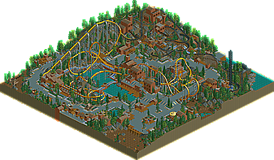
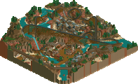
This is really sick, i always love mining and industrial themes in rct, it works super well! This is no exception, this is cut clean and simple and really effective. Solid layout, i love the really fast swooping section through the ditch and tunnel, always a sick thing to do. The mine train is alright, would've loved more breathing room but whatever! map sizes lol. Looks fun none the less!!
GoldenGarden-
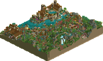
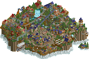
Woo! More lurker is always great! This is fun, really feels like the anthesis of your other park! Inverted hairpin is a fun choice. Love how it hugs the terrain. The dark pink center piece is a cool touch, that color is the perfect choice for there!
Prism CIty-
SLAY
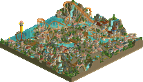
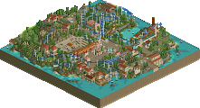
The impressive hacks in Prism City and the consistent rainbow motif caused it to win my vote. I would put Front Range Coal Mine in 2nd due to it pulling off a more RCT2-esque park layout in LL with 2 nice layouts and some cool-looking mine infrastructure. Golden Gardens was very pleasant but its size and amount of content compared to the other 2 parks put it in 3rd place for me.
Great to see three more parks, thanks to everyone involved. I really liked them.
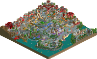
Prism city gets my vote here, it's a busy map but everything is set in it's place really nicely and it works well. Love the rides, and you've done well to get a pretty abstract theme and make it feel like a real setting.
I really liked Front Range as well, very serene and calm setting and a really beautiful map. But overall it felt a little lifeless when up against Prism City.
Golden Gardens
A supremely charming park with excellent landscaping, foliage, and ride interaction. Peepability in LL is certainly something special, and honestly contributes a lot to the overall atmosphere. A valiant effort, but may struggle a little against the other two parks due to the relatively smaller amount of content present.
Front Range Coal Field
Lovely work. Love the layouts, love the atmosphere. The mine structures are really nice, and the overall composition of the park is quite nice. It's really very appealing from any viewing angle and I appreciate that a lot. It's a little more subdued than the other two parks, but I personally don't mind that. Excellent example of classic parkmaking.
Prism City
I enjoyed this a lot more than I initially expected to! I appreciate the use of greenery and color here, and there are some nice subtle hacks interspersed throughout the park. The containers were a nice highlight in the port. Coaster layout is good, though I wish those rapids were not so hidden.
Golden Gardens is an absolute delight. Never change Lurker!
Hard vote between Sundae and Hawaii for me, but since former is so much my alley I went with that. Always tricky when you use the wooden wall texture a lot since it's not window friendly. The tunnel solution doesn't really do it for me, but nevertheless the park has some amazing macro and is overall quite elegant. The stuff we don't get enough of.
Hawaii was both technically and stylistically interesting. You're carving a modern day LL meta out for yourself Terry and it's exciting to see. The last person who had a strong vision in LL was pierrot, so I think you should definitely be proud. The composition here was troubled and didn't come together for me. I think you want to work on park layouting and stylistic cleanliness, as currently I think it's too mixed. I guess however that's exactly your thing.
Lurker, your park was sweet and endearing, but ultimately a bit boring to be frank. Didn't think it stood a chance against the other too.
Front Range Coal Field - Good classic old school design entry. I actually think Anthracite is the more interesting of the two though - the decorative structures and the way it's nestled back between them and also in to the hillside looks great.
Prism City - That scrolling sign is so dope. Love the clean city aesthetic in LL, all the cool tones and the nice bright foliage. Vaporwave-ish but not in an ironic way. This is definitely one of the more innovative LL parks we've seen. Ultralight's layout is dope. If I hadn't seen the comments here I'm not sure I would have noticed the river rapids.
Golden Gardens - Hard for a park like this to stand up in a contest with much larger maps, but I appreciate the cuteness. Foliage is a bit scattered. This would work great as a low intensity area in a broader high fantasy or medieval park. Almost Shire-ish?
I think everyone has something to be proud of here.
Sundae's Yest(erday) has a very strong inverted layout and a solid supporting coaster layout.
Lurker completed another solo that has a fantastic Hairpin layout.
O'ahu Crew made a sick multi-layered rainbow town with a great Floorless layout.
I like layouts. That is all.
Front Range Coal Field:
Nice choice of coaster color and appropriate name. Really pleasant macro. I found the buildings to be lacking in detail even for LL. There are some good ideas like the conveyer belts and the single rail pullies. I agree with Ling, Anthracite Adventure is even more enjoyable than Canary,
Prism City:
Love this take on an urban theme. The trains of Ultralight Beam look awesome. The "refracted light" around the lighthouse looks great. The spiral stairs are less convincing. The park becomes harder to read as the red end of the spectrum is approached.
Golden Gardens:
Love that this is peepable. The hairpin layout is really nice. The path in the back is conspicuously without rides or buildings. Seems like you ran out of time.
Three very nice LL parks here.
Golden Gardens feels very retro in the best way. The atmosphere is charming and very lively. I especially love the area by the junior coaster and maze. While I really like what is here, it felt slightly lacking in a way. Maybe a couple more larger rides to finish out one of the edges of the map. All in all though this is a very strong entry and holds its own against the other two. Also holy hell Lurker, you are a machine! I can't wait to see your inevitable full size LL solo.
Prism City is impressive and eye-catching. Lots of flashy things to look at here. It kinda feels like a retro Sonic map if that makes sense. The theme is cohesive across the map except a few spots that felt out of place (personally the lighthouse and dock/crane areas felt a bit forced to me). Although the more I looked at it, the more I found gripes with it, it's definitely an impressive feat in LL.
Front Range Coal Field is the winner for me. Very clean throughout, and just some classic LL vibes. The invert is imposing without taking up too much space, letting the surrounding areas breathe. Even though this map has less going on in terms of movement than the other two, it doesn't fail to capture my attention. The mine train is stellar as well. The use of texture is tasteful across the board, and makes for a very satisfying viewing experience. It makes me wish there was a full size park of this.
Three fantastic entries that each team should be proud of. Glad we could end the contest with a strong LL showing.
Prism City:
Wowee. This is fantastic. The lighthouse was highlight for me, along with the scrolling entrance sign. The variety of structures and buildings in the city made the overall park very unique and fun to comb through. This would go well against many H2H parks which says a lot about how good this park is, but also how not laid back and casual this contest ended up being. Coaster layout was nice, but 3 loops was a bit excessive.
Golden Gardens:
Scenario vibes, simple, yet enjoyable. Just not a lot of content in comparison to the other two parks.
Coal Field:
Canary is a great layout. Love how bright it is in contrast to the muted tones of the rest of the park. I'm definitely a fan of the stupid long queue! Anthracite Adventure was cool too, love the double lift, rarely see that, but had some pacing issues near the end of the first half. The RC trucks was a cool idea. To echo CC9, very subdued park, but hits all the right notes.
Poll is closed so I'm assuming I can review now.
Front Range Coal Field: Funny to see this name pop up as I'm actually from the Front Range! Not sure if this park refers to the Front Range in Colorado but still. This is a nice little realism map with a cool underlying theme. Canary is a wonderful layout, but I do wish the diagonal brake run was functional as the second half of the layout is taken way too fast. Conversely, Anthracite Adventure feels a bit sluggish in areas, but I would also call it the highlight of the park. It's a great supporting coaster with even better theming around it. The RC trucks are also a really neat idea. Honestly though, I feel like this park is missing some movement and atmosphere that would take it over the top. If the whole park was like the Anthracite Adventure area with some more immersive theming and even some moving minecarts I think it would have really stood out. Considering Liam led Black Sea Deluge for R5 though, this must have been a fast build and I respect the effort to get a quality park out that quickly. Well done!
Oh and The Shaft. Ha. Ha ha ha.
Golden Gardens: Was not expecting even more classic Lurker but I can't say I'm not here for it. Just like the core theme of the park, this is a golden example of your style shining through. It's a very homely little park with some simple yet effective archi and adorable coaster layouts. The jagged landscaping gives it a real sense of depth and magnitude and works super well for LL. Unfortunately, I'm not sure if it's the more open back half or the map size itself but this park feels a lot smaller than the rest. What's there is very very nice, but it just doesn't feel like a lot. Regardless, I still love this park to bits. Lurker, you've been a joy this contest. A 245% builder share and a W behind it is a damn good showing for your first H2H.
Prism City: Little reflection on my experience with this park. Terry and Kumba are free to sum it up on their own if they'd like. This was by far the most fun build for me in this contest. There was always something going on with the other parks I worked on outside of my Culinarium guest spot, but this was just a smooth, speedy process from start to finish.
Believe it or not, this whole city rose from the ground in not even a month! Around the R4 deadline, Walto tipped me off to Terry brainstorming another LL park after he finished Undertaker. I asked him about it and he said he wanted to do something City of Dreams-esque. I already had a LL park in the works we could have easily finished, but it was far below the level of quality seen in the rest of the contest and I thought it would be better to start anew.
Smitten by this idea, I threw together some test archi which got a good response from the rest of the team. We hadn't come up with the rainbow/prism thing yet, so I was going for a City of Dreams look with the castle walls and aqua windows. Miami 2040 was also a huge influence on the overall style of this park.
Terry was still finishing up Undertaker at this time, so while Recurious was building on Endswell I threw together a quick B&M floorless layout (with some early differences, shoutout to Zarathustra for the suggestions to improve it), defined a map shape, plopped down some buildings, and threw down a rough path layout. I also had an Arrow shuttle loop as a supporting ride early on, but I scrapped it almost immediately. This was the first time the whole contest I forced myself to do the layout before anything else, and it was working far better than I could have imagined. Once all was said and done, I was really feeling it!
Everything changed the next day when the sixth round was announced with an extended deadline. Our big ambitious concept was far more doable with an extra week on the table. Around this time, I started tinkering with the Prism City name, which was a throwaway name for a MMO game my little brother came up with for a story. It was a working name at first, but the more I sat on it the more I thought of having abstract prisms and refracting light play a major part in the park. Everything finally clicked when I came up with the lighthouse that refracted light across the city. Not only did this set the tone for the park's overall theme, but thinking of ways to pull it off also led me to conceptualize the scrolling sign at the entrance.
On the topic of the scrolling sign, it was originally going to be way more ambitious than it turned out and there were going to be more of them. My initial attempt was an 18-car train, but LL wouldn't let me paint trains with more than 12 cars so it hit the backburner. Later in, we attempted to hack a second train onto the first track, but I would need to do this to four ghost trains stacked on top of each other and it would've just been a nightmare. I ended up using two nine-car trains instead to save time and stress, which did the job but not nearly as well. With that said, I am glad to see the reception it got.
Early attempts at neon lights using coaster trains, as well as my first whack at a Luna Park-style billboard. My initial thought was mimicking the UFO lights in The Architects. Shoutout to Terry for suggesting I use ghost train vehicles to remove the necessity for a chain lift. Yes, somehow that never came to me.
At this point, Terry had hopped on the map and was making his presence known. Our schedules worked perfectly together, as he was mostly active during the night when I was working on Endswell. The archi went up lightning fast, and he had already gotten the freeway and chairlift in place as well. He also added an island which he wasn't exactly sure what to do with but I saw as an absolute goldmine for an entrance. Meanwhile, I was adding abstract station windows and walkways to liven Terry's buildings up. We were doing teal, white, and gold for windows at this time, but I decided to nudge a rainbow motif to match the Prism City name. Terry then came up with having the entire overview resemble a rainbow which I thought was too good to pass up.
A huge revelation that would end up defining the park was finding a trick Fatha did for windows in Busch Gardens San Simeon; dropping an abstract cube into a chairlift tunnel. I put them to work in the entrance and they were a smash. Unfortunately this entrance didn't make it into the final release, but these cubes ended up all over Prism City. Terry took it a step further by using other kinds of abstract scenery as windows.
We eventually got to a point where we had a workflow going and Terry started delegating tasks to me, the biggest of which was the port. While it was a bit of a pain to plan, everything fell into place when I started placing the cranes and filling the gaps with buildings and shipping containers. I originally did the shipping containers using river rapids and go-kart track. There was also going to be an industrial pier/boardwalk, but we just couldn't find a good spot for it and decided to let the open ocean speak for itself. The port wasn't nearly as detailed as it ended up being in the final release, and it would have stayed that way had we not begged and pleaded for a third builder enough.
A big change came about a week before the R6 deadline. I was on vacation with only ORCT2 on hand, so I'd be AWOL from Prism City for about four days. Around this time, we had managed to convince Kumba to shake off the LL rust for the first time since Musket and H2H8/8. Kumba ended up taking Prism City to a whole new level of detail, completely overhauling my lighthouse, entrance, and port. It was amazing seeing him work his magic and I really think his contributions made Prism City a real winner. I was much more focused on Endswell during the last week of the contest so I wasn't very involved with Prism City's development, but I did return during the last few days to add some more details and get the neon signs ready.
Overall, super fun build. Took me long enough to actually treat this contest as a for-fun deal. Huge props to Terry for kickstarting this idea and carrying most of the weight. Best new LL player since alex IMO and absolutely H05's MVP. Equally huge shoutout to Kumba for willing to step up as the third builder and push this one over the top. Pretty surreal collabing with two of my earliest influences and all in all I'm super proud of what we did. Loopy Landscapes has been an absolute joy to build in, far more so than I was expecting. I definitely want to do more with LL, especially to try and strengthen my macro and layout skills.
Since the match is over I'll put my thoughts down.
Front Range Coal Field:
Nice ride layouts, interaction and the overall macro planning. I like how the theme is done here and the park definitely feels very classic. Also those RC trucks are a neat touch, loved that.
Prism City:
Love the theme here, and how it's done trough the bright, shining cityscape. So much action, content and detail packed in while still feeling classic, this park is one of my favorites from this contest.
Golden Gardens:
This park was actually made earlier in the contest, and was mostly just meant to be a "Spare" park to meet the LL minimum if it was needed and for me to gain some LL experience. When it started looking like I'd need to build a solo for the last round I made the mistake of trying to build an RCT2 park which came out very poorly, and I ended up having to hurry and polish this up as much as I could and submit it.
Looking back I should've just stayed with LL and built a 60x60, even if it was just a bigger version of this park.
Cool writeup Gustav. I loved the park. I am curious though why you didn't use any of the coloured land edges besides pink-red. Like surely the yellow/green/lilac edges would've been perfect here?
Terry had them in the park at one point, but I felt it would look a little better with more neutral colored buildings and colored accents in the glass and awnings. Looking back, sprinkling them throughout their respective sections in small doses could have definitely livened up the archi a bit, but I do remember not being a fan when they were more prevalent in the park.
Winner:
Sundae's Best
Hawaii 0-Five
Barnacle Heads
damn, dont have LL installed on this computer yet, so will have to go just by the overviews, sorry. this round hilariously has like 3 very classic LL parks that are also wildly different from each other, which is always fun.
front rang: i love this. just smooth, flowing, uncomplicated LL, with some lovely layouts and simple texturing. easy to love. very warm
gardens: moving back to the beauty of simple rct parkmaking, scenario kinda single tiles and shit. I really love this. honestly have no clue who I would have voted for in this match
prism city: wild, unapologetically textural and colorful. I don't usually like 'colors' as themes but its fun/funny to do it intentionally in this context. this is actually a pretty impressive LL park by modern standards, even