Park / Thunder Rock
-
 19-September 22
- Views 6,281
- Downloads 315
- Fans 0
- Comments 36
-
 63.50%(required: 60%)
 Silver

In:Cities 75% RWE 75% bigshootergill 65% Faas 65% saxman1089 65% Terry Inferno 65% Xtreme97 65% chorkiel 60% G Force 60% ottersalad 60% Scoop 55% posix 50% 63.50% -
 No fans of this park
-
 Full-Size Map
-
 Download Park
315
-
 Objects
1
-
 Tags
Tags
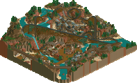
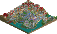
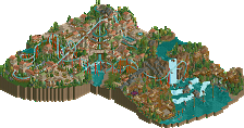
Retracing our collective footsteps
Round 6 | Match 1
Crooked House 1
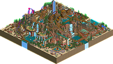
Thunder Rock
Levis (80%)
MorganFan (10%)
Microwave (10%)
Zarathustra (60%)
AJ- (35%)
wheres_walto (5%)
Voting Rules
- You should only vote if you have viewed both parks in game.
- Take your time to reflect on each park. The poll stays open for three days, not three minutes.
- Everyone but players belonging to either team in the match may vote.
Two very fun parks to explore.
Crooked House 1:
I don't think I have seen a park this size with this many operating rides. It's filled to the brim! I honestly dont know where to start, so I will go area by area:
-Entrance is cool, love how you tried to replicate the crooked house and put some actual crooked houses on top.
-Mount madness has some very neat tricks in it, like the lift-path and the observation tower cabins used as turntables. Coaster feels very random, and I am not sure if I like the lifthill on the map's edge.
-Moving along, I like how the shallow roof theme is continued into the Favela area. My favourite bit of architecture on the entire map. I really like the look of these colourful houses and all the details to be found on the balconies. Underground rave is fun and has good placement but the random ship and people walking on the slides don't do it for me.
-The abstract area is my least favourite area in the park. I dig all the hacks on MirrorMaze and the spiral slides as supports, but the area feels messy and it's a shame the trains lose each other after that intertwined cobra roll.
-Next up: Monkeying around. Best coaster on the map for me. I like the colours and the supports too. This area of the park looks like a lot of fun. Wish the track didnt glitch in so many places.
-Very fun multi-story bouncy castle/motorrace thing in the corner. I actually really like how the horrible land textures match the bouncy castle on the side. The jumping peeps are a lot of fun and together with those motorcycles up top it makes for one of the most entertaining areas in the park.
-I like the castle and all the bridges leading up to it. Nice centrepiece of this park and lots of little details to look at there.
Thunder Rock:
Great to see a park inspired by a scenario, and definitely recognisable upon opening your map:
-A lot of coaster, and I love it. I like how they all kind of follow the terrain, some more than others but it feels like the appropiate thing to do when building Thunder Rock. I can remember getting the 'too high for supports' notification a few times too many back when I played this in the early 2000s, so definitely a good call to don't build too high off the surface level.
-In addition, they all interact with at least one or two other rides/ coasters. Big plus there. There isnt a single one thats on its own tucked away somewhere in a corner.
-The virginia reel is my favourite of the bunch. After the classic beginning, that steep dive underneath the path before waving around the caves really appeals.
-I like the supports and colour scheme on BatCave, but I would have loved to see peeps on there. Why not do the effort of hacking those stats?
-Mine train is cool, especially the aligning drops and the helix around the pagoda.
-Lil spelunker is pretty great. I love how it pops in and our of cover on top of the mountain. The station is well-designed as well.
-Architecture individually looks really good, but there's a lot of different stuff on the map. I think sticking to for example mine theme only would have helped this map.
-Same could be said for foliage and landscape. There is this big rock formation, but there is also forest, desert, flowers, sand, it's a mish-mash of too many things for my taste.
I think both parks feel classic. Thunder Rock definitely had the better coasters, while Crooked House 1 had more content. Thunder rock felt easier to take in, while Crooked house 1 felt more fun to take in. I am going to think about my vote for a little while, because I am really not sure.
EDIT: Ultimately voted for TR, as it wasn't as chaotic and crammy, felt easier to take in and had the better line-up. Still very much liked the chaos in CH though.
I am not a massive fan of either park, compared to some we've seen in this contest, but they're definitely interesting to look around and explore. Very full, tons of rides, pretty confusing in places, but some really nice parts. The shoestring coasters with the vertical station was a really interesting concept, executed pretty well (although I couldn't really see what was going on, would have loved to see this themed differently around the station to show it off more).
Ultimately I voted for Thunder Rock, as I just liked the theme a little better and the execution felt a bit cleaner to me.
Levis's Wacky Tacky Hack Jack-Off: I'm gonna have a brain bleed. What even is this park? This whole thing is just overload; wildly different themes, music everywhere, and the most insane hacking of the contest by far; Levis in his element. What I really appreciate about this park is that like his earlier efforts in Riff Valley, this touches on a style of 2005 many sacrificed in favor of the more safe Turtle/Artist worship. Mirror Maze reminded me a lot of classic adventure rides like Unfriendly Invador From Outer Space which there was a disappointing lack of this contest. (We bounced the idea around too but nothing came out of it.) My favorite area has to be the jungle/mountain though; Mt. Madnezz is bonkers and the landscaping and scenery around it does it justice. That moving bridge is so sick. I'm still wrapping my head around it yet but this is a super ambitious effort and I really respect that.
Camping Trip On Acid: Happy AJ and Zara got to build together for this contest. There was a point where AJ was bouncing between a bunch of awesome ideas without finishing them and Zara straight up wasn't building and I would've hated to see neither of them have something for the contest. They're a tried and true pair and Walto dropping acid halfway through gave it a unique look. Also look at the stalls and the staff and stuff they're funny
Fun fact: With this match, Demigoddesses and Hawaii 0-5 have now had every player involved in at least one park. Hope we can see the other remaining players get some time to shine.
I will look at the other park later. Just wanted to say that to experience our park best you do need LL textures (as shown in the screenshot).
I liked the hacks in Crooked House, but it was far too messy and busy for my taste. I found Thunder Rock to have just the right amount of stuff packed into it without being cluttered, and overall it felt much more cleanly executed, while still maintaining the pt2 style.
I find it funny you say that. I was really going for the H2H4 style with parks which where crammed to the brink with stuff like:
https://www.nedesign.../internet-city/
https://www.nedesign...ys-shadowlands/
https://www.nedesign...allowhusk-cove/
Maybe I read it wrong but I think the park for sure feels like from that era.
I'm just glad to see you back Levis. Amazing that we've seen two releases from you after coming back so soon!
Two cool parks with nice concepts and a lot to look at. Congrats to both teams for some great releases at the end of the contest!
Not saying your park was outside the realm of pt2, I just prefer the style of the other park that still maintained the pt2 style with a cleaner composition. It's just what I prefer.
dang! my park!
Crooked House 1 is a really cool park, both maps are pretty similar is cool ways, i love all the density and craziness. plus another really classic idea. the crooked house opening looks so good. my two fav sections are the favela section with the slides. Id love to see more of this style! The next fav section for me was the werid dueling abstract twisters!!! I dont love that coaster but the idea and aestheics are so cool !!!!
thunder rok slays
I thought this was a chill contest, and now every park needs named staff, hidden messages, welcome messages, Easter eggs, etc. I only ever look to see if I’m a named staff and that’s all I need
congrats on two great parks. Super proud of how ours came together in the end. I'm sure Levis will speak more - but this one started off as Microwave's concept.
Always stoked to see anything from the beautiful zara and AJ boys. This park is right up my alley.
Excellent work all around!
Crooked House 1:
Awesome idea of expanding a crooked house into a full map of various themes. Great hacks throughout, loved the claw grabber machine especially, must have taken a while to perfect. The mirror maze area felt like quite a throwback to a really cool style imo, even if it comes across as a bit messy. The invert area is nice, but a little under par compared to the rest, though I think the coaster is the best on the map with its lift structure and nice colour combo. Castle centerpiece is interesting and separates the themes visually quite well, great use of elevation too. The bouncy castle thing is nice, quite a memorable idea and execution with the red/yellow pattern and use of LL land textures for that. Favela area is nicely made, but some things like the slides for steps in this area felt a bit too random for random-ness's sake if that makes sense.
Thunder Rock:
Cool to see another "reimagined" scenario take. Great use of the landscape for all the various coasters, especially the mine train and the Bat Cave which I enjoyed. You squeezed a lot of layouts in there. Chinese portion of the rock was super sweet, if a bit out of place theme-wise. Not a huge fan of the swathes of green path, and I think the lower portions in general felt a bit too flat. Cliffhanger ride is great, nice use of the invisible platform option for that idea. The set piece in front of the waterfalls with the duelling coasters wrapping the mazes is also really cool, through to me the big tower coasters feels a bit unnatural with the bright colour scheme compared to some of the more natural surroundings.
Super difficult vote for me, both parks brought something unique and quite wholesome. Went with Crooked House in the end as I kept digging in finding more stuff and little easter eggs.
Crooked House 1:
I love this park. Bold colors, wild themes and tons of amazing hacks and easter eggs make this so much fun to explore. I especially love the Mirror Maze area, the bright shining object and land choices and the mind-melting shoestrung coaster come together so well.
Thunder Rock:
Love seeing a good scenario-inspired park. Ride design stands out to me, the interaction with the terrain and other rides, along with the high amount of them, is both fun and gives it some more of that classic scenario park feel.
Crooked House 1:
This one can't really be taken in from afar. The whole map is full of area with clever ideas that require closer observation. Mirror Maze is really cool hack. A surreal ride experience. I liked the entrance building and the simplicity of the dragon idea. This is the more chaotic of two quite chaotic maps.
Thunder Rock:
Fun take on the scenario. Plenty of good ideas on how to use the landscape to your advantage. I especially like the scramblers. The mine train is my favorite coaster in the map. Many cool moments right from the trick-track start. I would have prepared a more singular theme. I know it's a "classic look" contest, but it doesn't have to be a 4 corners park. At least the Asian theme resulted in the 10/10 Thunder Wok restaurant name.
Winner:
Crooked House 1 - Man Mirror Maze is wild. Crazy to watch. Although the area lacks a clarity of the theme I think, it is the most visually striking in the park. The other areas feel sort of... random? There is some overarching unifying idea that is either missing or is going over my head. Madnezz is cool to watch. The pirate area mixing in water slides that no one seems to be riding is a strange touch, and the invert kinda pokes through the bottom of the area, but not in an integrated way so it sort of looks like a mistake? The castle is intense, but as a pedestal for a non-operational flat ride it is just a little too disconnected from everything else.
Thunder Rock: I do think this basically being a riff on a scenario park gives it more of a clear vision relative to Crooked House despite also looking quite random. Dessert Rose is a great layout - really, all of the coaster layouts here are excellent. The horse ride corner could maybe have been expanded to be more Tombstone/western-city-ish. I don't really understand the inclusion of the Asian area. It does give some nice colors to the park, but again, feels like a lack of clarity. I'm glad you kept the crappy chairlift lol.