Park / Hellforge: Hadean Heights
-
 09-September 22
- Views 4,541
- Downloads 331
- Fans 1
- Comments 13
-
 62.00%(required: 60%)
 Silver

bigshootergill 65% CoasterCreator9 65% In:Cities 65% RWE 65% Terry Inferno 65% Camcorder22 60% G Force 60% Liampie 60% ottersalad 60% posix 60% Xtreme97 60% Faas 45% 62.00% -
1 fan
 Fans of this park
-
 Full-Size Map
-
 Download Park
331
-
 Objects
424
-
 Tags
Tags

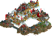
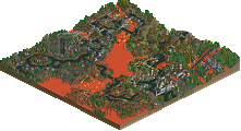
Retracing our collective footsteps
Round 5 | Match 1
Hellforge: Hadean Heights
Black Sea Deluge
Jaguar (100%)
Liampie (70%)
Ride6 (15%)
Disneylandian192 (15%)
Voting Rules
- You should only vote if you have viewed both parks in game.
- Take your time to reflect on each park. The poll stays open for three days, not three minutes.
- Everyone but players belonging to either team in the match may vote.
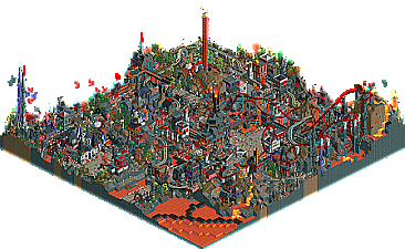
Love your park Jag, it's such a hectic map with little touches everywhere you look. Examples: the Christian/priest torture chamber, the dragon emerging from the volcano, the mouldy gallows field, and numerous purely stylistic touches that just paint the scene.
I really like that you went out of your way to dig up all these obscure objects. Also appreciate the naming. Hostile architecture was funny, and then I found that you had a funny archiect roaming the map
Two cool parks. I think stylewise both parks nailed it as they both feel very 2005 for me.
Hellforge: I appreciate that you actually went with the .sv6 save format. I think that is the first park of the contest to do this? As for the park itself, love the Fall of the Archangel coaster, it has a very nice classic layout and its so cool to watch it go with that background music. Also like the coaster with the spiral lift. Cool unconventional choice. Favourite part is that little bridge over the path. Love that little bridge over the lava with that mine cart ghost train. My only knock on this park is that it is a little too full in places, although this also gives it charm and it helps give it that 2005 vibe so its not too much of a knock.
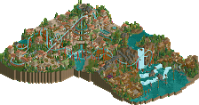
Black Sea Deluge: Very different park. I love the concept of this. The flooded area is very well done and the ship going over the edge is a nice cool gimmick. Also love that collapsed bridge in the "waterfall". The Parihedri coaster has a nice layout reminiscant of Jack Rabbit at Kennywood. Love the little wooden bridges. Overall composition of this park is pretty nice and the whole map gives a very classic vibe. Archy is good although maybe a bit monotome colourwise for my taste. The Cernavoda coaster was not my taste, although I did really like the station, the double drop under the queue and the interaction witth the path, the rest of the coaster layout was just a bit uninteresting to me. It also felt a bit cramped in the corner of the map.
Overall well done to both teams!
Hellforge: The moment Jag signed up for this contest I knew he'd go in on the cursed Argonath scenery and rock it. I'm not super familiar with Warcraft but its early '00s PC game feel is definitely present in the use of objects. The use of movement throughout is absolutely crazy. I love all the fire/lava effects going on; I had no idea that full-tile fire object was a thing and I actually kinda love it. The eruption trick is a classic which really reminds me of Butter's Platypus Paradise, a park I really loved when I first joined this site. The ride layouts are really interesting and refreshing. I feel like a lot of us are still in that modern realism groove so it's a breath of fresh air. I really loved the dark ride with the wooden wild mine cars, but the dive coaster does get a bit sluggish near the end. The named staff take this over the top for me; I loved the hostile architect and the biblically accurate gorilla. Honestly though, the biggest surprise of this park and the most classic touch of all is the SV6 format. I'm not sure if Jag forgot to update Open or if he just used plain ol' RCT2 for a true throwback. Overall it's a real joy to see you doing what you do best and making it work for this contest.
Let me see the goblin city. I need to be one with my people.
Black Sea Deluge: This is up there for the most 2005 park of the contest. Stylistically and architecturally it really feels like an archetypal Turtle/Artist spotlight, but it also introduces a visually striking theme with some really neat tricks. Love the overall idea of the deluge forcing the residents of this town to move up the mountain. The highlight of the park for me is the ship coming down the deluge; it makes clever use of both scenery and trackitecture and has so much motion behind it despite being completely still. The collapsed bridge nearby is also executed really well, although I kinda wish you took advantage of the staff names a bit more and had an opposing captain stuck on the bridge. Ride designs are on point with a great blend of realism and identity and some great interactions with the landscape throughout. The downside is the lack of color variation throughout the archi; it's somehow more brown than the self-aware Kumba park! Echoing an earlier statement, I also would've liked to see some named staff and even stalls. Even then, though, this is the park that gets my vote.
I really enjoyed Black Sea Deluge. Especially the log flume was great.
I thought Hellforge was very ugly and random.
That's why I voted for Black Sea Deluge.
hellforge: what a chaotic blast. so much energy. i actually quite like the main coaster, although I found it hard to follow anything in this park---in a good way. the corner with the church felt the strongest and most well-built to me
deluge: this really feels like the park this contest was designed for. stunning all around, and so much fun to explore. all the layouts were excellent, but the spiral coaster stood out to me the most. I loved the rooftop pathing and the interactions with the log flume, the cool bridges everywhere, and the purple flower highlights. just a lot of action and a lot of graceful design. standout of the contest, probably!
Awesome parks this round. Hellforge was sick. Super chaotic and a really strong coaster. I love how much energy and movement is present in this map. Tons of little details and moving pieces everywhere you look.
Though it was hard not to vote for Black Sea. Simply a classy map with a simple concept executed really well. Log flume was sick. The little coaster felt a bit unnecessary though. Wooden coaster was awesome. Great interactions all around.
Both parks have stellar overviews and leave a strong first impression. Had to vote for the ice cream boys though - this map stood out in a big way.
Nice work all!
Black Sea got my vote. Really pleasant, flumes were great. Flood setpiece was well done with the ship about to crash into the rocks. Only thing I didnt like was the steel coaster off to the side. Seemed sort of just hanging over stuff and reminded me a lot of scenario play where you build coasters over a lake or something silly.
Hellforge was a lot of fun, and very enjoyable. But felt a bit too cluttered. I appreciate the unusual object choices and the gritty-ness of it all.
I voted for Black Sea Deluge, pretty much was head and shoulders for me above Hellforge. I just really didn't like Hellforge very much and struggled with the theme.
BSD: Woodie was great, some really classic archy that I loved, Amazing seeing these three builders together, I was really hoping Liam and Ride6 were going to build together and Disneylandian was a huge bonus. Just a really strong park that woulda beat most it came up against this contest. Great work guys.
Winner:
Hellforge: I will always appreciate a bold and unique submission like this. Using the crazier animated objects that have been largely left behind is a gutsy choice, and I think works in this setting. The park is dense with theming, and although it is chaotic I can look at that as a design choice fitting the theme.
Black Sea Deluge: The flooding set-piece is excellent, although I was wishing for more peep interaction with it. The woodie layout is is cool. It would be amazing to have a beginning and ending like that on a real coaster. I think the dips in the valley could have been highlighted/explained with some more prominent cliffs. There is a lot of verticality, but is sort of hidden instead of accentuated.
I didn't enjoy Hellforge at all like I already stated before.
A bit of a longer review now:
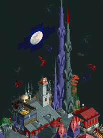
It felt to me like a park made by someone that has discovered custom scenery objects for the first time and just tried to place as much of the coolest scenery pieces in one park. The result for me was a mess texture and object wise that I couldn't really look through to be honest. The stuff flying around over my screen didn't help either.
An example of what I mean. The tower objects are ugly to me, and I don't understand the abundance of (wall) textures.
I get that this park is themed to hell, but it was a bit of a personal hell to have to look at it.
Black Sea Deluge
I like that this was very in spirit of the contest stylistically, but it is something new and creatively innovative. The sense of movement with the ship crashing down the waterfall is fantastic. I love the grandeur of the wooden coaster with such deep valleys and the bridges/ folaige are quite nice there. Really nice infrastructure and the use of the rooftops as paths are cool. I get the overall impression that this could be the really ambitious concept for a high budget park which I really like when it is explored in this way to create these very fantasy settings with well integrated rides and infrastructure.
Hellforge
So I am actualyl glad to see these objects used. As far as abstract representation go I can read the overall forms you were drawing using them. At ground level this lava dark ride think off in th side and the break of foliage is a really cool vibe. There is just so0mething about the ovearll color and atmosphere that feels like some kind of old computer game but I guess that is what this is. The dive coaster is badass, for some eason the vertical loop feels special here. Mayybe it's because it forms an eye lined up with the enterprise like that. Perhaps the eye of sauron alluding to the mordor stuff?