Park / Stallion
-
 15-September 22
- Views 1,964
- Downloads 405
- Fans 1
- Comments 9
-
 Description
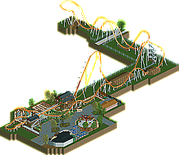
A B&M Hypercoaster at some fictional park .
-
1 fan
 Fans of this park
-
 Download Park
405
-
 Objects
1
-
 Tags
Tags

![park_3806 [NEDC4 2/15] - Interstellar](https://www.nedesigns.com/uploads/parks/3806/aerialt3455.png)
Station is solid. Queue interaction is good. Love the dense foliage and rockwork near the end of the layout. Very twisty too. But it seems like you kinda gave up on the rest of the layout. Super tight crop, and just dirt mounds and grass. I honestly enjoy what is there. I'm happy you were able to see this to completion.
I'm highlighting this portion here because it shows a huge amount of potential. The more fully-fleshed out areas around the station are really quite nice. Give the layout more room to shine and a nice touch-up with foliage and some more polished architecture and this is quite nice indeed.
As it stands, it feels a little half baked. As otter mentioned, the map crop makes everything feel a little "artificial" - less like a design choice and more like rushing to the finish line.
That being said - this is generally quite the step up, I believe. Stick with the next one!
Really like the station and queue area, good foliage and nice interaction there.
Yeah, this is pretty good stuff, though a bit on the unfinished side. More foliage could've done wonders. Foliage around the station looks good, and the shedding trees are a nice touch. Elevator is a nice detail too.
Coaster is servicable, nothing about it stands out much. Layouts has flow, train is too fast. I like it, don't love it.
Keep it up!
This is nice! The overall layout is well structured and the plaza area around the coaster station works really well and feels cohesive with the flat ride and restaurant. The coaster layout is good, nothing too fancy but well done. However the coaster's surroundings felt a little too barebones. I get what you were going for, but a few more little details to break it up would have helped greatly. All in all this is a good showing. Happy to see more from you DH
I think you did a great job on the coaster infrastructure. That transfer track is awesome. Also really like how you laid out the queue line. Some of the bigger NCSO mine objects look out of place here.
The facade of shops looks very promising, could imagine that being the facade for some type of western shooter darkride.
Support work on the coaster is great. Wish you would have put the same amount of effort into the (now land) tunnels.
The edges of the map are just not there to be honest. Expanding the map four or five tiles and adding foliage would have easily bumped it up another 10% for me. It really seems like one hour of work to get this design that much further.
Thanks for the feedback. Will definitely keep those things in mind if I decide to do another project.
not bad here! the station and queue line are lively with nice interactions, and the custom flat is great. for a finished park, you've left a lot of bare flat land, which I think could have been polished up pretty easily to make something design-worthy