Park / Pinocchio: Ride to Maturity
-
 15-September 22
- Views 2,968
- Downloads 424
- Fans 2
- Comments 18
-

-
 77.00%(required: 65%)
 Design

SSSammy 85% bigshootergill 80% chorkiel 80% Liampie 80% ottersalad 80% RWE 80% CoasterCreator9 75% Scoop 75% Terry Inferno 75% Xtreme97 75% G Force 70% posix 70% 77.00% -
 Description
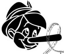
I tried to pay hommage to my favourite film as a little boy. This is Pinocchio re-imagined in RCT2.
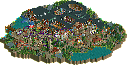
The coaster, which is an extreme spinner with a substantial darkride section, follows the story of the puppet who came to be a real boy. Pinocchio gets brought to life, is introduced to Stromboli, chooses the wrong path, and then ends up on Pleasure Island. In my head the outdoor section of the ride resembles Pleasure Island.
I put some numbers above each dark-ride section, to try to make it easier to follow.
Please note, this is not a try-hard attempt at a Disney-style park. I just used the IP.
I hope everyone enjoys this design. I definitely enjoyed making it. -
2 fans
 Fans of this park
-
 Full-Size Map
-
 Download Park
424
-
 Objects
1
-
 Tags
Tags

Hands down one of the best sculptures of all time lol
Been excited to see this come out and this is leaps and bounds ahead of anything you've released before. In this release you're absolutely letting loose with potential I feel some NE users may not have realized you had.
+ Sculpture work is amazing. You're up there with Babar Tapie and Mamarillas for the best sculptures in the community and this was a great design for you to show that off. All of it is remarkable but the one with the extending nose is genius.
+ Interior cutaways are gorgeous. The house interior and mock village cutaways are my favorite.
+ Drunken Donkey is a gift.
+ The Cyclops ride vehicles for Monstro's eyes, hoooooly. Absolutely redeemed that cursed artifact.
+ The archi is consistently charming with some really memorable facades.
- Minor nitpick but one of the trains gets stuck behind the other at the station for quite a while. Block sections may have worked better here, but then again unless you use cutaway you can't even see it.
- That truck object in the back of house. Eeeeewww.
75% from me. I think this is your big breakthrough on NE and I can't wait to see what comes out of you next!
Notable evolution to your style, I think. J K/Babar-esque style (this is a good thing). Nice tricks all around that add some character to this, which is pretty important considering the source material.
One thing I would have personally enjoyed seeing is some music to up the atmosphere; toyland style somewhere would have been plenty! I know not everyone plays with sound on, but I'm big into sound as a contributor to overall presentation and general atmosphere. Tiny thing, really.
Generally very well done - great interaction, wonderful dedication to the theme and overall concept. The particular style of parkmaking doesn't resonate with me as strongly as others, but there's a lot to love here.
What a neat freaking ride this is, dude.
I love the use of Extreme Spinner trains, as it doubles down with the dark ride portion in the beginning; rotating trains to give guests multiple views of the different showrooms, genius!
Some little details I loved that may not be as noticed:
+ The different colors of water (red and blue) on the whale's tongue and chin to show "clearness" is pretty neat.
+ The multi-purpose building for the Drunken Donkey.
+ The twinkle effect over the beds in section 2.
+ The piano in section 4.
Super happy to see you complete a full design submission this quickly after your H2H Classic park. It's easy to see where you were just kinda done building on this, but I'm glad to see it out and hope you get a great score!
Love the sculpture work and building fronts, the whole park is so lively and fun to explore. Great to see more CSO work from you.
wow, ulvenwood, this is some amazing progress from your previous work! You can be really proud of this!
This is amazing dude! The whole place is brimming with character and there are some genuinely funny pieces sprinkled in. I love all of the sculptures. Seriously, these are some of the best RCT sculptures I've ever seen. The coaster itself is great, I love the extreme spinner getting some well deserved attention, and the dark ride sections are executed very well. Everything else here was easy to read; you definitely have an eye for expressive building, and your intentions come across with grace. Even with some of the more crass elements (which I personally love), each detail lends a great deal of atmosphere to an already impressive environment. I hope this doesn't get overshadowed by H2HC because it's some of the best recent work I've seen. Awesome work man!
This so delightful and totally your brand. Super charming, full of character, and fantastic ideas. I love the donkey part the most!
cant wait to see whats next
This was such a pleasant surprise! I enjoyed this way more than I thought I would. This is what a design should be.
75% for me.
It's a very cute release !
I love the sculpts, especially the whale and pinocchio, the nose is such a simple but brilliant idea !!
Just gave this the final vote - I went with 80% and it came out 77%, which sounds about right to me. This map is such a nice, complete, creative little piece! There are lovely ideas and well done sculptures everywhere, without it being overwhelming. Perhaps only the whale is too in your face, but even then it's still nicely done with good details like the 'drooling' for a lack of a better word. Pinocchio's nose is probably the best idea for me, which is fitting for this map of course. I also got a weak spot for the building that's covered in clocks - the clocks themselves at least.
I can also think of some criticism. The archy was a tad inconsistent. Generally good, but with some mediocre stuff (clock tower, clocks shop) and once I think it's even outright weak - Cleo's burgers is so bland, and also poorly placed as it puts a backstage area in focus. I would've picked different colours for the coaster. There's no obvious better choice (though I think red is an improvement), but that's also because the colour scheme in the area overall seems to be all over the place - perhaps absent.
Anyway, none of these things are even close to being dealbreakers. I voted 80% for a reason. I find the park name strange, but as a parkmaker I think you've definitely ridden to maturity with this.
Very neat ride Ulvenwood, so creative and very well deserved design, gratz!
It's been quite a few years since I've seen this movie and this park brought out some nostalgia for me and reminded me that I actually like it. The scenes you created here brought back memories of the movie that I had forgotten. Clearly you nailed the theming.
Some of my favorite bits: Drunken Donkey is an A+ flat ride. Cutaway scenes 1 and 4 were particularly well done. The twisted coaster section before entering the whale's mouth is integrated so well with the path.
Glad to see this finished and looking forward to what comes next.
ok firstly, ride to maturity is a hilarious name.
i'm always a sucker for coasters with dark ride sections, and this one is lovely. the room with the green/red doors would be a really fun trick IRL too. the layout is not bad, kinda a bit wonky towards the end, but the overall environment is really festive and lively. good atmosphere and good shit